
 Web Front-end
JS Tutorial
Detailed explanation of how to use Bootstrap button examples (code examples)
Web Front-end
JS Tutorial
Detailed explanation of how to use Bootstrap button examples (code examples)
Detailed explanation of how to use Bootstrap button examples (code examples)

This chapter will explain how to use Bootstrap buttons through examples. Any element with class .btn will inherit the default appearance of a rounded gray button. But Bootstrap provides some options to style the buttons. Detailed explanation through the examples of this article
[Related video recommendations: Bootstrap tutorial]
Bootstrap button
This chapter will explain how to use Bootstrap buttons through examples. Any element with class .btn will inherit the default appearance of a rounded gray button. However, Bootstrap provides some options to define the style of buttons, as shown in the following table:
The following styles can be used on ,
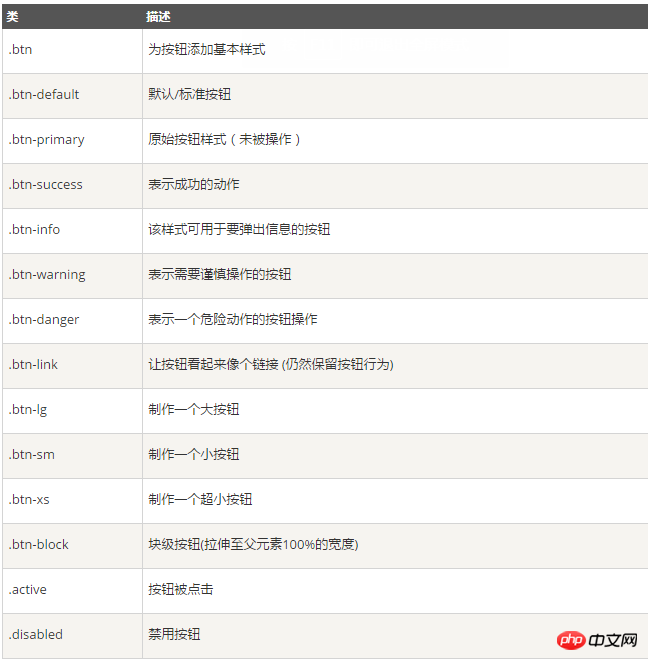
The following example demonstrates all the above button classes:
<!-- 标准的按钮 -->
<button type="button" class="btn btn-default">默认按钮</button>
<!-- 提供额外的视觉效果,标识一组按钮中的原始动作 -->
<button type="button" class="btn btn-primary">原始按钮</button>
<!-- 表示一个成功的或积极的动作 -->
<button type="button" class="btn btn-success">成功按钮</button>
<!-- 信息警告消息的上下文按钮 -->
<button type="button" class="btn btn-info">信息按钮</button>
<!-- 表示应谨慎采取的动作 -->
<button type="button" class="btn btn-warning">警告按钮</button>
<!-- 表示一个危险的或潜在的负面动作 -->
<button type="button" class="btn btn-danger">危险按钮</button>
<!-- 并不强调是一个按钮,看起来像一个链接,但同时保持按钮的行为 -->
<button type="button" class="btn btn-link">链接按钮</button>
Effect

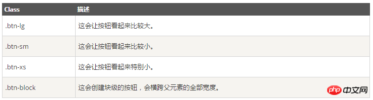
Button size
The following table lists the classes for obtaining buttons of various sizes:
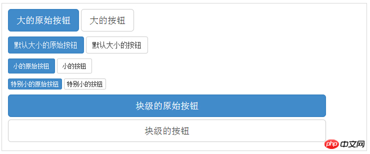
<p>
 <button type="button" class="btn btn-primary btn-lg">大的原始按钮</button>
 <button type="button" class="btn btn-default btn-lg">大的按钮</button>
</p>
<p>
 <button type="button" class="btn btn-primary">默认大小的原始按钮</button>
 <button type="button" class="btn btn-default">默认大小的按钮</button>
</p>
<p>
 <button type="button" class="btn btn-primary btn-sm">小的原始按钮</button>
 <button type="button" class="btn btn-default btn-sm">小的按钮</button>
</p>
<p>
 <button type="button" class="btn btn-primary btn-xs">特别小的原始按钮</button>
 <button type="button" class="btn btn-default btn-xs">特别小的按钮</button>
</p>
<p>
 <button type="button" class="btn btn-primary btn-lg btn-block">块级的原始按钮</button>
 <button type="button" class="btn btn-default btn-lg btn-block">块级的按钮</button>
</p>
Effect
Button state
Bootstrap provides classes for activation, deactivation and other button states, which will be explained in detail below.
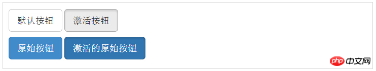
Activation state
The button will have a pressed appearance (dark background, dark border, shadow) when activated.
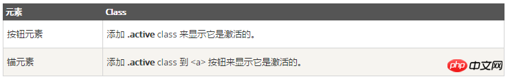
The following table lists the classes that make button elements and anchor elements active:
<p>
 <button type="button" class="btn btn-default btn-lg ">默认按钮</button>
 <button type="button" class="btn btn-default btn-lg active">激活按钮</button>
</p>
<p>
 <button type="button" class="btn btn-primary btn-lg ">原始按钮</button>
 <button type="button" class="btn btn-primary btn-lg active">激活的原始按钮</button>
</p>
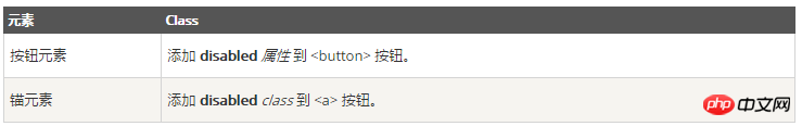
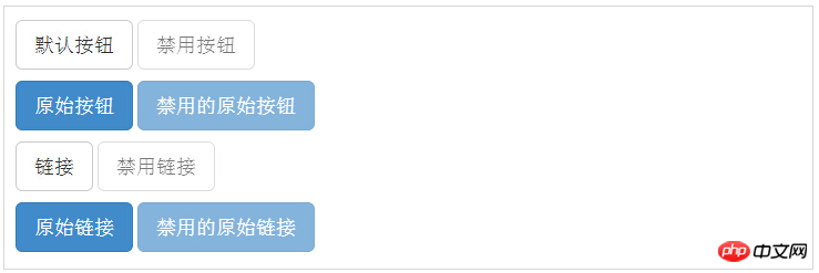
DisabledState
When you disable a button, it becomes 50% lighter and loses its gradient.
The following table lists the classes that disable button elements and anchor elements:
The following example demonstrates this:
<p>
 <button type="button" class="btn btn-default btn-lg">默认按钮</button>
 <button type="button" class="btn btn-default btn-lg" disabled="disabled">禁用按钮</button>
</p>
<p>
 <button type="button" class="btn btn-primary btn-lg ">原始按钮</button>
 <button type="button" class="btn btn-primary btn-lg" disabled="disabled">禁用的原始按钮</button>
</p>
<p>
 <a href="#" rel="external nofollow" rel="external nofollow" rel="external nofollow" rel="external nofollow" rel="external nofollow" class="btn btn-default btn-lg" role="button">链接</a>
 <a href="#" rel="external nofollow" rel="external nofollow" rel="external nofollow" rel="external nofollow" rel="external nofollow" class="btn btn-default btn-lg disabled" role="button">禁用链接</a>
</p>
<p>
 <a href="#" rel="external nofollow" rel="external nofollow" rel="external nofollow" rel="external nofollow" rel="external nofollow" class="btn btn-primary btn-lg" role="button">原始链接</a>
 <a href="#" rel="external nofollow" rel="external nofollow" rel="external nofollow" rel="external nofollow" rel="external nofollow" class="btn btn-primary btn-lg disabled" role="button">禁用的原始链接</a>
</p>
Effect
Button label
You can use , Use button class on
The following example demonstrates this:
<a class="btn btn-default" href="#" rel="external nofollow" rel="external nofollow" rel="external nofollow" rel="external nofollow" rel="external nofollow" role="button">链接</a>
<button class="btn btn-default" type="submit">按钮</button>
<input class="btn btn-default" type="button" value="输入">
<input class="btn btn-default" type="submit" value="提交">
The above is a detailed example of using Bootstrap buttons introduced by the editor. I hope it will be helpful to you. If you have any questions, please Leave me a message and I will reply to you in time. I would also like to thank you all for your support of the php website!
The above is the detailed content of Detailed explanation of how to use Bootstrap button examples (code examples). For more information, please follow other related articles on the PHP Chinese website!

Hot AI Tools

Undresser.AI Undress
AI-powered app for creating realistic nude photos

AI Clothes Remover
Online AI tool for removing clothes from photos.

Undress AI Tool
Undress images for free

Clothoff.io
AI clothes remover

Video Face Swap
Swap faces in any video effortlessly with our completely free AI face swap tool!

Hot Article
Hot Tools

Notepad++7.3.1
Easy-to-use and free code editor

SublimeText3 Chinese version
Chinese version, very easy to use

Zend Studio 13.0.1
Powerful PHP integrated development environment

Dreamweaver CS6
Visual web development tools

SublimeText3 Mac version
God-level code editing software (SublimeText3)
Hot Topics
 1386
1386
 52
52

 How to get the bootstrap search bar
Apr 07, 2025 pm 03:33 PM
How to get the bootstrap search bar
Apr 07, 2025 pm 03:33 PM
How to use Bootstrap to get the value of the search bar: Determines the ID or name of the search bar. Use JavaScript to get DOM elements. Gets the value of the element. Perform the required actions.
 How to use bootstrap in vue
Apr 07, 2025 pm 11:33 PM
How to use bootstrap in vue
Apr 07, 2025 pm 11:33 PM
Using Bootstrap in Vue.js is divided into five steps: Install Bootstrap. Import Bootstrap in main.js. Use the Bootstrap component directly in the template. Optional: Custom style. Optional: Use plug-ins.
 How to write split lines on bootstrap
Apr 07, 2025 pm 03:12 PM
How to write split lines on bootstrap
Apr 07, 2025 pm 03:12 PM
There are two ways to create a Bootstrap split line: using the tag, which creates a horizontal split line. Use the CSS border property to create custom style split lines.
 How to do vertical centering of bootstrap
Apr 07, 2025 pm 03:21 PM
How to do vertical centering of bootstrap
Apr 07, 2025 pm 03:21 PM
Use Bootstrap to implement vertical centering: flexbox method: Use the d-flex, justify-content-center, and align-items-center classes to place elements in the flexbox container. align-items-center class method: For browsers that do not support flexbox, use the align-items-center class, provided that the parent element has a defined height.
 How to set up the framework for bootstrap
Apr 07, 2025 pm 03:27 PM
How to set up the framework for bootstrap
Apr 07, 2025 pm 03:27 PM
To set up the Bootstrap framework, you need to follow these steps: 1. Reference the Bootstrap file via CDN; 2. Download and host the file on your own server; 3. Include the Bootstrap file in HTML; 4. Compile Sass/Less as needed; 5. Import a custom file (optional). Once setup is complete, you can use Bootstrap's grid systems, components, and styles to create responsive websites and applications.
 How to insert pictures on bootstrap
Apr 07, 2025 pm 03:30 PM
How to insert pictures on bootstrap
Apr 07, 2025 pm 03:30 PM
There are several ways to insert images in Bootstrap: insert images directly, using the HTML img tag. With the Bootstrap image component, you can provide responsive images and more styles. Set the image size, use the img-fluid class to make the image adaptable. Set the border, using the img-bordered class. Set the rounded corners and use the img-rounded class. Set the shadow, use the shadow class. Resize and position the image, using CSS style. Using the background image, use the background-image CSS property.
 How to resize bootstrap
Apr 07, 2025 pm 03:18 PM
How to resize bootstrap
Apr 07, 2025 pm 03:18 PM
To adjust the size of elements in Bootstrap, you can use the dimension class, which includes: adjusting width: .col-, .w-, .mw-adjust height: .h-, .min-h-, .max-h-
 How to use bootstrap button
Apr 07, 2025 pm 03:09 PM
How to use bootstrap button
Apr 07, 2025 pm 03:09 PM
How to use the Bootstrap button? Introduce Bootstrap CSS to create button elements and add Bootstrap button class to add button text
