 Web Front-end
 JS Tutorial
 JavaScript implements the production of special effects for selected boxes
JavaScript implements the production of special effects for selected boxes
The example of this article describes the JS implementation of adding a border display effect to the checkbox in the form. Share it with everyone for your reference. The details are as follows:
Here, JavaScript is used to realize the checkbox selection effect, the checkbox effect in the form, the check-check effect simulation, and the beautification effect achieved by combining JS and HTML5. It seems to be a popular effect at the moment!
The screenshot of the running effect is as follows:
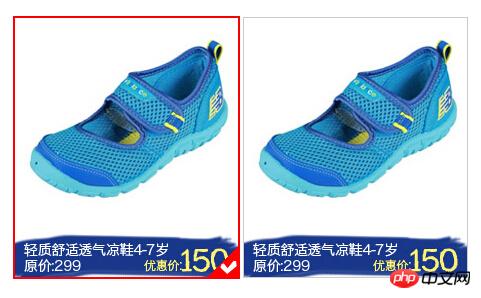

The specific code is as follows:
<!doctype html>
<html lang="en-US">
<head>
<meta http-equiv="Content-Type" content="text/html; chaRset=gb2312" />
<title>JS实现单个图片选中美化框</title>
<style type="text/css">
body, p, dl, dt, dd, ul, ol, li, h1, h2, h3, h4, h5, h6, pre, code, form, fieldset,
legend, input, button, textarea, blockquote, th, td, p { margin:0; padding:0 }
input, button, select, textarea { outline:none }
li { list-style:none }
img { vertical-align:top; border:none }
textarea { resize:none }
body { width:auto; height:auto; padding:0; margin:0; color: #666; background: #FFF; }
body, input, textarea { font-size:12px; font-family:Arial, Verdana, "Microsoft Yahei", Simsun }
a{cursor:pointer}
a:link{color:#37a;text-decoration:none}
a:visited{color:#669;text-decoration:none}
a:hover{color:#fff;text-decoration:none;background:#37a}
a:active{color:#fff;text-decoration:none;background:#f93}
.clear { clear:both }
.clearfix:after{ content:"."; display:block; font-size: 0; height:0; clear:both; visibility:hidden }
.clearfix{ zoom:1}
#radio_wrap{width: 916px; margin: 50px auto 0;font-size: 0;*word-spacing:-1px;}
@media screen and (-webkit-min-device-pixel-ratio:0){
#radio_wrap{letter-spacing:-4px;}}
#radio_wrap input{display: none;}
#radio_wrap li{position:relative; width: 223px; height: 259px; border: 1px solid #CCC; display:inline-block; *display:inline; *zoom:1; margin:0 2px;}
#radio_wrap li.checked{border:2px solid red;margin:-1px 1px;}
#radio_wrap li.checked i{width:30px; height:30px; position:absolute; right:0; bottom:0;_right:-1px; _bottom:-1px;background:url(images/checked.gif) no-repeat;}
</style>
</head>
<body>
<p id="radio_wrap">
 <ul>
 <li class="c checked">
  <input type="radio" id="radio_a_01" name="radio_a" />
  <label for="radio_a_01"><img src="/static/imghw/default1.png"  data-src="images/taobao2.jpg"  class="lazy"   alt="" disabled/></label>
  <i></i>
 </li>
 <li class="c">
  <input type="radio" id="radio_a_02" name="radio_a" />
  <label for="radio_a_02"><img src="/static/imghw/default1.png"  data-src="images/taobao2.jpg"  class="lazy"   alt="" disabled/></label>
  <i></i>
 </li>
 </ul>
</p>
<script type="text/javascript">
(function() {
 var radioWrap = document.getElementById("radio_wrap"),
 li = radioWrap.getElementsByTagName("li");
 for(var i = 0; i < li.length; i++){
 li[i].onclick = function() {
  for(var i = 0; i < li.length; i++){
  li[i].className = "";
  }
  this.className = "checked";
 }
 }
})();
</script>
<p style="text-align:center;clear:both"><br>
</p>
</body>
</html>I hope that this article will help everyone’s javascript programming Helps.
The above is the detailed content of JavaScript implements the production of special effects for selected boxes. For more information, please follow other related articles on the PHP Chinese website!

Hot AI Tools

Undresser.AI Undress
AI-powered app for creating realistic nude photos

AI Clothes Remover
Online AI tool for removing clothes from photos.

Undress AI Tool
Undress images for free

Clothoff.io
AI clothes remover

AI Hentai Generator
Generate AI Hentai for free.

Hot Article

Hot Tools

Notepad++7.3.1
Easy-to-use and free code editor

SublimeText3 Chinese version
Chinese version, very easy to use

Zend Studio 13.0.1
Powerful PHP integrated development environment

Dreamweaver CS6
Visual web development tools

SublimeText3 Mac version
God-level code editing software (SublimeText3)

Hot Topics
 1382
1382
 52
52
 Recommended: Excellent JS open source face detection and recognition project
Apr 03, 2024 am 11:55 AM
Face detection and recognition technology is already a relatively mature and widely used technology. Currently, the most widely used Internet application language is JS. Implementing face detection and recognition on the Web front-end has advantages and disadvantages compared to back-end face recognition. Advantages include reducing network interaction and real-time recognition, which greatly shortens user waiting time and improves user experience; disadvantages include: being limited by model size, the accuracy is also limited. How to use js to implement face detection on the web? In order to implement face recognition on the Web, you need to be familiar with related programming languages and technologies, such as JavaScript, HTML, CSS, WebRTC, etc. At the same time, you also need to master relevant computer vision and artificial intelligence technologies. It is worth noting that due to the design of the Web side
 Specific method to create film movement effect in PPT
Mar 26, 2024 pm 04:00 PM
1. Start PPT, create a new blank document, select all text boxes and delete them. 2. Execute the Insert-Shape command, drag a rectangle in the document, and fill the shape with black. 3. Drag the rectangle to elongate it, execute the Insert-Shape command, drag out the small square, and set the fill color to white. 4. Copy and paste the small squares one by one so that the top and bottom are evenly distributed on both sides of the film. After selecting them all with ctrl+a, right-click and select Group. 5. Execute the Insert-Picture command, find the picture to be inserted in the pop-up dialog box, click to open, and adjust the size and position of the picture. 6. Repeat step 5 to insert and set the remaining pictures in order to form a film picture. 7. Select the film, execute animation-add animation command
 How to make a tomato novel cover
Feb 23, 2024 pm 01:55 PM
How to make the cover of Tomato novel? You can make exclusive novel cover in Tomato novel, but most friends don’t know how to make the cover of Tomato novel. Next is the picture of how to make the cover of Tomato novel brought by the editor to the players. Tutorial, interested players come and take a look! Tomato Novel usage tutorial How to make a Tomato Novel cover 1. First open the Tomato Novel APP, enter the work management page to create a new book, and select the [Cover Template] as shown by the arrow below; 2. Then enter the cover template page and select your favorite cover Template; 3. After finally selecting the cover, click [Confirm] in the upper right corner.
 Operation guide for creating mobile Excel tables
Feb 18, 2024 pm 02:41 PM
Mobile Excel table creation tutorial With the popularity of mobile devices and the continuous advancement of technology, mobile phones have become one of the indispensable tools in our daily life and work. Using Excel spreadsheets on your mobile phone can easily record, calculate and analyze data and improve work efficiency. This article will share with you the basic operations and techniques for creating mobile Excel tables. 1. Choose the right application. There are many mobile Excel applications on the market to choose from, such as GoogleSheets, Micro
 PHP and JS Development Tips: Master the Method of Drawing Stock Candle Charts
Dec 18, 2023 pm 03:39 PM
With the rapid development of Internet finance, stock investment has become the choice of more and more people. In stock trading, candle charts are a commonly used technical analysis method. It can show the changing trend of stock prices and help investors make more accurate decisions. This article will introduce the development skills of PHP and JS, lead readers to understand how to draw stock candle charts, and provide specific code examples. 1. Understanding Stock Candle Charts Before introducing how to draw stock candle charts, we first need to understand what a candle chart is. Candlestick charts were developed by the Japanese
 Simple JavaScript Tutorial: How to Get HTTP Status Code
Jan 05, 2024 pm 06:08 PM
JavaScript tutorial: How to get HTTP status code, specific code examples are required. Preface: In web development, data interaction with the server is often involved. When communicating with the server, we often need to obtain the returned HTTP status code to determine whether the operation is successful, and perform corresponding processing based on different status codes. This article will teach you how to use JavaScript to obtain HTTP status codes and provide some practical code examples. Using XMLHttpRequest
 The relationship between js and vue
Mar 11, 2024 pm 05:21 PM
The relationship between js and vue: 1. JS as the cornerstone of Web development; 2. The rise of Vue.js as a front-end framework; 3. The complementary relationship between JS and Vue; 4. The practical application of JS and Vue.
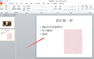 Let me teach you! How to create animation effects in PPT!
Mar 20, 2024 pm 06:40 PM
When making PPT, using some animation effects will make it more lively and cute than without using animation effects. With the addition of animation effects, people may like to watch this PPT, so we must learn how to create animation effects for PPT. Next, I will introduce in detail how to add animation effects to PPT. Please continue reading and study these steps carefully. I believe they will be helpful to you! First, open the PPT we made ourselves. You will notice that this PPT currently does not have any animation effects (as shown by the red arrow in the picture below). 2. Then, we need to add animation effects to the picture. We first select the picture, and then click the [Animation] button on the menu bar (as shown in the red circle in the figure below). 3. Next, we click inside the animation


