Detailed explanation of div alignment and web page layout
p layout is the focus of learning. This article mainly introduces the relevant learning materials of p alignment and web page layout in detail. It has certain reference value. Interested friends can refer to it
The reason why you need to learn p layout thoroughly is because the layout of table is really difficult to use. If they are in the same table, the distribution of specifications of each row cannot be adjusted at all. For example, the following very simple code:
<!DOCTYPE html PUBLIC "-//W3C//DTD XHTML 1.0 Transitional//EN" "http://www.w3.org/TR/xhtml1/DTD/xhtml1-transitional.dtd">
<html xmlns="http://www.w3.org/1999/xhtml">
<head>
<meta http-equiv="Content-Type" content="text/html; charset=utf-8" />
<title>无标题文档</title>
</head>

<body>
<table border="1">
<tr>
<td width="5%">11111111111111</td>
<td width="85%">11111111111111</td>
<td width="5%">11111111111111</td>
<td width="5%">11111111111111</td>
</tr>
<tr>
<td width="5%">11111111111111</td>
<td width="5%">11111111111111</td>
<td width="85%">11111111111111</td>
<td width="5%">11111111111111</td>
</tr>
</table>
</body>
</html>
I wanted to write a layout like this:
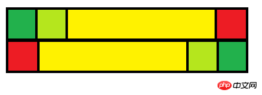
But the actual effect is like this:

This is normal, because only the first row of the table layout is effective for the td setting, and the td settings of the remaining rows will be overwritten by the td setting of the first row. .
This problem is very serious, especially for web designers. When you set the border attribute of the table to 0, it is difficult to figure out what happened?
To solve this problem, if you still use table layout, you have two methods. One is to make the two rows not in the same table, and the other is to use table nesting.
But this is too painful, isn’t it? Do you have to use a new table every time you layout? And how does the script number so many tables? How to control?
So the web page layout of table is not very useful and can only be used for in-line layout. The role of table in in-line layout is indeed much more powerful for p.
But p layout can also complete inline layout, but you need to define the float attribute in style, and complete an inline layout, and use clear:both in style to wrap the line.
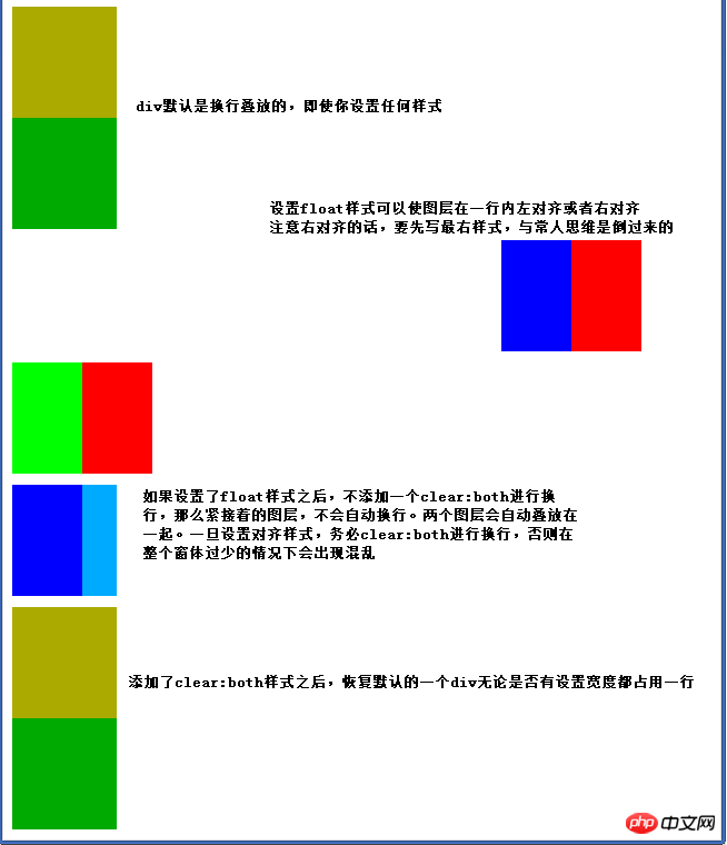
The above layer discharge is achieved through the following code:
<!DOCTYPE html PUBLIC "-//W3C//DTD XHTML 1.0 Transitional//EN" "http://www.w3.org/TR/xhtml1/DTD/xhtml1-transitional.dtd">
<html xmlns="http://www.w3.org/1999/xhtml">
<head>
<meta http-equiv="Content-Type" content="text/html; charset=utf-8" />
<title>p</title>
</head>

<body>
<!--默认情况下的p对齐-->
<p style="background:#aa0; width:15%; height:100px;"></p>
<p style="background:#0a0; width:15%; height:100px;"></p>
<!--更换对齐方式,必须使用clear:both换行,这个换行符的高度为10px,默认为0px,颜色同网页的背景色-->
<p style="clear:both; height:10px;"></p>
<!--使用了行内右对齐的方式,是先写最右图层,再写次右图层,与常人思维相反-->
<p style="background:#F00; width:10%; height:100px; float:right; margin-right:10%"></p>
<p style="background:#00f; width:10%; height:100px; float:right;"></p>
<p style="clear:both; height:10px;"></p>
<!--使用行内左对齐方式-->
<p style="background:#0f0; width:10%; height:100px; float:left;"></p>
<p style="background:#F00; width:10%; height:100px; float:left;"></p>
<p style="clear:both; height:10px;"></p>
<p style="background:#00f; width:10%; height:100px; float:left;"></p>
<!--如果你更换对齐方式,这里是希望从行内左对齐更变成一个无论大小的图层占用一行,而不用clear:both换行的话,这两个图层会叠放在一起,出错-->
<p style="background:#0af; width:15%; height:100px;"></p>
<!--此乃正确的使用方式。-->
<p style="clear:both; height:10px;"></p>
<p style="background:#aa0; width:15%; height:100px;"></p>
<p style="background:#0a0; width:15%; height:100px;"></p>
</body>
</html>
And for some such as navigation Layers such as bars that are fixed at the beginning or end of the page, and some advertising layers that are free from the system, need to use the alignment method of position. The former is fixed and the latter is absolute.
In the above code, continue to add the following code:
<p style="background:#eee; width:15%; height:100px; position:absolute; top:5%; left:80%;">游离于体系之外</p>
<p style="background:#aaa; width:100%; height:30px; position:fixed; top:0%;left:0%">游离于体系之外</p>
<!--下面两个图层,只是为了说明上面两行代码可以放在任何位置,但不影响网页布局之用-->
<p style="background:#aa0; width:15%; height:100px;"></p>
<p style="background:#0a0; width:15%; height:100px;"></p>
The following effect will appear:
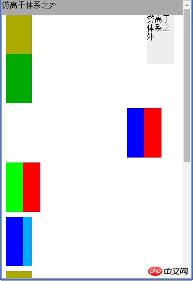
The layer with position:fixed will always have its head hanging even if the scroll bar is pulled down:
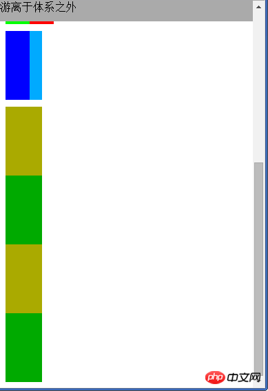
The above is about the "Navigation Bar" layer and " The two lines of code for the "Advertising" layer can be placed anywhere without affecting the network layout. Then, all the code of the web page evolves into the following:
p


<p style="background:#eee; width:15%; height:100px; position:absolute; top:5%; left:80%;">游离于体系之外</p>
<p style="background:#aaa; width:100%; height:30px; position:fixed; top:0%;left:0%">游离于体系之外</p>
<!--下面两个图层,只是为了说明上面两行代码可以放在任何位置,但不影响网页布局之用-->
<p style="background:#aa0; width:15%; height:100px;"></p>
<p style="background:#0a0; width:15%; height:100px;"></p>
So, p layout is much more powerful, controllable and usable than table layout
The above is the detailed content of Detailed explanation of div alignment and web page layout. For more information, please follow other related articles on the PHP Chinese website!

Hot AI Tools

Undresser.AI Undress
AI-powered app for creating realistic nude photos

AI Clothes Remover
Online AI tool for removing clothes from photos.

Undress AI Tool
Undress images for free

Clothoff.io
AI clothes remover

AI Hentai Generator
Generate AI Hentai for free.

Hot Article

Hot Tools

Notepad++7.3.1
Easy-to-use and free code editor

SublimeText3 Chinese version
Chinese version, very easy to use

Zend Studio 13.0.1
Powerful PHP integrated development environment

Dreamweaver CS6
Visual web development tools

SublimeText3 Mac version
God-level code editing software (SublimeText3)

Hot Topics
 1385
1385
 52
52
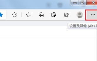 How to send web pages to desktop as shortcut in Edge browser?
Mar 14, 2024 pm 05:22 PM
How to send web pages to the desktop as a shortcut in Edge browser? Many of our users want to display frequently used web pages on the desktop as shortcuts for the convenience of directly opening access pages, but they don’t know how to do it. In response to this problem, the editor of this issue will share the solution with the majority of users. , let’s take a look at the content shared in today’s software tutorial. The shortcut method of sending web pages to the desktop in Edge browser: 1. Open the software and click the "..." button on the page. 2. Select "Install this site as an application" in "Application" from the drop-down menu option. 3. Finally, click it in the pop-up window
 How to set up web page automatic refresh
Oct 26, 2023 am 10:52 AM
To set the automatic refresh of a web page, you can use the HTML "meta" tag, the JavaScript "setTimeout" function, the "setInterval" function or the HTTP "Refresh" header. Detailed introduction: 1. Use the "meta" tag of HTML. In the "<head>" tag of the HTML document, you can use the "meta" tag to set the automatic refresh of the web page; 2. The "setTimeout" function of JavaScript, etc.
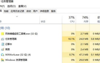 What should I do if the images on the webpage cannot be loaded? 6 solutions
Mar 15, 2024 am 10:30 AM
Some netizens found that when they opened the browser web page, the pictures on the web page could not be loaded for a long time. What happened? I checked that the network is normal, so where is the problem? The editor below will introduce to you six solutions to the problem that web page images cannot be loaded. Web page images cannot be loaded: 1. Internet speed problem The web page cannot display images. It may be because the computer's Internet speed is relatively slow and there are more softwares opened on the computer. And the images we access are relatively large, which may be due to loading timeout. As a result, the picture cannot be displayed. You can turn off the software that consumes more network speed. You can go to the task manager to check. 2. Too many visitors. If the webpage cannot display pictures, it may be because the webpages we visited were visited at the same time.
 Possible reasons why the network connection is normal but the browser cannot access the web page
Feb 19, 2024 pm 03:45 PM
The browser cannot open the web page but the network is normal. There are many possible reasons. When this problem occurs, we need to investigate step by step to determine the specific cause and solve the problem. First, determine whether the webpage cannot be opened is limited to a specific browser or whether all browsers cannot open the webpage. If only one browser cannot open the web page, you can try to use other browsers, such as Google Chrome, Firefox, etc., for testing. If other browsers are able to open the page correctly, the problem is most likely with that specific browser, possibly
 What to do if the webpage cannot be opened
Feb 21, 2024 am 10:24 AM
How to solve the problem of web pages not opening With the rapid development of the Internet, people increasingly rely on the Internet to obtain information, communicate and entertain. However, sometimes we encounter the problem that the web page cannot be opened, which brings us a lot of trouble. This article will introduce you to some common methods to help solve the problem of web pages not opening. First, we need to determine why the web page cannot be opened. Possible reasons include network problems, server problems, browser settings problems, etc. Here are some solutions: Check network connection: First, we need
 How to open php on the web page
Mar 22, 2024 pm 03:20 PM
Executing PHP code in a web page requires ensuring that the web server supports PHP and is properly configured. PHP can be opened in three ways: * **Server environment:** Place the PHP file in the server root directory and access it through the browser. * **Integrated Development Environment: **Place PHP files in the specified web root directory and access them through the browser. * **Remote Server:** Access PHP files hosted on a remote server via the URL address provided by the server.
 C++ object layout is aligned with memory to optimize memory usage efficiency
Jun 05, 2024 pm 01:02 PM
C++ object layout and memory alignment optimize memory usage efficiency: Object layout: data members are stored in the order of declaration, optimizing space utilization. Memory alignment: Data is aligned in memory to improve access speed. The alignas keyword specifies custom alignment, such as a 64-byte aligned CacheLine structure, to improve cache line access efficiency.
 How to use JavaScript to show and hide the fixed navigation bar at the bottom of the web page?
Oct 19, 2023 am 09:04 AM
How to use JavaScript to show and hide the fixed navigation bar at the bottom of the web page? In web design, a fixed navigation bar is a common design element that can provide users with quick navigation functions to access the website. When the user scrolls the page, the navigation bar can be fixed at the bottom of the page to provide continuous navigation services. This article will introduce how to use JavaScript to achieve this effect and provide specific code examples. To realize the display and hiding effect of the fixed navigation bar at the bottom of the web page, it can be divided into the following steps: Step


