How to make a mobile HTML5 list
Preface
The CSS part of this series of articles will all be written in SASS syntax. If you don’t know SASS, it is recommended to read relevant tutorials, including my own "Summary of SASS Learning Experience with CSS Precompilation Technology" Tutorial.
This series of articles will refer to the two basic documents reset.scss and mixin.scss, which are used to reset browser styles, and some basic SASS code blocks. Since the code is longer, please refer to the "Mobile Terminal Series Blog Basics reset.scss and mixin.scss》Get.
My level is limited and my ability is average, so there will inevitably be errors and omissions in the article. Therefore, everyone is welcome to leave comments in the article. I will report it as soon as possible Response within. Thank you all.
The simplest list
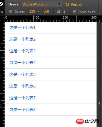
First, let’s make the simplest list. The effect we want to achieve is as shown in the figure below:

As shown above, what we want to achieve is such a simple list. This is not difficult at all.
html code
<!DOCTYPE html><html lang="en"><head><meta charset="UTF-8"><meta name="viewport" content="width=device-width, initial-scale=1.0, maximum-scale=1.0, user-scalable=0" /><title>list 1</title><link rel="stylesheet" href="../style/style.css"></head><body><p class="list_1">
    <ul>
        <li><a href="">这是一个列表1</a></li>
        <li><a href="">这是一个列表2</a></li>
        <li><a href="">这是一个列表3</a></li>
        <li><a href="">这是一个列表4</a></li>
        <li><a href="">这是一个列表5</a></li>
        <li><a href="">这是一个列表6</a></li>
        <li><a href="">这是一个列表7</a></li>
        <li><a href="">这是一个列表8</a></li>
</ul></p></body></html>What needs to be explained here is that the mobile terminal You must add <meta name="viewport" content="width=device-width, initial-scale=1.0, maximum-scale=1.0, user-scalable=0" /> code. Otherwise, the mobile browser will treat it as a PC version of the web page, which is scalable.
It is recommended that the server, database, back-end program, front-end HTML and CSS all be unified into utf-8 encoding .Avoid garbled codes caused by encoding.
SASS code
.list_1 {
        ul {}
    li {
        border-bottom:1px solid
         #ddd;padding:0 1.6rem;
     a {display: block;
         height: 4rem;
         line-height:
         4rem;overflow:
         hidden;font-size: 1.4rem;}
    }
}
这里的单位全部使用的是,我们里面,已经将的字体大小设置为了,也就相当于正常情况下的10px.也就是说,上面的相当于.至于为什么这么写,请到本文开头的链接里面查看前面我写的文章中的解释.
不会sass的,请先阅读sass相关教程.不要觉得难,一个小时保证学会,两天能玩的非常溜.It’s still a simple list
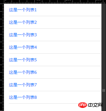
First, let’s look at the rendering:

At first glance, this list is no different from the list above. However, if we take a closer look, we will find that the lines below are not straight.
Don’t be surprised , many times, designers have their own design concepts when designing like this. As front-end personnel, we must faithfully restore some of the small details of the designer's design. Even if you think this is a bit unnecessary. Haha.
html code is exactly the same as the first example. The code will not be repeated here
SASS code
.list_1 {
        ul {padding-left: 1.6rem;}
    li {border-bottom: 1px solid
        #ddd;padding-right: 1.6rem;
        a {display: block;
            height: 4rem;
            line-height: 4rem;
            overflow: hidden;
            font-size: 1.4rem;}
    }
}In fact, it is just a slight change of thinking. The loading li in demo1 will be Just assign the padding value to ul and li.
The above is the detailed content of How to make a mobile HTML5 list. For more information, please follow other related articles on the PHP Chinese website!

Hot AI Tools

Undresser.AI Undress
AI-powered app for creating realistic nude photos

AI Clothes Remover
Online AI tool for removing clothes from photos.

Undress AI Tool
Undress images for free

Clothoff.io
AI clothes remover

AI Hentai Generator
Generate AI Hentai for free.

Hot Article

Hot Tools

Notepad++7.3.1
Easy-to-use and free code editor

SublimeText3 Chinese version
Chinese version, very easy to use

Zend Studio 13.0.1
Powerful PHP integrated development environment

Dreamweaver CS6
Visual web development tools

SublimeText3 Mac version
God-level code editing software (SublimeText3)

Hot Topics
 1378
1378
 52
52
 Table Border in HTML
Sep 04, 2024 pm 04:49 PM
Guide to Table Border in HTML. Here we discuss multiple ways for defining table-border with examples of the Table Border in HTML.
 HTML margin-left
Sep 04, 2024 pm 04:48 PM
Guide to HTML margin-left. Here we discuss a brief overview on HTML margin-left and its Examples along with its Code Implementation.
 Nested Table in HTML
Sep 04, 2024 pm 04:49 PM
This is a guide to Nested Table in HTML. Here we discuss how to create a table within the table along with the respective examples.
 HTML Table Layout
Sep 04, 2024 pm 04:54 PM
Guide to HTML Table Layout. Here we discuss the Values of HTML Table Layout along with the examples and outputs n detail.
 HTML Input Placeholder
Sep 04, 2024 pm 04:54 PM
Guide to HTML Input Placeholder. Here we discuss the Examples of HTML Input Placeholder along with the codes and outputs.
 HTML Ordered List
Sep 04, 2024 pm 04:43 PM
Guide to the HTML Ordered List. Here we also discuss introduction of HTML Ordered list and types along with their example respectively
 Moving Text in HTML
Sep 04, 2024 pm 04:45 PM
Guide to Moving Text in HTML. Here we discuss an introduction, how marquee tag work with syntax and examples to implement.
 HTML onclick Button
Sep 04, 2024 pm 04:49 PM
Guide to HTML onclick Button. Here we discuss their introduction, working, examples and onclick Event in various events respectively.


