Discussion on Web Dynamic Effects
With the development of CSS3 and HTML5, more and more cool and explosive animations are blooming in web design. According to the latest browser market share report, IE6’s share has dropped to 5.21%. This This is great news. The era of doing animations without caring about low-end browsers is already beckoning to us. As the saying goes, if appearance is not enough, animation is enough to make up for it. Web animation is no longer just a lubricant for web design. Its functions are more reflected in interactive logic, visual rendering and innovative practice, which can attract the attention of the world. When people pay attention, it can be subtle.
Next, we will use the classic golden circle rule to explain to you our dynamic design on the B2B aggregation page-Discussion on Web Dynamic Effects88 homepage project. It is mainly divided into three parts, the purpose, method and plan of dynamic design. .
First of all, let’s talk about the master’s words. Disney animation master Natwick’s life experience is condensed into one sentence: “Everything in animation lies in time point and spatial extent.” Motion effect design and animation are one and the same. In the same vein, we are not trying to make realistic animations, but to establish the credibility of motion for users through the setting of time points and spatial amplitudes.
During the design and development process, when the designer prepares a set of static pages and imagines N kinds of interesting interactive animations, and then delivers them to the front end for reconstruction and restoration of the pages, due to the inability to provide accurate dynamics parameters, resulting in increased communication and production costs, and the final test demo was unsatisfactory. Therefore, in the motion design of the Discussion on Web Dynamic Effects88 homepage project, we summarized a set of methods and processes suitable for designers to express motion concepts.
Purpose of motion effect design
First of all, why do motion effects? In the early stage of motion effect design, we need to understand the project itself from both the business and user aspects. Conduct a demand analysis and derive the role of motion effects. The business aspect is to guide users and display hierarchical information. The user aspect is to transition through pages and improve user experience. The purpose of motion design is to present Class B e-commerce websites naturally and smoothly. information, and, exude professionalism and integrity.
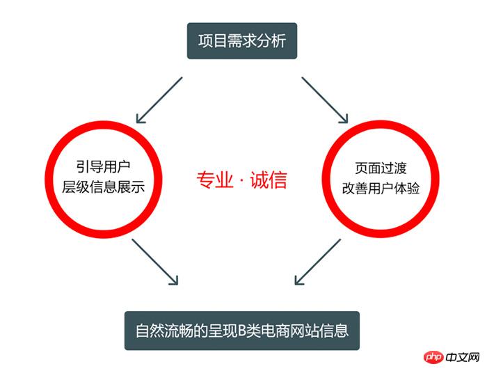
Motion design method
Next, let’s talk about how to make motion effects. As the saying goes, design comes from life, and the movement process The definitions are all based on our daily life experience. In order to create a sense of familiarity for Type B users, we set an entry point for dynamic effect design - Type B business characteristic actions, and refined a dynamic effect method for each action. , including:
Stamping, status switching is difficult to control, and action connection is difficult; 
Exchange business cards, please refer to switching actions; 
Scanning the code is too technological and difficult to apply; 
Packaging, the 3D movement range is large and unnatural; 
Handshake, the effect is single, you can refer to it; 
Signature, this effect cannot be applied; 
Pipeline, a complete pipeline scene basically contains all the actions of the page motion, which can be refined and easily dispersed. At the same time, we Class B e-commerce carries all aspects of business from designers, raw material merchants, manufacturers, wholesalers, and retailers, including the underlying payment logistics, etc. It is a macro conveyor belt, so as an aggregation page for B2B business, we Use the conveyor belt as the basic action of the Discussion on Web Dynamic Effects88 homepage dynamic design. 
After determining the basic actions, we need to combine the interactive framework of the page to grade the blocks, set the rhythm, and highlight the key points. From the moment the user sees a page, if the display area is the same, the user's attention is attracted by: Dynamic > Color > Shape. Determining whether a block requires animation is mainly based on the following two points: 1. Interactively, whether it contains hidden information; 2. Visually, whether auxiliary rendering is needed. Therefore, the search with the highest click-through rate and the categories and banners with the most hidden information on the Discussion on Web Dynamic Effects88 homepage will be the focus of our design.

Now let’s analyze the dynamic design of the three key blocks just identified. For general input boxes, users need to click in the input box before they can start the input operation. In the Discussion on Web Dynamic Effects88 homepage project, we improved In the input box method, a threshold time is set. After the user hovers the mouse to the input box, if the dwell time exceeds the threshold, the input box is activated. The user can directly perform input operations, reducing user clicks and making the operation smoother.

The category area is divided into three levels of menus. We use the movement of secondary objects to express the relationship between these three levels of menus. The movement of secondary objects of ancillary nature It is generated along with the movement of the main object. The secondary movement has a certain delay compared to the movement of the main object. Therefore, we also bring logical relationships through the time difference of movement in the category area. The first-level menu leads to the second-level menu, and the second-level menu is The first-level menu pulls out the third-level menu. 
The parallax scrolling effect of the banner and the split-screen loading effect of the floor simulate the movement process of the conveyor belt. We regard the subject as the force-receiving party and the conveyor belt as the force-exerting party for analysis. The entire motion process is divided into three states, the starting state, the intermediate state, and the ending state. According to Newton's second law, the object can move in a straight line with uniform acceleration, uniform speed, and uniform deceleration respectively. 
According to the previous analysis, we can draw the speed-time curve and displacement-time curve of the object's movement. You can see that the following curve is obtained by integrating the above curve, then Here comes the problem! Why does motion effect design draw such a motion curve? 
Front-end students can use curves to define motion. Transition and animation in CSS attributes can specify easing functions, but not all functions are supported. Custom motion can be achieved by drawing Bezier curves. The effect is to fix the head and tail points of the Bezier curve, and determine the arc of the curve through the anchor points derived from these two points. Any motion curve can be disassembled into segments of Bezier curves for definition. Bezier curve drawing function: http://cubic-bezier.com/#.63,0,1,1  Determine the position of the two anchor points through the VIP attribute specially set by CSS for the motion curve, allowing smooth movement. The effect is done
Here I will provide you with a more trouble-free method, SCSS, which is an advanced version of CSS, and Javascript can directly call the easing function library. You may be interested in the following There are doubts about complex and twisted functions, but in fact these are motion curves with feedback effects. According to our previous analysis, since the Discussion on Web Dynamic Effects88 homepage adopts a design strategy with content first and a simple visual style, our animation actions must be "steady, accurate, and ruthless" and will never be sloppy or overwhelming. Therefore, This action of comparing Q bombs is something we try our best to avoid. In fact, these curves are more suitable for application on the wireless side. Since users on the wireless side directly use their fingers to operate, when we need to express the elasticity of block elements, paper or the material metaphor of cards, we use feedback effects to express materials and gravity. is more appropriate. Easing function cheat sheet: http://easings.net/zh-cn
# Animation design plan
Eventually we will get a The complete timeline of time points, key frames, trigger conditions, motion processes and spatial amplitudes clearly shows the style and transition between page block elements at each time point. With such standardized output, Ma Ma I no longer have to worry about restoring my motion effects. Please check online for specific animation effects: http://www.Discussion on Web Dynamic Effects88.com/ In fact, the technical solution mentioned in today’s article has a shelf life. Due to the rapid iteration of technology, we don’t know how long this shelf life will last, but according to time The animation design ideas of axes and key frames will never expire. The essence of animation design established by Disney from the time of Snow White still holds true in today’s Super Marines. Every action design of Baymax is still a point in time in essence. and spatial amplitude, so as a motion effect designer, as long as you keep this in mind, a good motion effect plan will be half successful, and the other half is to combine business and user thinking.

Finally, let’s summarize the workflow of motion effect design. Find the entry point of motion effect through comprehensive analysis of project requirements and architecture, refine and emanate a key action, combine it with the front-end implementation framework, determine the process logic and movement, and practice it repeatedly. Check to get the optimal solution, don’t forget to set a surprise for the user, and you’re done! 
The above is the detailed content of Discussion on Web Dynamic Effects. For more information, please follow other related articles on the PHP Chinese website!

Hot AI Tools

Undresser.AI Undress
AI-powered app for creating realistic nude photos

AI Clothes Remover
Online AI tool for removing clothes from photos.

Undress AI Tool
Undress images for free

Clothoff.io
AI clothes remover

Video Face Swap
Swap faces in any video effortlessly with our completely free AI face swap tool!

Hot Article

Hot Tools

Notepad++7.3.1
Easy-to-use and free code editor

SublimeText3 Chinese version
Chinese version, very easy to use

Zend Studio 13.0.1
Powerful PHP integrated development environment

Dreamweaver CS6
Visual web development tools

SublimeText3 Mac version
God-level code editing software (SublimeText3)

Hot Topics
 1386
1386
 52
52
 Users encounter rare glitches: Samsung Watch smartwatches suddenly experience white screen issues
Apr 03, 2024 am 08:13 AM
You may have encountered the problem of green lines appearing on the screen of your smartphone. Even if you have never seen it, you must have seen related pictures on the Internet. So, have you ever encountered a situation where the smart watch screen turns white? On April 2, CNMO learned from foreign media that a Reddit user shared a picture on the social platform, showing the screen of the Samsung Watch series smart watches turning white. The user wrote: "I was charging when I left, and when I came back, it was like this. I tried to restart, but the screen was still like this during the restart process." Samsung Watch smart watch screen turned white. The Reddit user did not specify the smart watch. Specific model. However, judging from the picture, it should be Samsung Watch5. Previously, another Reddit user also reported
 Kyushu Fengshen Assassin 4S Radiator Review Air-cooled 'Assassin Master' Style
Mar 28, 2024 am 11:11 AM
Speaking of ASSASSIN, I believe players will definitely think of the master assassins in "Assassin's Creed". They are not only skilled, but also have the creed of "devoting themselves to the darkness and serving the light". The ASSASSIN series of flagship air-cooled radiators from the appliance brand DeepCool coincide with each other. Recently, the latest product of this series, ASSASSIN4S, has been launched. "Assassin in Suit, Advanced" brings a new air-cooling experience to advanced players. The appearance is full of details. The Assassin 4S radiator adopts a double tower structure + a single fan built-in design. The outside is covered with a cube-shaped fairing, which has a strong overall sense. It is available in white and black colors to meet different colors. Tie
 Exquisite light and shadow art in spring, Haqu H2 is the cost-effective choice
Apr 17, 2024 pm 05:07 PM
With the arrival of spring, everything revives and everything is full of vitality and vitality. In this beautiful season, how to add a touch of color to your home life? Haqu H2 projector, with its exquisite design and super cost-effectiveness, has become an indispensable beauty in this spring. This H2 projector is compact yet stylish. Whether placed on the TV cabinet in the living room or next to the bedside table in the bedroom, it can become a beautiful landscape. Its body is made of milky white matte texture. This design not only makes the projector look more advanced, but also increases the comfort of the touch. The beige leather-like material adds a touch of warmth and elegance to the overall appearance. This combination of colors and materials not only conforms to the aesthetic trend of modern homes, but also can be integrated into
 Huntkey MX750P full module power supply review: 750W of concentrated platinum strength
Mar 28, 2024 pm 03:20 PM
With its compact size, the ITX platform has attracted many players who pursue the ultimate and unique beauty. With the improvement of manufacturing processes and technological advancements, both Intel's 14th generation Core and RTX40 series graphics cards can exert their strength on the ITX platform, and gamers also There are higher requirements for SFX power supply. Game enthusiast Huntkey has launched a new MX series power supply. In the ITX platform that meets high-performance requirements, the MX750P full-module power supply has a rated power of up to 750W and has passed 80PLUS platinum level certification. Below we bring the evaluation of this power supply. Huntkey MX750P full-module power supply adopts a simple and fashionable design concept. There are two black and white models for players to choose from. Both use matte surface treatment and have a good texture with silver gray and red fonts.
 Easily understand 4K HD images! This large multi-modal model automatically analyzes the content of web posters, making it very convenient for workers.
Apr 23, 2024 am 08:04 AM
A large model that can automatically analyze the content of PDFs, web pages, posters, and Excel charts is not too convenient for workers. The InternLM-XComposer2-4KHD (abbreviated as IXC2-4KHD) model proposed by Shanghai AILab, the Chinese University of Hong Kong and other research institutions makes this a reality. Compared with other multi-modal large models that have a resolution limit of no more than 1500x1500, this work increases the maximum input image of multi-modal large models to more than 4K (3840x1600) resolution, and supports any aspect ratio and 336 pixels to 4K Dynamic resolution changes. Three days after its release, the model topped the HuggingFace visual question answering model popularity list. Easy to handle
 Colorful Hidden Star P15 24 Review: A hard-core all-round gaming laptop with both good looks and performance
Mar 06, 2024 pm 04:40 PM
In the current era of rapid technological development, laptops have become an indispensable and important tool in people's daily life and work. For those players who have high performance requirements, a laptop with powerful configuration and excellent performance can meet their hard-core needs. With its excellent performance and stunning design, the Colorful Hidden Star P15 notebook computer has become the leader of the future and can be called a model of hard-core notebooks. Colorful Hidden Star P1524 is equipped with a 13th generation Intel Core i7 processor and RTX4060Laptop GPU. It adopts a more fashionable spaceship design style and has excellent performance in details. Let us first take a look at the features of this notebook. Supreme equipped with Intel Core i7-13620H processing
 The screen is good for playing games. Brief analysis of iQOO Neo9S Pro+ screen
Jul 19, 2024 pm 03:53 PM
In today's smartphone market, screen quality has become one of the key indicators to measure the overall performance of a mobile phone. iQOO's Neo series has always been committed to providing users with excellent gaming experience and visual enjoyment. The latest product iQOO Neo9SPro+ uses a "Three Good Eye Protection Gaming Screen". Next, let's take a look at the quality of this screen. How brilliant. iQOO Neo9S Pro+ is equipped with a 1.5 KOLED e-sports direct screen, which supports flagship LTPO adaptive refresh rate from 1Hz to 144Hz, which means that it can achieve ultra-low power standby state when displaying static content, and it can also be intelligent during gaming. Switch to dynamic high from 90Hz to 144Hz
 A true one-lens experience with the NIKKOR Z 28-400mm f/4-8 VR lens
Mar 28, 2024 pm 02:54 PM
Many photography enthusiasts like to use lenses. Their shooting needs are very changeable, so when it comes to lens selection, they prefer a more versatile product, which is what we commonly call "one lens to conquer the world" lens. It just so happens that Nikon has launched a new product, the NIKKOR Z28-400mmf/4-8VR lens, a true "one lens that can conquer the world" lens. The lens covers from the 28mm wide-angle end to the 400mm telephoto end. Equipped with its Z-mount camera, it can easily shoot a very rich range of photography themes and bring about a rich change of perspective. Today, we will talk to you about this NIKKOR Z28-400mmf/4-8VR lens through our recent use experience. NIKKOR Z28-400mmf/4-8VR is


