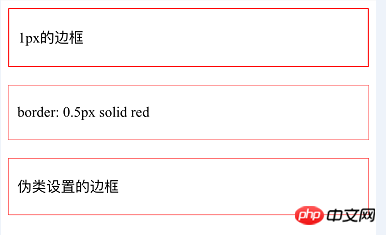
This article mainly introduces the implementation of 0.5 pixel border using css. The detailed code is compiled here, which is very practical. Friends who need it can refer to
when the company’s designers are making design drawings. They are all designed based on iPhone 6 (width is 750 physical pixels). The device pixel ratio of iPhone 6 (that is, the ratio of CSS pixels to physical pixels) is 2, so when the designer designs a box with a border of 1px, it is 0.5 pixels relative to the CSS code.
For this problem, the most intuitive way is to directly set the border to 0.5px using CSS. After testing, the iPhone can display it normally. Almost all browsers under Android will recognize 0.5 as 0, which is the borderless state. So this method won’t work
CSS3 has a zoom attribute. We can use this attribute to reduce the 1px border by 50% to achieve this function. The specific implementation code is as follows
<p class="border3">

    <p class="content">伪类设置的边框</p>

</p>css:
.border3{

     position: relative;

 }


.border3:before{

       content: '';

       position: absolute;

       width: 200%;

       height: 200%;

       border: 1px solid red;

       -webkit-transform-origin: 0 0;

       -moz-transform-origin: 0 0;

       -ms-transform-origin: 0 0;

       -o-transform-origin: 0 0;

       transform-origin: 0 0;

       -webkit-transform: scale(0.5, 0.5);

       -ms-transform: scale(0.5, 0.5);

       -o-transform: scale(0.5, 0.5);

       transform: scale(0.5, 0.5);

       -webkit-box-sizing: border-box;

       -moz-box-sizing: border-box;

       box-sizing: border-box;

}Implementation ideas:
1. Set the reference position of the target element
2 , add a pseudo element before or after to the target element, and set absolute positioning
3. Add a 1px border to the pseudo element
4. Use the box-sizing: border-box attribute to set the border Include everything in the width and height
5. Set the width and height to 200%
6. Reduce the entire box model to 0.5
7. Adjust the position of the box model. Taking the upper left corner as the benchmark transform-origin: 0 0;
The implementation result is displayed on the iPhone as follows:

The above is the detailed content of Detailed explanation of how to implement a 0.5 pixel border with CSS. For more information, please follow other related articles on the PHP Chinese website!


