Detailed explanation of the method of CSS box floating
In the standard flow, a block-level element will automatically stretch in the horizontal direction until the boundary of the element containing it; and in the vertical direction, it will be arranged one after another with its sibling elements, not side by side. After using the "floating" method, block-level elements will behave differently.
There is a float attribute in CSS, which defaults to none, which is the usual case of standard streams. If the value of the float attribute is set to left or right, the element will be close to the left or right side of its parent element. At the same time, by default, the width of the box will not stretch, but will be stretched according to the content inside the box. Determine the width.
Prepare the basic code
The nature of floating is more complicated. Here we first create a basic page, the code is as follows. The following series of experiments will be based on the following code, and different new codes will be added according to different knowledge points.
<html xmlns="http://www.w3.org/1999/xhtml">
<head>
<style type="text/css">
body {
    margin:15px;
    font-family:Arial; font-size:12px;
}
.father {
    background-color:#ffff99;
    border:1px solid #111111;
    padding:5px;
}
.father p {
    padding:10px;
    margin:15px;
    border:1px dashed #111111;
    background-color:#90baff;
}
.father p {
    border:1px dashed #111111;
    background-color:#ff90ba;
}
.son1 {
/* 这里设置son1的浮动方式*/
}
.son2 {
/* 这里设置son1的浮动方式*/
}
.son3 {
/* 这里设置son1的浮动方式*/
}
</style>
</head>
<body>
    <p class="father">
        <p class="son1">Box-1</p>
        <p class="son2">Box-2</p>
        <p class="son3">Box-3</p>
        <p>这里是浮动框外围的文字,这里是浮动框外围的文字,这里是浮动框外围的文字,这里是浮动框外围的文字,这里是浮动框外围的文字,这里是浮动框外围的文字,这里是浮动框外围的文字,这里是浮动框外围的文字,这里是浮动框外围的文字.</p>
    </p>
</body>
</html>The above code defines 4
blocks, one of which is the parent block and the other three are its child blocks. In order to facilitate observation, each block is added with a border and background color, and there is a certain margin value between the
tag and each p. If none of the three sub-p's have any floating settings, it will be the box state in the standard stream. In the parent box, the four boxes stretch to the right and are arranged vertically, as shown below.
Let’s start experiments on this basis. Through a series of experiments, we can fully understand the properties of floating boxes.
Experiment 1: Set the first floating p
.son1 {       float: left;
}The effect is as shown below, you can see the Box in the standard stream The text of -2 is arranged around Box-1, At this time, the width of Box-1 is no longer stretched, but the minimum width that can accommodate the content. At the same time, since Box-1 is out of the standard stream, and Box-2 in the standard stream will push up to the original position of Box-1, therefore the left border of Box-2 coincides with the left border of Box-1.

Experiment 2: Set the second floating p
Continue to set the float attribute of Box-2 to left, this You can see that Box-2 also changes to determine the width based on the content, and the text of Box-3 is arranged around Box-2. As can be clearly seen from the picture below, the left border of Box-3 is still below the left border of Box-1, otherwise the space between Box-1 and Box-2 would not be dark. This dark color is actually Box The background color of -3, the space between Box-1 and Box-2 is composed of their margins.

Experiment 3: Set the third floating p
Next, we set Box-3 to the left Floating, at this time you can clearly see from the picture below the range of the box where the text is located, and the text will be arranged around the floating box.
 Experiment 4: Change the floating direction
Change Box-3 to float to the right, that is, float:right. The effect at this time is as shown below.

You can see that Box-3 has moved to the far right. The range of the text paragraph box has not changed, but the text is sandwiched between Box-2 and Box-3. At this time, if the browser window is slowly adjusted to be narrower, the browser window will not be able to accommodate Box-1 to Box-3 in one row. Box-3 will be squeezed into the next row, but it will still remain floating to the right. This The text will automatically fill the space.
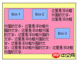
Experiment 5: Change the direction of floating again
Change Box-2 to float to the right and Box-3 to Float to the left. As can be seen from the picture below, the layout has not changed, except that Box-2 and Box-3 have exchanged positions.

Now, return to the experiment again and slowly narrow the browser window. When the browser window cannot accommodate Box-1 to Box-3 in one row, As in the previous experiment, one Box will be squeezed to the next one. So which one is pushed to the next line this time? The answer is written at the end in HTML, that is, Box-3 will be squeezed into the next line, but it will still float to the left and will reach the left end of the next line. At this time, the text will still be automatically arranged. ,As shown below.
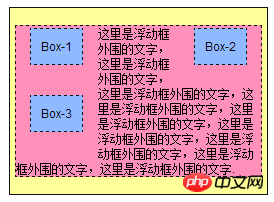
Experiment 6: Move all to the left
下面把3个Box都设置为向左浮动,然后再在Box-1中增加一行,使它的高度比原来高一些,如下图所示。
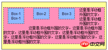
那么请想一想,如果继续把浏览器的窗口变窄,结果会如何呢?Box-3会被挤到下一行,那么它会在Box-1的下面,还是Box-2的下面呢?答案如下图。
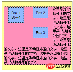
Box-3被挤到下一行并向左移动,发现Box-1比Box-2高出一块儿,这样Box-3就会被卡住,进而停留在Box-2的下面。说道最后,需要非常注意的是,如果某个盒子被设置为float,那么它将脱离标准流,其后面的标准流中的盒子将不再受它影响。
实验七:使用clear属性清除浮动的影响
以使文字的左右两侧同时围绕浮动的盒子。首先将Box-1到Box-2的浮动都改为float:left,而Box-3的浮动为float:right,之后再将Box-3的内容修改为:
<p class="son3">
    Box-3<br>
    Box-3<br>
    Box-3<br>
    Box-3
</p>
效果如下图:
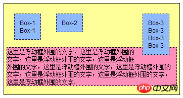
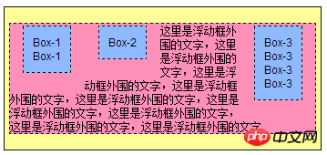 如果不希望文字围绕浮动的盒子,又该如何呢?此时对围绕文字所在标签
的样式进行如下修改后,从下面的效果图中可以看出,段落的上边界向下移动,直到文字不受左边的两个盒子影响位置,但仍然受到Box-3的影响。
.father p {
    border:1px dashed #111111;
    background-color:#ff90ba;
    clear:left;
}
接着,将clear属性设置为right,将看到如下效果。由于Box-3比较高,因此清除了右边的影响,自然左边也就不会受到影响了。还有说明的是可以将clear属性设置为both,从直接消除左右两边浮动盒子的影响。

实验八:扩展盒子的高度
关于clear的应用,这里再给出一个例子,将文字所在的段落
标签删除,这时在父p里面只有3个浮动的盒子,它们都不在标准流中,这时浏览器的显示效果如下:

可以看到,文字段落被删除以后,父p的范围缩成一条,是由padding和border构成的,也就是说,一个p的范围是由它里面的标准流内容决定的,与里面的浮动内容无关。下面将介绍一种方法以使父p的范围能够包含3个浮动的子p,见如下修改后的HTML代码和与之对应的效果图。
<p class="father">
    <p class="son1">Box-1<br>Box-1</p>
    <p class="son2">Box-2</p>
    <p class="son3">
        Box-3<br>
        Box-3<br>
        Box-3<br>
        Box-3
    </p>
    <p style="clear:both;border:0;padding:0;margin:0;"></p>
</p>

The above is the detailed content of Detailed explanation of the method of CSS box floating. For more information, please follow other related articles on the PHP Chinese website!

Hot AI Tools

Undresser.AI Undress
AI-powered app for creating realistic nude photos

AI Clothes Remover
Online AI tool for removing clothes from photos.

Undress AI Tool
Undress images for free

Clothoff.io
AI clothes remover

Video Face Swap
Swap faces in any video effortlessly with our completely free AI face swap tool!

Hot Article

Hot Tools

Notepad++7.3.1
Easy-to-use and free code editor

SublimeText3 Chinese version
Chinese version, very easy to use

Zend Studio 13.0.1
Powerful PHP integrated development environment

Dreamweaver CS6
Visual web development tools

SublimeText3 Mac version
God-level code editing software (SublimeText3)

Hot Topics
 1386
1386
 52
52
 How to use bootstrap in vue
Apr 07, 2025 pm 11:33 PM
Using Bootstrap in Vue.js is divided into five steps: Install Bootstrap. Import Bootstrap in main.js. Use the Bootstrap component directly in the template. Optional: Custom style. Optional: Use plug-ins.
 The Roles of HTML, CSS, and JavaScript: Core Responsibilities
Apr 08, 2025 pm 07:05 PM
HTML defines the web structure, CSS is responsible for style and layout, and JavaScript gives dynamic interaction. The three perform their duties in web development and jointly build a colorful website.
 How to write split lines on bootstrap
Apr 07, 2025 pm 03:12 PM
There are two ways to create a Bootstrap split line: using the tag, which creates a horizontal split line. Use the CSS border property to create custom style split lines.
 Understanding HTML, CSS, and JavaScript: A Beginner's Guide
Apr 12, 2025 am 12:02 AM
WebdevelopmentreliesonHTML,CSS,andJavaScript:1)HTMLstructurescontent,2)CSSstylesit,and3)JavaScriptaddsinteractivity,formingthebasisofmodernwebexperiences.
 How to set up the framework for bootstrap
Apr 07, 2025 pm 03:27 PM
To set up the Bootstrap framework, you need to follow these steps: 1. Reference the Bootstrap file via CDN; 2. Download and host the file on your own server; 3. Include the Bootstrap file in HTML; 4. Compile Sass/Less as needed; 5. Import a custom file (optional). Once setup is complete, you can use Bootstrap's grid systems, components, and styles to create responsive websites and applications.
 How to resize bootstrap
Apr 07, 2025 pm 03:18 PM
To adjust the size of elements in Bootstrap, you can use the dimension class, which includes: adjusting width: .col-, .w-, .mw-adjust height: .h-, .min-h-, .max-h-
 How to insert pictures on bootstrap
Apr 07, 2025 pm 03:30 PM
There are several ways to insert images in Bootstrap: insert images directly, using the HTML img tag. With the Bootstrap image component, you can provide responsive images and more styles. Set the image size, use the img-fluid class to make the image adaptable. Set the border, using the img-bordered class. Set the rounded corners and use the img-rounded class. Set the shadow, use the shadow class. Resize and position the image, using CSS style. Using the background image, use the background-image CSS property.
 How to use bootstrap button
Apr 07, 2025 pm 03:09 PM
How to use the Bootstrap button? Introduce Bootstrap CSS to create button elements and add Bootstrap button class to add button text


