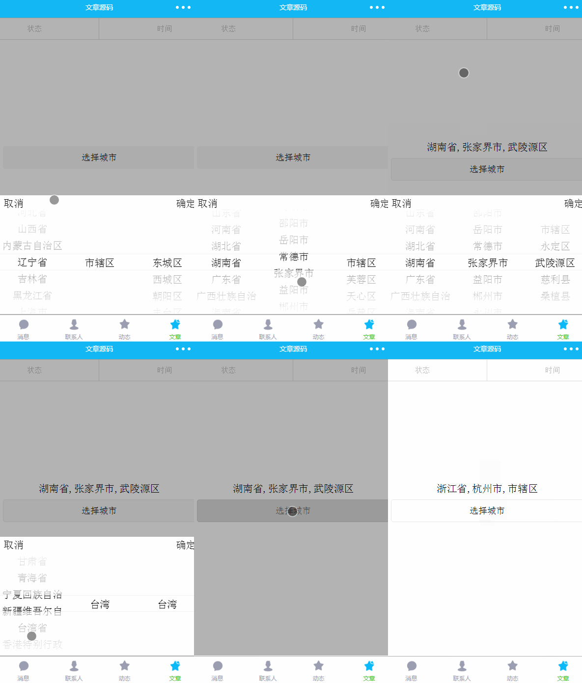
This article introduces the example code of the three-level linkage address selector of the WeChat applet and shares it with everyone. If you need it, you can learn about it together
In some e-commerce small programs, the address Selecting this function is generally necessary. Generally, receiving information requires a control that can select provinces, cities and counties. Of course, some people directly write an input for input to save trouble. The shortcomings of this are self-evident. Yu, and the user experience is not that good. Today’s article will share the implementation of WeChat applet address selection. Data on provinces, cities and counties and area codes can be found from the National Bureau of Statistics. You can search for details yourself. As usual, upload the source code and renderings first
Source code portal

##picker and picker-view components
Before we formally introduce the implementation, we need to introduce these two components first. The picker component has been briefly introduced in the previous article. It is a scroll selector that pops up from the bottom. You can set the type by value to implement date selection, time selection and ordinary selectors. If we want to achieve the three-level linkage address selection effect in the above figure, we find that it is very difficult to implement. It should be said that it is impossible to achieve because the ordinary selector of picker can only have one column. If you want to achieve the effect of three columns, you need to find another way. Since we are taking a different approach, we naturally think of picker-view. This component is a scroll selector embedded in the page. Multiple picker-view-column can be placed in this component, and only picker-view- column, other components will not be displayed, each picker-view-column is a column. picker-view has several important attributes. value is an array type. The numbers in the array represent the selected items of the picker-view-colume in the picker-view (the subscript starts from 0). , when the number is greater than the length of picker-view-column options, the last item is selected. indicator-style and indicator-class can set the style of the selected box in the middle of the selector. It has an event bindchange. This function will be triggered when the selected item data changes when we scroll the item, and can be passed through event.detai.vaule (and The vaule introduced above has the same meaning) to obtain the currently selected item (the subscript starts from 0). The height of the picker-view-column will be automatically set to be consistent with the height of the picker-view check box. The province, city and county data files store the data needed for address selection, mainly the area code and name, and then expose the data through the following code for use
module.exports = {
 citys,
 provinces,
 areas
}<view class="picker-view" animation="{{animationAddressMenu}}" style="visibility:{{addressMenuIsShow ? 'visible':'hidden'}}">
<view style="height:10% ;width:95%;margin-top:10rpx">
<text catchtap="cityCancel">取消</text>
<text style="float: right" catchtap="citySure">确定</text>
</view>
<picker-view style="width: 100%; height: 300px;" bindchange="cityChange" value="{{value}}" wx:key="">
<picker-view-column>
<view wx:for="{{provinces}}" class="picker-item">
{{item.name}}</view>
</picker-view-column>
<picker-view-column>
<view wx:for="{{citys}}" class="picker-item" wx:key="">
{{item.name}}</view>
</picker-view-column>
<picker-view-column>
<view wx:for="{{areas}}" class="picker-item" wx:key="">
{{item.name}}</view>
</picker-view-column>
</picker-view>
</view>.picker-view {
width: 100%;
display: flex;
z-index:12;
background-color: #fff;
flex-direction: column;
justify-content: center;
align-items: center;
position: fixed;
bottom: 0rpx;
left: 0rpx;
height: 40vh;
}
.picker-item {
line-height: 70rpx;
margin-left: 5rpx;
margin-right: 5rpx;
text-align: center;
}/**
* 控件当前显示的数据
* provinces:所有省份
* citys 选择省对应的所有市,
* areas选择市对应的所有区
* areaInfo:点击确定时选择的省市县字符拼接
* animationAddressMenu:动画
* addressMenuIsShow:是否可见
*/
data: {
animationAddressMenu: {},
addressMenuIsShow: false,
value: [0, 0, 0],
provinces: [],
citys: [],
areas: [],
areaInfo:''
},var address = require('../../utils/city.js')
## by default. #
// 默认联动显示北京
  var id = address.provinces[0].id
  this.setData({
   provinces: address.provinces,
   citys: address.citys[id],
   areas: address.areas[address.citys[id][0].id],
})// 点击所在地区弹出选择框
selectDistrict: function (e) {
var that = this
// 如果已经显示,不在执行显示动画
if (that.data.addressMenuIsShow) {
return
}
// 执行显示动画
that.startAddressAnimation(true)
},
// 执行动画
startAddressAnimation: function (isShow) {
console.log(isShow)
var that = this
if (isShow) {
// vh是用来表示尺寸的单位,高度全屏是100vh
that.animation.translateY(0 + 'vh').step()
} else {
that.animation.translateY(40 + 'vh').step()
}
that.setData({
animationAddressMenu: that.animation.export(),
addressMenuIsShow: isShow,
})
},
// 点击地区选择取消按钮
cityCancel: function (e) {
this.startAddressAnimation(false)
},
// 点击地区选择确定按钮
citySure: function (e) {
var that = this
var city = that.data.city
var value = that.data.value
that.startAddressAnimation(false)
// 将选择的城市信息显示到输入框
var areaInfo = that.data.provinces[value[0]].name + ',' + that.data.citys[value[1]].name + ',' + that.data.areas[value[2]].name
that.setData({
areaInfo: areaInfo,
})
},
// 点击蒙版时取消组件的显示
hideCitySelected: function (e) {
console.log(e)
this.startAddressAnimation(false)
},
// 处理省市县联动逻辑
cityChange: function (e) {
console.log(e)
var value = e.detail.value
var provinces = this.data.provinces
var citys = this.data.citys
var areas = this.data.areas
var provinceNum = value[0]
var cityNum = value[1]
var countyNum = value[2]
// 如果省份选择项和之前不一样,表示滑动了省份,此时市默认是省的第一组数据,
if (this.data.value[0] != provinceNum) {
var id = provinces[provinceNum].id
this.setData({
value: [provinceNum, 0, 0],
citys: address.citys[id],
areas: address.areas[address.citys[id][0].id],
})
} else if (this.data.value[1] != cityNum) {
// 滑动选择了第二项数据,即市,此时区显示省市对应的第一组数据
var id = citys[cityNum].id
this.setData({
value: [provinceNum, cityNum, 0],
areas: address.areas[citys[cityNum].id],
})
} else {
// 滑动选择了区
this.setData({
value: [provinceNum, cityNum, countyNum]
})
}
console.log(this.data)
},The above is the detailed content of Example sharing of three-level linkage address selector in WeChat mini program. For more information, please follow other related articles on the PHP Chinese website!
 Mini program path acquisition
 How to distinguish whether two addresses are on the same site?
 what does focus mean
 c array initialization method
 Summary of commonly used computer shortcut keys
 What are the PHP visual Chinese development tools?
 Domestic digital currency platform
 How to open img file
 What is the difference between xls and xlsx


