 Backend Development
 Python Tutorial
 Detailed explanation of Python data visualization tool Matplotlib
Detailed explanation of Python data visualization tool Matplotlib
The following editor will bring you an article based on the Python data visualization tool Matplotlib, an introduction to drawing, and a detailed explanation of Pyplot. The editor thinks it is quite good, so I will share it with you now and give it as a reference for everyone. Let’s follow the editor and take a look.
Pyplot
matplotlib.pyplot is a collection of imperative functions, which allows us to use MATLAB like Use matplotlib as well. Each function in pyplot will make corresponding changes to the canvas image, such as creating a canvas, creating a drawing area in the canvas, drawing several lines on the drawing area, adding text descriptions to the image, etc. Below we will appreciate its charm through example code.
import matplotlib.pyplot as plt
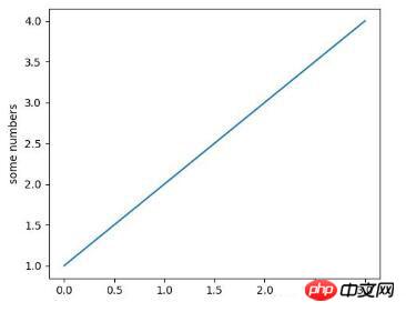
plt.plot([1,2,3,4])
plt.ylabel('some numbers')
plt.show()

The above picture is drawn by the line of code plt.plot([1,2,3,4]) Image, at this time some friends may have a question, "Why is the coordinate range of the X-axis 0-3, and the coordinate range of the Y-axis is 1-4?"
This is because , when we use the plot() command function, if we only pass a value list or array as a parameter to the function, matplotlib will treat this value list as the value of the Y-axis, and then automatically generate it based on the number N of values on the Y-axis. A list of values [0,N-1] as the X-axis value. So the Y-axis value in the above picture is the list we gave [1,2,3,4], and the X-axis value is the automatically generated list [0,1,2,3].
Some friends who see this may think that this is too weak. Don't worry, let's learn step by step. The above picture is just a very simple example. In fact, the plot() command is very powerful. Through this command, we can pass multiple image parameters at the same time. For example, if we want to give the values of the X-axis and Y-axis at the same time, we can achieve it through the following line of code:
##
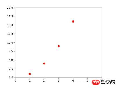
plt.plot([1, 2, 3, 4], [1, 4, 9, 16]) #X:[1, 2, 3, 4],Y:[1, 4, 9, 16]
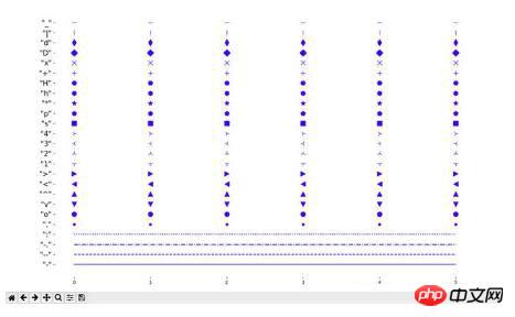
command are:
'b': blue'g': green
'r': red
'c': cyan
'm': magenta
'y': yellow
'k': black
'w': white
Command support Line characters:

import matplotlib.pyplot as plt
plt.plot([1,2,3,4], [1,4,9,16], 'ro')
plt.axis([0, 6, 0, 20])
plt.show()

import matplotlib.pyplot as plt
import numpy as np
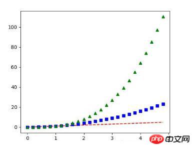
t = np.arange(0., 5., 0.2)
plt.plot(t, t, 'r--', t, t**2, 'bs', t, t**3, 'g^')
plt.show()

The above is the detailed content of Detailed explanation of Python data visualization tool Matplotlib. For more information, please follow other related articles on the PHP Chinese website!

Hot AI Tools

Undresser.AI Undress
AI-powered app for creating realistic nude photos

AI Clothes Remover
Online AI tool for removing clothes from photos.

Undress AI Tool
Undress images for free

Clothoff.io
AI clothes remover

AI Hentai Generator
Generate AI Hentai for free.

Hot Article

Hot Tools

Notepad++7.3.1
Easy-to-use and free code editor

SublimeText3 Chinese version
Chinese version, very easy to use

Zend Studio 13.0.1
Powerful PHP integrated development environment

Dreamweaver CS6
Visual web development tools

SublimeText3 Mac version
God-level code editing software (SublimeText3)

Hot Topics
 Is the conversion speed fast when converting XML to PDF on mobile phone?
Apr 02, 2025 pm 10:09 PM
The speed of mobile XML to PDF depends on the following factors: the complexity of XML structure. Mobile hardware configuration conversion method (library, algorithm) code quality optimization methods (select efficient libraries, optimize algorithms, cache data, and utilize multi-threading). Overall, there is no absolute answer and it needs to be optimized according to the specific situation.
 How to convert XML files to PDF on your phone?
Apr 02, 2025 pm 10:12 PM
It is impossible to complete XML to PDF conversion directly on your phone with a single application. It is necessary to use cloud services, which can be achieved through two steps: 1. Convert XML to PDF in the cloud, 2. Access or download the converted PDF file on the mobile phone.
 What is the function of C language sum?
Apr 03, 2025 pm 02:21 PM
There is no built-in sum function in C language, so it needs to be written by yourself. Sum can be achieved by traversing the array and accumulating elements: Loop version: Sum is calculated using for loop and array length. Pointer version: Use pointers to point to array elements, and efficient summing is achieved through self-increment pointers. Dynamically allocate array version: Dynamically allocate arrays and manage memory yourself, ensuring that allocated memory is freed to prevent memory leaks.
 Is there any mobile app that can convert XML into PDF?
Apr 02, 2025 pm 08:54 PM
An application that converts XML directly to PDF cannot be found because they are two fundamentally different formats. XML is used to store data, while PDF is used to display documents. To complete the transformation, you can use programming languages and libraries such as Python and ReportLab to parse XML data and generate PDF documents.
 How to convert xml into pictures
Apr 03, 2025 am 07:39 AM
XML can be converted to images by using an XSLT converter or image library. XSLT Converter: Use an XSLT processor and stylesheet to convert XML to images. Image Library: Use libraries such as PIL or ImageMagick to create images from XML data, such as drawing shapes and text.
 How to control the size of XML converted to images?
Apr 02, 2025 pm 07:24 PM
To generate images through XML, you need to use graph libraries (such as Pillow and JFreeChart) as bridges to generate images based on metadata (size, color) in XML. The key to controlling the size of the image is to adjust the values of the <width> and <height> tags in XML. However, in practical applications, the complexity of XML structure, the fineness of graph drawing, the speed of image generation and memory consumption, and the selection of image formats all have an impact on the generated image size. Therefore, it is necessary to have a deep understanding of XML structure, proficient in the graphics library, and consider factors such as optimization algorithms and image format selection.
 How to open xml format
Apr 02, 2025 pm 09:00 PM
Use most text editors to open XML files; if you need a more intuitive tree display, you can use an XML editor, such as Oxygen XML Editor or XMLSpy; if you process XML data in a program, you need to use a programming language (such as Python) and XML libraries (such as xml.etree.ElementTree) to parse.
 Recommended XML formatting tool
Apr 02, 2025 pm 09:03 PM
XML formatting tools can type code according to rules to improve readability and understanding. When selecting a tool, pay attention to customization capabilities, handling of special circumstances, performance and ease of use. Commonly used tool types include online tools, IDE plug-ins, and command-line tools.


