

Introduction to BootStrap basic styles

Usage of basic styles of Bootstrap
1. Preparation
1, Responsive layout
Bootstrap is a responsive layout framework that can automatically adapt to different devices Size display mode, usage method: introduce the following code in the head tag:
[Related recommendations: Bootstrap tutorial]
where initial-scale=1 means the scaling ratio is 1.
2, introduce bootstrap.css
You can download the bootstrap.css file locally for local import, or you can use CDN to import. The CDN import method is as follows:
<!-- 最新版本的 Bootstrap 核心 CSS 文件 -->
<link rel="stylesheet" href="https://cdn.bootcss.com/bootstrap/3.3.7/css/bootstrap.min.css">

<!-- 可选的 Bootstrap 主题文件(一般不用引入) -->
<link rel="stylesheet" href="https://cdn.bootcss.com/bootstrap/3.3.7/css/bootstrap-theme.min.css">

<!-- 最新的 Bootstrap 核心 JavaScript 文件 -->
<script src="https://cdn.bootcss.com/bootstrap/3.3.7/js/bootstrap.min.js"></script>
Advantages and disadvantages of using CDN: 1. It must be introduced in a network environment; 2. If there are files on the local server, the loading speed will be very fast. For example, the CDN exists on a server in Qingdao bootstrap.css file, users in the Qingdao area will import the file very quickly, otherwise it will be slower and the loading delay will be higher; 3. There is no code prompt in the Webstorm software when using CDN to load css files. If you need code prompts, It is recommended to download bootstrap.css locally and then import it.
3, introduce bootstrap.js and jQuery.js
You can download the bootstrap.js and jQuery.js files locally for local import, or you can use CDN to import. The CDN import method is as follows :
<!-- jQuery 某些bootstrap插件需要使用 -->
<script src="https://cdn.bootcss.com/jquery/1.12.4/jquery.min.js"></script>
<!-- 所有的bootstrap插件都需要引入 -->
<script src="js/bootstrap.min.js"></script>
Note: Try to place the introduction of the js file at the end of the body tag to improve the performance of the browser rendering the page.
2. Styles commonly used in development
1. Grid system
Bootstrap provides a responsive, mobile device-first fluid grid system that can be easily As the screen or viewport size increases, the system will automatically divide it into up to 12 columns.
"Row" must be contained in
.container(fixed width) or.container-fluid(100% width) , in order to give it appropriate alignment and padding. Fluid layout container (.container-fluid), change the outermost layout element.containerto.container-fluid, you can layout the fixed-width grid Convert to 100% width layout. The difference from .container is that the maximum width of the container is always set to 100% of the device screen.#Columns in the grid system represent the range they span by specifying a value from 1 to 12. For example, three equal-width columns can be created using three
.col-xs-4.If the "column" contained in a "row" is greater than 12, the elements where the extra "column" is located will be treated as a whole. Arrange in a row.
The code snippet is as follows:
<p class="container">
//将一行按照8:4分成两列
  <p class="row">
    <p class="col-md-8">.col-md-8</p>
    <p class="col-md-4">.col-md-4</p>
  </p>
//将一行三等分为三列
  <p class="row">
    <p class="col-md-4">.col-md-4</p>
    <p class="col-md-4">.col-md-4</p>
    <p class="col-md-4">.col-md-4</p>
  </p>
//将一行等分为两列
  <p class="row">
    <p class="col-md-6">.col-md-6</p>
    <p class="col-md-6">.col-md-6</p>
  </p>
</p>Grid parameters
You can view the Bootstrap grid in detail through the following table How the grid system works on a variety of screen devices;
The compatibility mode is backward compatible. For example, when using .col-md-, it will still be arranged according to the layout of the medium screen on the large screen. For small or ultra-small screens, they are arranged in a stacked manner. In the same principle, if .col-xs- is set, the set layout will be displayed on all devices because the grid system is backward compatible;
The grid layout uses a left-floating layout. You can clear the floating by defining the class attribute value as .clearfix;
.col-md-offset-5 to set the grid The 5 empty spaces on the left, .col-md-push-3, means that the grid is moved 3 spaces to the right, .col-md-pull-3 means that the grid is moved 3 spaces to the left;
| 超小屏幕 手机 (<768px) | 小屏幕 平板 (≥768px) | 中等屏幕 桌面显示器 (≥992px) | 大屏幕 大桌面显示器 (≥1200px) | |
|---|---|---|---|---|
| 栅格系统行为 | 总是水平排列 | 开始是堆叠在一起的,当大于这些阈值时将变为水平排列C | ||
.container 最大宽度 | None (自动) | 750px | 970px | 1170px |
| 类前缀 | .col-xs- | .col-sm- | .col-md- | .col-lg- |
| 列(column)数 | 12 | |||
| 最大列(column)宽 | 自动 | ~62px | ~81px | ~97px |
| 槽(gutter)宽 | 30px (每列左右均有 15px) | |||
| 可嵌套 | 是 | |||
| 偏移(Offsets) | 是 | |||
| 列排序 | 是 | |||
通过栅格系统的布局方式,可以很简洁的设计出自己需要的响应式布局排版,能够在不同设备上达到不同的显示效果。
通过下面的实例说明栅格布局在手机、平板、电脑设备上的动态布局的强大:
<p class="container">
 <p class="row">
   <p class="col-xs-12 col-sm-6 col-md-8">.col-xs-12 .col-sm-6 .col-md-8</p>
   <p class="col-xs-6 col-md-4">.col-xs-6 .col-md-4</p>
 </p>
</p>
其中第三行的class属性值表示的意思是,在超小屏幕(<768px)上显示为12个栅格,在小屏幕(>768px)上显示为6个栅格,在中等屏幕(>=992px)上显示的为8个栅格,大屏幕上未定义,根据栅格的向后兼容,在大屏幕上显示的为中等屏幕的布局。
媒体查询
很容易理解,如下代码:
-width: @screen-sm--width: @screen-md--width: @screen-lg-min) { ... }

e.g:
p{
/* 中等屏幕(桌面显示器,大于等于 992px) 此时执行{}里面的样式*/@media (min-width: @screen-md-min) { width:100% }
/* 大屏幕(大桌面显示器,大于等于 1200px) 此时执行{}里面的样式*/@media (min-width: @screen-lg-min) { width:80%}}2、表格的常用样式
基础样式.table
带条纹区分行的表格.table-striped

带边框的表格.table-border

带鼠标悬停是区分的表格.table-hover

表格行显示的样式,通过设置tr的class属性值来控制,常用属性值有.info/.success/.warning/.active/.danger

The above is the detailed content of Introduction to BootStrap basic styles. For more information, please follow other related articles on the PHP Chinese website!

Hot AI Tools

Undresser.AI Undress
AI-powered app for creating realistic nude photos

AI Clothes Remover
Online AI tool for removing clothes from photos.

Undress AI Tool
Undress images for free

Clothoff.io
AI clothes remover

AI Hentai Generator
Generate AI Hentai for free.

Hot Article
Hot Tools

Notepad++7.3.1
Easy-to-use and free code editor

SublimeText3 Chinese version
Chinese version, very easy to use

Zend Studio 13.0.1
Powerful PHP integrated development environment

Dreamweaver CS6
Visual web development tools

SublimeText3 Mac version
God-level code editing software (SublimeText3)
Hot Topics


 How to introduce bootstrap into Eclipse
Apr 05, 2024 am 02:30 AM
How to introduce bootstrap into Eclipse
Apr 05, 2024 am 02:30 AM
Introduce Bootstrap in Eclipse in five steps: Download the Bootstrap file and unzip it. Import the Bootstrap folder into the project. Add Bootstrap dependency. Load Bootstrap CSS and JS in HTML files. Start using Bootstrap to enhance your user interface.
 How to read the bootstrap mediation effect test results in stata
Apr 05, 2024 am 01:48 AM
How to read the bootstrap mediation effect test results in stata
Apr 05, 2024 am 01:48 AM
Interpretation steps of Bootstrap mediation effect test in Stata: Check the sign of the coefficient: Determine the positive or negative direction of the mediation effect. Test p value: less than 0.05 indicates that the mediating effect is significant. Check the confidence interval: not containing zero indicates that the mediation effect is significant. Comparing the median p-value: less than 0.05 further supports the significance of the mediation effect.
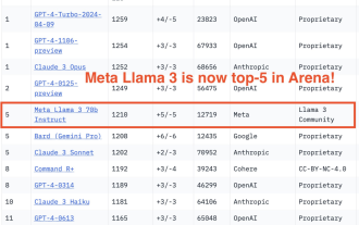 750,000 rounds of one-on-one battle between large models, GPT-4 won the championship, and Llama 3 ranked fifth
Apr 23, 2024 pm 03:28 PM
750,000 rounds of one-on-one battle between large models, GPT-4 won the championship, and Llama 3 ranked fifth
Apr 23, 2024 pm 03:28 PM
Regarding Llama3, new test results have been released - the large model evaluation community LMSYS released a large model ranking list. Llama3 ranked fifth, and tied for first place with GPT-4 in the English category. The picture is different from other benchmarks. This list is based on one-on-one battles between models, and the evaluators from all over the network make their own propositions and scores. In the end, Llama3 ranked fifth on the list, followed by three different versions of GPT-4 and Claude3 Super Cup Opus. In the English single list, Llama3 overtook Claude and tied with GPT-4. Regarding this result, Meta’s chief scientist LeCun was very happy and forwarded the tweet and
 How to introduce idea into bootstrap
Apr 05, 2024 am 02:33 AM
How to introduce idea into bootstrap
Apr 05, 2024 am 02:33 AM
Steps to introduce Bootstrap in IntelliJ IDEA: Create a new project and select "Web Application". Add "Bootstrap" Maven dependency. Create an HTML file and add Bootstrap references. Replace with the actual path to the Bootstrap CSS file. Run the HTML file to use Bootstrap styles. Tip: Use a CDN to import Bootstrap or customize HTML file templates.
 How to use bootstrap to test mediation effects
Apr 05, 2024 am 03:57 AM
How to use bootstrap to test mediation effects
Apr 05, 2024 am 03:57 AM
The Bootstrap test uses resampling technology to evaluate the reliability of the statistical test and is used to prove the significance of the mediation effect: first, calculate the confidence interval of the direct effect, indirect effect and mediation effect; secondly, calculate the significance of the mediation type according to the Baron and Kenny or Sobel method. significance; and finally estimate the confidence interval for the natural indirect effect.
 How to read the results of bootstrap mediation test
Apr 05, 2024 am 03:30 AM
How to read the results of bootstrap mediation test
Apr 05, 2024 am 03:30 AM
The Bootstrap mediation test evaluates the mediation effect by resampling the data multiple times: Indirect effect confidence interval: indicates the estimated range of the mediation effect. If the interval does not contain zero, the effect is significant. p-value: Evaluates the probability that the confidence interval does not contain zero, with values less than 0.05 indicating significant. Sample size: The number of data samples used for analysis. Bootstrap subsampling times: the number of repeated samplings (500-2000 times). If the confidence interval does not contain zero and the p-value is less than 0.05, the mediation effect is significant, indicating that the mediating variable explains the relationship between the independent and dependent variables.
 What is the difference between bootstrap and springboot
Apr 05, 2024 am 04:00 AM
What is the difference between bootstrap and springboot
Apr 05, 2024 am 04:00 AM
The main difference between Bootstrap and Spring Boot is: Bootstrap is a lightweight CSS framework for website styling, while Spring Boot is a powerful, out-of-the-box backend framework for Java web application development. Bootstrap is based on CSS and HTML, while Spring Boot is based on Java and the Spring framework. Bootstrap focuses on creating the look and feel of a website, while Spring Boot focuses on back-end functionality. Spring Boot can be integrated with Bootstrap to create fully functional, beautiful
 How to export the results of bootstrap test mediation effect stata command
Apr 05, 2024 am 03:39 AM
How to export the results of bootstrap test mediation effect stata command
Apr 05, 2024 am 03:39 AM
Export the results of the Bootstrap mediation effect test in Stata: Save the results: bootstrap post Create variable list: local vars: coef se ci Export the results (CSV): export delimited results.csv, varlist(`vars') replace comma nolabel
