
background-image: linear-gradient( [ <angle> | <side-or-corner> ]?, <color-stop> [, <color-stop>]+ );
means: (angle deg or Positional words, one or more gradient color key nodes (separate multiple with ","));
This writing method is the same as the regular expression Similar:
[ ]: represents a character bit, usually used with "|" to indicate selecting one from [ ];
|: means "or", meaning to choose one from the left and right sides of this symbol.
eg: [1|2], which means this bit is either 1 or 2;
? : Indicates that it is dispensable, and the value range is [0,1];
*: It means that it is dispensable, and the value range is (0,+∞);
+: means there is at least one, the value range is [1,+∞];
This article is previewed with Chrome browser, so it is added Upper -webkit- prefix (taking red and yellow colors as an example)
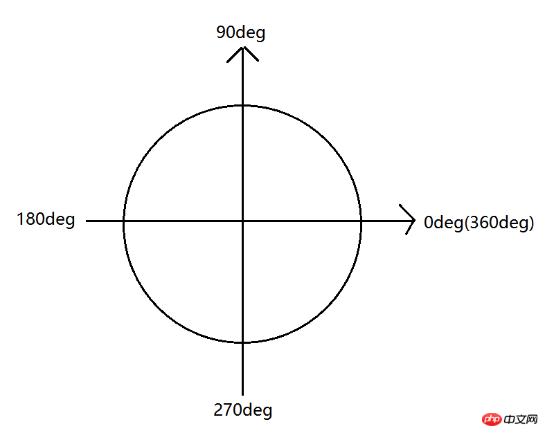
1) Find the center point of the gradient graphic and use it as the origin of the coordinate system to make the coordinate system.
2) Starting from 0deg, the angle formed by counterclockwise rotation is positive, and the angle formed by clockwise rotation is negative.
3) The gradient trend is the same as the direction of the ray formed after rotating at a certain angle.
xx=0 或 xx=360 时,渐变为水平从左向右;
eg:background: -webkit-linear-gradient(0deg,red 0,yellow 200px);
xx=90 时,渐变为垂直从下向上;
eg:background: -webkit-linear-gradient(90deg,red 0,yellow 200px);
xx=180 时,渐变为水平从右向左;
eg:background: -webkit-linear-gradient(180deg,red 0,yellow 200px);
xx=270 时,渐变为垂直从上向下;
eg:background: -webkit-linear-gradient(270deg,red 0,yellow 200px);
Illustration 1:

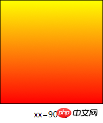
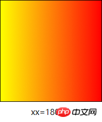
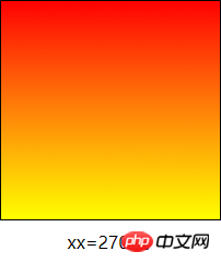
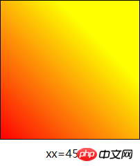
0<xx<90 时,渐变从左下到右上。
eg:beg:ackground: -webkit-linear-gradient(45deg,red 0,yellow 200px);
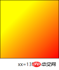
90<xx<180 时,渐变从右下到左上。
eg:background: -webkit-linear-gradient(135deg,red 0,yellow 200px);
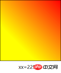
180<xx<270 时,渐变从右上到左下。
eg:background: -webkit-linear-gradient(225deg,red 0,yellow 200px);
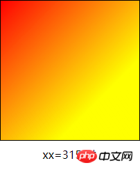
270<xx<360 时,渐变从左上到右下。
eg:background: -webkit-linear-gradient(315deg,red 0,yellow 200px);
Illustration 2:
Optional values are top (270deg or -90deg ), bottom (90deg), left (0deg), right (180deg), left top (315deg or -45deg), left bottom (45deg), right top (225deg or -135deg), right bottom (135deg) , It is used to express directions from top to bottom, from bottom to top, from left to right, from right to left, from top left to bottom right, from bottom left to top right, from top right to bottom left, from bottom right to top left.
Formula:
means: color value or English word representing color + space + the percentage of the position of this gradient key point in the corresponding graphic or Length value (px);
Note: Here a color value
The above is the detailed content of How to understand linear gradients in css3. For more information, please follow other related articles on the PHP Chinese website!


