
 Web Front-end
CSS Tutorial
Introduction to the implementation method of creating three-dimensional navigation bar with CSS
Web Front-end
CSS Tutorial
Introduction to the implementation method of creating three-dimensional navigation bar with CSS
Introduction to the implementation method of creating three-dimensional navigation bar with CSS

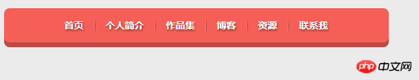
This article mainly introduces the relevant information about using CSS to make a three-dimensional navigation bar. Friends in need can refer to the three-dimensional navigation bar made by
css. The specific implementation code is as follows:
<!doctype html>
<html lang="en">
    <head>
        <meta charset="UTF-8">
        <title>CSS制作立体导航</title>
        <link rel="stylesheet" href="http://www.w3cplus.com/demo/css3/base.css">
        <style>
            body{
              background: #ebebeb;
            }
            .nav{
              width:560px;
              height: 50px;
              font:bold 0/50px Arial;
              text-align:center;
              margin:40px auto 0;
              background: #f65f57;
             /*制作导航圆角*/
              border-radius: 8px;
             /*制作导航立体效果*/
              box-shadow: 0 7px 0 #ba4a45;
            }
            .nav a{
              display: inline-block;
              /* a元素的过渡属性:1、设置所有a标签过渡;2、过渡时间;3、速度曲线:以慢速开始的过渡效果 */
                -webkit-transition: all 0.2s ease-in;/* Safari 和 Chrome */
                -moz-transition: all 0.2s ease-in;/* Firefox */
               -o-transition: all 0.2s ease-in;/* Opera */
               -ms-transition: all 0.2s ease-in;/* IE 9 */
               transition: all 0.2s ease-in;
            }
            .nav a:hover{
                /* 鼠标移上时的效果;定义2D旋转10度 */
              -webkit-transform:rotate(10deg);
              -moz-transform:rotate(10deg);
              -o-transform:rotate(10deg);
              -ms-transform:rotate(10deg);
              transform:rotate(10deg);
            }
            .nav li{
              position:relative;
              display:inline-block;
              padding:0 16px;
              font-size: 14px;
              text-shadow:1px 2px 4px rgba(0,0,0,.5);
              list-style: none outside none;
            }
            /*制作导航分隔线效果*/
            .nav li::before,
            .nav li::after{
              content:"";
              position:absolute;
              top:14px;
              height: 25px;
              width: 1px;
            }
            .nav li::after{
              right: 0;
              /* 线性渐变 */
              background: -moz-linear-gradient(top, rgba(255,255,255,0), rgba(255,255,255,.2) 50%, rgba(255,255,255,0));
              background: -webkit-linear-gradient(top, rgba(255,255,255,0), rgba(255,255,255,.2) 50%, rgba(255,255,255,0));
              background: -o-linear-gradient(top, rgba(255,255,255,0), rgba(255,255,255,.2) 50%, rgba(255,255,255,0));
              background: -ms-linear-gradient(top, rgba(255,255,255,0), rgba(255,255,255,.2) 50%, rgba(255,255,255,0));
              background: linear-gradient(top, rgba(255,255,255,0), rgba(255,255,255,.2) 50%, rgba(255,255,255,0));
            }
            .nav li::before{
              left: 0;
              background: -moz-linear-gradient(top, #ff625a, #9e3e3a 50%, #ff625a);
              background: -webkit-linear-gradient(top, #ff625a, #9e3e3a 50%, #ff625a);
              background: -o-linear-gradient(top, #ff625a, #9e3e3a 50%, #ff625a);
              background: -ms-linear-gradient(top, #ff625a, #9e3e3a 50%, #ff625a);
              background: linear-gradient(top, #ff625a, #9e3e3a 50%, #ff625a);
            }
            /*删除导航第一个导航项左边的分隔线*/
            .nav li:first-child::before{
              background: none;
            }
            /*删除导航最后一个导航右边的分隔线*/
            .nav li:last-child::after{
              background: none;
            }
            .nav a,
            .nav a:hover{
              color:#fff;
              text-decoration: none;
            }
        </style>
    </head>
    <body>
        <ul class="nav">
        <li><a href="">首页</a></li>
        <li><a href="">个人简介</a></li>
        <li><a href="">作品集</a></li>
        <li><a href="">博客</a></li>
        <li><a href="">资源</a></li>
        <li><a href="">联系我</a></li>
        </ul>
    </body>
</html>Rendering:
## Summary:
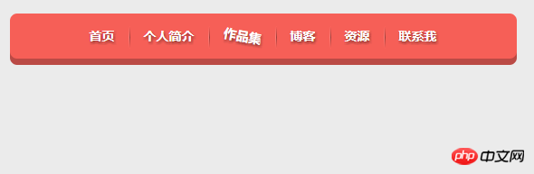
1. Use an unordered list for the body part2. (1)hover The effect when the mouse is moved up. (2) Question: The difference between::before and :before Simply put, a single colon (:) is used for CSS3 pseudo-classes, and a double colon (::) is used for CSS3 pseudo-elements. w3c specification on css selectors:A pseudo-element is made of two colons (::) followed by the name of the pseudo-element.This :: notation is introduced by the current document in order to establish a discrimination between pseudo-classes and pseudo-elements. For compatibility with existing style sheets, user agents must also accept the previous one-colon notation for pseudo-elements introduced in CSS levels 1 and 2 (namely, :first-line, :first-letter, :before and :after). This compatibility is not allowed for the new pseudo-elements introduced in CSS level 3. Composed of colon and pseudo-element name. The double colon was introduced in the current specification to distinguish pseudo-classes from pseudo-elements. However, the browser needs to support the old existing pseudo-element writing methods at the same time, such as: first-line, :first-letter, :before, :after, etc., while the new pseudo-elements introduced in CSS3 are no longer allowed to support the old ones. Single colon writing.
The above is the detailed content of Introduction to the implementation method of creating three-dimensional navigation bar with CSS. For more information, please follow other related articles on the PHP Chinese website!

Hot AI Tools

Undresser.AI Undress
AI-powered app for creating realistic nude photos

AI Clothes Remover
Online AI tool for removing clothes from photos.

Undress AI Tool
Undress images for free

Clothoff.io
AI clothes remover

Video Face Swap
Swap faces in any video effortlessly with our completely free AI face swap tool!

Hot Article
Hot Tools

Notepad++7.3.1
Easy-to-use and free code editor

SublimeText3 Chinese version
Chinese version, very easy to use

Zend Studio 13.0.1
Powerful PHP integrated development environment

Dreamweaver CS6
Visual web development tools

SublimeText3 Mac version
God-level code editing software (SublimeText3)
Hot Topics
 1390
1390
 52
52

 How to use bootstrap in vue
Apr 07, 2025 pm 11:33 PM
How to use bootstrap in vue
Apr 07, 2025 pm 11:33 PM
Using Bootstrap in Vue.js is divided into five steps: Install Bootstrap. Import Bootstrap in main.js. Use the Bootstrap component directly in the template. Optional: Custom style. Optional: Use plug-ins.
 The Roles of HTML, CSS, and JavaScript: Core Responsibilities
Apr 08, 2025 pm 07:05 PM
The Roles of HTML, CSS, and JavaScript: Core Responsibilities
Apr 08, 2025 pm 07:05 PM
HTML defines the web structure, CSS is responsible for style and layout, and JavaScript gives dynamic interaction. The three perform their duties in web development and jointly build a colorful website.
 How to write split lines on bootstrap
Apr 07, 2025 pm 03:12 PM
How to write split lines on bootstrap
Apr 07, 2025 pm 03:12 PM
There are two ways to create a Bootstrap split line: using the tag, which creates a horizontal split line. Use the CSS border property to create custom style split lines.
 Understanding HTML, CSS, and JavaScript: A Beginner's Guide
Apr 12, 2025 am 12:02 AM
Understanding HTML, CSS, and JavaScript: A Beginner's Guide
Apr 12, 2025 am 12:02 AM
WebdevelopmentreliesonHTML,CSS,andJavaScript:1)HTMLstructurescontent,2)CSSstylesit,and3)JavaScriptaddsinteractivity,formingthebasisofmodernwebexperiences.
 How to use bootstrap button
Apr 07, 2025 pm 03:09 PM
How to use bootstrap button
Apr 07, 2025 pm 03:09 PM
How to use the Bootstrap button? Introduce Bootstrap CSS to create button elements and add Bootstrap button class to add button text
 How to resize bootstrap
Apr 07, 2025 pm 03:18 PM
How to resize bootstrap
Apr 07, 2025 pm 03:18 PM
To adjust the size of elements in Bootstrap, you can use the dimension class, which includes: adjusting width: .col-, .w-, .mw-adjust height: .h-, .min-h-, .max-h-
 How to set up the framework for bootstrap
Apr 07, 2025 pm 03:27 PM
How to set up the framework for bootstrap
Apr 07, 2025 pm 03:27 PM
To set up the Bootstrap framework, you need to follow these steps: 1. Reference the Bootstrap file via CDN; 2. Download and host the file on your own server; 3. Include the Bootstrap file in HTML; 4. Compile Sass/Less as needed; 5. Import a custom file (optional). Once setup is complete, you can use Bootstrap's grid systems, components, and styles to create responsive websites and applications.
 How to insert pictures on bootstrap
Apr 07, 2025 pm 03:30 PM
How to insert pictures on bootstrap
Apr 07, 2025 pm 03:30 PM
There are several ways to insert images in Bootstrap: insert images directly, using the HTML img tag. With the Bootstrap image component, you can provide responsive images and more styles. Set the image size, use the img-fluid class to make the image adaptable. Set the border, using the img-bordered class. Set the rounded corners and use the img-rounded class. Set the shadow, use the shadow class. Resize and position the image, using CSS style. Using the background image, use the background-image CSS property.
