box-shadow:none;
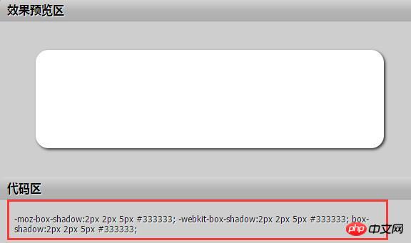
box-shadow: h-shadow v-shadow blur spread color inset;
| Value | Description |
|---|---|
| none | Default value, the element does not have any shadow effect. |
| h-shadow | The shadow horizontal offset, its value can be positive or negative. If the value is positive, the shadow is on the right side of the element; if it is negative, the shadow is on the left side of the element. |
| v-shadow | The shadow vertical offset, its value can be positive or negative. If the value is positive, the shadow is at the bottom of the element; if it is negative, the shadow is at the top of the element. |
| blur | Shadow blur radius, optional parameter. Its value can only be positive. If the value is "0", it means that the shadow has no blurring effect. If the value is larger, the edge of the shadow will be blurry. |
| spread | Shadow expansion radius, optional parameter. Its value can be positive or negative. If the value is positive, the entire shadow will be expanded. Otherwise, if the value is negative, the entire shadow will be reduced. |
| color | Shadow color, optional parameter. If no color is set, the browser will use the default color, but the default color is different in each browser. Especially browsers under the Webkit kernel will be colorless, that is, transparent. It is recommended not to omit this parameter. |
| inset | Shadow type, optional value. If not set, the default projection method is outer shadow; if its unique value "inset" is taken, the inner shadow is set for the element. |

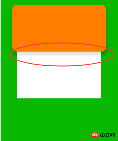
The effect we want to do next is like this

Pay attention to this area. The white box model has the border shadow of the orange box above. How to achieve this effect?
<p class="contain">
    <p class="contain-wrapper">
    </p>
    <p class="foot-wrapper">
</p></p>This is our html code. It is obvious that the green area is contain, the orange area is contain-wrapper, and the white area is foot-wrapper.
Let’s write their css code
*{
    margin:0;
    padding: 0;
}.contain{
    overflow: hidden;
    margin: 0 auto;
    width: 250px;
    height: 300px;
    background-color: #09b800;
}.contain-wrapper{
    margin: 0 auto;
    margin-top: 10px;
    width: 200px;
    height: 100px;
    background: #ff7e00;
    border-radius: 10px;
    box-shadow: 0px 9px 15px -1px rgba(0,0,0,0.3);
}.foot-wrapper{
    margin: 0 auto;
    width: 180px;
    height: 100px;
    background: white;
}We set a border shadow for the orange box. The lower border of the orange box and the upper border of the white box are closely attached. Together, at this time, a problem arises. Let’s take a look at the effect.

#We find that the shadow of the lower border of the orange box is obscured by the white box. How can this be? good? I solved it in a very clumsy way.
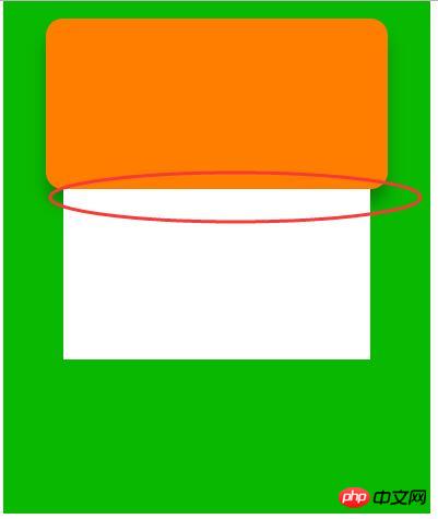
Since the shadow is covered, then we let the white box compensate for giving the orange box a shadow. Isn't there a parameter called inset? Wouldn't it be great if we projected the shadow of the upper border of the white box into the inside to fill this gap?
*{
    margin:0;
    padding: 0;
}.contain{
    overflow: hidden;
    margin: 0 auto;
    width: 250px;
    height: 300px;
    background-color: #09b800;
}.contain-wrapper{
    margin: 0 auto;
    margin-top: 10px;
    width: 200px;
    height: 100px;
    background: #ff7e00;
    border-radius: 10px;
    box-shadow: 0px 9px 15px -1px rgba(0,0,0,0.3);
}.foot-wrapper{
    margin: 0 auto;
    width: 180px;
    height: 100px;
    background: white;
box-shadow: inset 0 9px 5px -1px rgba(0,0,0,0.1);//新增,其他所有的参数要跟橙色盒子的阴影一样,只是方向改变,这样才不会影响结合起来的效果。}The above is the detailed content of Tips for using box-shadow. For more information, please follow other related articles on the PHP Chinese website!


