 Web Front-end
 HTML Tutorial
 HTML implements fixed floating translucent search box on mobile terminal
HTML implements fixed floating translucent search box on mobile terminal
Now there are thousands of websites on the Internet, but an indispensable function of the website is search. We can see that the search boxes of many websites are different, and the same is true on the mobile terminal. In this article, we will share with you a search box that is fixed at the top of the page on the mobile side, semi-transparent and suspended, and part of the carousel can be vaguely seen.

To create such a search box, the key technology lies in:
fixed search box positioning
opacity setting transparency
Solution. Solution
First we define an html fragment:
1 2 3 4 5 6 7 8 9 10 11 12 13 |
|
The header tag is the search box, and the p below is a background image.
Attached is the CSS style:
1 2 3 4 5 6 7 8 9 10 11 12 13 14 15 16 17 18 19 20 21 22 23 24 25 26 27 28 29 30 31 32 33 34 35 36 37 38 39 40 41 42 43 44 45 46 47 48 49 50 51 52 53 54 55 |
|
It’s a long CSS style, but its core is just two sentences: position: fixed; /* determines the top of the search box*/ and background-color : #fff; opacity: 0.8; /* Search box translucency effect */, other styles are for the layout of the page. The details of the layout need to be written and understood by readers, and the process may take some time.
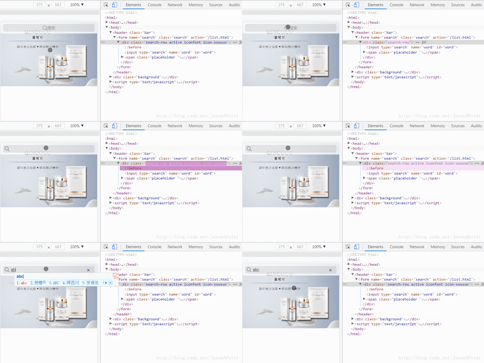
In this way we have completed a static search box:

Note: The search icon here uses iconfont, readers can go to the iconfont vector icon library by themselves download.
At this point, we still need to implement some animation effects through JS:

is used to switch the "search" position icon when the user switches input. The principle is very simple. Simple, add and remove classes, these classes define styles.
1 2 3 4 5 6 7 8 9 10 11 12 13 14 15 16 17 18 19 20 21 22 23 24 25 26 27 28 |
|
Note: jQuery needs to be introduced here, don’t forget it!
Extension. Extension
Complete html code:
1 2 3 4 5 6 7 8 9 10 11 12 13 14 15 16 17 18 19 20 21 22 23 24 25 26 27 28 29 30 31 32 33 34 35 36 37 38 39 40 41 42 43 44 45 46 47 48 49 50 51 52 53 54 55 56 57 58 59 60 61 62 63 64 65 66 67 68 69 70 71 72 73 74 75 76 77 78 79 80 81 82 83 84 85 86 87 88 89 90 91 92 |
|
The above content is a tutorial on how to implement a fixed floating translucent search box on the mobile terminal in HTML. I hope you can help during development. Everyone.
Related recommendations:
Css to create a good-looking search box
How to use Js to implement the Baidu search box prompt function
The above is the detailed content of HTML implements fixed floating translucent search box on mobile terminal. For more information, please follow other related articles on the PHP Chinese website!

Hot AI Tools

Undresser.AI Undress
AI-powered app for creating realistic nude photos

AI Clothes Remover
Online AI tool for removing clothes from photos.

Undress AI Tool
Undress images for free

Clothoff.io
AI clothes remover

AI Hentai Generator
Generate AI Hentai for free.

Hot Article

Hot Tools

Notepad++7.3.1
Easy-to-use and free code editor

SublimeText3 Chinese version
Chinese version, very easy to use

Zend Studio 13.0.1
Powerful PHP integrated development environment

Dreamweaver CS6
Visual web development tools

SublimeText3 Mac version
God-level code editing software (SublimeText3)

Hot Topics
 1376
1376
 52
52
 Table Border in HTML
Sep 04, 2024 pm 04:49 PM
Guide to Table Border in HTML. Here we discuss multiple ways for defining table-border with examples of the Table Border in HTML.
 Nested Table in HTML
Sep 04, 2024 pm 04:49 PM
This is a guide to Nested Table in HTML. Here we discuss how to create a table within the table along with the respective examples.
 HTML margin-left
Sep 04, 2024 pm 04:48 PM
Guide to HTML margin-left. Here we discuss a brief overview on HTML margin-left and its Examples along with its Code Implementation.
 HTML Table Layout
Sep 04, 2024 pm 04:54 PM
Guide to HTML Table Layout. Here we discuss the Values of HTML Table Layout along with the examples and outputs n detail.
 HTML Ordered List
Sep 04, 2024 pm 04:43 PM
Guide to the HTML Ordered List. Here we also discuss introduction of HTML Ordered list and types along with their example respectively
 HTML Input Placeholder
Sep 04, 2024 pm 04:54 PM
Guide to HTML Input Placeholder. Here we discuss the Examples of HTML Input Placeholder along with the codes and outputs.
 Moving Text in HTML
Sep 04, 2024 pm 04:45 PM
Guide to Moving Text in HTML. Here we discuss an introduction, how marquee tag work with syntax and examples to implement.
 HTML onclick Button
Sep 04, 2024 pm 04:49 PM
Guide to HTML onclick Button. Here we discuss their introduction, working, examples and onclick Event in various events respectively.


