

Six classic CSS three-column layout solutions

css is an indispensable language for our front-end development programmers. Being able to master css well can greatly improve front-end development work. This article mainly introduces the classic CSS three-column layout scheme and shares it with everyone.
Three-column layout, as the name suggests, is fixed on both sides and adaptive in the middle. Three-column layout is very common in development
1. Float layout
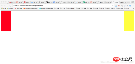
The simplest three-column layout is to use float for layout. First, draw the left and right columns:
    <style>
      .left {
        float: left;
        width: 100px;
        height: 200px;
        background-color: red;
      }

      .right {
        float: right;
        width: 100px;
        height: 200px;
        background-color: yellow;
      }
    </style>

      <p class="container">
        <p class="left"></p>
        <p class="right"></p>
        <p class="main"></p>
</p>At this time, you can get the distribution of the left and right columns:
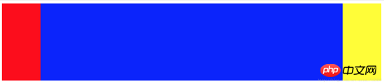
Next let’s look at how to deal with the middle column. We know that for float elements, they will break away from the document flow, and other boxes will ignore this element. (But the text in other boxes will still make room for this element and surround it.) So at this time, you only need to add a normal p in the container container, which will ignore the left and right and fill the entire container. Just In addition, the margin is left right to flow out the space:
   <style>
      .left {
        float: left;
        width: 100px;
        height: 200px;
        background-color: red;
      }

      .right {
        float: right;
        width: 100px;
        height: 200px;
        background-color: yellow;
      }

      .main {
        background-color: green;
        height: 200px;
        margin-left: 120px;
        margin-right: 120px;
      }

      .container {
        border: 1px solid black;
      }

      <p class="container">
      <p class="left"></p>
      <p class="right"></p>
      <p class="main"></p>
      </p>
Advantages: Simple
Disadvantages : The middle part is loaded last, which affects the experience when there is a lot of content
2. BFC rules
BFC (Block Formatting Context) rules stipulate that BFC will not overlap with floating elements . So if you set the main element as a BFC element:
    <style>
      .left {
        float: left;
        width: 100px;
        height: 200px;
        background-color: red;
      }

      .right {
        float: right;
        width: 100px;
        height: 200px;
        background-color: yellow;
      }

      .main {
        background-color: green;
        height: 200px;
        overflow: hidden;
      }

      <p class="container">
        <p class="left"></p>
        <p class="right"></p>
        <p class="main"></p>
</p>3. Holy Grail Layout
Holy Grail Layout The core is that the left, middle, and right columns are all floated through float, and then adjusted through negative margin.
The first step is to take a look at the basic layout
    <style>
        .left {
            float: left;
            width: 100px;
            height: 200px;
            background-color: red;
        }

        .right {
            float: left;
            width: 100px;
            height: 200px;
            background-color: yellow;
        }

        .main {
            float: left;
            width: 100%;
            height: 200px;
            background-color: blue;
        }
    </style>
    <body>
        <p class="container">
            <p class="main"></p>
            <p class="left"></p>
            <p class="right"></p>
        </p>
    </body>
The effect you see at this time Yes: The left and right columns are squeezed into the second row. This is because main's width is 100%. Next, we put the left, center, and right in one line by adjusting the margins of the left and right columns:
        .left {
            float: left;
            width: 100px;
            height: 200px;
            margin-left: -100%;
            background-color: red;
        }

        .right {
            float: left;
            width: 100px;
            height: 200px;
            margin-left: -100px;
            background-color: yellow;
}The second step is to put the left Set margin-left to -100%, and the left column will move to the beginning of the first row. Then set the margin-left of right to the negative value of its width: -100px, and the right column will also be moved to the same line as the left and middle columns:
However It’s not done yet, let’s try to add some text to main:
    <body>
        <p class="container">
            <p class="main">fjlskdjflkasjdfljasdljlsjdljsdjflksadj</p>
            <p class="left"></p>
            <p class="right"></p>
        </p>
    </body>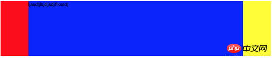
You can see that the text is suppressed Okay, now we have to solve this problem.
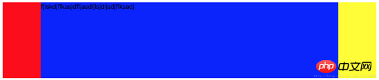
The third step is to give the container a padding, which should be exactly equal to the width of the left and right columns:
        .container {
            padding-left: 100px;
            padding-right: 100px;
}See this The result is that the left, middle, and right columns have all shrunk as a whole, but the text is still suppressed.

The fourth step is to add relative layout to the left and right columns, and then move them outward by setting the left and right values:
        .left {
            float: left;
            width: 100px;
            height: 200px;
            margin-left: -100%;
            position: relative;
            left: -100px;
            background-color: red;
        }

        .right {
            float: left;
            width: 100px;
            height: 200px;
            margin-left: -100px;
            position: relative;
            right: -100px;
            background-color: yellow;
}So far, you’re done:
4. Double flying wing layout
Double flying The first two steps of the wing layout are the same as the Holy Grail layout, except that the solution to the problem of the content in the middle column being blocked is different:
Since the content of the main part will be blocked, then add another one inside the main content, by setting its margin to avoid occlusion, the problem can be solved:
<!DOCTYPE html>
<html lang="en">
<head>
<style>
.main {
float: left;
width: 100%;
}
.content {
height: 200px;
margin-left: 110px;
margin-right: 220px;
background-color: green;
}
.main::after {
display: block;
content: '';
font-size: 0;
height: 0;
clear: both;
zoom: 1;
}
.left {
float: left;
height: 200px;
width: 100px;
margin-left: -100%;
background-color: red;
}
.right {
width: 200px;
height: 200px;
float: left;
margin-left: -200px;
background-color: blue;
}
</style>
</head>
<body>
<p class="main">
<p class="content"></p>
</p>
<p class="left"></p>
<p class="right"></p>
</body>
</html>The only thing to note is that you need to add an element after main to clear floats.
5. Flex layout
Flex layout is the trend. It is also very simple to use flex to implement three-column layout, but you need to pay attention to browser compatibility:
        <style type="text/css">
            .container {
                display: flex;
                flex-direction: row;
            }
            .middle {
                height: 200px;
                background-color: red;
                flex-grow: 1;
            }

            .left {
                height: 200px;
                order: -1;
                margin-right: 20px;
                background-color: yellow;
                flex: 0 1 200px;
            }

            .right {
                height: 200px;
                margin-left: 20px;
                background-color: green;
                flex: 0 1 200px;
            }
        </style>
    </head>
    <body>
        <p class="container">
            <p class="middle">fsdfjksdjflkasjdkfjsdkljfklsjadfkljaksdljfskljffjksldfjldsfdskjflsdjfkljsdlfjsldjfklsjdkflj</p>
            <p class="left"></p>
            <p class="right"></p>
        </p>
</body>There are a few points to note:
main must be written first if it is to be loaded first, but because left needs to be displayed On the far left, so you need to set the left order to -1
The complete writing method of the flex attribute is: flex: flex-grow flex-shrink flex-basis. This is also the core of flex's three-column layout. Main sets flex-grow to 1, which means that all the extra space is given to main. When the space is not enough, only the left and right parts are reduced. At the same time, because the flex-basis of the left and right parts is specified, Increase the width of both to ensure the display effect
6. Absolute positioning
The absolute positioning method is also relatively simple and can be loaded first. Subject:
        <style type="text/css">
            .container {
            }
            .middle {
                position: absolute;
                left: 200px;
                right: 200px;
                height: 300px;
                background-color: yellow;
            }

            .left {
                position: absolute;
                left: 0px;
                width: 200px;
                height: 300px;
                background-color: red;
            }

            .right {
                position: absolute;
                right: 0px;
                width: 200px;
                background-color: green;
                height: 300px;
            }
        </style>
    </head>
    <body>
        <p class="container">
            <p class="middle">fsdfjksdjflkasjdkfjsdkljfklsjadfkljaksdljfskljffjksldfjldsfdskjflsdjfkljsdlfjsldjfklsjdkflj</p>
            <p class="left"></p>
            <p class="right"></p>
        </p>
</body>The above content is about six classic CSS three-column layout schemes. I hope it can help everyone.
Related recommendations:
Write HTML first or CSS first when laying out the web page
In the web page layout of HTML What is the difference between div and span
What are the techniques for CSS layout
The above is the detailed content of Six classic CSS three-column layout solutions. For more information, please follow other related articles on the PHP Chinese website!

Hot AI Tools

Undresser.AI Undress
AI-powered app for creating realistic nude photos

AI Clothes Remover
Online AI tool for removing clothes from photos.

Undress AI Tool
Undress images for free

Clothoff.io
AI clothes remover

AI Hentai Generator
Generate AI Hentai for free.

Hot Article
Hot Tools

Notepad++7.3.1
Easy-to-use and free code editor

SublimeText3 Chinese version
Chinese version, very easy to use

Zend Studio 13.0.1
Powerful PHP integrated development environment

Dreamweaver CS6
Visual web development tools

SublimeText3 Mac version
God-level code editing software (SublimeText3)
Hot Topics
 1386
1386
 52
52

 How to use bootstrap in vue
Apr 07, 2025 pm 11:33 PM
How to use bootstrap in vue
Apr 07, 2025 pm 11:33 PM
Using Bootstrap in Vue.js is divided into five steps: Install Bootstrap. Import Bootstrap in main.js. Use the Bootstrap component directly in the template. Optional: Custom style. Optional: Use plug-ins.
 The Roles of HTML, CSS, and JavaScript: Core Responsibilities
Apr 08, 2025 pm 07:05 PM
The Roles of HTML, CSS, and JavaScript: Core Responsibilities
Apr 08, 2025 pm 07:05 PM
HTML defines the web structure, CSS is responsible for style and layout, and JavaScript gives dynamic interaction. The three perform their duties in web development and jointly build a colorful website.
 How to write split lines on bootstrap
Apr 07, 2025 pm 03:12 PM
How to write split lines on bootstrap
Apr 07, 2025 pm 03:12 PM
There are two ways to create a Bootstrap split line: using the tag, which creates a horizontal split line. Use the CSS border property to create custom style split lines.
 Understanding HTML, CSS, and JavaScript: A Beginner's Guide
Apr 12, 2025 am 12:02 AM
Understanding HTML, CSS, and JavaScript: A Beginner's Guide
Apr 12, 2025 am 12:02 AM
WebdevelopmentreliesonHTML,CSS,andJavaScript:1)HTMLstructurescontent,2)CSSstylesit,and3)JavaScriptaddsinteractivity,formingthebasisofmodernwebexperiences.
 How to resize bootstrap
Apr 07, 2025 pm 03:18 PM
How to resize bootstrap
Apr 07, 2025 pm 03:18 PM
To adjust the size of elements in Bootstrap, you can use the dimension class, which includes: adjusting width: .col-, .w-, .mw-adjust height: .h-, .min-h-, .max-h-
 How to set up the framework for bootstrap
Apr 07, 2025 pm 03:27 PM
How to set up the framework for bootstrap
Apr 07, 2025 pm 03:27 PM
To set up the Bootstrap framework, you need to follow these steps: 1. Reference the Bootstrap file via CDN; 2. Download and host the file on your own server; 3. Include the Bootstrap file in HTML; 4. Compile Sass/Less as needed; 5. Import a custom file (optional). Once setup is complete, you can use Bootstrap's grid systems, components, and styles to create responsive websites and applications.
 How to insert pictures on bootstrap
Apr 07, 2025 pm 03:30 PM
How to insert pictures on bootstrap
Apr 07, 2025 pm 03:30 PM
There are several ways to insert images in Bootstrap: insert images directly, using the HTML img tag. With the Bootstrap image component, you can provide responsive images and more styles. Set the image size, use the img-fluid class to make the image adaptable. Set the border, using the img-bordered class. Set the rounded corners and use the img-rounded class. Set the shadow, use the shadow class. Resize and position the image, using CSS style. Using the background image, use the background-image CSS property.
 How to use bootstrap button
Apr 07, 2025 pm 03:09 PM
How to use bootstrap button
Apr 07, 2025 pm 03:09 PM
How to use the Bootstrap button? Introduce Bootstrap CSS to create button elements and add Bootstrap button class to add button text
