The layout of the mobile terminal is different from that of the PC terminal. First of all, we must know that in the mobile terminal, 1px in CSS is not equal to the physical 1px, because the resolution of mobile phone screens has become higher and higher. High pixels but the screen size are not Not much has changed, which means that one physical pixel actually has several pixels crammed into it.
In mobile browsers and some desktop browsers, the window object has a devicePixelRatio attribute. Its official definition is: the ratio of the physical pixels of the device to the independent pixels of the device, that is, devicePixelRatio = physical pixel/independent pixel. px in css can be regarded as an independent pixel of the device, so through devicePixelRatio, we can know how many physical pixels a css pixel on the device represents. For example, on an iPhone with a Retina screen, the value of devicePixelRatio is 2, which means that 1 CSS pixel is equivalent to 2 physical pixels. However, it should be noted that devicePixelRatio still has some compatibility issues in different browsers, so we cannot fully rely on this thing yet.
There is another factor that can also cause changes in px in css, and that is user scaling. For example, when the user doubles the page size, the physical pixels represented by 1px in CSS will also double; conversely, when the page is doubled, the physical pixels represented by 1px in CSS will also be doubled.
So when doing mobile development, in order to make the mobile page display at the same size on different phones, we can fix the width of the page, and then get the width of the device, and we can get the settings we set before The ratio between the width and the width of the device is used, and then the new viewport in HTML5 is used to scale the page, and the user is not allowed to rescale.
Before looking at the specific usage of viewport, let’s first clarify a few concepts.
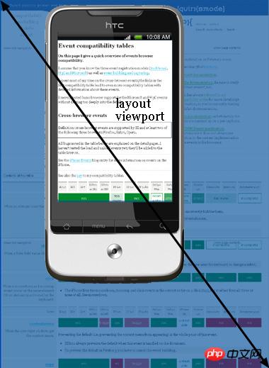
layout viewport:
layout viewport is all the content of the web page, which can be displayed to the user in whole or in part.
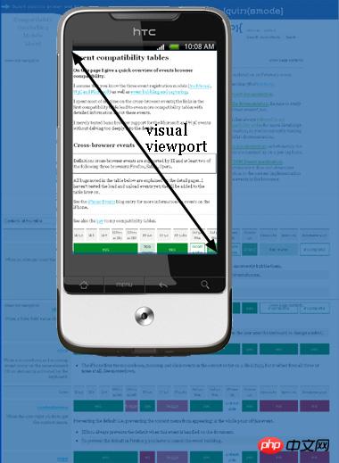
visual viewport
The visual viewport is the window currently displaying content to the user. You can drag or zoom in or out Web page.
If you don’t understand, just look at the picture below:


The specific usage of viewport is:
When using this meta tag, write attributes in content, separated by commas
<meta name="viewport" content="width=device-width, initial-scale=1.0, maximum-scale=1.0,minimum-scale=1.0,user-scalable=no" />
| Attribute name | Remarks | |||||||||||||
|---|---|---|---|---|---|---|---|---|---|---|---|---|---|---|
| width | Set the width of the layout viewport to a positive integer, use the string "width-device" to represent the device width | |||||||||||||
| initial-scale | Set the initial scaling value of the page , is a number, with decimals allowed | |||||||||||||
| minimum-scale | The minimum scaling value allowed to the user, is a number, with decimals allowed | |||||||||||||
| maximum-scale | The maximum zoom value allowed by the user is a number, which can contain decimals | |||||||||||||
| height | Set layout viewport The height of , no means not allowed, yes means allowed | |||||||||||||
Reprint:
The layout of the mobile terminal is different from that of the PC terminal. First of all, we must know that in the mobile terminal, 1px in CSS is not equal to the physical 1px, because the resolution of mobile phone screens has become higher and higher. The pixels but the screen size have not changed much, which means that one physical pixel actually has several pixels crammed into it. In mobile browsers and some desktop browsers, the window object has a devicePixelRatio attribute. Its official definition is: the ratio of device physical pixels to device independent pixels, that is, devicePixelRatio = physical pixels /Individual pixels. px in css can be regarded as an independent pixel of the device, so through devicePixelRatio, we can know how many physical pixels a css pixel on the device represents. For example, on an iPhone with a Retina screen, the value of devicePixelRatio is 2, which means that 1 CSS pixel is equivalent to 2 physical pixels. However, it should be noted that devicePixelRatio still has some compatibility issues in different browsers, so we cannot fully rely on this thing yet. There is another factor that can also cause changes in px in css, and that is user scaling. For example, when the user doubles the page size, the physical pixels represented by 1px in CSS will also double; conversely, when the page is doubled, the physical pixels represented by 1px in CSS will also be doubled. So when doing mobile development, in order to make the mobile page display at the same size on different phones, we can fix the width of the page, and then get the width of the device, and we can get the settings we set before The ratio between the width and the width of the device is used, and then the new viewport in HTML5 is used to scale the page, and the user is not allowed to rescale. Before looking at the specific usage of viewport, let’s first clarify a few concepts.
If you don’t understand, just look at the picture below:
The specific usage of viewport is: <meta name="viewport" content="width=device-width, initial-scale=1.0, maximum-scale=1.0,minimum-scale=1.0,user-scalable=no" /> Copy after login Copy after login
The above is the detailed content of js multi-touch problem. For more information, please follow other related articles on the PHP Chinese website!
Related labels:
Previous article:js realizes selecting all and not selecting all
Next article:Native js operation dom
Statement of this Website
The content of this article is voluntarily contributed by netizens, and the copyright belongs to the original author. This site does not assume corresponding legal responsibility. If you find any content suspected of plagiarism or infringement, please contact admin@php.cn
Latest Articles by Author
Latest Issues
Related Topics
More>
Popular Recommendations
Popular Tutorials
More>
Latest Downloads
More>
|