 Web Front-end
 CSS Tutorial
 A complete list of methods for customizing text omission using pure CSS
A complete list of methods for customizing text omission using pure CSS
This article mainly introduces a complete method of customizing text omission in pure CSS. The editor thinks it is quite good. Now I will share it with you and give you a reference. Let’s follow the editor to take a look, I hope it can help everyone.
WeTest Introduction
I got the design draft from Design MM, Oh NO, I started adding more content after a little bit, it’s such a small space, so much trouble! ! Poor UI developer GG, we always say sincerely that Wei Chen is not not doing it, but it is impossible to do it! Very guilty. But now, since I have used customized multi-line omission, my waist is no longer sore, my hands are no longer hurting, and I can answer requests effortlessly!
1. What is multi-line omission?
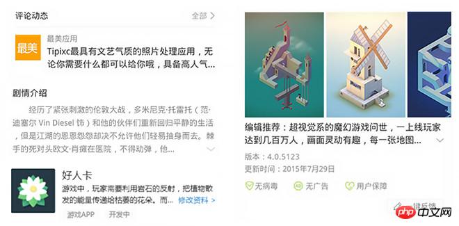
When the number of words reaches a certain level, ellipsis dots will be displayed. At first it was just a simple dot, dot, dot, then more and more tricks, dot dot plus down arrow, dot dot add more, dot dot add more plus arrow... Multi-line omission is a fancy dot after a long paragraph of text.
Peers do this:

1. Google Plus uses a gradient mask from transparent to white. The gradient mask is only displayed when the text exceeds it, but The text cannot be extruded, and the background can only be a solid color, which is not ideal.
2. Wandoujia is more simple and crude to display in line breaks. When displaying in line breaks, the text will still be displayed when the text does not exceed...xxx, which is even less ideal!
We do this:

We use an original mod-more UI component on the QQ browser page to achieve customized multi-line omission. It’s still pure CSS, a long way ahead of its peers, thumbs up! Thumbs up! Thumbs up! Unfortunately, the height of the mod-more component is fixed. Further evolution of mod-more, perfect adaptive height, and the code is simplified and easy to use.
2. How to do it?
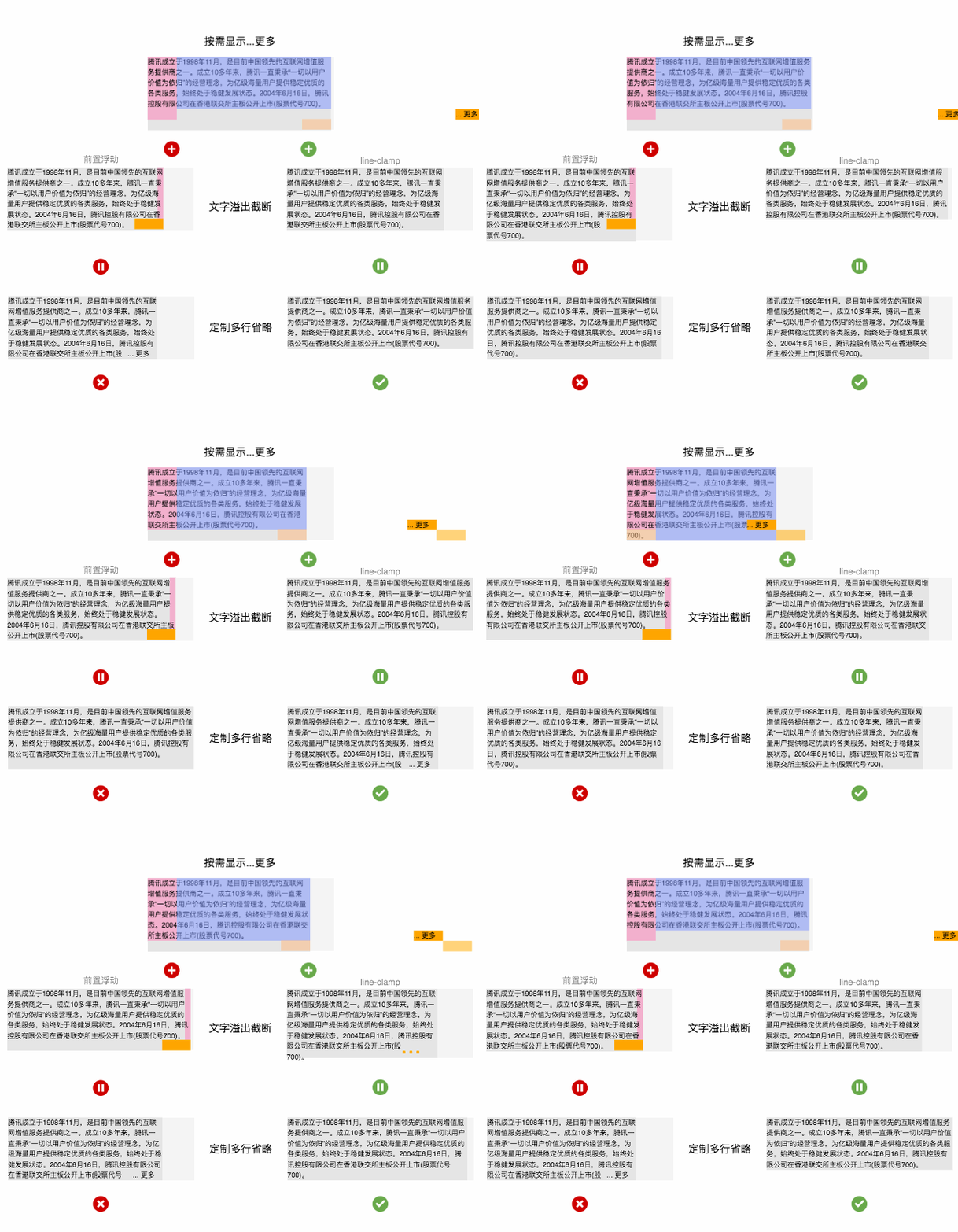
Customized multi-line omission = display on demand...more + text overflow truncation, display on demand...more is implemented using the floating feature, The text overflow stage can be realized by front-floating and line-clamp. The existing solution of QQ browser is front-floating, but the disadvantage is that the height is fixed. Using line-clamp can adapt the height, perfect! Due to space limitations, only the implementation plan of line-clamp is mentioned here. QQ browser will be upgraded to this plan in the next stage.
Detailed explanation of the principle!
Display on demand...more
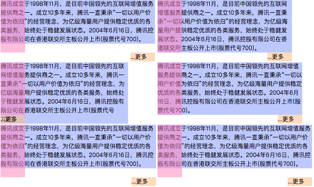
1 2 3 4 5 6 7 8 9 10 11 12 13 14 15 |
|
Use the right floating principle - right floating The elements are arranged from right to left, and if there is not enough space, they are wrapped. The blue block, pink block, and orange block float to the right in sequence. When the height of the blue block is less than 6 lines of text, the orange block is on the right. When the height of the blue block is greater than 6 lines of text, the lower left corner is just enough space for the orange blocks to be arranged, so the orange block The block is on the left

1 2 3 4 5 6 7 8 9 10 11 12 13 14 15 |
|
Further offset the orange block to the correct position and you're done! Careful students will find that adding orange blocks with a gradient base is the solution used by Google Plus.
Text overflow truncation
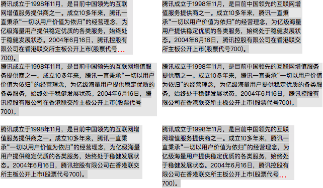
1 2 3 4 5 6 7 8 9 10 11 12 |
|
-webkit-line-clamp is Private css attribute of webkit kernel, used for multi-line omission, fully supported on Android and iOS. But it uses ellipses fixedly and cannot be expanded directly. And it comes with overflow truncation logic, which acts on the height of the container. Careful inspection shows that the ellipsis it uses is a single character... and can be controlled using text css attributes such as font-size, letter-spacing, color, etc.
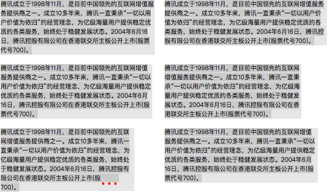
1 2 3 4 5 6 7 8 9 |
|
Just set the font-size, letter-spacing, and color of the outer container and restore it in the sub-container Set the ellipses individually. Here, the value of font-size set in the outer container is equal to 2 times the line height (the remaining width to be stretched can be filled with letter-spacing, or only font-size can be used to stretch the entire width). If the color is transparent, line-clamp can be used It extrudes the text without cutting off the container height. The height of the outer container reaches 7 lines instead of the default 6 lines, thus achieving the required overflow truncation effect
fit! Customized multi-line omission

1 2 3 4 5 6 7 8 9 10 11 12 13 14 15 |
|
将-webkit-line-clamp实现的文字溢出截断代码为主体,叠加绝对定位同步的按需显示...更多结构。因为绝对定位,这里使用百分比简化代码。最外包一层结构限制最大高度。
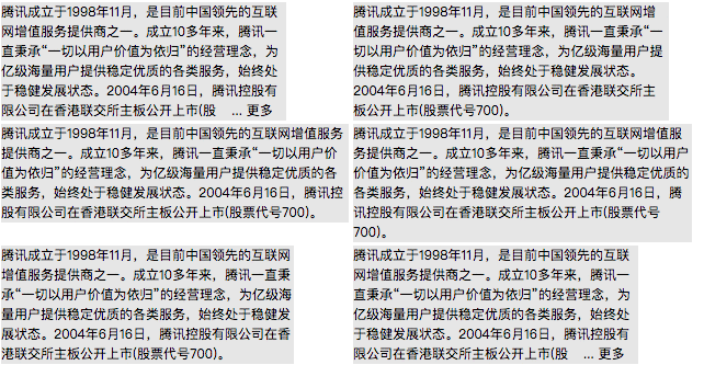
1 2 3 4 5 6 7 8 9 10 11 12 13 14 15 16 17 18 19 20 21 22 23 24 25 26 27 28 29 30 31 32 33 34 35 36 37 38 39 40 41 42 43 44 45 46 47 48 49 50 51 52 53 54 55 56 57 58 59 60 61 62 63 64 65 66 67 68 69 70 71 72 73 74 75 76 |
|
将橙色块偏移到正确位置,梳理了下代码,最终实现了自适应高度的定制多行省略,完美!从此妈妈再也不担心我在省略号后面加东西改东西了!恭喜你击败99%的同行了!
三、为什么这么做?
line-clamp有3宗罪

和 text-align:justify 一起用会使省略号和文字相叠
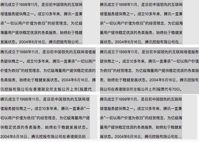
超出截断后会截掉部分行高

省略号出现在单词中间
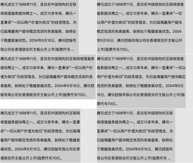
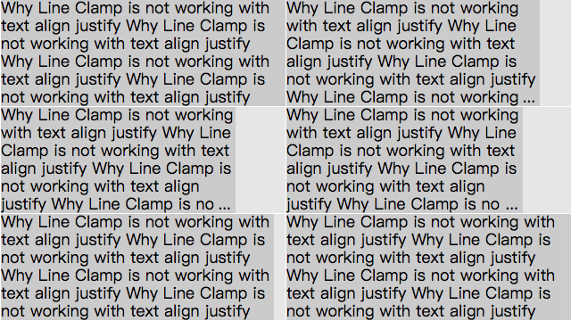
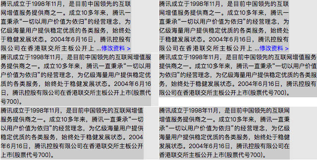
定制省略当然某问题啦
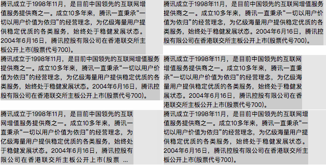
ext-align:justify时如期所示,没问题!
截断时如期所示,也没问题!
省略号在有单词时如期显示,依然没问题!
更别说点点点花样增改
简单增改文字加链接只是小case
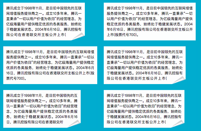
用折角还是其他图片表示文本溢出可以增添趣味
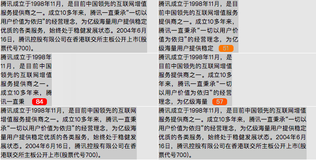
溢出时显示溢出字数增加了实用用途
相关推荐:
The above is the detailed content of A complete list of methods for customizing text omission using pure CSS. For more information, please follow other related articles on the PHP Chinese website!

Hot AI Tools

Undresser.AI Undress
AI-powered app for creating realistic nude photos

AI Clothes Remover
Online AI tool for removing clothes from photos.

Undress AI Tool
Undress images for free

Clothoff.io
AI clothes remover

Video Face Swap
Swap faces in any video effortlessly with our completely free AI face swap tool!

Hot Article

Hot Tools

Notepad++7.3.1
Easy-to-use and free code editor

SublimeText3 Chinese version
Chinese version, very easy to use

Zend Studio 13.0.1
Powerful PHP integrated development environment

Dreamweaver CS6
Visual web development tools

SublimeText3 Mac version
God-level code editing software (SublimeText3)

Hot Topics
 1393
1393
 52
52
 1207
1207
 24
24
 How to use bootstrap in vue
Apr 07, 2025 pm 11:33 PM
Using Bootstrap in Vue.js is divided into five steps: Install Bootstrap. Import Bootstrap in main.js. Use the Bootstrap component directly in the template. Optional: Custom style. Optional: Use plug-ins.
 The Roles of HTML, CSS, and JavaScript: Core Responsibilities
Apr 08, 2025 pm 07:05 PM
HTML defines the web structure, CSS is responsible for style and layout, and JavaScript gives dynamic interaction. The three perform their duties in web development and jointly build a colorful website.
 How to write split lines on bootstrap
Apr 07, 2025 pm 03:12 PM
There are two ways to create a Bootstrap split line: using the tag, which creates a horizontal split line. Use the CSS border property to create custom style split lines.
 Understanding HTML, CSS, and JavaScript: A Beginner's Guide
Apr 12, 2025 am 12:02 AM
WebdevelopmentreliesonHTML,CSS,andJavaScript:1)HTMLstructurescontent,2)CSSstylesit,and3)JavaScriptaddsinteractivity,formingthebasisofmodernwebexperiences.
 How to resize bootstrap
Apr 07, 2025 pm 03:18 PM
To adjust the size of elements in Bootstrap, you can use the dimension class, which includes: adjusting width: .col-, .w-, .mw-adjust height: .h-, .min-h-, .max-h-
 How to insert pictures on bootstrap
Apr 07, 2025 pm 03:30 PM
There are several ways to insert images in Bootstrap: insert images directly, using the HTML img tag. With the Bootstrap image component, you can provide responsive images and more styles. Set the image size, use the img-fluid class to make the image adaptable. Set the border, using the img-bordered class. Set the rounded corners and use the img-rounded class. Set the shadow, use the shadow class. Resize and position the image, using CSS style. Using the background image, use the background-image CSS property.
 How to use bootstrap button
Apr 07, 2025 pm 03:09 PM
How to use the Bootstrap button? Introduce Bootstrap CSS to create button elements and add Bootstrap button class to add button text
 How to set up the framework for bootstrap
Apr 07, 2025 pm 03:27 PM
To set up the Bootstrap framework, you need to follow these steps: 1. Reference the Bootstrap file via CDN; 2. Download and host the file on your own server; 3. Include the Bootstrap file in HTML; 4. Compile Sass/Less as needed; 5. Import a custom file (optional). Once setup is complete, you can use Bootstrap's grid systems, components, and styles to create responsive websites and applications.


