

BFC hidden in CSS

When writing styles, we often add a style or modify a certain attribute to achieve our expectations. And BFC is hidden in it. When you modify the style, you can trigger it accidentally without realizing it, so you don't realize the magic of BFC. In this article, we will share with you the BFC hidden in CSS, hoping it will be helpful to everyone.
1. What is BFC (Block Formatting Context)
When writing CSS styles, setting css on an element, we must first know this Whether the element is a block-level element or an inline element, BFC is used to format block-level boxes.
Formatting Context: refers to a rendering area in the page and has a set of rendering rules, which determines how its sub-elements are positioned and their interactions with other elements.
BFC definition: block-level formatting context, which refers to an independent block-level rendering area, only Block-level Box participates, this area has a set of rendering rules to constrain the block-level The layout of the box, regardless of the outside of the area.
2. Generation of BFC
We mentioned that BFC is a rendering area, so where is this rendering area and its specific size? How much again? These are determined by the elements that generate the BFC.
Elements that satisfy one of the following CSS declarations will generate a BFC:
1, the root element or other elements that contain it
2. The value of float is not none;
3. The value of overflow is not visible;
4. The value of position is not static;
5. The value of display is inline-block, table-cell, table-caption;
6, flex boxes (display of element: flex or inline-flex);
Note: Some people also think that display: table can generate BFC. I think the main reason is that table will An anonymous table-cell is generated by default, and it is this anonymous table-cell that generates BFC.
3. The layout rules of BFC
are simply summarized as follows:
1. Internal elements will be arranged one after another in the vertical direction Arrangement can be understood as a regular flow in BFC
2. The vertical distance of elements is determined by margin, that is, the margins of two adjacent boxes belonging to the same BFC may overlap
3. Each The left margin of the element is in contact with the left boundary of the containing block (from left to right, otherwise the opposite), even if there is float, which means that the sub-elements in BFC will not exceed its containing block
4, BFC The area will not overlap with the float element area
5. When calculating the height of BFC, floating sub-elements also participate in the calculation
6. BFC is an isolated independent container on the page, and the sub-elements in the container will not be affected. External elements, and vice versa
4. Application of BFC
Having said so much, what is the use of our BFC? Below we use several examples to solve some problems:
Example 1. Solve the problem of margin overlap
Friends who play CSS all know margin collapse , that is, after adjacent vertical elements have margins set at the same time, the actual margin value will collapse to the larger one.
The basic principle is that they are in the same BFC, which conforms to the rule that "the margins of two adjacent elements belonging to the same BFC will overlap".
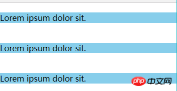
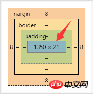
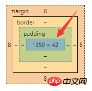
<span style="font-size: 14px;">margin重叠现象:<br><!DOCTYPE html><br><html lang="en"><br><head><br> <meta charset="UTF-8"><br> <meta name="viewport" content="width=device-width, initial-scale=1.0"><br> <meta http-equiv="X-UA-Compatible" content="ie=edge"><br> <title>margin重叠现象</title><br> <style type="text/css"><br> *{margin: 0;padding: 0;}<br> .box p {<br> margin: 20px 0px;<br> background-color: skyblue;<br> }<br> </style><br></head><br><body><br> <p class="box" ><br> <p>Lorem ipsum dolor sit.</p><br> <p>Lorem ipsum dolor sit.</p><br> <p>Lorem ipsum dolor sit.</p><br> </p><br></body><br></html><br></span>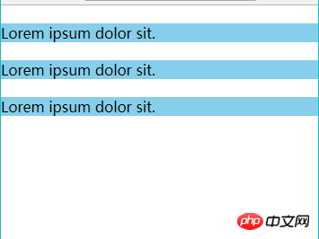
##Passed As a result of the experiment, we found that the upper and lower margins overlapped.
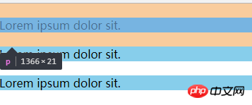
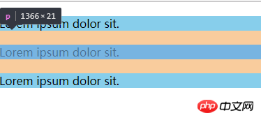
We can wrap a container around one of the elements and trigger the container to generate a BFC. Then the two elements belong to different BFCs, and margin overlap will not occur. We make the following modifications:
<span style="font-size: 14px;"><p class="box"><br> <p>Lorem ipsum dolor sit.</p><br> <p style="overflow:hidden;"><br> <p>Lorem ipsum dolor sit.</p><br> </p><br> <p>Lorem ipsum dolor sit.</p><br></p><br></span>
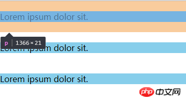
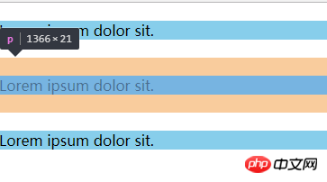
We use overflow:hidden; generates a BFC and successfully solves the margin overlap problem.
实例2、解决浮动问题
我们知道给父元素设置overflow:hidden可以清除子元素的浮动,但往往都不知道原理是什么。
其实这就是应用了BFC的原理:当在父元素中设置overflow:hidden时就会触发BFC,所以他内部的元素就不会影响外面的布局,BFC就把浮动的子元素高度当做了自己内部的高度去处理溢出,所以外面看起来是清除了浮动。
<span style="font-size: 14px;"><!DOCTYPE html><br><html lang="en"><br><head><br> <meta charset="UTF-8"><br> <meta name="viewport" content="width=device-width, initial-scale=1.0"><br> <meta http-equiv="X-UA-Compatible" content="ie=edge"><br> <title>BFC浮动问题</title><br> <style><br> .one {<br> /* 文档流 里面的文字标签将父元素撑起来 */<br> background-color: pink;<br> }<br> .two {<br> float: left;<br> }<br> </style><br></head><br><body><br> <!-- 文档流 从上到下,当遇到float、position:absolute时,会离开文档流 --><br> <p class="one"><br> <p class="two">Hello World!</p><br> </p><br> 你好世界!<br></body><br></html><br></span>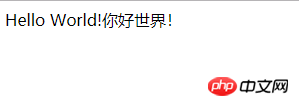
我们做如下修改:
<span style="font-size: 14px;">.one {<br> background-color: pink;<br> overflow: hidden;<br> }<br></span>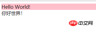
对比发现,当我们一个元素设置成为BFC之后,计算BFC元素高度的时候,浮动元素也参与了计算。
实例3、解决侵占浮动元素的问题
我们知道浮动元素会脱离文档流,然后浮盖在文档流元素上。
<span style="font-size: 14px;"><!DOCTYPE html><br><html lang="en"><br><head><br> <meta charset="UTF-8"><br> <meta name="viewport" content="width=device-width, initial-scale=1.0"><br> <meta http-equiv="X-UA-Compatible" content="ie=edge"><br> <title>BFC侵占浮动元素的问题</title><br> <style><br> .box1 {<br> float: left;<br> width: 100px;<br> height: 100px;<br> background-color: pink;<br> }<br> .box2 {<br> width: 200px;<br> height: 200px;<br> background-color: skyblue;<br> }<br> </style><br></head><br><body><br> <p class="box1">box1</p><br> <p class="box2">box2</p><br></body><br></html><br></span>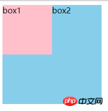
当一个元素浮动,另一个元素不浮动时,浮动元素因为脱离文档流就会盖在不浮动的元素上。
我们做如下修改:
<span style="font-size: 14px;">.box2 {<br> width: 200px;<br> height: 200px;<br> background-color: skyblue;<br> overflow: hidden;<br> }<br></span>或如下修改:
<span style="font-size: 14px;">.box2 {<br> width: 200px;<br> height: 200px;<br> background-color: skyblue;<br> /* overflow: hidden; */<br> float: left;<br> } <br></span>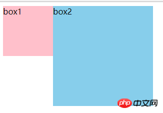
我们为非浮动元素建立BFC环境,根据BFC的不与float box重叠的规则,解决了侵占元素问题。
这一特性,我认为还是很有用的,特别是应用在两栏布局上,对比我们常规为非浮动元素或非定位元素设置margin来挤开的方法,其优点在于不需要去知道浮动或定位元素的宽度。
以上就是关于BFC的一些分析,BFC 是一种概念,是对前端布局技术的一种理论上的总结,掌握它可以让我们在使用CSS +p进行布局时,知道一些特殊操作以及规避问题的原理。BFC的概念比较抽象,但通过实例分析,有助于我们对BFC的理解。
相关推荐:
The above is the detailed content of BFC hidden in CSS. For more information, please follow other related articles on the PHP Chinese website!

Hot AI Tools

Undresser.AI Undress
AI-powered app for creating realistic nude photos

AI Clothes Remover
Online AI tool for removing clothes from photos.

Undress AI Tool
Undress images for free

Clothoff.io
AI clothes remover

Video Face Swap
Swap faces in any video effortlessly with our completely free AI face swap tool!

Hot Article
Hot Tools

Notepad++7.3.1
Easy-to-use and free code editor

SublimeText3 Chinese version
Chinese version, very easy to use

Zend Studio 13.0.1
Powerful PHP integrated development environment

Dreamweaver CS6
Visual web development tools

SublimeText3 Mac version
God-level code editing software (SublimeText3)
Hot Topics
 1389
1389
 52
52

 The Roles of HTML, CSS, and JavaScript: Core Responsibilities
Apr 08, 2025 pm 07:05 PM
The Roles of HTML, CSS, and JavaScript: Core Responsibilities
Apr 08, 2025 pm 07:05 PM
HTML defines the web structure, CSS is responsible for style and layout, and JavaScript gives dynamic interaction. The three perform their duties in web development and jointly build a colorful website.
 How to use bootstrap in vue
Apr 07, 2025 pm 11:33 PM
How to use bootstrap in vue
Apr 07, 2025 pm 11:33 PM
Using Bootstrap in Vue.js is divided into five steps: Install Bootstrap. Import Bootstrap in main.js. Use the Bootstrap component directly in the template. Optional: Custom style. Optional: Use plug-ins.
 How to write split lines on bootstrap
Apr 07, 2025 pm 03:12 PM
How to write split lines on bootstrap
Apr 07, 2025 pm 03:12 PM
There are two ways to create a Bootstrap split line: using the tag, which creates a horizontal split line. Use the CSS border property to create custom style split lines.
 Understanding HTML, CSS, and JavaScript: A Beginner's Guide
Apr 12, 2025 am 12:02 AM
Understanding HTML, CSS, and JavaScript: A Beginner's Guide
Apr 12, 2025 am 12:02 AM
WebdevelopmentreliesonHTML,CSS,andJavaScript:1)HTMLstructurescontent,2)CSSstylesit,and3)JavaScriptaddsinteractivity,formingthebasisofmodernwebexperiences.
 How to use bootstrap button
Apr 07, 2025 pm 03:09 PM
How to use bootstrap button
Apr 07, 2025 pm 03:09 PM
How to use the Bootstrap button? Introduce Bootstrap CSS to create button elements and add Bootstrap button class to add button text
 How to resize bootstrap
Apr 07, 2025 pm 03:18 PM
How to resize bootstrap
Apr 07, 2025 pm 03:18 PM
To adjust the size of elements in Bootstrap, you can use the dimension class, which includes: adjusting width: .col-, .w-, .mw-adjust height: .h-, .min-h-, .max-h-
 How to set up the framework for bootstrap
Apr 07, 2025 pm 03:27 PM
How to set up the framework for bootstrap
Apr 07, 2025 pm 03:27 PM
To set up the Bootstrap framework, you need to follow these steps: 1. Reference the Bootstrap file via CDN; 2. Download and host the file on your own server; 3. Include the Bootstrap file in HTML; 4. Compile Sass/Less as needed; 5. Import a custom file (optional). Once setup is complete, you can use Bootstrap's grid systems, components, and styles to create responsive websites and applications.
 How to insert pictures on bootstrap
Apr 07, 2025 pm 03:30 PM
How to insert pictures on bootstrap
Apr 07, 2025 pm 03:30 PM
There are several ways to insert images in Bootstrap: insert images directly, using the HTML img tag. With the Bootstrap image component, you can provide responsive images and more styles. Set the image size, use the img-fluid class to make the image adaptable. Set the border, using the img-bordered class. Set the rounded corners and use the img-rounded class. Set the shadow, use the shadow class. Resize and position the image, using CSS style. Using the background image, use the background-image CSS property.
