

Flex layout method of display attribute in CSS3

When I was learning the WeChat applet and designing the homepage layout, I came across a new layout method, display:flex. This article mainly introduces the Flex layout method of the display attribute in CSS3. The editor thinks it is quite good. Now I share it with everyone and give it as a reference. I hope it can help everyone.
 .container {
   display: flex;
   flex-direction: column;
   align-items: center;
   background-color: #b3d4db;
}The effect after compilation is very obvious, the layout of the interface is also very reasonable, and it looks very clear. So what is this attribute used for?
Flex is the abbreviation of Flexible Box, which means "flexible layout" and is used to provide maximum flexibility for box-shaped models. After setting to Flex layout, the float, clear and vertical-align attributes of child elements will be invalid.
It can be applied to containers or inline elements. (The above description is combined with the WeChat developer tool description) In 2009, W3C proposed a new solution-Flex layout, which can implement various page layouts simply, completely, and responsively. Currently, it is supported by all browsers, which means it is now safe to use this feature.
Basic concepts
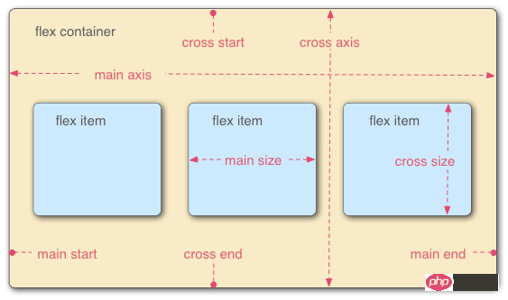
Elements that adopt Flex layout are called Flex containers (flex containers), referred to as "containers". All its child elements automatically become container members, called Flex items (flex items), referred to as "items". The container has two axes by default: the horizontal main axis and the vertical cross axis. The starting position of the main axis (the intersection with the border) is called main start, and the ending position is called main end; the starting position of the cross axis is called cross start, and the ending position is called cross end. Items are arranged along the main axis by default. The main axis space occupied by a single item is called main size, and the cross axis space occupied by a single item is called cross size.
The following 6 properties are set on the container:
flex-direction The arrangement direction of the items in the container (default horizontal arrangement)
flex-wrap The wrapping method of items in the container
flex-flow The abbreviation of the above two properties
justify-content How items are aligned on the main axis
align-items How items are aligned on the cross axis
align- content Defines the alignment of multiple axes. This property has no effect if the project has only one axis.
flex-direction
.box { 2 flex-direction: row | row-reverse | column | column-reverse; 3 }The optional value range of the attribute is row (default ) are arranged from left to right along the horizontal main axis, row-reverse is arranged from right to left along the horizontal main axis, column is arranged from top right to bottom and column-reverse along the vertical main axis.
flex-wrap
.box{ 2 flex-wrap: nowrap | wrap | wrap-reverse; 3 }The range of optional values of the attribute is nowrap (default) no line wrapping, wrap wrapping (The first line is above) and wrap-reverse (you know~)
flex-flow
.box { 2 flex-flow: <flex-direction> || <flex-wrap>; 3 }In the writing attribute, just connect the values of the above two methods with ||
justify-content
.box { 2 justify-content: flex-start | flex-end | center | space-between | space-around; 3 }The alignment of the items on the main axis (which axis the main axis is depends on the setting of the attribute flex-direction)
flex-start: Arrange from left or top on the main axis
flex-end: Arrange from the right or bottom on the main axis
center: Arrange in the center on the main axis
space-between: Arrange from the left and right ends or the upper and lower ends on the main axis
space-around: Each item is equally spaced on both sides. Therefore, the space between items is twice as large as the space between items and the border.
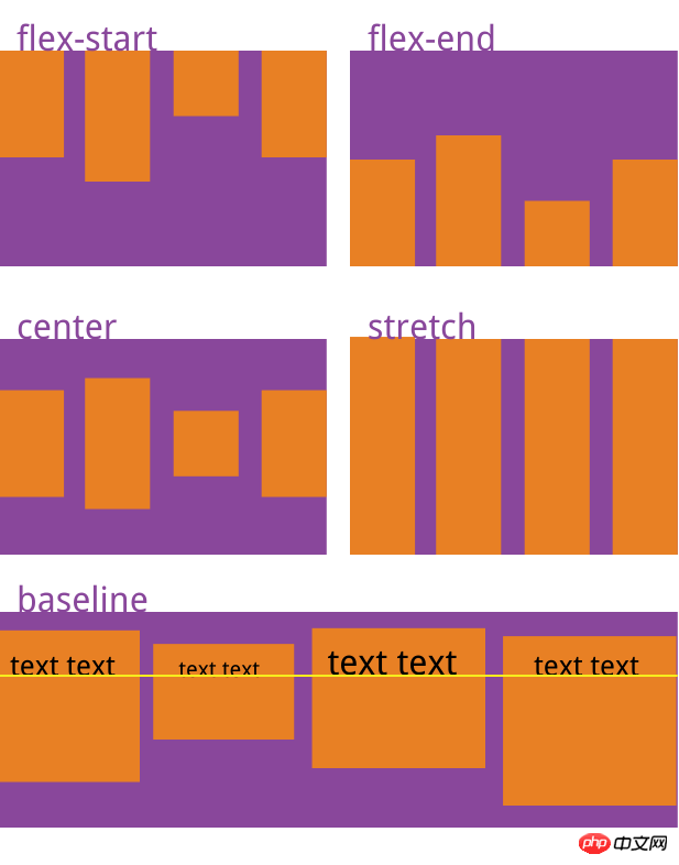
align-items
.box { 2 align-items: flex-start | flex-end | center | baseline | stretch; 3 }It will be clearer to explain directly with the pictures
align-content
.box { 2 align-content: flex-start | flex-end | center | space-between | space-around | stretch; 3 }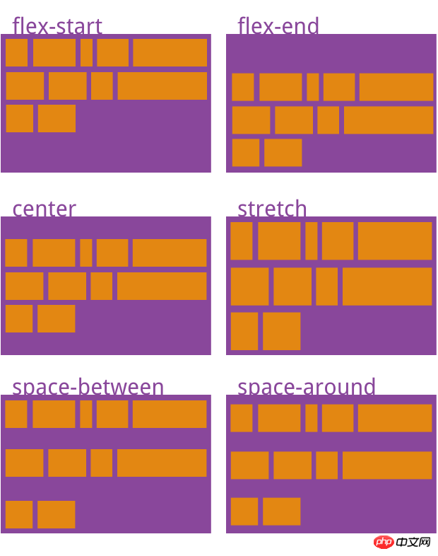
The above introduction to the container is complete The attributes in the container, let’s talk about the attributes of the items in the container:
order The order of the items. The smaller the value, the higher the ranking. The default is 0.
flex-grow The magnification ratio of the item, the default is 0, that is, if there is remaining space, it will not be enlarged.
flex-shrink The shrinkage ratio of the item, the default is 1, that is, if there is insufficient space, the item will shrink.
flex-basis The main size that the item occupies before allocating excess space. The browser uses this attribute to calculate whether there is extra space on the main axis. Its default value is auto, which is the original size of the project.
flex is the abbreviation of flex-grow, flex-shrink and flex-basis. The default value is 0 1 auto. The last two properties are optional.
align-self Allows a single item to be aligned differently from other items by overriding the align-items attribute. The default value is auto, which means inheriting the align-items attribute of the parent element. If there is no parent element, it is equivalent to stretch.
order
     .item {
       order: <integer>;
}flex-grow
     .item {
       flex-grow: <number>; /* default 0 */
}flex-shrink
     .item {
       flex-shrink: <number>; /* default 1 */
}flex-basis
    .item {
       flex-basis: <length> | auto; /* default auto */
}flex
.item {
flex: none | [ <'flex-grow'> <'flex-shrink'>? || <'flex-basis'> ]
}align-self
     .item {
       align-self: auto | flex-start | flex-end | center | baseline | stretch;
}容器属性和项目属性是可以配合使用的,用法类似于CSS的行内式和嵌入式的道理一样。希望你可以在实际应用中熟练使用。
相关推荐:
The above is the detailed content of Flex layout method of display attribute in CSS3. For more information, please follow other related articles on the PHP Chinese website!

Hot AI Tools

Undresser.AI Undress
AI-powered app for creating realistic nude photos

AI Clothes Remover
Online AI tool for removing clothes from photos.

Undress AI Tool
Undress images for free

Clothoff.io
AI clothes remover

AI Hentai Generator
Generate AI Hentai for free.

Hot Article
Hot Tools

Notepad++7.3.1
Easy-to-use and free code editor

SublimeText3 Chinese version
Chinese version, very easy to use

Zend Studio 13.0.1
Powerful PHP integrated development environment

Dreamweaver CS6
Visual web development tools

SublimeText3 Mac version
God-level code editing software (SublimeText3)
Hot Topics
 1378
1378
 52
52

 Fujifilm X-M5 price expectations rise as leaked selfie display adds complexity to the formerly affordable camera line
Sep 07, 2024 am 09:34 AM
Fujifilm X-M5 price expectations rise as leaked selfie display adds complexity to the formerly affordable camera line
Sep 07, 2024 am 09:34 AM
Fujifilm fans were recently very excited at the prospect of the X-T50, since it presented a relaunch of the budget-oriented Fujifilm X-T30 II that had become quite popular in the sub-$1,000 APS-C category. Unfortunately, as the Fujifilm X-T50's launc
 Apple Studio Display's power cord is detachable, but requires special tools
May 17, 2023 pm 03:05 PM
Apple Studio Display's power cord is detachable, but requires special tools
May 17, 2023 pm 03:05 PM
Apple Studio Display is now officially available in stores, and many customers around the world have purchased the product. Unlike the ProDisplayXDR, the StudioDisplay has a unique power connector that appears to be non-removable. It turns out that the cable is removable, but you'll need a special tool to remove it. Apple says on its website that the Studio Display's power cord is not detachable -- and many users think so. That's because removing the cable with your hands seems impossible, but luckily the cable can be detached from the monitor. , Apple has a special tool for extracting information from its new StudioDispl
 Comparison: Apple Studio Display vs Samsung Smart Monitor M8
May 11, 2023 pm 10:46 PM
Comparison: Apple Studio Display vs Samsung Smart Monitor M8
May 11, 2023 pm 10:46 PM
Samsung Smart Display M8 vs. Apple Studio Display: Design and Size Since its launch, the Apple Studio Display has been compared to the iMac, consisting of a relatively thin panel on a relatively simple L-shaped stand. It's a well-known and well-loved aesthetic, and Samsung seems to have borrowed it for its presentation. The Samsung SmartMonitor M8 uses the same idea of a thin screen on a stand that looks very similar. Some minor elements are different, such as the small section in the lower left corner that sticks out a bit and the Samsung's chin is very thin, but they seem to be close in terms of basic design. Samsung seems to have taken a lot of inspiration from the 24-inch iMac. Apple's display is smaller than Samsung's
 Samsung: New, large display based on E Ink technology displays colors and communicates wirelessly
Jun 19, 2024 pm 03:37 PM
Samsung: New, large display based on E Ink technology displays colors and communicates wirelessly
Jun 19, 2024 pm 03:37 PM
We frequently report on devices based on displays with electronic ink, such as e-readers. The technology offers a number of advantages: it can be read in bright environments without a backlight, and it only requires power when switching without light
 How to implement lace borders in css3
Sep 16, 2022 pm 07:11 PM
How to implement lace borders in css3
Sep 16, 2022 pm 07:11 PM
In CSS, you can use the border-image attribute to achieve a lace border. The border-image attribute can use images to create borders, that is, add a background image to the border. You only need to specify the background image as a lace style; the syntax "border-image: url (image path) offsets the image border width inward. Whether outset is repeated;".
 Comparison: Apple Studio Display vs LG UltraFine 5K Display: Which one is better?
Apr 16, 2023 pm 08:25 PM
Comparison: Apple Studio Display vs LG UltraFine 5K Display: Which one is better?
Apr 16, 2023 pm 08:25 PM
StudioDisplay and LG UltraFine5KDisplay occupy similar positions in the market, but Apple's monitor is $300 more expensive. Here's everything you need to know about how these monitors compare. Six years is a long time in the tech world, and it's also the time since Apple has sold a branded monitor that costs less than $5,000. During this time, Apple partnered with LG to sell the LG UltraFine series, which catered specifically to Mac users. In 2019, Apple stopped selling these LG monitors in favor of ProDisplayXDR, an affordable Mac-friendly display
 Boot Camp updated to support Apple Studio Display
May 20, 2023 pm 11:34 PM
Boot Camp updated to support Apple Studio Display
May 20, 2023 pm 11:34 PM
IntelMac users running Windows on a Mac can now update their drivers in BootCamp to support Apple's StudioDisplay. Apple regularly updates BootCamp to introduce support for new hardware, as well as typical compatibility and performance improvements. In the March software update, Apple has enabled BootCamp to work with the new StudioDisplay. The update that brings BootCamp to version 6.1.17 introduces two key support elements. First, it adds compatibility with StudioDisplay, ensuring
 display what does it mean
Oct 26, 2023 am 11:50 AM
display what does it mean
Oct 26, 2023 am 11:50 AM
Display usually refers to the operation or function of displaying data, information or results to the user in some way or outputting it to a screen or other device. Specific meaning: 1. In the command line interface (CLI), display may refer to outputting data in text, tables or other formats to the terminal window for users to view or analyze; 2. In the graphical user interface (GUI), Display may refer to displaying images, text, charts and other content on the application window or interface for user interaction or browsing, etc.
