Examples to explain the usage of WeChat applet tabBar
This article mainly introduces the usage of tabBar in WeChat mini program, and analyzes the function, configuration item usage and operation precautions of tabBar in WeChat mini program in detail with examples. I hope it can help everyone.
1. Effect display

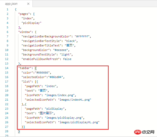
##2. Principle: Configure the tabBar attribute in app.json
{
 "pages": [
  "index",
  "picDisplay"
 ],
 "window": {
  "navigationBarBackgroundColor": "#ffffff",
  "navigationBarTextStyle": "black",
  "navigationBarTitleText": "首页",
  "backgroundColor": "#eeeeee",
  "backgroundTextStyle": "light",
  "enablePullDownRefresh": false
 },
 "tabBar": {
  "color":"#666666",
  "selectedColor":"#06bd04",
  "list": [{
   "pagePath": "index",
   "text": "首页",
   "iconPath": "images/index.png",
   "selectedIconPath": "images/indexHL.png"
  },{
   "pagePath": "picDisplay",
   "text": "图片展示",
   "iconPath": "images/picDisplay.png",
   "selectedIconPath": "images/picDisplayHL.png"
  }]
 }
}##3. Key code
"tabBar": {
  "color":"#666666",
  "selectedColor":"#06bd04",
  "list": [{
   "pagePath": "index",
   "text": "首页",
   "iconPath": "images/index.png",
   "selectedIconPath": "images/indexHL.png"
  },{
   "pagePath": "picDisplay",
   "text": "图片展示",
   "iconPath": "images/picDisplay.png",
   "selectedIconPath": "images/picDisplayHL.png"
  }]
}4. Operation methodCreate a new project, open the app.json file, and add the key code Copy to "window": {}, after which, note the comma before the braces of window, as shown below
 Configure the tabBar attribute value
"tabBar": {
  //设置tabBar文字默认颜色
  "color":"#666666",
  //设置tabBar文字被选中是的颜色
  "selectedColor":"#06bd04",
  //tab列表,数组类型,改数组内至少要有两个但不大于5个的tab对象
  "list": [{
   //设置tab跳转页面链接
   "pagePath": "index",
   //设置tab上的文字
   "text": "首页",
   //设置tab上的默认图标
   "iconPath": "images/index.png",
   //设置tab被选中时的图标
   "selectedIconPath": "images/indexHL.png"
  },{
   "pagePath": "picDisplay",
   "text": "图片展示",
   "iconPath": "images/picDisplay.png",
   "selectedIconPath": "images/picDisplayHL.png"
  }]
}1)
color: No font color selected 2)
selectedColor:Select the font color3)
borderStyle:The color of the line above the tabbar white (only white and black are supported) 4)
backgroundColor:tabbar background color5)
list: Set rab list items (minimum 2, maximum 5 tabs).
In addition, list is an array attribute, and each item is an object. List can set 4 attributes:①
text: Set the text on the tab ②
iconPath: Set the image path displayed when the tab is inactive. ③
selectedIconPath: Set the image path when the tab is active (iconPath and selectedIconPath image size limits are both 40KB) ④
pagePath: Set the jump page path when tab is pressed (This page must be configured in pages) Related recommendations:
The above is the detailed content of Examples to explain the usage of WeChat applet tabBar. For more information, please follow other related articles on the PHP Chinese website!

Hot AI Tools

Undresser.AI Undress
AI-powered app for creating realistic nude photos

AI Clothes Remover
Online AI tool for removing clothes from photos.

Undress AI Tool
Undress images for free

Clothoff.io
AI clothes remover

AI Hentai Generator
Generate AI Hentai for free.

Hot Article

Hot Tools

Notepad++7.3.1
Easy-to-use and free code editor

SublimeText3 Chinese version
Chinese version, very easy to use

Zend Studio 13.0.1
Powerful PHP integrated development environment

Dreamweaver CS6
Visual web development tools

SublimeText3 Mac version
God-level code editing software (SublimeText3)

Hot Topics
 Analyze the usage and classification of JSP comments
Feb 01, 2024 am 08:01 AM
Classification and Usage Analysis of JSP Comments JSP comments are divided into two types: single-line comments: ending with, only a single line of code can be commented. Multi-line comments: starting with /* and ending with */, you can comment multiple lines of code. Single-line comment example Multi-line comment example/**This is a multi-line comment*Can comment on multiple lines of code*/Usage of JSP comments JSP comments can be used to comment JSP code to make it easier to read
 Usage of WPSdatedif function
Feb 20, 2024 pm 10:27 PM
WPS is a commonly used office software suite, and the WPS table function is widely used for data processing and calculations. In the WPS table, there is a very useful function, the DATEDIF function, which is used to calculate the time difference between two dates. The DATEDIF function is the abbreviation of the English word DateDifference. Its syntax is as follows: DATEDIF(start_date,end_date,unit) where start_date represents the starting date.
 Implement card flipping effects in WeChat mini programs
Nov 21, 2023 am 10:55 AM
Implementing card flipping effects in WeChat mini programs In WeChat mini programs, implementing card flipping effects is a common animation effect that can improve user experience and the attractiveness of interface interactions. The following will introduce in detail how to implement the special effect of card flipping in the WeChat applet and provide relevant code examples. First, you need to define two card elements in the page layout file of the mini program, one for displaying the front content and one for displaying the back content. The specific sample code is as follows: <!--index.wxml-->&l
 How to correctly use the exit function in C language
Feb 18, 2024 pm 03:40 PM
How to use the exit function in C language requires specific code examples. In C language, we often need to terminate the execution of the program early in the program, or exit the program under certain conditions. C language provides the exit() function to implement this function. This article will introduce the usage of exit() function and provide corresponding code examples. The exit() function is a standard library function in C language and is included in the header file. Its function is to terminate the execution of the program, and can take an integer
 Alipay launched the 'Chinese Character Picking-Rare Characters' mini program to collect and supplement the rare character library
Oct 31, 2023 pm 09:25 PM
According to news from this site on October 31, on May 27 this year, Ant Group announced the launch of the "Chinese Character Picking Project", and recently ushered in new progress: Alipay launched the "Chinese Character Picking-Uncommon Characters" mini program to collect collections from the society Rare characters supplement the rare character library and provide different input experiences for rare characters to help improve the rare character input method in Alipay. Currently, users can enter the "Uncommon Characters" applet by searching for keywords such as "Chinese character pick-up" and "rare characters". In the mini program, users can submit pictures of rare characters that have not been recognized and entered by the system. After confirmation, Alipay engineers will make additional entries into the font library. This website noticed that users can also experience the latest word-splitting input method in the mini program. This input method is designed for rare words with unclear pronunciation. User dismantling
 Introduction to Python functions: Usage and examples of abs function
Nov 03, 2023 pm 12:05 PM
Introduction to Python functions: usage and examples of the abs function 1. Introduction to the usage of the abs function In Python, the abs function is a built-in function used to calculate the absolute value of a given value. It can accept a numeric argument and return the absolute value of that number. The basic syntax of the abs function is as follows: abs(x) where x is the numerical parameter to calculate the absolute value, which can be an integer or a floating point number. 2. Examples of abs function Below we will show the usage of abs function through some specific examples: Example 1: Calculation
 How uniapp achieves rapid conversion between mini programs and H5
Oct 20, 2023 pm 02:12 PM
How uniapp can achieve rapid conversion between mini programs and H5 requires specific code examples. In recent years, with the development of the mobile Internet and the popularity of smartphones, mini programs and H5 have become indispensable application forms. As a cross-platform development framework, uniapp can quickly realize the conversion between small programs and H5 based on a set of codes, greatly improving development efficiency. This article will introduce how uniapp can achieve rapid conversion between mini programs and H5, and give specific code examples. 1. Introduction to uniapp unia
 Introduction to Python functions: Usage and examples of isinstance function
Nov 04, 2023 pm 03:15 PM
Introduction to Python functions: Usage and examples of the isinstance function Python is a powerful programming language that provides many built-in functions to make programming more convenient and efficient. One of the very useful built-in functions is the isinstance() function. This article will introduce the usage and examples of the isinstance function and provide specific code examples. The isinstance() function is used to determine whether an object is an instance of a specified class or type. The syntax of this function is as follows


