This article mainly introduces the relevant information on how to understand CSS layout and block-level formatting context. The editor thinks it is quite good. Now I will share it with you. The CSS source code is available for your reference. Friends who are interested in CSS, please follow the editor to take a look.
The concept of BFC began with CSS2, which is a very old CSS topic. Introductions to BFC can be found everywhere on the Internet, but they are not enough. concise. This article is translated from Ms. Rachel Andrew’s blog post Understanding CSS Layout And The Block Formatting Context. The content is concise and clear enough.
The purpose of this article is to introduce some concepts to help you enhance your CSS coding power. As the title indicates, this article mainly talks about Block Formatting Context (BFC, Block Formatting Context). You may not have heard of this term, but if you've ever used CSS layout, you'll understand it. It is very useful to understand what BFC is, how it works, and how to create a BFC, which can help you better understand CSS layout.
In this article, I will explain BFC through a few examples that will be familiar to you. I'll also tell you about a new display value that you may need once you understand BFC.
What is BFC
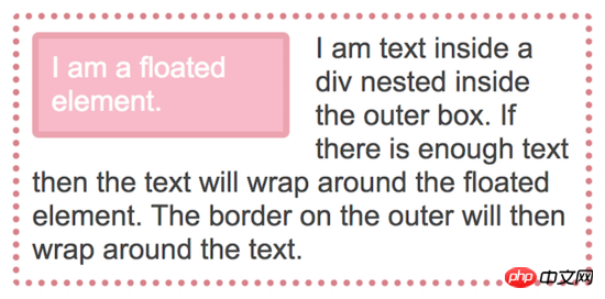
A simple floating example can understand the behavior of BFC. In the following example we create a box element that wraps a piece of text and a floating image. If there is a lot of text content, the text will surround the entire floating image, and the border of the box will wrap them entirely.
<p class="outer">
	<p class="float">I am a floated element.</p>
	I am text inside the outer box.
</p>
##
.outer {
      border: 5px dotted rgb(214,129,137);
      border-radius: 5px;
      width: 450px;
      padding: 10px;
      margin-bottom: 40px;
}

.float {
      padding: 10px;
      border: 5px solid rgba(214,129,137,.4);
      border-radius: 5px;
      background-color: rgba(233,78,119,.4);
      color: #fff;
      float: left;
      width: 200px;
      margin: 0 20px 0 0;
} ##Text surrounds floating elements
But if some text is deleted, there will not be enough text to surround the image (floating element). At the same time, because the floating element is out of the document flow, the border height of the box element will be reduced. Decreases as text decreases.
 Without enough text, the height of the box element border will be lower than the height of the floating element
The reason why this happens is because when we After floating an element, the box element still maintains its original width. The space occupied by the text is shortened to make room for the floating element. This is why the background and border can appear to wrap the floating element.
We usually use two different ways to solve this problem. One is to use clear hack, which is to insert a p below the text and image and add its CSS
clear The property is set to both. Another method is to use the overflow attribute and set it to a value other than the default visible.
.outer {
      overflow: auto;
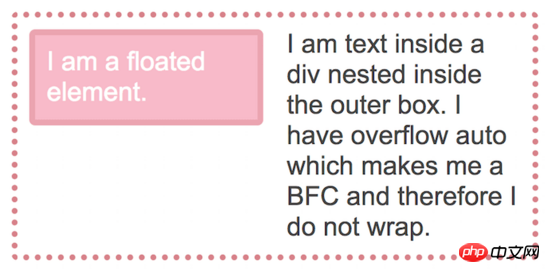
}##make  use overflow: auto
overflow can be effective because when it is right or wrongvisible
Wrapping floating elements. BFC is a mini layout in the layout
You can think of BFC as a small layout in your page. When an element is created as a BFC, its All elements will be wrapped by it. As we can see, when the box element becomes BFC, the floated element in it can no longer break through its bottom. In addition to this, BFC has some useful features.
BFC can block
MarginsOverlay (margins collapsing)Understanding margins collapsing is another underrated CSS trick. In the following example, I created a p with a gray background. This p contains two paragraphs. The margin-bottom of the p element is 40px, and each paragraph has a 20px margin-top
and margin-bottom..outer {
background-color: #ccc;
margin: 0 0 40px 0;
}
p {
padding: 0;
margin: 20px 0 20px 0;
background-color: rgb(233,78,119);
color: #fff;
}Since there is nothing between the edge of the p element and the edge of the outer element, the margins of outer and p will overlap. p will be flush with the top and bottom of the outer, and the outer margin of p seems to be merged with the outer margin, making it impossible for us to see the gray background of the outer above and below the paragraph.
Due to margin collapse, we see that there is no gray background up and down inside the outer element
.outer {
       background-color: #ccc;
      margin: 0 0 40px 0;
      overflow: auto;
}
建立 BFC 后,外边距不再叠加
一旦 BFC 建立,它就会阻止它内部的元素逃离突破它。
一个 BFC 会停止去环绕浮动元素
你可能很熟悉 BFC 的这个特性,我们在有浮动元素的列类型布局中常用到。如果一个元素创建了 BFC,它就不会去环绕(或者说包装?)任何浮动元素。看下面这个示例:
<p class="outer">
      <p class="float">I am a floated element.</p>
      <p class="text">I am text</p>
</p>class 名为 float 的元素将会浮动在布局的左侧,class 名为 text 的 p 元素将会在它后面并环绕它。

文字环绕着浮动元素
我们可以通过给 text 元素建立 BFC 来阻挡这种环绕行为。
.text {
      overflow: auto;
}
text 元素建立 BFC 后就不再环绕浮动元素了
该方法也是我们创建浮动布局的基本方式。还需注意的是浮动一个元素时也会给该元素创建 BFC,也就是说此时 .float 与 .text 都是 BFC,这也是无论右侧高度低于还是高于左侧两者都不会互相围绕的原因。
创建一个 BFC 的常用方式
除了使用 overflow 外, 一些其他的 CSS 属性也可以创建 BFC,比如上面我们所见,浮动一个元素也可以为该元素创建 BFC,浮动元素会包裹它内部的所有元素。还有以下几种方式可以创建 BFC:
使用 position: absolute 或者 position: fixed 。
使用 display: inline-block 、 display: table-cell 或者 display: table-caption ,其中 table-cell 和 table-caption 是表格相关 HTML 元素的对应默认 CSS 值,所以当你创建表格每个表格单元都会自动创建 BFC。
另外当使用 multi-column layout (多列布局)时使用 colum-span: all 也可以创建 BFC。Flex(弹性) 和 Grid(网格) 布局中的元素也会自动创建类似 BFC 的机制,只是它们被称为 Flex Formatting Context(弹性格式上下文)和 Grid Formatting Context(网格格式上下文)。这反映了它们所参与的布局类型。一个 Block Formatting Context(块级格式上下文)表明他内部的元素参与了块级布局,一个 弹性格式上下文意味着它内部的元素参与了弹性布局。在实践中,这几种布局的结果是相似的,浮动元素会被包裹、外边距不会叠加。
创建 BFC 的新方式
使用 overflow 或其他的方法创建 BFC 时会有两个问题。第一个是这些方法本身是有自身的设计目的的,所以在使用它们创建 BFC 时会可能产生副作用。例如使用 overflow 创建 BFC 后在某些情况下你可能会看到出现一个滚动条或者元素内容被削减。这是由于 overflow 属性是设计被用来让你告诉浏览器如何定义元素的溢出状态的。浏览器执行了它最基本的定义。
另一个问题是,即使在没有出现副作用的情况下,使用 overflow 也可能会使另一个开发人员感到困惑。他们可能会各种猜想:这里为啥要把 overflow 的值设为 auto 或 scroll?原开发人员做这个意义何在?原开发人员是想让这里出现滚动条吗?
最安全的做法应该是创建一个 BFC 时不会有任何副作用,它内部的元素都安安全全的呆在这个小布局里,这种方法不会引起任何意想不到的问题,也可以让开发者意图清晰。CSS 工作组也十分认同这种想法,所以他们定制了一个新的属性值: display: flow-root 。
你可以使用 display: flow-root 安全的创建 BFC 来解决本文中提到的各种问题,包括:包裹浮动元素、阻止外边距叠加、阻止环绕浮动元素。

caniuse 上 display: flow-root 各浏览器支持情况
Browser support for this attribute value is currently limited. If you think this attribute value is very convenient, please vote to let Edge support it. But anyway, you should now understand what BFC is, and how to use overflow or other methods to wrap floats, and know that BFC can prevent elements from surrounding floated elements. If you want to use elastic or grid layout, you can do it in some different ways. Support their browsers to use these features of BFC for downgrade processing.
Understanding how browsers lay out web pages is very basic. While it may seem inconsequential at times, these little things can speed up the time it takes to create and debug CSS layouts.
The above is the entire content of this article. I hope it will be helpful to everyone's learning. I also hope that everyone will support the PHP Chinese website.
Related recommendations:
CSS method to achieve perfect horizontal arrangement of photo albums
Use pure CSS to implement the filter menu function
Detailed explanation of CSS to add asterisks to required options in the form
The above is the detailed content of How to understand CSS layout and block-level formatting context_CSS tutorial_CSS_Web page production. For more information, please follow other related articles on the PHP Chinese website!


