
 Web Front-end
HTML Tutorial
Summary of pixel display problems in mobile development tutorials_Experiences and tips_Web page production
Web Front-end
HTML Tutorial
Summary of pixel display problems in mobile development tutorials_Experiences and tips_Web page production
Summary of pixel display problems in mobile development tutorials_Experiences and tips_Web page production

Recently during development, I discovered some problems with mobile pixels that I have never noticed before. This article mainly introduces you to relevant information about pixel display problems in mobile development tutorials. The article uses sample code The introduction is very detailed and has certain reference value for everyone's study or work. Friends who need it can follow the editor to study together.
Preface
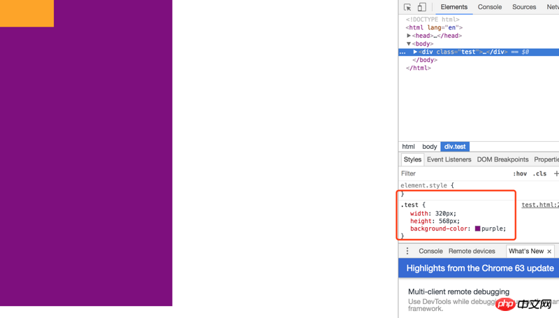
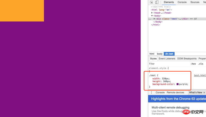
I believe that in the process of mobile terminal development, everyone will find that the display on the mobile terminal is generally different from that on the desktop terminal. For example, when a block element with a size of 1334x750 pixels is displayed on the iPhone 6, although the nominal screen pixel density of the iPhone 6 on Apple's official website is 1334x750, we found that this block element with a size of 1334x750 pixels cannot cover the entire screen.
Then why? Let’s discuss it from several aspects.
Pixel density (PPI)
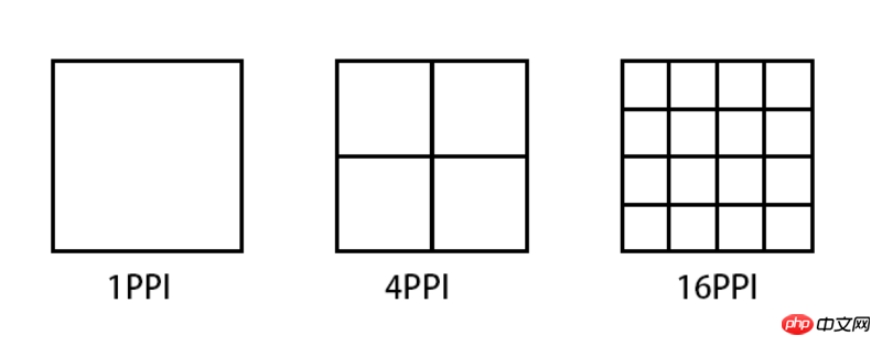
PPI (Pixel Per Inch), which means how many pixels per inch, similar to population Density and building density, the following figure illustrates several PPI representations.
Taking iPhone6 as an example, the general calculation formula for pixel density is: Math.sqrt(1366*1366 + 640*640)
But to calculate this PPI, we first need to know how many pixels there are on the device's screen, which is the first Pixel in Pixel Per Inch.
Device pixel (DP) && Device pixel ratio (DPR)
Device pixel (Device pixel), also called physical pixel (Physical pixel) ), which is the screen specifications of iPhone 6 mentioned at the beginning of this article. The pixels referred to in pixel density are device pixels. For general display devices, one pixel corresponds to a luminous point on the screen, so PPI is also called DPI (dots per inch), but this is only true on display devices. Equivalently, for example, it is different on a printer.
Since the screen specifications of each mobile phone on the market are different, some are 720P, some are 1080P, even 2K, etc. Some of the screens of these devices have more pixels and some have less pixels. If the same pixel is displayed , a situation like the following will occur:
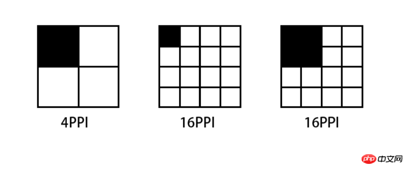
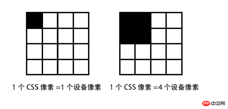
The higher the PPI screen, the smaller the area that displays one pixel. A picture composed of 4x4 pixels If it is displayed on a screen with a PPI of 64, then the display will be reduced to half of the original size when switched to a screen with 256PPI.
Conversely, if you want to display the same effect on a screen with a PPI of 256 as a screen with a PPI of 64, you have to enlarge the image by 2 times.
Therefore, for mobile phones equipped with high-definition screens, manufacturers must ensure that all types of materials are displayed on their devices in the same way as standard-definition devices for the usability of their devices, that is, icons and text can be correctly recognized and clicked accurately. The solution is to enlarge all sizes several times. This magnification ratio is called Device Pixel Ratio (DPR). Generally, DPR corresponds to the following table:
| Ȧ | ##ldpimdpi | hdpi | xhdpi | |
|---|---|---|---|---|
| 120 | 160 | 240 | 320 | ##dpr |
| 1.0 | 1.5 | 2.0 |
The above is the detailed content of Summary of pixel display problems in mobile development tutorials_Experiences and tips_Web page production. For more information, please follow other related articles on the PHP Chinese website!

Hot AI Tools

Undresser.AI Undress
AI-powered app for creating realistic nude photos

AI Clothes Remover
Online AI tool for removing clothes from photos.

Undress AI Tool
Undress images for free

Clothoff.io
AI clothes remover

Video Face Swap
Swap faces in any video effortlessly with our completely free AI face swap tool!

Hot Article
Hot Tools

Notepad++7.3.1
Easy-to-use and free code editor

SublimeText3 Chinese version
Chinese version, very easy to use

Zend Studio 13.0.1
Powerful PHP integrated development environment

Dreamweaver CS6
Visual web development tools

SublimeText3 Mac version
God-level code editing software (SublimeText3)
Hot Topics
 1390
1390
 52
52

 Tutorial on how to use Dewu
Mar 21, 2024 pm 01:40 PM
Tutorial on how to use Dewu
Mar 21, 2024 pm 01:40 PM
Dewu APP is currently a very popular brand shopping software, but most users do not know how to use the functions in Dewu APP. The most detailed usage tutorial guide is compiled below. Next is the Dewuduo that the editor brings to users. A summary of function usage tutorials. Interested users can come and take a look! Tutorial on how to use Dewu [2024-03-20] How to use Dewu installment purchase [2024-03-20] How to obtain Dewu coupons [2024-03-20] How to find Dewu manual customer service [2024-03-20] How to check the pickup code of Dewu [2024-03-20] Where to find Dewu purchase [2024-03-20] How to open Dewu VIP [2024-03-20] How to apply for return or exchange of Dewu
 In summer, you must try shooting a rainbow
Jul 21, 2024 pm 05:16 PM
In summer, you must try shooting a rainbow
Jul 21, 2024 pm 05:16 PM
After rain in summer, you can often see a beautiful and magical special weather scene - rainbow. This is also a rare scene that can be encountered in photography, and it is very photogenic. There are several conditions for a rainbow to appear: first, there are enough water droplets in the air, and second, the sun shines at a low angle. Therefore, it is easiest to see a rainbow in the afternoon after the rain has cleared up. However, the formation of a rainbow is greatly affected by weather, light and other conditions, so it generally only lasts for a short period of time, and the best viewing and shooting time is even shorter. So when you encounter a rainbow, how can you properly record it and photograph it with quality? 1. Look for rainbows. In addition to the conditions mentioned above, rainbows usually appear in the direction of sunlight, that is, if the sun shines from west to east, rainbows are more likely to appear in the east.
 Tutorial on how to turn off the payment sound on WeChat
Mar 26, 2024 am 08:30 AM
Tutorial on how to turn off the payment sound on WeChat
Mar 26, 2024 am 08:30 AM
1. First open WeChat. 2. Click [+] in the upper right corner. 3. Click the QR code to collect payment. 4. Click the three small dots in the upper right corner. 5. Click to close the voice reminder for payment arrival.
 DisplayX (monitor testing software) tutorial
Mar 04, 2024 pm 04:00 PM
DisplayX (monitor testing software) tutorial
Mar 04, 2024 pm 04:00 PM
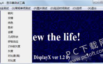
Testing a monitor when buying it is an essential part to avoid buying a damaged one. Today I will teach you how to use software to test the monitor. Method step 1. First, search and download the DisplayX software on this website, install it and open it, and you will see many detection methods provided to users. 2. The user clicks on the regular complete test. The first step is to test the brightness of the display. The user adjusts the display so that the boxes can be seen clearly. 3. Then click the mouse to enter the next link. If the monitor can distinguish each black and white area, it means the monitor is still good. 4. Click the left mouse button again, and you will see the grayscale test of the monitor. The smoother the color transition, the better the monitor. 5. In addition, in the displayx software we
 What software is photoshopcs5? -photoshopcs5 usage tutorial
Mar 19, 2024 am 09:04 AM
What software is photoshopcs5? -photoshopcs5 usage tutorial
Mar 19, 2024 am 09:04 AM
PhotoshopCS is the abbreviation of Photoshop Creative Suite. It is a software produced by Adobe and is widely used in graphic design and image processing. As a novice learning PS, let me explain to you today what software photoshopcs5 is and how to use photoshopcs5. 1. What software is photoshop cs5? Adobe Photoshop CS5 Extended is ideal for professionals in film, video and multimedia fields, graphic and web designers who use 3D and animation, and professionals in engineering and scientific fields. Render a 3D image and merge it into a 2D composite image. Edit videos easily
 How to change pixels on Meitu Xiuxiu How to change pixels on Meitu Xiuxiu
Mar 12, 2024 pm 02:50 PM
How to change pixels on Meitu Xiuxiu How to change pixels on Meitu Xiuxiu
Mar 12, 2024 pm 02:50 PM
How to change the pixels of Meitu Xiuxiu? Meitu Xiuxiu is a mobile photo editing software with many functions, dedicated to providing users with an excellent photo editing experience. In the software, we can perform many operations on our photos, such as portrait beauty, skin whitening, facial reshaping, face slimming, etc. If we are not satisfied, we can just click on it to create perfect proportions easily. For the repaired photos, we can also adjust their size and pixels before saving. So, do you know how to pixel? For those who don’t know yet, let’s take a look at the method shared by the editor below. How to change the pixels of MeituXiuXiu 1. Double-click to open MeituXiuXiu, click to select the "Beautify Picture" option; 2. In the beautify picture, click "Size"
 Experts teach you! The Correct Way to Cut Long Pictures on Huawei Mobile Phones
Mar 22, 2024 pm 12:21 PM
Experts teach you! The Correct Way to Cut Long Pictures on Huawei Mobile Phones
Mar 22, 2024 pm 12:21 PM
With the continuous development of smart phones, the functions of mobile phones have become more and more powerful, among which the function of taking long pictures has become one of the important functions used by many users in daily life. Long screenshots can help users save a long web page, conversation record or picture at one time for easy viewing and sharing. Among many mobile phone brands, Huawei mobile phones are also one of the brands highly respected by users, and their function of cropping long pictures is also highly praised. This article will introduce you to the correct method of taking long pictures on Huawei mobile phones, as well as some expert tips to help you make better use of Huawei mobile phones.
 How to set the pixel height of Meitu Xiuxiu
Mar 27, 2024 am 11:00 AM
How to set the pixel height of Meitu Xiuxiu
Mar 27, 2024 am 11:00 AM
In the digital age, pictures have become an integral part of our daily lives and work. Whether it is sharing on social media or presenting in a work report, high-quality pictures can add a lot of points to us. However, many times the pixels of the pictures in our hands are not satisfactory. In this case, we need to use some tools to adjust the pixel height to meet the needs of different scenes. So this tutorial guide will introduce in detail how to use Meitu Xiuxiu to adjust the pixels of pictures. I hope it can help you! First of all, please find the [Meitu Xiu Xiu] icon on your mobile phone, click to enter the main interface, and then click on the [Beautify Pictures] item. 2. The second step, next, we come to the [Camera Roll] page as shown in the picture, please click on yourself
