
 Web Front-end
JS Tutorial
Detailed explanation of the difference between .nav and .navbar in bootstrap
Web Front-end
JS Tutorial
Detailed explanation of the difference between .nav and .navbar in bootstrap
Detailed explanation of the difference between .nav and .navbar in bootstrap

The navigation bar is a great feature and a prominent feature of Bootstrap websites. The navigation bar serves as the responsive foundational component of the navigation header in your app or website. The navigation bar collapses in mobile viewports and expands horizontally as the available viewport width increases. At the core of the Bootstrap navigation bar, the navigation bar includes the site name and basic navigation definition styles. This article mainly introduces the detailed explanation of the difference between .nav and .navbar in the bootstrap navigation bar. The editor thinks it is quite good. Now I will share it with you and give you a reference. I hope it can help everyone.
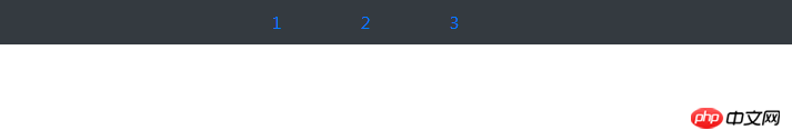
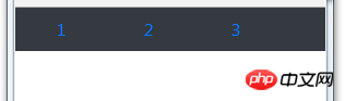
1. Simple navigation composed of ul and li:
<ul class="nav nav-pills justify-content-center bg-dark nav-dark">
    <li class="nav-item">
      <a href="#" rel="external nofollow" rel="external nofollow" rel="external nofollow" rel="external nofollow" rel="external nofollow" rel="external nofollow" rel="external nofollow" rel="external nofollow" rel="external nofollow" rel="external nofollow" rel="external nofollow" rel="external nofollow" rel="external nofollow" rel="external nofollow" rel="external nofollow" rel="external nofollow" rel="external nofollow" rel="external nofollow" rel="external nofollow" rel="external nofollow" class="nav-link">1</a>
    </li>
    <li class="nav-item">
      <a href="#" rel="external nofollow" rel="external nofollow" rel="external nofollow" rel="external nofollow" rel="external nofollow" rel="external nofollow" rel="external nofollow" rel="external nofollow" rel="external nofollow" rel="external nofollow" rel="external nofollow" rel="external nofollow" rel="external nofollow" rel="external nofollow" rel="external nofollow" rel="external nofollow" rel="external nofollow" rel="external nofollow" rel="external nofollow" rel="external nofollow" class="nav-link">2</a>
    </li>
    <li class="nav-item">
      <a href="#" rel="external nofollow" rel="external nofollow" rel="external nofollow" rel="external nofollow" rel="external nofollow" rel="external nofollow" rel="external nofollow" rel="external nofollow" rel="external nofollow" rel="external nofollow" rel="external nofollow" rel="external nofollow" rel="external nofollow" rel="external nofollow" rel="external nofollow" rel="external nofollow" rel="external nofollow" rel="external nofollow" rel="external nofollow" rel="external nofollow" class="nav-link">3</a>
    </li>
  </ul>


//解析:.nav .nav-item .nav-link表示ul li是导航——.nav-pills表示胶囊状导航——.bg-dark/.nav-dark表示黑底白字——.justify-content-center表示导航栏在浏览器上居中显示
is displayed on the browser as:
Reduce the browser window Displayed as:
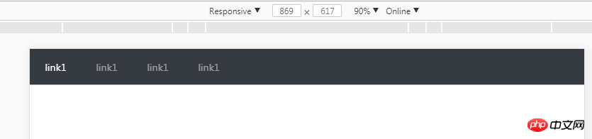
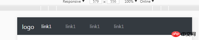
2. Navigation bar - class="navbar navbar-expand-sm" in
The code is:
<nav class="navbar navbar-expand-sm bg-dark navbar-dark">
  <ul class="navbar-nav">
    <li class="nav-item active">
      <a href="#" rel="external nofollow" rel="external nofollow" rel="external nofollow" rel="external nofollow" rel="external nofollow" rel="external nofollow" rel="external nofollow" rel="external nofollow" rel="external nofollow" rel="external nofollow" rel="external nofollow" rel="external nofollow" rel="external nofollow" rel="external nofollow" rel="external nofollow" rel="external nofollow" rel="external nofollow" rel="external nofollow" rel="external nofollow" rel="external nofollow" class="nav-link">link1</a>
    </li>
    <li class="nav-item">
      <a href="#" rel="external nofollow" rel="external nofollow" rel="external nofollow" rel="external nofollow" rel="external nofollow" rel="external nofollow" rel="external nofollow" rel="external nofollow" rel="external nofollow" rel="external nofollow" rel="external nofollow" rel="external nofollow" rel="external nofollow" rel="external nofollow" rel="external nofollow" rel="external nofollow" rel="external nofollow" rel="external nofollow" rel="external nofollow" rel="external nofollow" class="nav-link">link1</a>
    </li>
  </ul>
</nav>
The normal window display is:
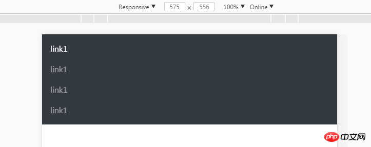
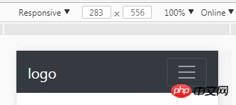
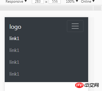
When the window is smaller than 576px:
3. Fold the navigation bar
When the window is smaller than 576px, it is not just a simple vertical programming Navigation; displayed as a button button, the navigation link is hidden, click the button to display;
The code is:
<nav class="navbar navbar-expand-sm bg-dark navbar-dark fixed-top">
  <a href="#" rel="external nofollow" rel="external nofollow" rel="external nofollow" rel="external nofollow" rel="external nofollow" rel="external nofollow" rel="external nofollow" rel="external nofollow" rel="external nofollow" rel="external nofollow" rel="external nofollow" rel="external nofollow" rel="external nofollow" rel="external nofollow" rel="external nofollow" rel="external nofollow" rel="external nofollow" rel="external nofollow" rel="external nofollow" rel="external nofollow" class="navbar-brand">
      <img src="" alt="logo" style="width:70px;height:30px;">
  </a>
  <button class="navbar-toggler" type="button" data-toggle="collapse" data-target="#collapsible">
    <span class="navbar-toggler-icon"></span>
  </button>
  <p class="collapse navbar-collapse" id="collapsible">
  <ul class="navbar-nav">
    <li class="nav-item active">
      <a href="#" rel="external nofollow" rel="external nofollow" rel="external nofollow" rel="external nofollow" rel="external nofollow" rel="external nofollow" rel="external nofollow" rel="external nofollow" rel="external nofollow" rel="external nofollow" rel="external nofollow" rel="external nofollow" rel="external nofollow" rel="external nofollow" rel="external nofollow" rel="external nofollow" rel="external nofollow" rel="external nofollow" rel="external nofollow" rel="external nofollow" class="nav-link">link1</a>
    </li>
    <li class="nav-item">
      <a href="#" rel="external nofollow" rel="external nofollow" rel="external nofollow" rel="external nofollow" rel="external nofollow" rel="external nofollow" rel="external nofollow" rel="external nofollow" rel="external nofollow" rel="external nofollow" rel="external nofollow" rel="external nofollow" rel="external nofollow" rel="external nofollow" rel="external nofollow" rel="external nofollow" rel="external nofollow" rel="external nofollow" rel="external nofollow" rel="external nofollow" class="nav-link">link1</a>
    </li>
    <li class="nav-item">
      <a href="#" rel="external nofollow" rel="external nofollow" rel="external nofollow" rel="external nofollow" rel="external nofollow" rel="external nofollow" rel="external nofollow" rel="external nofollow" rel="external nofollow" rel="external nofollow" rel="external nofollow" rel="external nofollow" rel="external nofollow" rel="external nofollow" rel="external nofollow" rel="external nofollow" rel="external nofollow" rel="external nofollow" rel="external nofollow" rel="external nofollow" class="nav-link">link1</a>
    </li>
    <li class="nav-item">
      <a href="#" rel="external nofollow" rel="external nofollow" rel="external nofollow" rel="external nofollow" rel="external nofollow" rel="external nofollow" rel="external nofollow" rel="external nofollow" rel="external nofollow" rel="external nofollow" rel="external nofollow" rel="external nofollow" rel="external nofollow" rel="external nofollow" rel="external nofollow" rel="external nofollow" rel="external nofollow" rel="external nofollow" rel="external nofollow" rel="external nofollow" class="nav-link">link1</a>
    </li>
  </ul>

</nav>
//Note: .navbar-brand is the brand logo;
When the window is larger than 576, it is displayed as:
When the window is smaller than 576, it is displayed as:
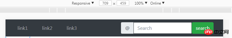
4. Add a form to the navigation bar to represent the search box: [? ? ? ? ? 】
The code is as follows:
<nav class="navbar navbar-expand-sm bg-dark navbar-dark fixed-top">
  <a href="#" rel="external nofollow" rel="external nofollow" rel="external nofollow" rel="external nofollow" rel="external nofollow" rel="external nofollow" rel="external nofollow" rel="external nofollow" rel="external nofollow" rel="external nofollow" rel="external nofollow" rel="external nofollow" rel="external nofollow" rel="external nofollow" rel="external nofollow" rel="external nofollow" rel="external nofollow" rel="external nofollow" rel="external nofollow" rel="external nofollow" class="navbar-brand">
      <img src="" alt="logo" style="width:70px;height:30px;">
  </a>
  <button class="navbar-toggler" type="button" data-toggle="collapse" data-target="#collapsible">
    <span class="navbar-toggler-icon"></span>
  </button>
  <p class="collapse navbar-collapse" id="collapsible">
  <ul class="navbar-nav">
    <li class="nav-item active">
      <a href="#" rel="external nofollow" rel="external nofollow" rel="external nofollow" rel="external nofollow" rel="external nofollow" rel="external nofollow" rel="external nofollow" rel="external nofollow" rel="external nofollow" rel="external nofollow" rel="external nofollow" rel="external nofollow" rel="external nofollow" rel="external nofollow" rel="external nofollow" rel="external nofollow" rel="external nofollow" rel="external nofollow" rel="external nofollow" rel="external nofollow" class="nav-link">link1</a>
    </li>
    <li class="nav-item">
      <a href="#" rel="external nofollow" rel="external nofollow" rel="external nofollow" rel="external nofollow" rel="external nofollow" rel="external nofollow" rel="external nofollow" rel="external nofollow" rel="external nofollow" rel="external nofollow" rel="external nofollow" rel="external nofollow" rel="external nofollow" rel="external nofollow" rel="external nofollow" rel="external nofollow" rel="external nofollow" rel="external nofollow" rel="external nofollow" rel="external nofollow" class="nav-link">link1</a>
    </li>
    <li class="nav-item">
      <a href="#" rel="external nofollow" rel="external nofollow" rel="external nofollow" rel="external nofollow" rel="external nofollow" rel="external nofollow" rel="external nofollow" rel="external nofollow" rel="external nofollow" rel="external nofollow" rel="external nofollow" rel="external nofollow" rel="external nofollow" rel="external nofollow" rel="external nofollow" rel="external nofollow" rel="external nofollow" rel="external nofollow" rel="external nofollow" rel="external nofollow" class="nav-link">link1</a>
    </li>
    <li class="nav-item">
      <a href="#" rel="external nofollow" rel="external nofollow" rel="external nofollow" rel="external nofollow" rel="external nofollow" rel="external nofollow" rel="external nofollow" rel="external nofollow" rel="external nofollow" rel="external nofollow" rel="external nofollow" rel="external nofollow" rel="external nofollow" rel="external nofollow" rel="external nofollow" rel="external nofollow" rel="external nofollow" rel="external nofollow" rel="external nofollow" rel="external nofollow" class="nav-link">link1</a>
    </li>
  </ul>
  <form class="form-inline">
        <p class="input-group">
          <span class="input-group-addon">@</span>
          <input list="dl" type="text" class="form-control" placeholder="Search"/>
          <datalist id="dl">
            <option value="IE"></option>
            <option value="Firefox"></option>
            <option value="chrome"></option>
            <option value="safari"></option>
          </datalist>
        </p>

        <button class="btn btn-success" type="submit">search</button>
      </form>
</nav>
As shown in the picture, how to make the form in the navigation bar right-aligned and moved to the far right? ? ? ? ? float:eight should also work. .
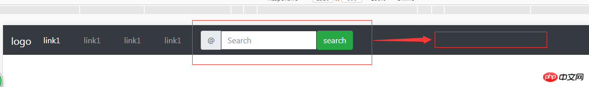
emmmm...I know the above solution: use the grid system to arrange the ul and li on the left and the form on the right respectively; .col -sm-6; Then float the form to the right;
The code is as follows:
<p class="container-fluid">
  <p class="row">
    <!-- 导航栏 -->
    <nav class="navbar fixed-top navbar-expand-sm bg-dark navbar-dark">
      <p class="col-lg-4">
      <ul class="navbar-nav">
        <li class="nav-item">
          <a class="nav-link" href="#" rel="external nofollow" rel="external nofollow" rel="external nofollow" rel="external nofollow" rel="external nofollow" rel="external nofollow" rel="external nofollow" rel="external nofollow" rel="external nofollow" rel="external nofollow" rel="external nofollow" rel="external nofollow" rel="external nofollow" rel="external nofollow" rel="external nofollow" rel="external nofollow" rel="external nofollow" rel="external nofollow" rel="external nofollow" rel="external nofollow" >link1</a>
        </li>
        <li class="nav-item">
          <a class="nav-link" href="#" rel="external nofollow" rel="external nofollow" rel="external nofollow" rel="external nofollow" rel="external nofollow" rel="external nofollow" rel="external nofollow" rel="external nofollow" rel="external nofollow" rel="external nofollow" rel="external nofollow" rel="external nofollow" rel="external nofollow" rel="external nofollow" rel="external nofollow" rel="external nofollow" rel="external nofollow" rel="external nofollow" rel="external nofollow" rel="external nofollow" >link2</a>
        </li>
        <li class="nav-item">
          <a class="nav-link" href="#" rel="external nofollow" rel="external nofollow" rel="external nofollow" rel="external nofollow" rel="external nofollow" rel="external nofollow" rel="external nofollow" rel="external nofollow" rel="external nofollow" rel="external nofollow" rel="external nofollow" rel="external nofollow" rel="external nofollow" rel="external nofollow" rel="external nofollow" rel="external nofollow" rel="external nofollow" rel="external nofollow" rel="external nofollow" rel="external nofollow" >link3</a>
        </li>
      </ul>
      </p>
<!-- 导航栏表单与按钮 -->
    <p class="col-lg-8">
      <form class="form-inline" style="float:right;">
        <p class="input-group">
          <span class="input-group-addon">@</span>
          <input list="dl" type="text" class="form-control" placeholder="Search"/>
          <datalist id="dl">
            <option value="IE"></option>
            <option value="Firefox"></option>
            <option value="chrome"></option>
            <option value="safari"></option>
          </datalist>
          <button class="btn btn-success" type="submit">search</button>
        </p>
      </form>
      </p>
    </nav>
    </p>
      </p>
Have you learned it? I believe that everyone has a better understanding of the difference between .nav and .navbar in Bootstrap navigation bar. If you find this article useful, please quickly save it.
Related recommendations:
Analysis of the bootstrap navigation bar and its responsive implementation
How to operate each element of the Bootstrap navigation bar (form , button, text)_javascript skills
bootstrap drop-down search plug-in usage detailed explanation
The above is the detailed content of Detailed explanation of the difference between .nav and .navbar in bootstrap. For more information, please follow other related articles on the PHP Chinese website!

Hot AI Tools

Undresser.AI Undress
AI-powered app for creating realistic nude photos

AI Clothes Remover
Online AI tool for removing clothes from photos.

Undress AI Tool
Undress images for free

Clothoff.io
AI clothes remover

AI Hentai Generator
Generate AI Hentai for free.

Hot Article
Hot Tools

Notepad++7.3.1
Easy-to-use and free code editor

SublimeText3 Chinese version
Chinese version, very easy to use

Zend Studio 13.0.1
Powerful PHP integrated development environment

Dreamweaver CS6
Visual web development tools

SublimeText3 Mac version
God-level code editing software (SublimeText3)
Hot Topics
 1382
1382
 52
52

 How to get the bootstrap search bar
Apr 07, 2025 pm 03:33 PM
How to get the bootstrap search bar
Apr 07, 2025 pm 03:33 PM
How to use Bootstrap to get the value of the search bar: Determines the ID or name of the search bar. Use JavaScript to get DOM elements. Gets the value of the element. Perform the required actions.
 How to use bootstrap in vue
Apr 07, 2025 pm 11:33 PM
How to use bootstrap in vue
Apr 07, 2025 pm 11:33 PM
Using Bootstrap in Vue.js is divided into five steps: Install Bootstrap. Import Bootstrap in main.js. Use the Bootstrap component directly in the template. Optional: Custom style. Optional: Use plug-ins.
 How to do vertical centering of bootstrap
Apr 07, 2025 pm 03:21 PM
How to do vertical centering of bootstrap
Apr 07, 2025 pm 03:21 PM
Use Bootstrap to implement vertical centering: flexbox method: Use the d-flex, justify-content-center, and align-items-center classes to place elements in the flexbox container. align-items-center class method: For browsers that do not support flexbox, use the align-items-center class, provided that the parent element has a defined height.
 How to write split lines on bootstrap
Apr 07, 2025 pm 03:12 PM
How to write split lines on bootstrap
Apr 07, 2025 pm 03:12 PM
There are two ways to create a Bootstrap split line: using the tag, which creates a horizontal split line. Use the CSS border property to create custom style split lines.
 How to resize bootstrap
Apr 07, 2025 pm 03:18 PM
How to resize bootstrap
Apr 07, 2025 pm 03:18 PM
To adjust the size of elements in Bootstrap, you can use the dimension class, which includes: adjusting width: .col-, .w-, .mw-adjust height: .h-, .min-h-, .max-h-
 How to set up the framework for bootstrap
Apr 07, 2025 pm 03:27 PM
How to set up the framework for bootstrap
Apr 07, 2025 pm 03:27 PM
To set up the Bootstrap framework, you need to follow these steps: 1. Reference the Bootstrap file via CDN; 2. Download and host the file on your own server; 3. Include the Bootstrap file in HTML; 4. Compile Sass/Less as needed; 5. Import a custom file (optional). Once setup is complete, you can use Bootstrap's grid systems, components, and styles to create responsive websites and applications.
 How to insert pictures on bootstrap
Apr 07, 2025 pm 03:30 PM
How to insert pictures on bootstrap
Apr 07, 2025 pm 03:30 PM
There are several ways to insert images in Bootstrap: insert images directly, using the HTML img tag. With the Bootstrap image component, you can provide responsive images and more styles. Set the image size, use the img-fluid class to make the image adaptable. Set the border, using the img-bordered class. Set the rounded corners and use the img-rounded class. Set the shadow, use the shadow class. Resize and position the image, using CSS style. Using the background image, use the background-image CSS property.
 What to do if the Bootstrap Table uses AJAX to get data garbled
Apr 07, 2025 am 11:54 AM
What to do if the Bootstrap Table uses AJAX to get data garbled
Apr 07, 2025 am 11:54 AM
Solutions to the garbled code of Bootstrap Table when using AJAX to obtain data from the server: 1. Set the correct character encoding of the server-side code (such as UTF-8). 2. Set the request header in the AJAX request and specify the accepted character encoding (Accept-Charset). 3. Use the "unescape" converter of the Bootstrap Table to decode the escaped HTML entity into original characters.
