CSS3 replaces JS to achieve interaction
This article mainly introduces the use of CSS3 instead of JS to achieve interaction. From the perspective of comparing CSS3 animation and JS animation, it will be clearer; and with the use of front-end frameworks, page animation will be used more and more CSS3. Please refer to this article for specific sample code. I hope it can help you.
[CSS3 and JS]
Students who know CSS all know that the implementation of CSS is the lowest level, neither in terms of implementation nor performance. JS The scripts that provide interfaces are comparable; from the perspective of comparing CSS3 animation and JS animation, it will be clearer; and with the use of front-end frameworks, page animations will increasingly use CSS3
[Other uses of CSS3]
In addition to the replacement of animations, there is also the implementation of various interactions, which also reflects the power of CSS, and more options are provided by using CSS3 Tool;
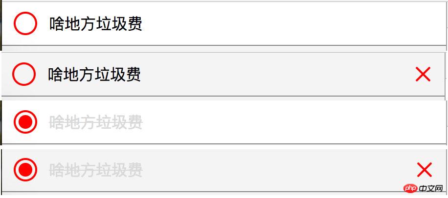
Let’s take a look at an example first: it can better reflect my deep understanding of CSS this time
<style>
body{background:#f4f4f4;margin:0;}
/*list*/
.list__con{}
.list__con .box{background:#fff;position:relative;border-bottom:solid 1px #858585;overflow:hidden;}
.list__con .box:hover{background:#f4f4f4;-webkit-transition:all .6s;transition:all .6s;}
.list__con .box:hover .delete{-webkit-transition:all .6s;transition:all .6s;opacity:1;}
.list__con .input{-webkit-appearance:none;appearance:none;position:absolute;top:10px;left:12px;padding:0;border:none;margin:0;width:24px;height:24px;border:solid 2px red;border-radius:50%;box-sizing:border-box;outline:none;cursor:pointer;}
.list__con .input:checked::after{content:'';width:14px;height:14px;background:red;position:absolute;top:3px;left:3px;border-radius:50%;}
.list__con label{line-height:24px;padding:10px 0 10px 48px;display:block;-webkit-transition:all .4s;transition:all .4s;}
.list__con .input:checked+label{color:#d9d9d9;text-decoration:line-through;}
.list__con .delete{width:44px;height:44px;float:right;position:relative;cursor:pointer;opacity:0;}
.list__con .delete:hover::after{-webkit-transform:rotate(225deg);transform:rotate(225deg);}
.list__con .delete:hover::before{-webkit-transform:rotate(225deg);transform:rotate(225deg);}
.list__con .delete::after{content:'';position:absolute;width:2px;height:20px;background:red;top:12px;left:50%;margin-left:-1px;-webkit-transform:rotate(45deg);transform:rotate(45deg);border-radius:4px;-webkit-transition:all .6s;transition:all .6s;}
.list__con .delete::before{content:'';position:absolute;width:20px;height:2px;background:red;top:50%;left:12px;margin-top:-1px;-webkit-transform:rotate(45deg);transform:rotate(45deg);border-radius:4px;-webkit-transition:all .6s;transition:all .6s;}
</style>
<p class="list__con">
<p class="box">
<p class="delete"></p>
<input class="input" type="checkbox" />
<label>啥地方垃圾费</label>
</p>
</p>
[Explanation]
The above includes many interactions, hover interaction, checked interaction;
I believe that many people have already implemented the above method. Achieved; here I will mainly talk about my understanding of this time and my vision for technology. I have been working for nearly four years now. During these years, I know how fast I have grown, but the same thing is that I can use a lot of knowledge, and I can also use it. I know how to use it; but this time I really understand what it means to only know its meaning but not its true meaning, and why!
I have previously implemented the above interactive effects using a combination of css and js. During this period, I also tried to use all css to achieve interactive effects. However, I was stuck in my ways when exploring, and it has not been truly realized until now. Original idea;
The benefits of using CSS to fully realize it improve the reusability and maintainability, provide a better way to implement the corresponding components, and also improve the performance;
.list__con .input:checked+label
Like the above usage, we can use various powerful selectors added by CSS3 to achieve more and better interactive effects; from now on, we will leave the use of JS to change the DOM. Tragedy, more inclined to CSS
Related recommendations:
An example of dynamic web technology PHP and JS realizing interaction
Ajax Asynchronous transmission and interaction with PHP
The above is the detailed content of CSS3 replaces JS to achieve interaction. For more information, please follow other related articles on the PHP Chinese website!

Hot AI Tools

Undresser.AI Undress
AI-powered app for creating realistic nude photos

AI Clothes Remover
Online AI tool for removing clothes from photos.

Undress AI Tool
Undress images for free

Clothoff.io
AI clothes remover

AI Hentai Generator
Generate AI Hentai for free.

Hot Article

Hot Tools

Notepad++7.3.1
Easy-to-use and free code editor

SublimeText3 Chinese version
Chinese version, very easy to use

Zend Studio 13.0.1
Powerful PHP integrated development environment

Dreamweaver CS6
Visual web development tools

SublimeText3 Mac version
God-level code editing software (SublimeText3)

Hot Topics
 1384
1384
 52
52
 How to implement an online speech recognition system using WebSocket and JavaScript
Dec 17, 2023 pm 02:54 PM
How to use WebSocket and JavaScript to implement an online speech recognition system Introduction: With the continuous development of technology, speech recognition technology has become an important part of the field of artificial intelligence. The online speech recognition system based on WebSocket and JavaScript has the characteristics of low latency, real-time and cross-platform, and has become a widely used solution. This article will introduce how to use WebSocket and JavaScript to implement an online speech recognition system.
 WebSocket and JavaScript: key technologies for implementing real-time monitoring systems
Dec 17, 2023 pm 05:30 PM
WebSocket and JavaScript: Key technologies for realizing real-time monitoring systems Introduction: With the rapid development of Internet technology, real-time monitoring systems have been widely used in various fields. One of the key technologies to achieve real-time monitoring is the combination of WebSocket and JavaScript. This article will introduce the application of WebSocket and JavaScript in real-time monitoring systems, give code examples, and explain their implementation principles in detail. 1. WebSocket technology
 How to use JavaScript and WebSocket to implement a real-time online ordering system
Dec 17, 2023 pm 12:09 PM
Introduction to how to use JavaScript and WebSocket to implement a real-time online ordering system: With the popularity of the Internet and the advancement of technology, more and more restaurants have begun to provide online ordering services. In order to implement a real-time online ordering system, we can use JavaScript and WebSocket technology. WebSocket is a full-duplex communication protocol based on the TCP protocol, which can realize real-time two-way communication between the client and the server. In the real-time online ordering system, when the user selects dishes and places an order
 How to implement an online reservation system using WebSocket and JavaScript
Dec 17, 2023 am 09:39 AM
How to use WebSocket and JavaScript to implement an online reservation system. In today's digital era, more and more businesses and services need to provide online reservation functions. It is crucial to implement an efficient and real-time online reservation system. This article will introduce how to use WebSocket and JavaScript to implement an online reservation system, and provide specific code examples. 1. What is WebSocket? WebSocket is a full-duplex method on a single TCP connection.
 JavaScript and WebSocket: Building an efficient real-time weather forecasting system
Dec 17, 2023 pm 05:13 PM
JavaScript and WebSocket: Building an efficient real-time weather forecast system Introduction: Today, the accuracy of weather forecasts is of great significance to daily life and decision-making. As technology develops, we can provide more accurate and reliable weather forecasts by obtaining weather data in real time. In this article, we will learn how to use JavaScript and WebSocket technology to build an efficient real-time weather forecast system. This article will demonstrate the implementation process through specific code examples. We
 How to use insertBefore in javascript
Nov 24, 2023 am 11:56 AM
Usage: In JavaScript, the insertBefore() method is used to insert a new node in the DOM tree. This method requires two parameters: the new node to be inserted and the reference node (that is, the node where the new node will be inserted).
 Simple JavaScript Tutorial: How to Get HTTP Status Code
Jan 05, 2024 pm 06:08 PM
JavaScript tutorial: How to get HTTP status code, specific code examples are required. Preface: In web development, data interaction with the server is often involved. When communicating with the server, we often need to obtain the returned HTTP status code to determine whether the operation is successful, and perform corresponding processing based on different status codes. This article will teach you how to use JavaScript to obtain HTTP status codes and provide some practical code examples. Using XMLHttpRequest
 JavaScript and WebSocket: Building an efficient real-time image processing system
Dec 17, 2023 am 08:41 AM
JavaScript is a programming language widely used in web development, while WebSocket is a network protocol used for real-time communication. Combining the powerful functions of the two, we can create an efficient real-time image processing system. This article will introduce how to implement this system using JavaScript and WebSocket, and provide specific code examples. First, we need to clarify the requirements and goals of the real-time image processing system. Suppose we have a camera device that can collect real-time image data


