

Detailed explanation of CSS3 filter attribute

Recently I discovered a very powerful CSS3 attribute, which is the filter attribute. Friends who like p-pictures should know what kind of artifact this is by looking at the name. Of course, the effect of this attribute cannot be compared with that of PS, but if used well, one picture can be made into the effect of two pictures while saving a lot of space. This article mainly introduces relevant information about the powerful filter attribute in CSS3. Friends who need it can refer to it. I hope it can help everyone.
1. Definition
Filter literally means filter. The official filter attribute defines the visual effect of an element (usually ) (for example: blur and Saturation); give a chestnut:
<style>
    img{
      /*灰度100%*/
        -webkit-filter:grayscale(100%);
    }
</style>
<img src="img/boke.png" alt="">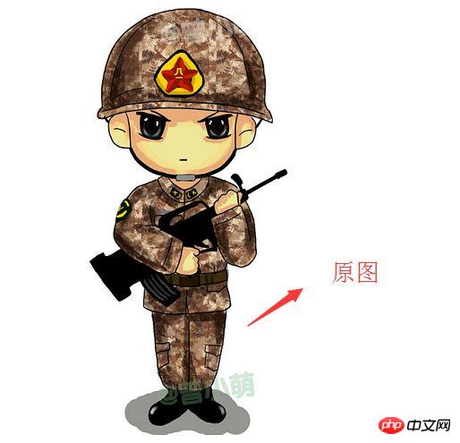
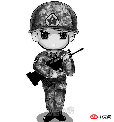
Seeing this effect, are bloggers starting to be interested in filters?
2. Syntax
filter: none | blur() | brightness() | contrast() | drop-shadow() | grayscale() | hue-rotate() | invert() | opacity() | saturate() | sepia() | url();
As you can see, the attribute has many optional values. What do they mean?
grayscale grayscale
sepia brown (a retro old photo feel)
saturate saturation
hue-rotatehue rotation
invert reverse color
opacitytransparency
brightness
contrast
blur
-
drop-shadow
For example:
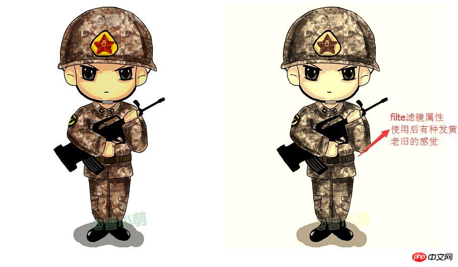
Use sepia to adjust here
 <head>
     <meta charset="UTF-8">
      <title>Title</title>
      <style>
          .img{

             -webkit-filter:sepia(70%);
          }
      </style>
  </head>
 <body>
 <img src="img/boke.png" alt="">
 <img class="img" src="img/boke.png" alt="">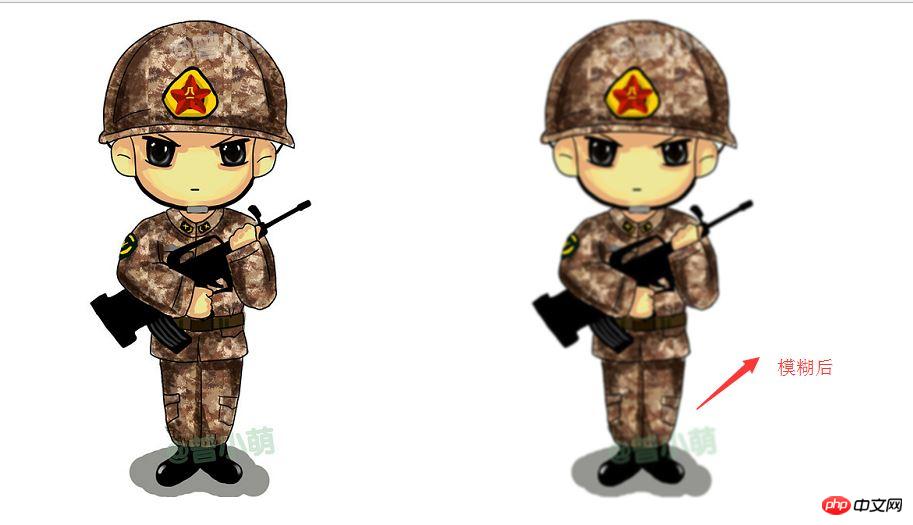
</body>Sample picture:
3. Example
Below, I will give an example of several values of the filter attribute. Other interesting things need to be discovered by fellow bloggers. If you have any interesting things, you can join me. Share
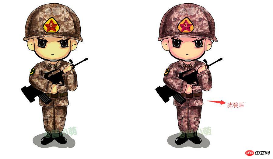
(1)hue-rotate(color rotation)
Let’s see the effect in the picture. The specific effect depends on everyone’s discovery:
     <style>
          .img{
              -webkit-filter:hue-rotate(330deg);
          }
      </style>
  </head>
  <body>
  <img src="img/boke.png" alt="">
  <img class="img" src="img/boke.png" alt="">
</body>Effect picture:
(2)blur(blur)
blur (blur effect, unit px)
     <style>
          .img{
            -webkit-filter:blur(1px);
          }
      </style>
  <body>
  <img src="img/boke.png" alt="">
  <img class="img" src="img/boke.png" alt="">
</body>Sample picture:
(3)invert reverse color
invert reverse color will turn the picture into a negative. It is useless to say more, look at the code:
 <style>
        .img{
            -webkit-filter:invert(100%);
        }
    </style>
<body>
<img src="img/boke.png" alt="">
<img class="img" src="img/boke.png" alt="">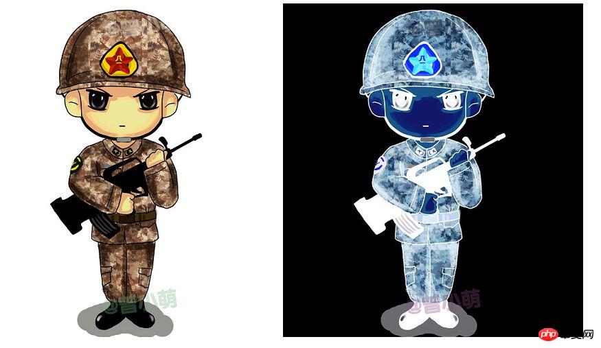
</body>Example Picture:
Do you think it’s fun? Hurry up and give it a try.
Related recommendations:
Example explanation of css filter filter_html/css_WEB-ITnose
About filter filter Two creative ideas applied to pictures_Experience exchange
Detailed introduction to the filter attribute of CSS3
The above is the detailed content of Detailed explanation of CSS3 filter attribute. For more information, please follow other related articles on the PHP Chinese website!

Hot AI Tools

Undresser.AI Undress
AI-powered app for creating realistic nude photos

AI Clothes Remover
Online AI tool for removing clothes from photos.

Undress AI Tool
Undress images for free

Clothoff.io
AI clothes remover

AI Hentai Generator
Generate AI Hentai for free.

Hot Article
Hot Tools

Notepad++7.3.1
Easy-to-use and free code editor

SublimeText3 Chinese version
Chinese version, very easy to use

Zend Studio 13.0.1
Powerful PHP integrated development environment

Dreamweaver CS6
Visual web development tools

SublimeText3 Mac version
God-level code editing software (SublimeText3)
Hot Topics
 1377
1377
 52
52

 How to achieve wave effect with pure CSS3? (code example)
Jun 28, 2022 pm 01:39 PM
How to achieve wave effect with pure CSS3? (code example)
Jun 28, 2022 pm 01:39 PM
How to achieve wave effect with pure CSS3? This article will introduce to you how to use SVG and CSS animation to create wave effects. I hope it will be helpful to you!
 Use CSS skillfully to realize various strange-shaped buttons (with code)
Jul 19, 2022 am 11:28 AM
Use CSS skillfully to realize various strange-shaped buttons (with code)
Jul 19, 2022 am 11:28 AM
This article will show you how to use CSS to easily realize various weird-shaped buttons that appear frequently. I hope it will be helpful to you!
 How to hide elements in css without taking up space
Jun 01, 2022 pm 07:15 PM
How to hide elements in css without taking up space
Jun 01, 2022 pm 07:15 PM
Two methods: 1. Using the display attribute, just add the "display:none;" style to the element. 2. Use the position and top attributes to set the absolute positioning of the element to hide the element. Just add the "position:absolute;top:-9999px;" style to the element.
 How to implement lace borders in css3
Sep 16, 2022 pm 07:11 PM
How to implement lace borders in css3
Sep 16, 2022 pm 07:11 PM
In CSS, you can use the border-image attribute to achieve a lace border. The border-image attribute can use images to create borders, that is, add a background image to the border. You only need to specify the background image as a lace style; the syntax "border-image: url (image path) offsets the image border width inward. Whether outset is repeated;".
 It turns out that text carousel and image carousel can also be realized using pure CSS!
Jun 10, 2022 pm 01:00 PM
It turns out that text carousel and image carousel can also be realized using pure CSS!
Jun 10, 2022 pm 01:00 PM
How to create text carousel and image carousel? The first thing everyone thinks of is whether to use js. In fact, text carousel and image carousel can also be realized using pure CSS. Let’s take a look at the implementation method. I hope it will be helpful to everyone!
![How to solve the '[Vue warn]: Failed to resolve filter' error](https://img.php.cn/upload/article/000/887/227/169243040583797.jpg?x-oss-process=image/resize,m_fill,h_207,w_330) How to solve the '[Vue warn]: Failed to resolve filter' error
Aug 19, 2023 pm 03:33 PM
How to solve the '[Vue warn]: Failed to resolve filter' error
Aug 19, 2023 pm 03:33 PM
Methods to solve the "[Vuewarn]:Failedtoresolvefilter" error During the development process using Vue, we sometimes encounter an error message: "[Vuewarn]:Failedtoresolvefilter". This error message usually occurs when we use an undefined filter in the template. This article explains how to resolve this error and gives corresponding code examples. When we are in Vue
 How to enlarge the image by clicking the mouse in css3
Apr 25, 2022 pm 04:52 PM
How to enlarge the image by clicking the mouse in css3
Apr 25, 2022 pm 04:52 PM
Implementation method: 1. Use the ":active" selector to select the state of the mouse click on the picture; 2. Use the transform attribute and scale() function to achieve the picture magnification effect, the syntax "img:active {transform: scale(x-axis magnification, y Axis magnification);}".
 Does css3 animation effect have deformation?
Apr 28, 2022 pm 02:20 PM
Does css3 animation effect have deformation?
Apr 28, 2022 pm 02:20 PM
The animation effect in css3 has deformation; you can use "animation: animation attribute @keyframes ..{..{transform: transformation attribute}}" to achieve deformation animation effect. The animation attribute is used to set the animation style, and the transform attribute is used to set the deformation style. .
