

Analysis of usage and common problems of margin in CSS

We are familiar with margin. This article mainly introduces the usage of margin in CSS and the analysis of common problems. The introduction in the article is very detailed and has certain reference and learning value for everyone. Friends who need it can follow Let’s take a look together.
1. Introduction
marginWe are generally used to calling it margins. We can set the margins in four directions respectively. No more details here. Describe the assignment syntax in detail.
Actually, the margins we usually set are physical-level settings, and margins also include start, end, before, after, etc. These are mainly logical-level settings. If you are interested, Google it yourself. .
When setting margin, we must know:
For block-level elements, how effective is margin in four directions;
For inline elements, margin is only effective in the horizontal direction.
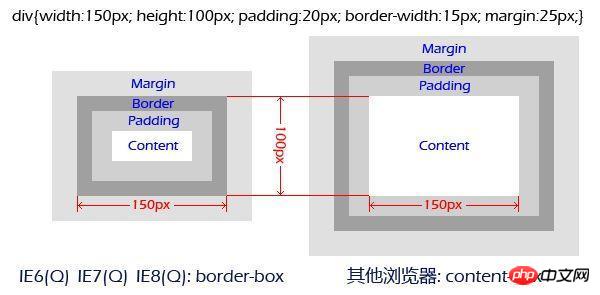
2. Box model
Speaking of margin, I have to talk about the box model:
1. Content => padding => border => margin
The reason why the box model needs to be understood from the inside and outside is mainly because the standards of the box model are different. It determines what the width we set in CSS is. At this time, everyone will think of those calculation formulas. In fact, with the arrival of CSS3, we can set the standard of the box model through box-sizing:
2. border-box: width is calculated from border;
3. content-box: width is calculated from content;
4. padding-box: has been calculated from removed from the standard.
Here’s another picture, are you already aware of it?
##3. Margin overlap problem
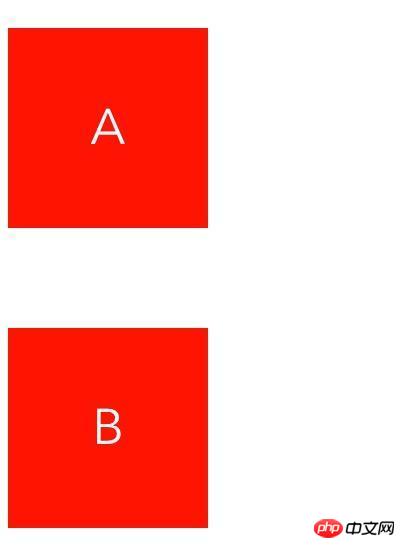
This kind of problem mainly occurs on block elements and not floating elements (it is not described clearly here, and will be discussed in detail later). Let’s take a look at what happened.1. Occurs in adjacent sibling elements
    .a {
        margin: 50px 0;
    }
    .b {
        margin: 100px 0;
    }
2. Occurs at the parent-child node
    p(class="b")
    p(class="a")
p(class="c") C .a {
margin: 20px 0;
}
.b {
margin: 100px 0;
}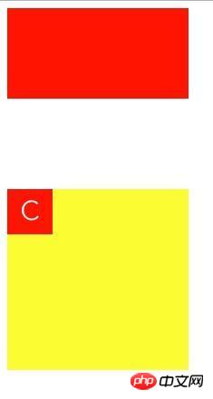
- The parent element sets the border;
- The parent element sets the padding ;
- The parent element sets overflow to hidden or scroll, others are not applicable;
- The parent element sets position to fixed or absolute, others not applicable.
4. Magical negative margin value
We set the margin in four directions for a block element What happens:- Setting negative values for top and left will move the element up or to the left by the corresponding pixel distance;
- setting bottom and right Negative values will move adjacent elements up or to the left.
    .item {
        margin: 0 200px;
        height: 200px;
} .item {
position: absolute;
background: red;
width: 200px;
height: 200px;
top: 50%;
left: 50%;
margin-top: -100px;
margin-left: -100px;
}5. Margin and float
For these two troublesome attributes, Together, let me just say, it was a real blast. I said above that "this problem mainly occurs on block elements and not floating elements". Here are two more points:- Adjacent sibling elements, if both of them are floating element, no margin overlap will occur;
- For parent-child elements, if one of them is a floating element, no margin overlap will occur;
    .clearfix::before, .clearfix::after {
        content: " ";
        display: table;
    }

    .clearfix::after {
        clear: both;
}学完本文相信大家对css 中margin属性有更深的认识,大家赶紧收藏起来吧。
相关推荐:
The above is the detailed content of Analysis of usage and common problems of margin in CSS. For more information, please follow other related articles on the PHP Chinese website!

Hot AI Tools

Undresser.AI Undress
AI-powered app for creating realistic nude photos

AI Clothes Remover
Online AI tool for removing clothes from photos.

Undress AI Tool
Undress images for free

Clothoff.io
AI clothes remover

AI Hentai Generator
Generate AI Hentai for free.

Hot Article
Hot Tools

Notepad++7.3.1
Easy-to-use and free code editor

SublimeText3 Chinese version
Chinese version, very easy to use

Zend Studio 13.0.1
Powerful PHP integrated development environment

Dreamweaver CS6
Visual web development tools

SublimeText3 Mac version
God-level code editing software (SublimeText3)
Hot Topics
 1378
1378
 52
52

 How to write split lines on bootstrap
Apr 07, 2025 pm 03:12 PM
How to write split lines on bootstrap
Apr 07, 2025 pm 03:12 PM
There are two ways to create a Bootstrap split line: using the tag, which creates a horizontal split line. Use the CSS border property to create custom style split lines.
 How to insert pictures on bootstrap
Apr 07, 2025 pm 03:30 PM
How to insert pictures on bootstrap
Apr 07, 2025 pm 03:30 PM
There are several ways to insert images in Bootstrap: insert images directly, using the HTML img tag. With the Bootstrap image component, you can provide responsive images and more styles. Set the image size, use the img-fluid class to make the image adaptable. Set the border, using the img-bordered class. Set the rounded corners and use the img-rounded class. Set the shadow, use the shadow class. Resize and position the image, using CSS style. Using the background image, use the background-image CSS property.
 How to resize bootstrap
Apr 07, 2025 pm 03:18 PM
How to resize bootstrap
Apr 07, 2025 pm 03:18 PM
To adjust the size of elements in Bootstrap, you can use the dimension class, which includes: adjusting width: .col-, .w-, .mw-adjust height: .h-, .min-h-, .max-h-
 How to set up the framework for bootstrap
Apr 07, 2025 pm 03:27 PM
How to set up the framework for bootstrap
Apr 07, 2025 pm 03:27 PM
To set up the Bootstrap framework, you need to follow these steps: 1. Reference the Bootstrap file via CDN; 2. Download and host the file on your own server; 3. Include the Bootstrap file in HTML; 4. Compile Sass/Less as needed; 5. Import a custom file (optional). Once setup is complete, you can use Bootstrap's grid systems, components, and styles to create responsive websites and applications.
 The Roles of HTML, CSS, and JavaScript: Core Responsibilities
Apr 08, 2025 pm 07:05 PM
The Roles of HTML, CSS, and JavaScript: Core Responsibilities
Apr 08, 2025 pm 07:05 PM
HTML defines the web structure, CSS is responsible for style and layout, and JavaScript gives dynamic interaction. The three perform their duties in web development and jointly build a colorful website.
 How to use bootstrap button
Apr 07, 2025 pm 03:09 PM
How to use bootstrap button
Apr 07, 2025 pm 03:09 PM
How to use the Bootstrap button? Introduce Bootstrap CSS to create button elements and add Bootstrap button class to add button text
 How to view the date of bootstrap
Apr 07, 2025 pm 03:03 PM
How to view the date of bootstrap
Apr 07, 2025 pm 03:03 PM
Answer: You can use the date picker component of Bootstrap to view dates in the page. Steps: Introduce the Bootstrap framework. Create a date selector input box in HTML. Bootstrap will automatically add styles to the selector. Use JavaScript to get the selected date.
 How to use bootstrap in vue
Apr 07, 2025 pm 11:33 PM
How to use bootstrap in vue
Apr 07, 2025 pm 11:33 PM
Using Bootstrap in Vue.js is divided into five steps: Install Bootstrap. Import Bootstrap in main.js. Use the Bootstrap component directly in the template. Optional: Custom style. Optional: Use plug-ins.
