

Detailed explanation of linear-gradient and radial-gradient in CSS3

This article mainly introduces the relevant information about gradients in CSS, mainly shares the knowledge of linear-gradient and radial-gradient in CSS3, and brings you another angle of using gradients. The article introduces it in detail through example code. Friends can refer to it, I hope it can help everyone.
1. Linear Gradient
Here you need to look at the basic syntax first, and then look at the following examples.
linear-gradient(90deg,red 20%,blue 50%,yellow 80%);
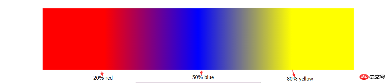
Obviously through this picture, you will roughly understand the role of setting these parameters. Although I didn't use any words to explain it. (So when you can’t understand the definition, you must practice it.)
Next, we have to do something. We overlap the color separation points.
    width: 300px;
    height: 200px;
    background: linear-gradient(90deg,blue 100px,#fff 100px,#fff 200px,red 200px);
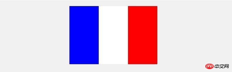
Yes, this is the effect produced by the above gradient code. Does it feel like it breaks your previous impression of gradients.
Next we use linear-gradient to achieve cooler effects, such as:
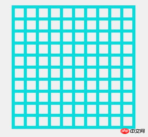
Do you feel that you have broken through your own understanding of gradients? know. Let me talk about the idea of implementing this background: This is a regular pattern. We need to find its basic pattern. I believe you have found it.
Knowledge points we need to use:
background supports the declaration of multiple linear-gradients, separated by commas;
When you declare multiple linear-gradients, the one declared first is closer to the user. (Here we need to consider the issue of covering, usually transparent);
I haven’t mastered the abbreviation of background yet, but it doesn’t work;
Reasonable combination of background-repeat, background-size and background-position.
    width: 410px;
    height: 410px;
    background: linear-gradient(rgb(2,222,222) 10px, transparent 10px) repeat left top / 40px,
                linear-gradient(90deg,rgb(2,222,222) 10px, transparent 10px) repeat left top / 40px;
Look, in the past, to achieve such an effect, we could only beg the artist to cut the image. Now in the wave of CSS3, we can be self-sufficient (^_^).
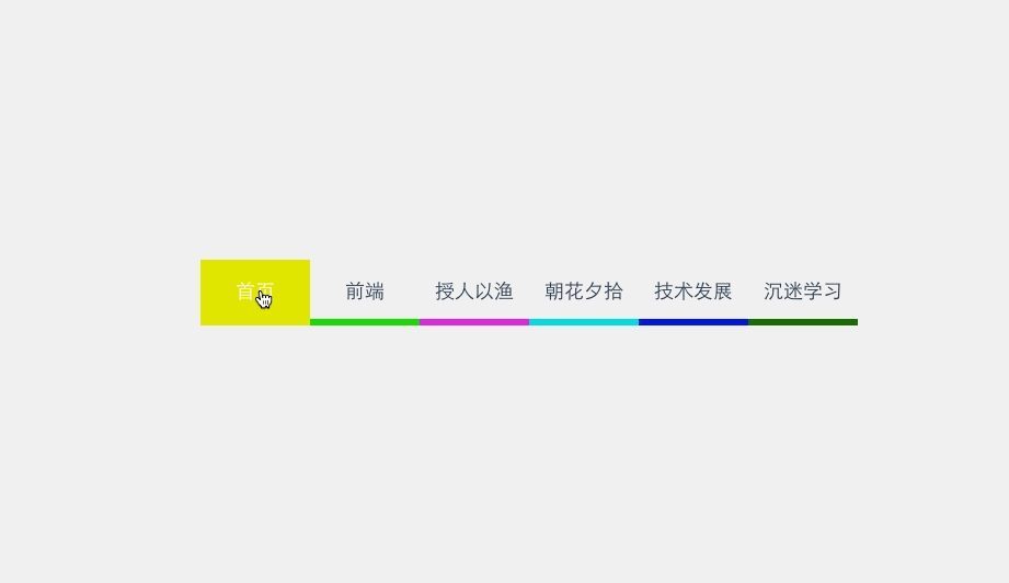
And through gradient we can animate the background color without consuming additional HTML elements to achieve the desired effect. Example:
##
    /*
     *  这里用scss写的,对新手不太友好,抱歉(-_-)
     */
    @mixin menuaction($color) {
        background: linear-gradient($color 100%, transparent 100%) no-repeat center bottom / 100% 10%;
        &:hover {
            background-size: 100% 100%;
            color: #fff;
        }
    }
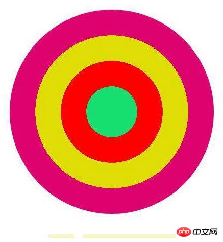
    border-radius: 50%;
    background: radial-gradient(circle,rgb(22,222,111) 0,rgb(22,222,111) 50px,red 50px,red 100px, rgb(222,222,1) 100px, rgb(222,222,1) 150px,rgb(222,2,111) 150px);
    width: 300px;
    height: 120px;
    background: radial-gradient(transparent 0, transparent 5px, rgb(247,245,201) 5px) no-repeat,
                radial-gradient(transparent 0, transparent 5px, rgb(247,245,201) 5px) no-repeat,
                radial-gradient(transparent 0, transparent 5px, rgb(247,245,201) 5px) no-repeat,
                radial-gradient(transparent 0, transparent 5px, rgb(247,245,201) 5px) no-repeat,
                radial-gradient(transparent 0, transparent 5px, rgb(247,245,201) 5px) no-repeat,
                radial-gradient(transparent 0, transparent 5px, rgb(247,245,201) 5px) no-repeat,
                radial-gradient(#fff 0, #fff 10px, rgb(247,245,201) 10px) no-repeat,
                radial-gradient(#fff 0, #fff 10px, rgb(247,245,201) 10px) no-repeat,
                linear-gradient(90deg,transparent 10px, rgb(247,245,201) 10px);
            background-size: 20px 20px,20px 20px,20px 20px,20px 20px,20px 20px,20px 20px,60px 60px,60px 60px,100% 100%;
            background-position: -10px 0,-10px 20px,-10px 40px,-10px 60px,-10px 80px,-10px 100px,60px -30px,60px 90px,left center;
How to use the transform gradient attribute in Css3
Example of how to implement text color gradient in CSS
Detailed explanation of how to make the background color gradient compatible with css
The above is the detailed content of Detailed explanation of linear-gradient and radial-gradient in CSS3. For more information, please follow other related articles on the PHP Chinese website!

Hot AI Tools

Undresser.AI Undress
AI-powered app for creating realistic nude photos

AI Clothes Remover
Online AI tool for removing clothes from photos.

Undress AI Tool
Undress images for free

Clothoff.io
AI clothes remover

Video Face Swap
Swap faces in any video effortlessly with our completely free AI face swap tool!

Hot Article
Hot Tools

Notepad++7.3.1
Easy-to-use and free code editor

SublimeText3 Chinese version
Chinese version, very easy to use

Zend Studio 13.0.1
Powerful PHP integrated development environment

Dreamweaver CS6
Visual web development tools

SublimeText3 Mac version
God-level code editing software (SublimeText3)
Hot Topics
 1386
1386
 52
52

 How to achieve wave effect with pure CSS3? (code example)
Jun 28, 2022 pm 01:39 PM
How to achieve wave effect with pure CSS3? (code example)
Jun 28, 2022 pm 01:39 PM
How to achieve wave effect with pure CSS3? This article will introduce to you how to use SVG and CSS animation to create wave effects. I hope it will be helpful to you!
 Use CSS skillfully to realize various strange-shaped buttons (with code)
Jul 19, 2022 am 11:28 AM
Use CSS skillfully to realize various strange-shaped buttons (with code)
Jul 19, 2022 am 11:28 AM
This article will show you how to use CSS to easily realize various weird-shaped buttons that appear frequently. I hope it will be helpful to you!
 How to hide elements in css without taking up space
Jun 01, 2022 pm 07:15 PM
How to hide elements in css without taking up space
Jun 01, 2022 pm 07:15 PM
Two methods: 1. Using the display attribute, just add the "display:none;" style to the element. 2. Use the position and top attributes to set the absolute positioning of the element to hide the element. Just add the "position:absolute;top:-9999px;" style to the element.
 How to implement lace borders in css3
Sep 16, 2022 pm 07:11 PM
How to implement lace borders in css3
Sep 16, 2022 pm 07:11 PM
In CSS, you can use the border-image attribute to achieve a lace border. The border-image attribute can use images to create borders, that is, add a background image to the border. You only need to specify the background image as a lace style; the syntax "border-image: url (image path) offsets the image border width inward. Whether outset is repeated;".
 It turns out that text carousel and image carousel can also be realized using pure CSS!
Jun 10, 2022 pm 01:00 PM
It turns out that text carousel and image carousel can also be realized using pure CSS!
Jun 10, 2022 pm 01:00 PM
How to create text carousel and image carousel? The first thing everyone thinks of is whether to use js. In fact, text carousel and image carousel can also be realized using pure CSS. Let’s take a look at the implementation method. I hope it will be helpful to everyone!
 How to enlarge the image by clicking the mouse in css3
Apr 25, 2022 pm 04:52 PM
How to enlarge the image by clicking the mouse in css3
Apr 25, 2022 pm 04:52 PM
Implementation method: 1. Use the ":active" selector to select the state of the mouse click on the picture; 2. Use the transform attribute and scale() function to achieve the picture magnification effect, the syntax "img:active {transform: scale(x-axis magnification, y Axis magnification);}".
 How to set animation rotation speed in css3
Apr 28, 2022 pm 04:32 PM
How to set animation rotation speed in css3
Apr 28, 2022 pm 04:32 PM
In CSS3, you can use the "animation-timing-function" attribute to set the animation rotation speed. This attribute is used to specify how the animation will complete a cycle and set the speed curve of the animation. The syntax is "element {animation-timing-function: speed attribute value;}".
 Does css3 animation effect have deformation?
Apr 28, 2022 pm 02:20 PM
Does css3 animation effect have deformation?
Apr 28, 2022 pm 02:20 PM
The animation effect in css3 has deformation; you can use "animation: animation attribute @keyframes ..{..{transform: transformation attribute}}" to achieve deformation animation effect. The animation attribute is used to set the animation style, and the transform attribute is used to set the deformation style. .
