I recently saw a very cool menu plug-in, and I have always wanted to tinker with it into vue form. Who told me that I am a die-hard vue fan, if this is not considered love:pensive:. :laughing: Let’s have a little fun and explore black magic together. Readers watching this tutorial need to have certain knowledge of vue and css3. This article mainly introduces you to implement a cool menu plug-in based on Vue. This tutorial requires you to have certain basic knowledge of css and vue. This article will introduce it to you step by step. It is very detailed, please refer to it if you need it, I hope it can help everyone.
Structure of this article
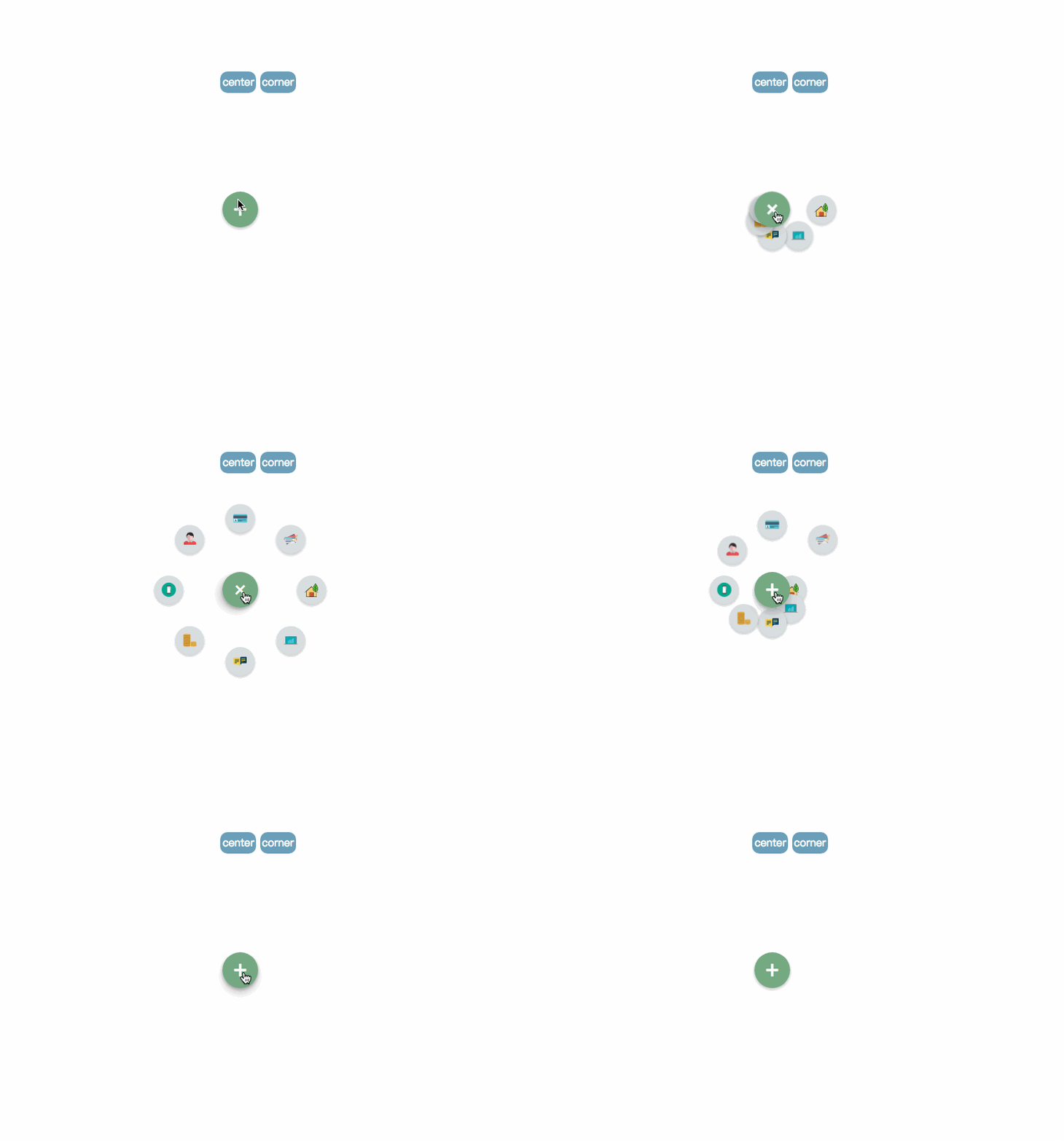
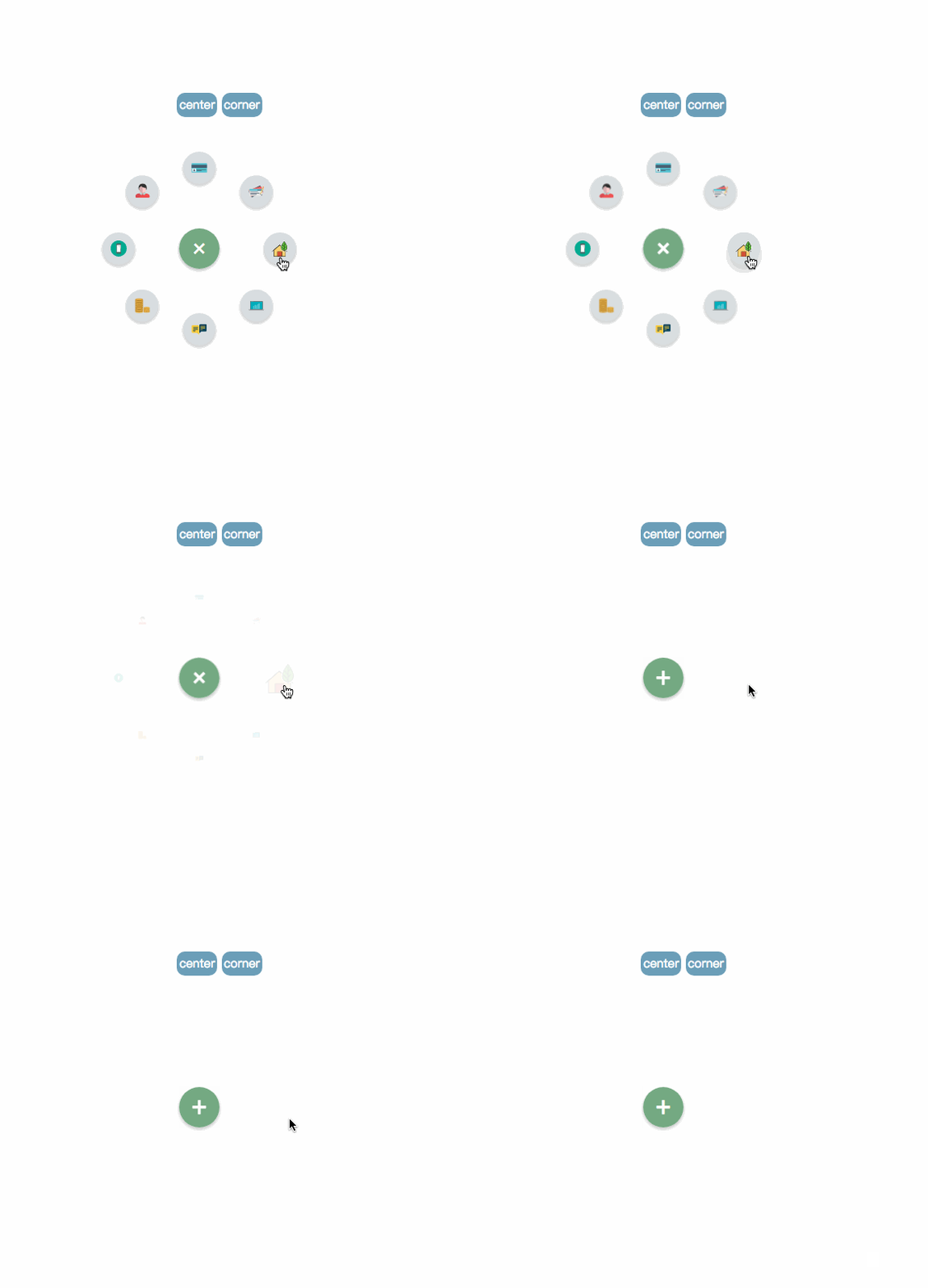
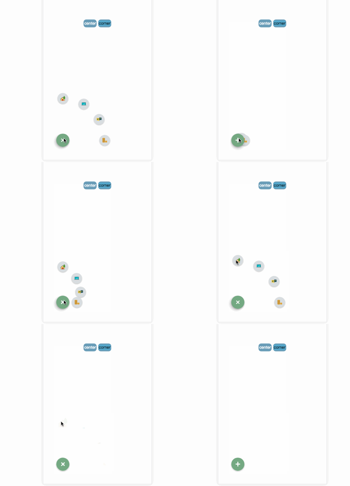
1. Effect demonstration
2. Introduction to usage
3. Explanation of key steps
Text
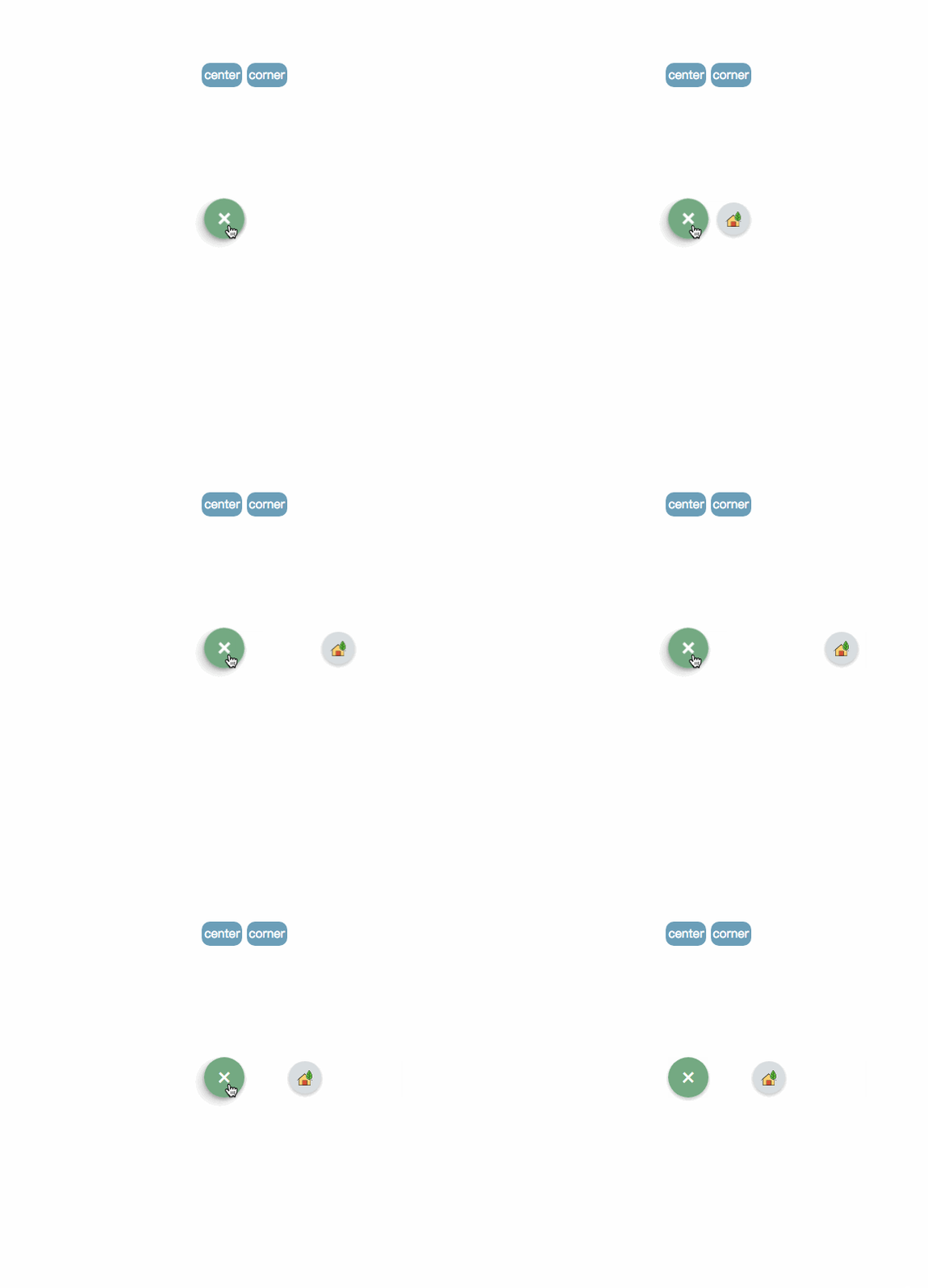
1. Effect demonstration

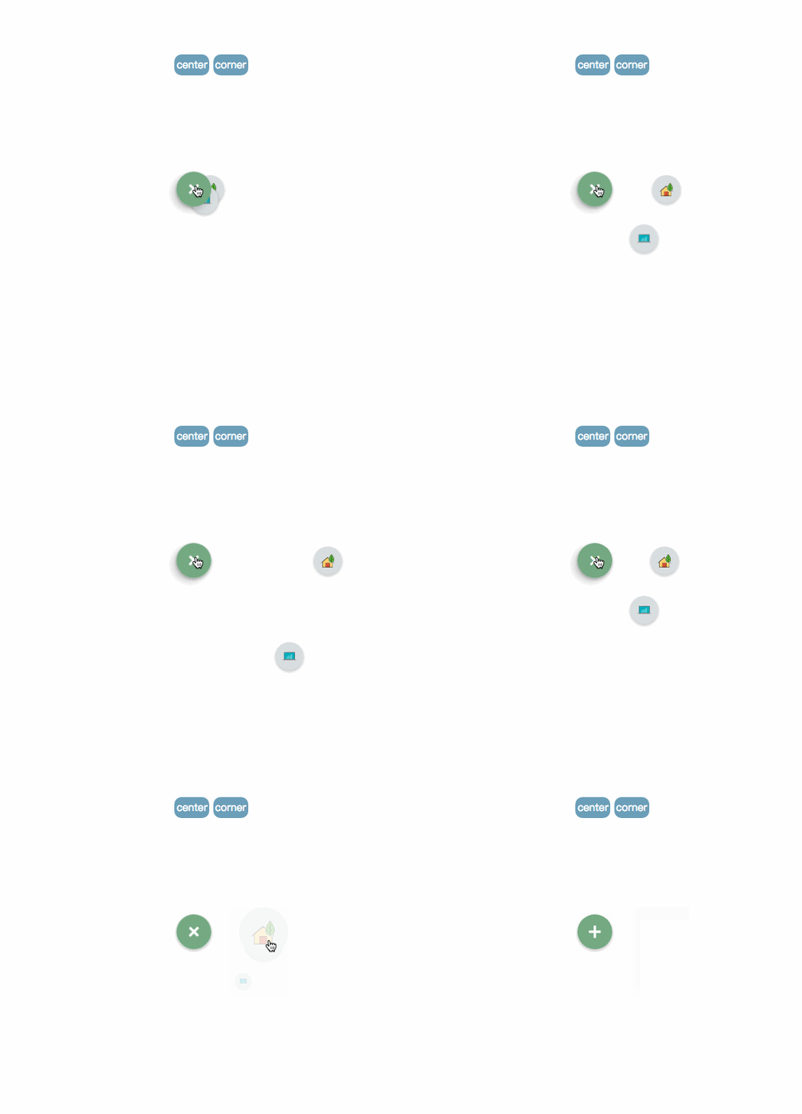
pic_1

##pic2

pic_3
Online demonstration live demo
2. Introduction to use
Project address: github.com/MingSeng-W/vue-bloom-menu, clone project Go to the local
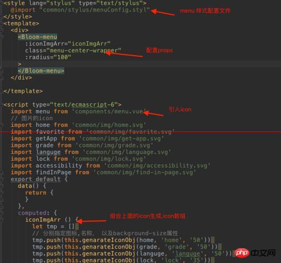
a. First introduce the menu component into the single file component, and import menuConfig.stylus.
b. Configure the corresponding parameters
in the common folder stylus. Select parameters
* radius: default is 100px, the distance between the item and the menu button.
* startAngle: defaut is 0, the angle at which the item starts is recorded as 0 with the 3 o'clock direction of the clock, and then the clockwise direction is the increasing direction.
* endAngle: default is 315, the angle of the last item.
* itemNum: default is 8
* animationDuration: default is 0.5s, the execution time of each item animation
* itemAnimationDelay: default is 0.04s, each item Interval delay time between animation triggers
Required parameters
* iconImgArr
Import the icon you need, and then generate iconImgArr (computed attribute binding) and pass it as props For the menu component
The position of the menu
Currently there are two positions, center and corner, which are specified in the menu class. center’s class:.menu-center-wrapper
corner’s class:.menu-left-corner-wrapper. Of course, it’s OK to specify the location yourself.
A simple example

demo
3. Explanation of key steps
The key to the implementation of the entire menu lies in calculation The final coordinates after the menu is expanded, as well as the animation of expansion and contraction. (Since the layout of the entire project is relatively simple, here we mainly explain the implementation of logic and animation)
Step 1: Calculate the horizontal and vertical coordinates after the menu is expanded The x and y below the coordinates
respectively represent the position of the item on the page, taking x as an example.
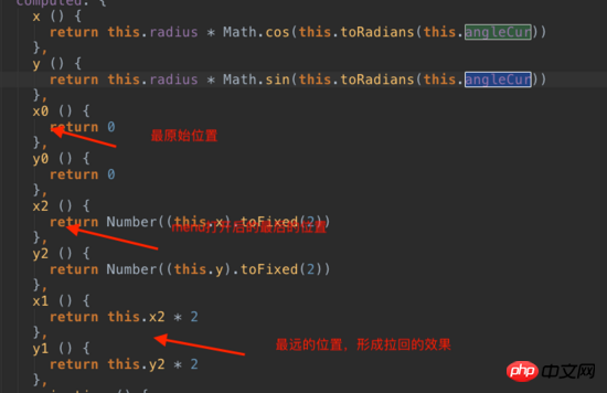
x: The original position, the last expanded position of x2, the transition position in the middle of x1 (mainly causing a "pull back" effect), the following is a picture explanation, in order to explain simply and clearly, I enlarged the radius Multiply and increase the animation execution time.

Position explanation
Calculation of position: First calculate the angle between each item. The starting item is laid out clockwise. The angle between items is equal to (endAngle-startAngle)/(itemNum-1). The angle at which the current item should be rotated is: angleCur=startAngle+index*the angle between each item. After getting the rotation angle of the item, multiply Math.cos, Math.sin and radius to get its abscissa and ordinate.
Key code:

Calculate the angle of each item

Position explanation
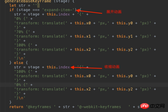
The second step is to use js to dynamically generate animtion based on the generated coordinates and insert it into the style file middle.

Generate keyframe for expansion and contraction
At this step we have completed clicking the menu to expand and contract.
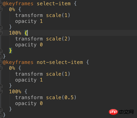
The second step is to complete clicking on the item and the item will enlarge and disappear, and other items will shrink and disappear
keyframe where the item disappears

Keyframe where item disappears
The animation is triggered here using vue to provide transition. When the v-show of the element is false, that is, when the display is none, the animation is triggered.
After each item animation is completed, the animationEnd event will be triggered, and the animationEnd event of the item will be monitored. When all animations are triggered in sequence, the menu will be reminded to be closed (parent-child component communication).
I use v-on in the menu component to listen to the animationEnd event. After the item's own animation is executed, the animationEnd event is triggered through $emit to notify the menu's animation count count++. When the count reaches the total number of items, menu to close.

code

code

When you open the menu again, check whether the showItem bound to the item is false, and if so, set it to true. When clicking, you need to get the index of the clicked item, and get the global currentIndex, which is the index of the clicked item. The clicked one uses the zoom-in animation, otherwise the zoom-out animation is used.

pic_6

If you think it’s good, hurry up and collect it. You can also give it a try.
Related recommendations: Sharing the differences between





 What are the jquery plug-ins?
 Introduction to the plug-ins required for vscode to run java
 What are the configuration management tools?
 console.readline
 freelaunchbar
 How to restore IE browser to automatically jump to EDGE
 What is the difference between css framework and component library
 Solution to slow access speed when renting a US server
 How to optimize the performance of Tomcat


