
 Web Front-end
JS Tutorial
Detailed explanation of CSS percentage padding to create image adaptive layout
Web Front-end
JS Tutorial
Detailed explanation of CSS percentage padding to create image adaptive layout
Detailed explanation of CSS percentage padding to create image adaptive layout

margin and padding attributes The percentage values in the vertical direction are calculated relative to the width, which is different from the percentage values of attributes such as top and bottom.
<p>The reasons for this design will be explained in my new book (which should be published in a few months), so I won’t go into it here.
<p>For the padding attribute, the percentage in any direction padding is calculated for the width, allowing us to easily implement a fixed-proportion block-level container. For example, Suppose there is now a <p> element:
p { padding: 50%; }p { padding: 100% 0 0; }p { padding-bottom: 100%; }<p> element is a square with a width and height of 1:1 , no matter what the width of its parent container is, this <p> element can always maintain the same proportion. <p>What is the function of this feature that can fix the proportion? <p>For most layouts, we do not require that the ratio must be fixed, but there is one exception, and that is the picture, because the original size of the picture is fixed. In the traditional fixed-width layout, we will set specific width and height values for the image to ensure that our image occupies a stable area; but on the mobile terminal or in the case of responsive development, the final width of the image is very small It may be uncertain. For example, for a banner advertisement on the mobile phone, the width is 375 under iPhone 7, 414 under iPhone 7 Plus, and 360. In this case, what is needed is not a fixed size setting for the image, but a proportion setting. <p>Usually have the following implementations: <p><p><p>1. Fix a height, and then use the background-size attribute to control, As follows: .banner {
height: 40px;
background-size: cover;
}vw, as follows: .banner {
height: 15.15vw;
background-size: cover;
}vw is also a good idea, at least it will be easier to understand. <p>However, if our image is not a banner, but needs to be 1rem distance from the left and right sides, at this time, our CSS code will be a bit verbose, and if we want to maintain perfect proportions, Just use CSS3 calc() to calculate: .banner {
height: calc(0.1515 * (100vw - 2rem));
background-size: cover;
}calc() is also stretched, but it is just the ordinary padding attribute that has great compatibility and adaptability. <p>3. Use percentage padding, as follows: .banner {
padding: 15.15% 0 0;
background-size: cover;
}<img> , percentagepadding can also be easily dealt with. The search routine is relatively fixed. A fixed-proportion container element is required outside the picture element, such as the following HTML structure: <br/>
# The ##
<p class="banner">
 <img src=""banner.jpg>
</p>
element is also responsible for controlling the proportion, and then the image is filled with the .banner element. The CSS code is as follows: .banner {
padding: 15.15% 0 0;
position: relative;
}
.banner > img {
position: absolute;
width: 100%; height: 100%;
left: 0; top: 0;
} You can see that no matter how wide the screen width is, the ratio of our advertising images is fixed, there will be no clipping, no missing areas, and the layout will look very neat. Flexible and more robust. <p>————-<p>In fact, I have always underestimated the practical application value of percentage <p>padding
, because of the existence of vw units, after all Understanding vw seems to be simpler, so I haven’t introduced related techniques. However, as more and more image-related layouts are processed, I found that the practical value of percentage padding is greater than imagined, and it is applicable to more scenes than vw units, and is more compatible. Better (percentage feature IE6+ support, pictures 100% coverage IE8+ support). For complex layouts, if the width of the picture is not fixed and adaptive, we usually think of a trick, which is to only set the width of the picture, for example: <p>img { width: 100%; }0到计算高度的图片变化,视觉上会有明显的元素跳动,代码层面会有布局重计算。<p>所以对图片高宽进行同时约定还是有必要的,但是同时要保证宽度自适应,似乎有点难度。记住,如果遇到这种需求场景,没有比百分比padding布局更好的做法!<p>缩小浏览器宽度可以看到不同宽度下的布局效果,Gif效果截图如下:<p>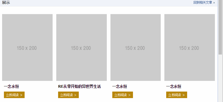 <p>此demo难点就是图片自适应同时保持比例,以及页面刷新的时候没有布局稳固不晃动,其核心HTML和CSS代码如下:
<br/>
<p class="works-item-t">
  <img src="./150x200.png">
</p>
.works-item-t {
 padding-bottom: 133%;
 position: relative;
}
.works-item-t > img {
 position: absolute;
 width: 100%; height: 100%;
}padding值只使用padding-bottom表示的时候,如果没有text-align属性干扰,<img>元素的left:0;top:0是可以省略的。<p>对于这种图片宽度100%容器,高度按比例的场景,padding-bottom的百分比值大小就是图片元素的高宽比,就这么简单。<p>但,有时候,图片宽度并不是100%容器的,例如,图片宽度50%容器宽度,图片高宽比4:3,此时,CSS垂直方向百分比就666了,如下:.img-box {
padding: 0 50% 66.66% 0;
}<p>一个CSS+div高度自适应布局模型_html/css_WEB-ITnose <p>CSS3自适应全屏焦点图切换的特效怎么做 <p>响应式和自适应有什么区别 <p>
The above is the detailed content of Detailed explanation of CSS percentage padding to create image adaptive layout. For more information, please follow other related articles on the PHP Chinese website!

Hot AI Tools

Undresser.AI Undress
AI-powered app for creating realistic nude photos

AI Clothes Remover
Online AI tool for removing clothes from photos.

Undress AI Tool
Undress images for free

Clothoff.io
AI clothes remover

Video Face Swap
Swap faces in any video effortlessly with our completely free AI face swap tool!

Hot Article
Hot Tools

Notepad++7.3.1
Easy-to-use and free code editor

SublimeText3 Chinese version
Chinese version, very easy to use

Zend Studio 13.0.1
Powerful PHP integrated development environment

Dreamweaver CS6
Visual web development tools

SublimeText3 Mac version
God-level code editing software (SublimeText3)
Hot Topics
 1387
1387
 52
52

 How to convert fraction to percentage in Python?
Aug 25, 2023 pm 01:25 PM
How to convert fraction to percentage in Python?
Aug 25, 2023 pm 01:25 PM
Fractions and percentages are two basic mathematical concepts used in various fields such as finance, data analysis, and statistics. Converting a fraction to a percentage is a simple but necessary operation that allows us to represent fractional values in a more understandable way. Python, one of the most popular programming languages, offers several methods for converting fractions to percentages, and understanding these methods is crucial for anyone working with data in Python. This article takes an in-depth look at converting fractions to percentages in Python. We'll explore different ways to do this and provide examples to help you understand each method. Whether you are a beginner or an experienced Python programmer, this article gives you the key to doing this in Python
 Python program to get percentage of word frequency
Sep 08, 2023 pm 06:29 PM
Python program to get percentage of word frequency
Sep 08, 2023 pm 06:29 PM
In this article, we will learn how to get word frequency as a percentage in Python. Suppose we have obtained a list of string inputs. Now, we will find the percentage of each word in the given list of input strings. The formula (OccurrenceofXword/Totalwords)*100 uses the sum(), Counter(), join() and split() functions. Use the join(), split() and count() functions. Use the countOf() function of the operator module. Method 1: Use sum(), Counter(), join() and split() functions join() is Py
 Detailed explanation of CSS border properties: padding, margin and border
Oct 21, 2023 am 11:07 AM
Detailed explanation of CSS border properties: padding, margin and border
Oct 21, 2023 am 11:07 AM
CSS border properties explained in detail: padding, margin and borderCSS is a style sheet language used to control and layout web page elements. In web design, the border attribute is one of the most important parts. This article will introduce in detail how to use the border attribute in CSS and provide specific code examples. padding The padding property is used to set the padding of an element, which is the space between the element's content and the element's borders. We can set padding using positive numbers or percentage values
 Detailed explanation of CSS text layout properties: text-overflow and white-space
Oct 20, 2023 am 11:19 AM
Detailed explanation of CSS text layout properties: text-overflow and white-space
Oct 20, 2023 am 11:19 AM
Detailed explanation of CSS text layout properties: text-overflow and white-space In web design, text layout is a very important link. Reasonable layout can make the text more readable and beautiful. CSS provides several properties to control how text is displayed, including text-overflow and white-space. This article will detail the usage and sample code of these two properties. 1. text-overflow attribute text
 How to use padding attribute in css
Dec 07, 2023 pm 02:58 PM
How to use padding attribute in css
Dec 07, 2023 pm 02:58 PM
In CSS, the padding property is used to set the padding of an element. This means it defines the space between the element's content and its border. The basic syntax is "padding: value;".
 How to enable battery percentage display on iPhone?
May 08, 2023 pm 12:07 PM
How to enable battery percentage display on iPhone?
May 08, 2023 pm 12:07 PM
How to Show Battery Percentage on iPhone Previously, you had to swipe down to open Control Center to find the exact percentage of remaining battery power. However, the option to see the precise battery percentage on the top edge of the lock screen is back. To show battery percentage on your iPhone: Open the Settings app from your iPhone home screen. Swipe down the Settings menu and tap Battery from the list. Next, switch the battery percentage button to the on position. Finally, you'll see the exact percentage of remaining power above the battery icon in the upper right corner of the screen. When the feature is enabled, percentage numbers will appear when you browse the Lock screen, Home screen, and most apps. Can't see battery percentage? If you don't see the
 Detailed explanation of linux top command
Feb 20, 2024 am 09:20 AM
Detailed explanation of linux top command
Feb 20, 2024 am 09:20 AM
Press 1 to see the usage of each CPU. The first line is the current time. The running time is the currently logged in user. Load balancing (1 minute, 5 minutes, 10 minutes). The loadaverage data checks the number of active processes every 5 seconds and calculates the value. If the number divided by the number of logical CPUs exceeds 5, the system is overloaded. The second line has a total of 248 processes, 1 running, 247 sleeping, 0 stopped, 0 zombie processes. The third line us (userspace): the percentage of cpu occupied by user space sy (sysctl): the percentage of cpu occupied by kernel space ni()— The percentage of CPU occupied by the process that has changed the priority id (idolt): idle CPU percentage wa (wait): IO waiting occupied CP
 Exploring CSS box model properties: padding, margin and border
Oct 20, 2023 pm 03:09 PM
Exploring CSS box model properties: padding, margin and border
Oct 20, 2023 pm 03:09 PM
Exploration of CSS box model properties: padding, margin and border The CSS box model is one of the important concepts in web page layout. In front-end development, understanding and correctly using padding, margin and border attributes is key. This article will delve into the usage and correlation of these three properties, and provide specific code examples. 1. Introduction to the box model The box model consists of four parts: content, padding, bo
