This article mainly introduces the relevant information about the sample code for realizing the accordion effect using pure CSS. The editor thinks it is quite good, so I will share it with you now and give it as a reference. Let’s follow the editor to take a look, I hope it can help everyone.
Yesterday I was working on a travel page project, and encountered such a requirement during the implementation of the front-end page. It is necessary to form a group of pictures into an accordion display effect. After thinking about it carefully, I decided to use ordinary HTML+CSS to achieve this requirement. I took advantage of my free time to sort it out a little today.
Implementation principle:

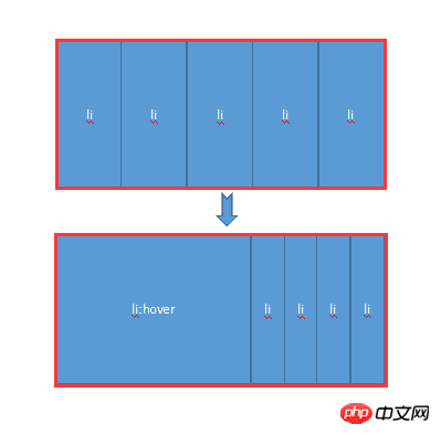
Mainly uses the hover attribute of CSS. When the mouse is not moved up, all li share the width of the entire container. When the mouse moves up, hover takes effect, allowing the li tag to return to the width of the original image, and other images share the remaining width. At the same time, the transition attribute is added to produce a gradient effect.
Next, let’s experience it personally through a small demo:
HTML code:
##
<body>
        <p class="contain">
            <ul>
                <li>
                    <a href="#">
                        <img src="img/1.jpg" />
                    </a>
                    <p class="title">
                        <a href="#">云南.大理</a>
                    </p>
                </li>
                <li>
                    <a href="#">
                        <img src="img/2.jpg" />
                    </a>
                    <p class="title">
                        <a href="#">广西.桂林</a>
                    </p>
                </li>
                <li>
                    <a href="#">
                        <img src="img/3.jpg" />
                    </a>
                    <p class="title">
                        <a href="#">福建.厦门</a>
                    </p>
                </li>
                <li>
                    <a href="#">
                        <img src="img/4.jpg" />
                    </a>
                    <p class="title">
                        <a href="#">浙江.千岛湖</a>
                    </p>
                </li>
                <li>
                    <a href="#">
                        <img src="img/5.jpg" />
                    </a>
                    <p class="title">
                        <a href="#">长江.三峡</a>
                    </p>
                </li>
            </ul>
        </p>
</body>
        .contain {
            width: 1050px;
            margin: 100px auto;
        }

        .contain li {
            float: left;
            list-style: none;
            width: 200px;
            height:284px;
            transition: all 2s;
            position: relative;
            overflow: hidden;
            border-left: 2px solid rgba(255, 255, 255, .8);
            box-shadow: 0px 0px 20px rgba(0, 0, 0, 0.8);
        }

        .contain ul:hover li {
            width: 80px;
        }

        .contain ul li:hover {
            width: 500px;
        }

        .contain li .title {
            position: absolute;
            width: 100%;
            height: 50px;
            background-color: rgba(0, 0, 0, .5);
            text-indent: 2em;
            line-height: 50px;
            bottom: 0px;
            left: 0
        }

        .contain a {
            color: #fff;
            text-decoration: none;
        }

1.hover selector
Explanation: The :hover selector is used to select the mouse pointer The element that floats above. The :hover selector can be used on all elements, not just links. Supplement: The :link selector sets the style of links pointing to pages that have not been visited, the :visited selector is used to set links to pages that have been visited, and the :active selector is used for active links. Extension: In the CSS definition, :hover must be located after :link and :visited (if present), so that the style can take effect.2.Transition attribute
Explanation: Transition is a shorthand attribute of CSS3, used to set four transition attributes:jquery accordion focus animation
JQuery implements simple accordion effect example code
Using Bootstrap to implement accordion effect
The above is the detailed content of Detailed explanation of the example of implementing accordion effect using pure CSS. For more information, please follow other related articles on the PHP Chinese website!


