
 Web Front-end
CSS Tutorial
An example to explain the CSS function of hiding an element when it is too wide to be fully displayed
Web Front-end
CSS Tutorial
An example to explain the CSS function of hiding an element when it is too wide to be fully displayed
An example to explain the CSS function of hiding an element when it is too wide to be fully displayed

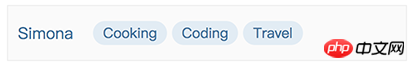
This article mainly shares with you the CSS function of hiding elements when they are too wide and cannot be fully displayed. I encountered a requirement. The style that needs to be implemented is to display several labels in a row in a fixed-width container. The number is variable, and each The length of the label is also variable. When a certain label cannot be fully displayed, it will not be displayed. The general effect is as follows. The labels are only displayed in one row. If there are too many labels, they will not be displayed.
The DOM structure of the tag part is as follows
1 2 3 4 5 6 7 |
|
At first glance, this problem seems very simple. , based on the principle of not using js to solve style problems as much as possible, I wrote the following styles to achieve the perfect effect. It can be seen that the last two .labels are folded to the next line because they exceed the width of .labels, and are then hidden by the overflow: hidden of .labels.
1 2 3 4 5 6 7 8 9 10 11 12 13 14 15 16 17 18 19 20 21 22 |
|
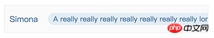
But not long after I was happy, I suddenly discovered a problem. If the length of the first label exceeds the width of the container, it will not be completely hidden. The content is truncated, like the following
This problem has troubled me for a long time. I have been thinking about what attributes in css can make the width of the child element exceed that of the parent. Container, hide it entirely (instead of just hiding the part beyond the parent container). All kinds of thinking had no results, and I was about to give up and worry about whether to use js to implement it. Suddenly an idea came to me. Since the wrapped elements can be hidden now, wouldn't it be enough to make the first label also wrap?
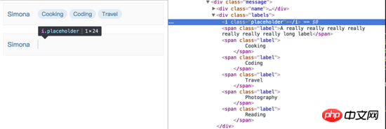
So how do you make the first label wrap? I thought of a trickier method. If it is no longer the first element, you can use the characteristics of flex to wrap it~ So, in all. Before the label element, a .placeholder element is added that is only 1px wide and 100% height. If you inspect the element, you can see that the placeholder element indeed occupies the position of the first row, achieving the effect we want~
In fact, using this idea, you can also use float achieve the same effect. Although it is a bit tricky and uses an additional DOM element, the effect is still perfectly achieved~
Related recommendations:
CSS3 realizes dynamic flip effect
Detailed example of using CSS to set an element to be translucent
The above is the detailed content of An example to explain the CSS function of hiding an element when it is too wide to be fully displayed. For more information, please follow other related articles on the PHP Chinese website!

Hot AI Tools

Undresser.AI Undress
AI-powered app for creating realistic nude photos

AI Clothes Remover
Online AI tool for removing clothes from photos.

Undress AI Tool
Undress images for free

Clothoff.io
AI clothes remover

Video Face Swap
Swap faces in any video effortlessly with our completely free AI face swap tool!
Hot Article
Hot Tools

Notepad++7.3.1
Easy-to-use and free code editor

SublimeText3 Chinese version
Chinese version, very easy to use

Zend Studio 13.0.1
Powerful PHP integrated development environment

Dreamweaver CS6
Visual web development tools

SublimeText3 Mac version
God-level code editing software (SublimeText3)
Hot Topics


 How to use bootstrap in vue
Apr 07, 2025 pm 11:33 PM
How to use bootstrap in vue
Apr 07, 2025 pm 11:33 PM
Using Bootstrap in Vue.js is divided into five steps: Install Bootstrap. Import Bootstrap in main.js. Use the Bootstrap component directly in the template. Optional: Custom style. Optional: Use plug-ins.
 The Roles of HTML, CSS, and JavaScript: Core Responsibilities
Apr 08, 2025 pm 07:05 PM
The Roles of HTML, CSS, and JavaScript: Core Responsibilities
Apr 08, 2025 pm 07:05 PM
HTML defines the web structure, CSS is responsible for style and layout, and JavaScript gives dynamic interaction. The three perform their duties in web development and jointly build a colorful website.
 How to write split lines on bootstrap
Apr 07, 2025 pm 03:12 PM
How to write split lines on bootstrap
Apr 07, 2025 pm 03:12 PM
There are two ways to create a Bootstrap split line: using the tag, which creates a horizontal split line. Use the CSS border property to create custom style split lines.
 Understanding HTML, CSS, and JavaScript: A Beginner's Guide
Apr 12, 2025 am 12:02 AM
Understanding HTML, CSS, and JavaScript: A Beginner's Guide
Apr 12, 2025 am 12:02 AM
WebdevelopmentreliesonHTML,CSS,andJavaScript:1)HTMLstructurescontent,2)CSSstylesit,and3)JavaScriptaddsinteractivity,formingthebasisofmodernwebexperiences.
 How to set up the framework for bootstrap
Apr 07, 2025 pm 03:27 PM
How to set up the framework for bootstrap
Apr 07, 2025 pm 03:27 PM
To set up the Bootstrap framework, you need to follow these steps: 1. Reference the Bootstrap file via CDN; 2. Download and host the file on your own server; 3. Include the Bootstrap file in HTML; 4. Compile Sass/Less as needed; 5. Import a custom file (optional). Once setup is complete, you can use Bootstrap's grid systems, components, and styles to create responsive websites and applications.
 How to insert pictures on bootstrap
Apr 07, 2025 pm 03:30 PM
How to insert pictures on bootstrap
Apr 07, 2025 pm 03:30 PM
There are several ways to insert images in Bootstrap: insert images directly, using the HTML img tag. With the Bootstrap image component, you can provide responsive images and more styles. Set the image size, use the img-fluid class to make the image adaptable. Set the border, using the img-bordered class. Set the rounded corners and use the img-rounded class. Set the shadow, use the shadow class. Resize and position the image, using CSS style. Using the background image, use the background-image CSS property.
 How to use bootstrap button
Apr 07, 2025 pm 03:09 PM
How to use bootstrap button
Apr 07, 2025 pm 03:09 PM
How to use the Bootstrap button? Introduce Bootstrap CSS to create button elements and add Bootstrap button class to add button text
 How to resize bootstrap
Apr 07, 2025 pm 03:18 PM
How to resize bootstrap
Apr 07, 2025 pm 03:18 PM
To adjust the size of elements in Bootstrap, you can use the dimension class, which includes: adjusting width: .col-, .w-, .mw-adjust height: .h-, .min-h-, .max-h-
