The so-called responsive design means that the web page layout can be adjusted adaptively in terminal devices with different screen resolutions, different pixel density ratios, and different widths. The original intention of responsive design is to make the original PC website compatible with mobile terminals. Most responsive web pages are implemented through media queries and loading CSS files of different styles. This kind of flexible layout makes the layout of the website more reasonable on different device terminals. This article mainly introduces the detailed explanation of the responsive image processing of the picture element in HTML5. The editor thinks it is quite good, so I will share it with you now and give it as a reference. Let’s follow the editor to take a look, I hope it can help everyone.
Although responsive design has many benefits, it also has many drawbacks. Since the PC and mobile terminals access the same website, the PC does not need to care about the traffic limit, but the mobile terminal cannot ignore it.
In order to adapt to the screen width and pixel density of different terminal models, we generally use the following method to set the CSS style of the image:
Change the image The maximum width is set to 100% to ensure that the image will not exceed the width of its parent element. If the width of the parent element changes, the width of the image will also change. height: auto can ensure that when the width of the image changes, The height of the image will be scaled according to its own width-to-height ratio.
In this way, when we access the image in the responsive webpage on the mobile device, we only scale the resolution of the image, and download the large image on the PC. This not only wastes traffic, but also wastes bandwidth. Moreover, it will slow down the opening speed of web pages and seriously affect the user experience.
New solution:
## is a new element of HTML5;
The element will enhance the process of working with responsive images if it works in conjunction with the current
can load different images according to different conditions. These conditions can be the current height of the window (viewport), width (width ), orientation, pixel density (dpr), etc.;
Give a few chestnuts In the following chestnuts, different images are loaded for different screen widths; when the page Minpic.png is loaded when the width is between 320px and 640px; middle.png is loaded when the page width is greater than 640px
<picture>
    <source media="(min-width: 320px) and (max-width: 640px)" srcset="img/minpic.png">
    <source media="(min-width: 640px)" srcset="img/middle.png">
    <img src="img/picture.png" alt="this is a picture">
</picture>
Copy after login
2. In the following example, the screen direction is added as a condition; when the screen direction is landscape orientation Load the image ending with _landscape.png; load the image ending with _portrait.png when the screen orientation is portrait orientation;
<picture>
    <source media="(min-width: 320px) and (max-width: 640px) and (orientation: landscape)" srcset="img/minpic_landscape.png">
    <source media="(min-width: 320px) and (max-width: 640px) and (orientation: portrait)" srcset="img/minpic_portrait.png">
    <source media="(min-width: 640px) and (orientation: landscape)" srcset="img/middlepic_landscape.png">
    <source media="(min-width: 640px) and (orientation: portrait)" srcset="img/middlepic_portrait.png">
    <img src="img/picture.png" alt="this is a picture">
</picture>
Copy after login
3. In the following chestnut, the screen pixel density is added as a condition; when the pixel density When the pixel density is 1x, load the image _retina.png 2x. When the pixel density is 1x, load the image without retina suffix;
<picture>
    <source media="(min-width: 320px) and (max-width: 640px)" srcset="img/minpic.png,img/minpic_retina.png 2x">
    <source media="(min-width: 640px)" srcset="img/middle.png,img/middle_retina.png 2x">
    <img src="img/picture.png,img/picture_retina.png 2x" alt="this is a picture">
</picture>
Copy after login
4. Add the image file format as a condition in the following chestnut, when the webp format image is supported Load webp format images, and load png format images when not supported;
<picture>
    <source type="image/webp" srcset="img/picture.webp">
    <img src="img/picture.png" alt="this is a picture">
</picture>
Copy after login
5. Add a width description in the following example; the page will choose to load the largest image that is not larger than the current width according to the current size;
<img src="picture-160.png" alt="this is a picture"
     sizes="90vw"
     srcset="picture-160.png 160w,
             picture-320.png 320w,
             picture-640.png 640w,
             picture-1280.png 1280w">
Copy after login
6. Add the sizes attribute in the following example; when the window width is greater than or equal to 800px, load the corresponding version of the image;
<img src="picture-160.png" alt="this is a picture"
     sizes="90vw"
     srcset="picture-160.png 160w,
             picture-320.png 320w,
             picture-640.png 640w,
             picture-1280.png 1280w">
Copy after login
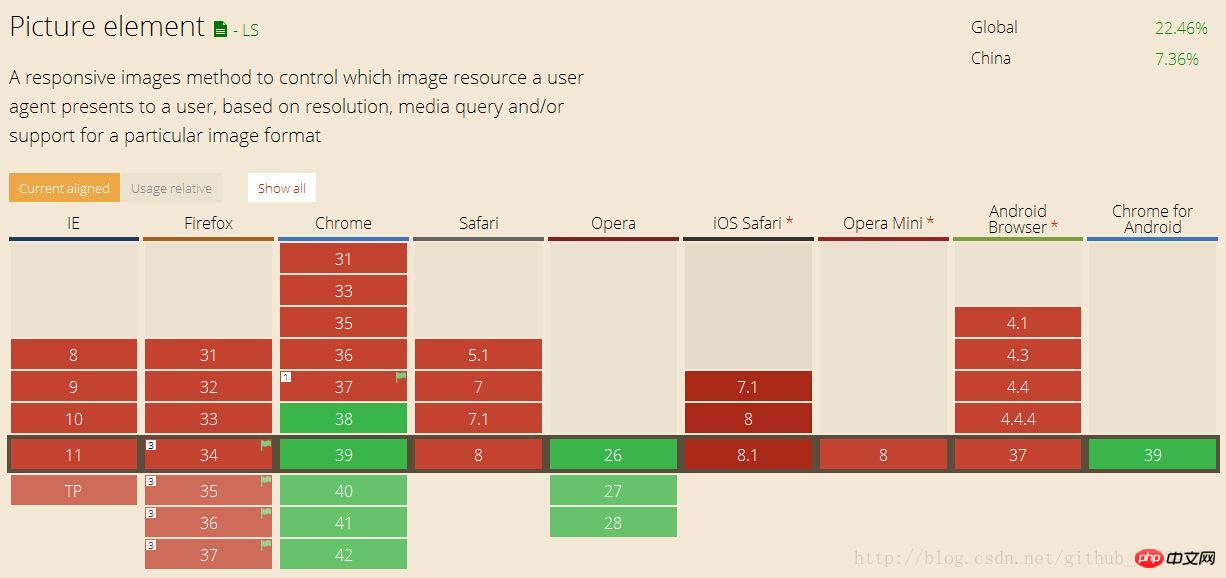
Compatibility: Currently only Chrome, Firefox, Opera can support it The compatibility is good. The specific compatibility is as shown in the figure:
## Advantages:
Load image files of appropriate size to make available bandwidth Be fully utilized;
Load images that are cropped differently and have different aspect ratios to accommodate layout changes at different widths;
Load more High pixel density, displaying higher resolution images;
Steps:Create tag ;
Create a tag within these tags that you want to use to perform any feature;
Add a media attribute to include the characteristics you want, such as width (max-width, min-width), direction (orientation), etc.;
Add a srcset attribute, The attribute value is the corresponding image file name to load. If you want to provide different pixel densities, such as Retina displays, you can add additional file names to the srcset attribute;
Add a fallback tag;
Working Principle
Syntax
As can be seen from the above sample code, without introducing js and third-party libraries, When media queries are not included in CSS, the element can declare responsive images using only HTML;
element
The tag itself has no attributes. The magic part is that is used as a container for . The element, which is used to load multimedia such as video and audio, has been updated to load images and some new attributes have been added:
srcset (required)
Accepts a single image file path (such as: srcset="img/minpic.png").
Or a comma-separated image path described by pixel density (such as: srcset=" img/minpic.png, img/minpic_retina.png 2x”), 1x descriptions are not used by default.
media (optional)
Accept any validated media query, as you can see in the CSS @media selector (eg: media="(min-width: 320px)").
It has been used in the previous syntax example.
sizes (optional)
Receive a single width description (such as: sizes="100vw") or a single media query width description (such as: sizes="(min-width: 320px ) 100vw”).
or comma-separated media query width description (such as: sizes="(min-width: 320px) 100vw, (min-width: 640px) 50vw, calc(33vw - 100px )") The last one is considered the default.
type(optional)
Accept supported MIME types (such as: type="image/webp" or type="image/vnd.ms-photo")
The browser will load the exact image resource based on these tips and attributes. According to the list order of tags. The browser will use the first appropriate element and ignore subsequent tags.
Add the final element
The element is used inside to be displayed when the browser does not support it or when there is no matching source tag. It is mandatory to use the tag within . If you forget, no image will be displayed.
Use to declare the default image display. Place the tag at the end of the , and the browser will ignore the declaration before finding the tag. This image tag also requires you to write its alt attribute.
This article draws on many other articles. All the introductions to picture are over here, so let’s try it now~
The above is the detailed content of How to handle pictures responsively using the picture element in HTML5. For more information, please follow other related articles on the PHP Chinese website!
Statement of this Website
The content of this article is voluntarily contributed by netizens, and the copyright belongs to the original author. This site does not assume corresponding legal responsibility. If you find any content suspected of plagiarism or infringement, please contact admin@php.cn

 Web Front-end


 ## Advantages:


 1385
1385
 52
52

 Table Border in HTML
Sep 04, 2024 pm 04:49 PM
Table Border in HTML
Sep 04, 2024 pm 04:49 PM
 HTML margin-left
Sep 04, 2024 pm 04:48 PM
HTML margin-left
Sep 04, 2024 pm 04:48 PM
 Nested Table in HTML
Sep 04, 2024 pm 04:49 PM
Nested Table in HTML
Sep 04, 2024 pm 04:49 PM
 HTML Table Layout
Sep 04, 2024 pm 04:54 PM
HTML Table Layout
Sep 04, 2024 pm 04:54 PM
 HTML Input Placeholder
Sep 04, 2024 pm 04:54 PM
HTML Input Placeholder
Sep 04, 2024 pm 04:54 PM
 HTML Ordered List
Sep 04, 2024 pm 04:43 PM
HTML Ordered List
Sep 04, 2024 pm 04:43 PM
 Moving Text in HTML
Sep 04, 2024 pm 04:45 PM
Moving Text in HTML
Sep 04, 2024 pm 04:45 PM
 HTML onclick Button
Sep 04, 2024 pm 04:49 PM
HTML onclick Button
Sep 04, 2024 pm 04:49 PM
