

Two ways to pop up a modal box in Angular

This article mainly introduces the two ways of popping up the modal box in Angular. It is very good and has reference value. Friends who need it can refer to it. I hope it can help everyone.
Before starting our blog, we must first install ngx-bootstrap-modal
npm install ngx-bootstrap-modal --save
Otherwise, the effect of our modal box will be ugly and you will want to vomit
1. Pop-up method one (this method comes from https://github.com/cipchk/ngx-bootstrap-modal)
1.alert pop-up box
(1)demo directory
--------app.component.ts
--------app.component.html
--------app.module .ts
--------detail(folder)
------------detail.component.ts
------------detail.component.html
(2)demo code
app.module.ts import the necessary BootstrapModalModule and ModalModule, and then register them
//app.module.ts
import { BrowserModule } from '@angular/platform-browser';
import { NgModule } from '@angular/core';
//这种模态框只需要导入下面这两个
import { BootstrapModalModule } from 'ngx-bootstrap-modal';
import { ModalModule } from 'ngx-bootstrap/modal';
import { AppComponent } from './app.component';
import { DetailComponent } from './detail/detail.component';
@NgModule({
 declarations: [
 AppComponent,
 DetailComponent
 ],
 imports: [
 BrowserModule,
 BootstrapModalModule
 ],
 providers: [],
 entryComponents: [
 DetailComponent
 ],
 bootstrap: [AppComponent]
})
export class AppModule { }app.component.htmlCreate a button that can pop up a modal box
<p class="container">
 <p class="row">
 <button type="button" class="btn btn-primary" (click)="showAlert()">alert模态框</button>
 </p>
</p>
app.component.tsWrite the action showAlert() of this button
import { Component } from '@angular/core';
import { DialogService } from "ngx-bootstrap-modal";
import { DetailComponent } from './detail/detail.component'
@Component({
 selector: 'app-root',
 templateUrl: './app.component.html',
 styleUrls: ['./app.component.css']
})
export class AppComponent {
 title = 'app';
 constructor(public dialogService: DialogService) {
 }
 showAlert() {
  this.dialogService.addDialog(DetailComponent, { title: 'Alert title!', message: 'Alert message!!!' });
 }
}detail.component .html writes the layout of the alert pop-up box
<p class="modal-dialog">
 <p class="modal-content">
  <p class="modal-header">
   <button type="button" class="close" (click)="close()" >×</button>
   <h4 class="modal-title">{{title}}</h4>
  </p>
  <p class="modal-body">
   这是alert弹框
  </p>
  <p class="modal-footer">
   <button type="button" class="btn btn-primary" (click)="close()">取消</button>
   <button type="button" class="btn btn-default">确定</button>
  </p>
 </p>
</p>detail.component.ts to create the modal box component. We need to create a component, and then ngx-bootstrap-model will help guide the startup
This component needs to be inherited DialogComponent
T The type of external parameter passed to the modal box.
T1 modal box return value type.
Therefore, DialogService should be a constructor parameter of DialogComponent.
import { Component } from '@angular/core';
import { DialogComponent, DialogService } from 'ngx-bootstrap-modal';
export interface AlertModel {
 title: string;
 message: string;
}
@Component({
 selector: 'alert',
 templateUrl: './detail.component.html',
 styleUrls: ['./detail.component.css']
})
export class DetailComponent extends DialogComponent<AlertModel, null> implements AlertModel {
 title: string;
 message: string;
 constructor(dialogService: DialogService) {
 super(dialogService);
 }
}2.confirm pop-up box
(1)demo directory
--------app.component.ts
----- ---app.component.html
--------app.module.ts
--------confirm(folder)
------- -----confirm.component.ts
------------confirm.component.html
(2)demo code
app.module .ts imports the necessary BootstrapModalModule and ModalModule, and then registers them. These are the same as the alert pop-up box, because these are the pop-up methods of method 1
//app.module.ts
import { BrowserModule } from '@angular/platform-browser';
import { NgModule } from '@angular/core';
//这种模态框只需要导入下面这两个
import { BootstrapModalModule } from 'ngx-bootstrap-modal';
import { ModalModule } from 'ngx-bootstrap/modal';
import { AppComponent } from './app.component';
import { DetailComponent } from './detail/detail.component';
@NgModule({
 declarations: [
 AppComponent,
 DetailComponent
 ],
 imports: [
 BrowserModule,
 BootstrapModalModule
 ],
 providers: [],
 entryComponents: [
 DetailComponent
 ],
 bootstrap: [AppComponent]
})
export class AppModule { }app.component.htmlCreate a modal box that can pop up Button
<p class="container">
 <p class="row">
 <button type="button" class="btn btn-primary" (click)="showConfirm()">modal模态框</button>
 </p>
</p>
app.component.tsWrite the action of this button showConfirm()
import { Component } from '@angular/core';
import { DialogService } from "ngx-bootstrap-modal";
import { ConfirmComponent } from './confirm/confirm.component'
@Component({
 selector: 'app-root',
 templateUrl: './app.component.html',
 styleUrls: ['./app.component.css']
})
export class AppComponent {
 title = 'app';
 constructor(public dialogService: DialogService,private modalService: BsModalService) {
 }
 showConfirm() {
  this.dialogService.addDialog(ConfirmComponent, {
   title: 'Confirmation',
   message: 'bla bla'
  })
   .subscribe((isConfirmed) => {
   });
 }
}confirm.component.htmlWrite the layout of the confirm pop-up box
<p class="modal-dialog">
 <p class="modal-content">
  <p class="modal-header">
   <button type="button" class="close" (click)="close()" >×</button>
   <h4 class="modal-title">{{title}}</h4>
  </p>
  <p class="modal-body">
   这是confirm弹框
  </p>
  <p class="modal-footer">
   <button type="button" class="btn btn-primary" (click)="close()">取消</button>
   <button type="button" class="btn btn-default">确定</button>
  </p>
 </p>
</p>confirm.component. ts creates modal box component
import { Component } from '@angular/core';
import { DialogComponent, DialogService } from 'ngx-bootstrap-modal';
export interface ConfirmModel {
 title:string;
 message:any;
}
@Component({
 selector: 'confirm',
 templateUrl: './confirm.component.html',
 styleUrls: ['./confirm.component.css']
})
export class ConfirmComponent extends DialogComponent<ConfirmModel, boolean> implements ConfirmModel {
 title: string;
 message: any;
 constructor(dialogService: DialogService) {
 super(dialogService);
 }
 confirm() {
 // on click on confirm button we set dialog result as true,
 // ten we can get dialog result from caller code
 this.close(true);
 }
 cancel() {
 this.close(false);
 }
}3. Built-in pop-up box
(1)demo directory
--------app.component.ts
--------app.component.html
--------app.module.ts
(2)demo code
The built-in pop-up box also includes three forms of alert confirm prompt, all with some built-in styles
app.module.ts
import { BrowserModule } from '@angular/platform-browser';
import { NgModule } from '@angular/core';
import { BootstrapModalModule } from 'ngx-bootstrap-modal';
import { ModalModule } from 'ngx-bootstrap/modal';
import { AppComponent } from './app.component';
@NgModule({
 declarations: [
 AppComponent
 ],
 imports: [
 BrowserModule,
 BootstrapModalModule,
 ModalModule.forRoot()
 ],
 providers: [],
 bootstrap: [AppComponent]
})
export class AppModule { }app.component.html is very simple, just one button
<p class="container">
 <p class="row">
 <button type="button" class="btn btn-default" (click)="show()">内置</button>
 </p>
</p>
app.component.ts is very simple, you don’t even need to write the layout of the component, just pass in some parameters such as icon, size, etc.
import { Component } from '@angular/core';
import { DialogService, BuiltInOptions } from "ngx-bootstrap-modal";
@Component({
 selector: 'app-root',
 templateUrl: './app.component.html',
 styleUrls: ['./app.component.css']
})
export class AppComponent {
 title = 'app';
 constructor(public dialogService: DialogService) {
 }
 show(){
  this.dialogService.show(<BuiltInOptions>{
   content: '保存成功',
   icon: 'success',
   size: 'sm',
   showCancelButton: false
  })
 }
}2. Pop-up method 2 (this method comes from https://valor-software.com/ngx-bootstrap/#/modals)
Still the same as the previous method, install ngx-bootstrap-modal first, and then import the bootstrap style sheet
1.demo directory
--------app.component.ts
--------app.component.html
------- -app.module.ts
2.demo code
app.module.ts imports the corresponding modules and registers them
//app.module.ts
import { BrowserModule } from '@angular/platform-browser';
import { NgModule } from '@angular/core';
import { ModalModule } from 'ngx-bootstrap/modal';
import { AppComponent } from './app.component';
@NgModule({
 declarations: [
 AppComponent
 ],
 imports: [
 BrowserModule,
 ModalModule.forRoot()
 ],
 providers: [],
 entryComponents: [
 ],
 bootstrap: [AppComponent]
})
export class AppModule { }app.component.ts
import { Component,TemplateRef } from '@angular/core';
import { BsModalService } from 'ngx-bootstrap/modal';
import { BsModalRef } from 'ngx-bootstrap/modal/modal-options.class';
@Component({
 selector: 'app-root',
 templateUrl: './app.component.html',
 styleUrls: ['./app.component.css']
})
export class AppComponent {
 title = 'app';
 public modalRef: BsModalRef;
 constructor(private modalService: BsModalService) {
 }
 showSecond(template: TemplateRef<any>){//传入的是一个组件
  this.modalRef = this.modalService.show(template,{class: 'modal-lg'});//在这里通过BsModalService里面的show方法把它显示出来
 };
}app.component.html
<p class="container">
 <p class="row">
 <button type="button" class="btn btn-success" (click)="showSecond(Template)">第二种弹出方式</button>
 </p>
</p>
<!--第二种弹出方法的组件-->
<template #Template>
 <p class="modal-header tips-modal-header">
 <h4 class="modal-title pull-left">第二种模态框</h4>
 <button type="button" class="close pull-right" aria-label="Close" (click)="modalRef.hide()">
  <span aria-hidden="true">×</span>
 </button>
 </p>
 <p class="modal-body tips-modal-body">
 <p class="tips-contain"><span>第二种模态框弹出方式</span></p>
 </p>
 <p class="modal-footer">
  <button type="button" class="btn btn-default" (click)="modalRef.hide()">确定</button>
  <button type="button" class="btn btn-default" (click)="modalRef.hide()">取消</button>
 </p>
</template>
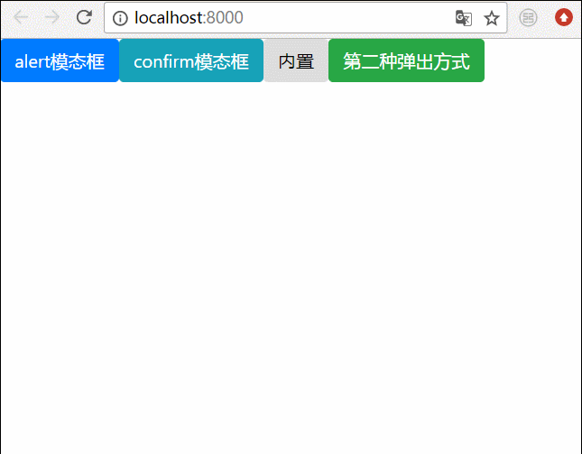
3. Final effect
We write all the bullet boxes above together, and then the effect is like this
Related recommendations:
How to solve the problem that the BootStrap modal box is not vertically centered
bootstrap modal box nesting, tabindex attribute, How to remove shadow
Detailed explanation of bootstrap3-dialog-master modal box usage
The above is the detailed content of Two ways to pop up a modal box in Angular. For more information, please follow other related articles on the PHP Chinese website!

Hot AI Tools

Undresser.AI Undress
AI-powered app for creating realistic nude photos

AI Clothes Remover
Online AI tool for removing clothes from photos.

Undress AI Tool
Undress images for free

Clothoff.io
AI clothes remover

Video Face Swap
Swap faces in any video effortlessly with our completely free AI face swap tool!

Hot Article
Hot Tools

Notepad++7.3.1
Easy-to-use and free code editor

SublimeText3 Chinese version
Chinese version, very easy to use

Zend Studio 13.0.1
Powerful PHP integrated development environment

Dreamweaver CS6
Visual web development tools

SublimeText3 Mac version
God-level code editing software (SublimeText3)
Hot Topics


 How to install Angular on Ubuntu 24.04
Mar 23, 2024 pm 12:20 PM
How to install Angular on Ubuntu 24.04
Mar 23, 2024 pm 12:20 PM
Angular.js is a freely accessible JavaScript platform for creating dynamic applications. It allows you to express various aspects of your application quickly and clearly by extending the syntax of HTML as a template language. Angular.js provides a range of tools to help you write, update and test your code. Additionally, it provides many features such as routing and form management. This guide will discuss how to install Angular on Ubuntu24. First, you need to install Node.js. Node.js is a JavaScript running environment based on the ChromeV8 engine that allows you to run JavaScript code on the server side. To be in Ub
 Detailed explanation of angular learning state manager NgRx
May 25, 2022 am 11:01 AM
Detailed explanation of angular learning state manager NgRx
May 25, 2022 am 11:01 AM
This article will give you an in-depth understanding of Angular's state manager NgRx and introduce how to use NgRx. I hope it will be helpful to you!
 How to use PHP and Angular for front-end development
May 11, 2023 pm 04:04 PM
How to use PHP and Angular for front-end development
May 11, 2023 pm 04:04 PM
With the rapid development of the Internet, front-end development technology is also constantly improving and iterating. PHP and Angular are two technologies widely used in front-end development. PHP is a server-side scripting language that can handle tasks such as processing forms, generating dynamic pages, and managing access permissions. Angular is a JavaScript framework that can be used to develop single-page applications and build componentized web applications. This article will introduce how to use PHP and Angular for front-end development, and how to combine them
 An article exploring server-side rendering (SSR) in Angular
Dec 27, 2022 pm 07:24 PM
An article exploring server-side rendering (SSR) in Angular
Dec 27, 2022 pm 07:24 PM
Do you know Angular Universal? It can help the website provide better SEO support!
 A brief analysis of how to use monaco-editor in angular
Oct 17, 2022 pm 08:04 PM
A brief analysis of how to use monaco-editor in angular
Oct 17, 2022 pm 08:04 PM
How to use monaco-editor in angular? The following article records the use of monaco-editor in angular that was used in a recent business. I hope it will be helpful to everyone!
 A brief analysis of independent components in Angular and see how to use them
Jun 23, 2022 pm 03:49 PM
A brief analysis of independent components in Angular and see how to use them
Jun 23, 2022 pm 03:49 PM
This article will take you through the independent components in Angular, how to create an independent component in Angular, and how to import existing modules into the independent component. I hope it will be helpful to you!
 Angular components and their display properties: understanding non-block default values
Mar 15, 2024 pm 04:51 PM
Angular components and their display properties: understanding non-block default values
Mar 15, 2024 pm 04:51 PM
The default display behavior for components in the Angular framework is not for block-level elements. This design choice promotes encapsulation of component styles and encourages developers to consciously define how each component is displayed. By explicitly setting the CSS property display, the display of Angular components can be fully controlled to achieve the desired layout and responsiveness.
 What should I do if the project is too big? How to split Angular projects reasonably?
Jul 26, 2022 pm 07:18 PM
What should I do if the project is too big? How to split Angular projects reasonably?
Jul 26, 2022 pm 07:18 PM
The Angular project is too large, how to split it reasonably? The following article will introduce to you how to reasonably split Angular projects. I hope it will be helpful to you!
