 Web Front-end
 JS Tutorial
 slideToggle+slideup implements the mobile phone folding menu effect example code
slideToggle+slideup implements the mobile phone folding menu effect example code
This article mainly introduces slideToggle+slideup in detail to realize the folding menu effect on the mobile phone. It has certain reference value. Interested friends can refer to it. I hope it can help everyone.
For the effect of collapsing menus, there are many plug-ins on the Internet, such as bootstrap's Collapse, which are easy to use and very simple. However, if you are not using the bootstrap framework, it will cause a lot of unnecessary trouble, such as the default style. Modified, code redundancy, etc. Generally, there are many jQuery-based plug-ins on the Internet, but they are too cumbersome. Today I will tell you how to use jQuery’s own functions to achieve this effect. Not much to say, just go straight to it. Code:
HTML part:
<p class="box">
  <!-- 内容-->
  <ul class="inner">
    <li class="inner_title">绿色校园<span></span></li>
    <ol class="inner_style">
      <li>篮球场</li>
      <li>篮球场</li>
      <li>篮球场</li>
      <li>篮球场</li>
      <li>篮球场</li>
    </ol>
    <li class="inner_title">绿色校园<span></span></li>
    <ol class="inner_style">
      <li>篮球场</li>
      <li>篮球场</li>
      <li>篮球场</li>
      <li>篮球场</li>
      <li>篮球场</li>
      <li>篮球场</li>
    </ol>
    <li class="inner_title">绿色校园<span></span></li>
    <ol class="inner_style">
      <li>篮球场</li>
      <li>篮球场</li>
      <li>篮球场</li>
      <li>篮球场</li>
      <li>篮球场</li>
      <li>篮球场</li>
    </ol>
  </ul>
</p>CSS part:
##
<style>
  body{
    background: #dddddd;
  }
  .inner{
    background: #fff;
    width: 100%;
    overflow: hidden;
    list-style: none;
    margin: 0;
    padding: 0;
  }
  .inner .inner_title{
    background-color: #fff;
    width: 100%;
    padding: 0 2.5%;
    border-bottom: 1px solid #efefef;
    color: #343434;
    height: 40px;
    line-height: 40px;
    font-size: 16px;
    position: relative;
  }
  .inner .inner_title span{
    position: absolute;
    width: 20px;
    height: 20px;
    top: 50%;
    margin-top: -10px;
    right: 6%;
    background: url("images/arow_left.png") no-repeat center;
  }
  .inner .inner_title.active{
    color: #4db780;
  }
  .inner .inner_title.active span{
    background: url("images/arow_down.png") no-repeat center;
  }
  /*弹出的二级分类处理*/
  .inner .inner_style{
    margin: 0;
    list-style: none;
    width: 100%;
    background-color: #efefef;
    overflow: hidden;
    padding: 15px 3%;
  }
  .inner .inner_style li{
    float: left;
    color: #333;
    font-size: 14px;
    width: 21%;
    text-align: center;
    line-height: 30px;
    margin-right: 5%;
  }
</style>##
<script>
/**处理折叠效果**/
(function ($) {
$.fn.Fold = function (options) {
//默认参数设置
var settings = {
speed: 300 //折叠速度(值越大越慢)
}
//不为空则合并参数
if (options)
$.extend(settings, options);
//遵循链式原则
return this.each(function () {
//为每个li元素绑定点击事件
$("> li", this).each(function () {
$(this).bind("click", function () {
//单击之前先判断当前菜单是否折叠
if($(this).hasClass('active')){//折叠状态
$(".inner ol").slideUp('500');//使用slideup()折叠其他选项
$(this).removeClass('active');//移除选中样式
}else{//打开状态
$(this).siblings('li').removeClass('active');
$(".inner ol").slideUp('500');//使用slideup()折叠其他选项
$(this).addClass('active')//添加选中样式
$(this).next("ol").slideToggle(settings.speed);
}
});
});
//默认折叠
$("> ol", this).hide();
});
}
})(jQuery);
$(".inner").Fold();//调用
</script>The effect is as follows:
 Related recommendations:
The above is the detailed content of slideToggle+slideup implements the mobile phone folding menu effect example code. For more information, please follow other related articles on the PHP Chinese website!

Hot AI Tools

Undresser.AI Undress
AI-powered app for creating realistic nude photos

AI Clothes Remover
Online AI tool for removing clothes from photos.

Undress AI Tool
Undress images for free

Clothoff.io
AI clothes remover

AI Hentai Generator
Generate AI Hentai for free.

Hot Article

Hot Tools

Notepad++7.3.1
Easy-to-use and free code editor

SublimeText3 Chinese version
Chinese version, very easy to use

Zend Studio 13.0.1
Powerful PHP integrated development environment

Dreamweaver CS6
Visual web development tools

SublimeText3 Mac version
God-level code editing software (SublimeText3)

Hot Topics
 1376
1376
 52
52
 Windows 11: The easy way to import and export start layouts
Aug 22, 2023 am 10:13 AM
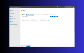
In Windows 11, the Start menu has been redesigned and features a simplified set of apps arranged in a grid of pages, unlike its predecessor, which had folders, apps, and apps on the Start menu. Group. You can customize the Start menu layout and import and export it to other Windows devices to personalize it to your liking. In this guide, we’ll discuss step-by-step instructions for importing Start Layout to customize the default layout on Windows 11. What is Import-StartLayout in Windows 11? Import Start Layout is a cmdlet used in Windows 10 and earlier versions to import customizations for the Start menu into
 Samsung's 10,000-yuan foldable phone W25 revealed: 5-megapixel under-screen front camera and thinner body
Aug 23, 2024 pm 12:43 PM
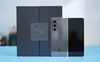
According to news on August 23, Samsung is about to launch a new folding mobile phone W25, which is expected to be unveiled at the end of September. It will make corresponding improvements in the under-screen front camera and body thickness. According to reports, Samsung W25, codenamed Q6A, will be equipped with a 5-megapixel under-screen camera, which is an improvement over the 4-megapixel camera of the Galaxy Z Fold series. In addition, the W25’s external-screen front camera and ultra-wide-angle camera are expected to be 10 million and 12 million pixels respectively. In terms of design, the W25 is about 10 mm thick in the folded state, which is about 2 mm thinner than the standard Galaxy Z Fold 6. In terms of screen, the W25 has an external screen of 6.5 inches and an internal screen of 8 inches, while the Galaxy Z Fold6 has an external screen of 6.3 inches and an internal screen of 8 inches.
 Google Pixel 9 Pro Fold phone case exposed: 6.4-inch outer screen, 8.02-inch inner screen
Jun 25, 2024 pm 02:35 PM
According to news on June 25, the source ytechb published a blog post yesterday (June 24), sharing a rendering of the Google Pixel 9 Pro Fold mobile phone case, once again showing the design of the back of this folding screen. According to previous news, Google will release the Pixel 9 series of mobile phones in October this year. In addition to the three phones in the Pixel 9 series, Pixel Fold will also be included in the Pixel 9 series and will be officially named Pixel 9 Pro Fold. The phone case exposed this time comes from accessory manufacturer Torro. The company's UK and US online stores have listed the product phone case and disclosed the design and display size of the phone. The page shows a large number of Pixel 9 Pro Fold phone case renderings
 How to Default 'Show More Options' in Windows 11's Right-Click Menu
Jul 10, 2023 pm 12:33 PM
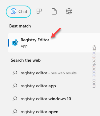
One of the most annoying changes that we users never want is the inclusion of "Show more options" in the right-click context menu. However, you can remove it and get back the classic context menu in Windows 11. No more multiple clicks and looking for these ZIP shortcuts in context menus. Follow this guide to return to a full-blown right-click context menu on Windows 11. Fix 1 – Manually adjust the CLSID This is the only manual method on our list. You will adjust specific keys or values in Registry Editor to resolve this issue. NOTE – Registry edits like this are very safe and will work without any issues. Therefore, you should create a registry backup before trying this on your system. Step 1 – Try it
 The biggest shortcoming of foldable screen mobile phones: no core application scenarios
Mar 16, 2024 am 09:04 AM
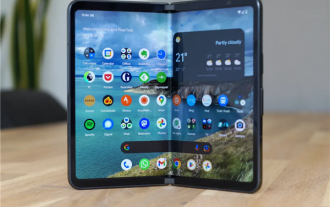
What we are discussing today is not what a certain product is like, but returning to the topic of "folding screen" itself and exploring the "rationality" of folding screen mobile phones. First, let’s take a look at the market performance of folding screen mobile phones. According to IDC’s latest data report, China’s folding screen mobile phone market will ship approximately 7.007 million units in 2023, a year-on-year increase of 114.5%. Among them, China's foldable screen mobile phone market shipped approximately 2.771 million units in the fourth quarter of 2023, a year-on-year increase of 149.6%. The data does look good, and the growth is also very strong. However, compared with the approximately 270 million smartphone shipments in the Chinese market in 2023, this data is really not enough. In general
 Samsung Galaxy Z Flip 6 model first revealed: narrower bezels, creases still present
Jun 22, 2024 am 03:28 AM
According to news on June 21, foreign media recently released model photos of Samsung Galaxy Z Flip 6 on the Internet. According to the picture, it can be understood that the borders of Samsung Galaxy Z Flip 6 will be further narrowed, which means that the width of the phone may be reduced in the folded state, and it will also provide a more comfortable grip and portability. Moreover, compared with the previous generation ZFlip5, the model of Galaxy ZFlip6 is more square and the camera module on the back is more prominent. It is expected to use a new camera sensor. However, from the front, the creases of the phone are still relatively obvious, but considering that the leaked model is a model phone, there may be some differences with the real phone, so it is for reference only. In terms of performance configuration, Galaxy
 IDC estimates that global smartphone shipments in 2024 will be 1.2 billion units: 25 million foldable screen units, a year-on-year increase of 37%
Feb 24, 2024 pm 02:20 PM
According to news on February 24, IDC recently released a market research report, predicting that global smartphone shipments will reach 1.2 billion units in 2024, a year-on-year increase of 2.8%, and will then maintain low single-digit growth by 2028. IDC believes that overall shipments in 2024 will still be below pre-pandemic levels, but the global smartphone market has bottomed out and is beginning to show an upward trend in recovery. IDC believes that the two key factors driving the overall market recovery are the equipment refresh cycle and the growth of demand in emerging markets. There are also two main driving forces. IDC estimates that folding screen mobile phone shipments will reach 25 million units in 2024, a year-on-year increase of 37%; the other is that artificial intelligence (AI) has quickly become a part of the discussion on smartphones, triggering
 Do you want to know about word folding?
Mar 19, 2024 pm 07:49 PM
After editing text content in Word, you need to view and check the edited content. If there is a lot of content, it is inconvenient to read it. How to solve this problem? In this case, the word folding method is needed. Let me share the method tutorial with you guys! First, open the Word document on your computer, enter the required content and select it, then click the "Start" option in the menu bar, and then select a style to apply to the text paragraph you just selected. You can refer to the part marked with a red circle in the picture below. 2. Then, the selected text paragraph will change its style and add a small arrow, as shown in the red circle in the picture below: 3. Click the small arrow to freely expand or collapse the previously selected text paragraph, or directly Right click, from


