jQuery date range picker analysis
jQuery Date Range Picker is a jQuery date picker plug-in that allows users to select a date and time range. The entire date picker plug-in uses CSS to render styles, and it is very easy to customize the skin using CSS. And the browser compatibility is very good and supports multiple time formats.
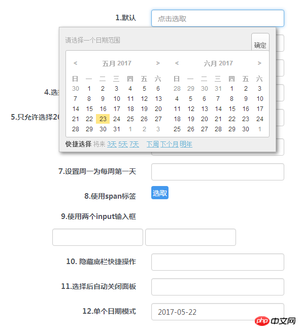
View the demo Download the source code
Prepare
Use the date picker plug-in Requires support for jQuery 1.3.2+ and Moment 2.2.0+.
<link rel="stylesheet" href="css/daterangepicker.css" rel="external nofollow" />
<script src="js/moment.min.js"></script>
<script src="js/jquery.daterangepicker.js"></script>
HTML structure
Add the following html structure where the date picker needs to be placed, which is an input box.
<input type="text" id="datepicker" value="">
Calling the plug-in
Calling the jQuery Date Range Picker plug-in is very simple, just like other common jQuery plug-ins:
$('#datepicker').dateRangePicker(option);
Configuration parameters
The default configuration parameters of this date picker are as follows:
{
 format: 'YYYY-MM-DD',
 separator: ' to ',
 language: 'auto',
 startOfWeek: 'sunday',// or monday
 getValue: function()
 {
  return this.value;
 },
 setValue: function(s)
 {
  this.value = s;
 },
 startDate: false,
 endDate: false,
 minDays: 0,
 maxDays: 0,
 showShortcuts: true,
 time: {
  enabled: false
 },
 shortcuts:
 {
  //'prev-days': [1,3,5,7],
  'next-days': [3,5,7],
  //'prev' : ['week','month','year'],
  'next' : ['week','month','year']
 },
 customShortcuts : [],
 inline:false,
 container: 'body',
 alwaysOpen:false,
 singleDate:false,
 batchMode:false,
 beforeShowDay: [function],
 daypAttrs: [],
 dayTdAttrs: [],
 applyBtnClass: ''
}format (String): Moment’s date format. Click here to view the Moment documentation.
separator (String): The separator between date strings.
language (String): The predefined languages are "en" and "cn". You can customize the language using this parameter. It can also be set to "auto" to let the browser detect the language itself.
startOfWeek (String): "sunday" or "monday".
getValue (Function): This function is called when getting the date range from the DOM element, and the context of the function is set to the datepicker DOM.
setValue (Function): This function is called when writing a date range to a DOM element.
startDate (String or false): Define the earliest date allowed by the user, the format is the same as format.
endDate (String or false): Define the last date allowed by the user, the format is the same as format.
minDays (Number): This parameter defines the minimum number of days in the date range. If set to 0, it means there is no limit to the minimum number of days.
maxDays (Number): This parameter defines the maximum number of days in the date range. If set to 0, it means there is no limit to the maximum number of days.
showShortcuts (Boolean): Mr. or hide the shortcuts area.
time (Object): If this parameter is allowed, a time range selection will be added.
shortcuts (Object): Define shortcut key buttons.
customShortcuts (Array): Define custom shortcut keys buttons.
inline (Boolean): Use inline mode to render the date picker instead of overlay mode. If set to true, the container parameters must be set together.
container (String, css selector || DOM Object): The date selector DOM element to be rendered.
alwaysOpen (Boolean): If using inline mode, you may want to render the date picker when the page loads. When this parameter is set to true, the "close" button will be hidden.
singleDate (Boolean): Set to true to select a single date.
batchMode (false / 'week' / 'month'): Automatic batch processing mode.
Events
Three events will be triggered when the date picker selects a date range in the DOM.
$('#datepicker')
.dateRangePicker()
.bind('datepicker-change',function(event,obj)
{
 console.log(obj);
 // obj will be something like this:
 // {
 //  date1: (Date object of the earlier date),
 //  date2: (Date object of the later date),
 //  value: "2013-06-05 to 2013-06-07"
 // }
})
.bind('datepicker-apply',function(event,obj)
{
 console.log(obj);
})
.bind('datepicker-close',function()
{
 console.log('close');
});API
After you call $(dom).dateRangePicker():
$(dom).data('dateRangePicker')
 .setDateRange('2013-11-20','2013-11-25'); //set date range, two date strings should follow the `format` in config object
 .clear(); // clear date range
 .close(); // close date range picker overlay
 .open(); // open date range picker overlay
 .destroy(); // destroy all date range picker related things
Project address: https://github.com/longbill/jquery-date-range-picker
Related recommendations:
A jQuery date range selector usage tutorial
jQuery UI date picker Datepicker detailed explanation
React Native open source time date picker component Detailed explanation
The above is the detailed content of jQuery date range picker analysis. For more information, please follow other related articles on the PHP Chinese website!

Hot AI Tools

Undresser.AI Undress
AI-powered app for creating realistic nude photos

AI Clothes Remover
Online AI tool for removing clothes from photos.

Undress AI Tool
Undress images for free

Clothoff.io
AI clothes remover

AI Hentai Generator
Generate AI Hentai for free.

Hot Article

Hot Tools

Notepad++7.3.1
Easy-to-use and free code editor

SublimeText3 Chinese version
Chinese version, very easy to use

Zend Studio 13.0.1
Powerful PHP integrated development environment

Dreamweaver CS6
Visual web development tools

SublimeText3 Mac version
God-level code editing software (SublimeText3)

Hot Topics
 1386
1386
 52
52
 How to use PUT request method in jQuery?
Feb 28, 2024 pm 03:12 PM
How to use PUT request method in jQuery? In jQuery, the method of sending a PUT request is similar to sending other types of requests, but you need to pay attention to some details and parameter settings. PUT requests are typically used to update resources, such as updating data in a database or updating files on the server. The following is a specific code example using the PUT request method in jQuery. First, make sure you include the jQuery library file, then you can send a PUT request via: $.ajax({u
 jQuery Tips: Quickly modify the text of all a tags on the page
Feb 28, 2024 pm 09:06 PM
Title: jQuery Tips: Quickly modify the text of all a tags on the page In web development, we often need to modify and operate elements on the page. When using jQuery, sometimes you need to modify the text content of all a tags in the page at once, which can save time and energy. The following will introduce how to use jQuery to quickly modify the text of all a tags on the page, and give specific code examples. First, we need to introduce the jQuery library file and ensure that the following code is introduced into the page: <
 Analysis of the reasons why the secondary directory of DreamWeaver CMS cannot be opened
Mar 13, 2024 pm 06:24 PM
Title: Analysis of the reasons and solutions for why the secondary directory of DreamWeaver CMS cannot be opened. Dreamweaver CMS (DedeCMS) is a powerful open source content management system that is widely used in the construction of various websites. However, sometimes during the process of building a website, you may encounter a situation where the secondary directory cannot be opened, which brings trouble to the normal operation of the website. In this article, we will analyze the possible reasons why the secondary directory cannot be opened and provide specific code examples to solve this problem. 1. Possible cause analysis: Pseudo-static rule configuration problem: during use
 Use jQuery to modify the text content of all a tags
Feb 28, 2024 pm 05:42 PM
Title: Use jQuery to modify the text content of all a tags. jQuery is a popular JavaScript library that is widely used to handle DOM operations. In web development, we often encounter the need to modify the text content of the link tag (a tag) on the page. This article will explain how to use jQuery to achieve this goal, and provide specific code examples. First, we need to introduce the jQuery library into the page. Add the following code in the HTML file:
 How to tell if a jQuery element has a specific attribute?
Feb 29, 2024 am 09:03 AM
How to tell if a jQuery element has a specific attribute? When using jQuery to operate DOM elements, you often encounter situations where you need to determine whether an element has a specific attribute. In this case, we can easily implement this function with the help of the methods provided by jQuery. The following will introduce two commonly used methods to determine whether a jQuery element has specific attributes, and attach specific code examples. Method 1: Use the attr() method and typeof operator // to determine whether the element has a specific attribute
 Analyze whether Tencent's main programming language is Go
Mar 27, 2024 pm 04:21 PM
Title: Is Tencent’s main programming language Go: An in-depth analysis. As China’s leading technology company, Tencent has always attracted much attention in its choice of programming languages. In recent years, some people believe that Tencent mainly adopts Go as its main programming language. This article will conduct an in-depth analysis of whether Tencent's main programming language is Go, and give specific code examples to support this view. 1. Application of Go language in Tencent Go is an open source programming language developed by Google. Its efficiency, concurrency and simplicity are loved by many developers.
 Introduction to how to add new rows to a table using jQuery
Feb 29, 2024 am 08:12 AM
jQuery is a popular JavaScript library widely used in web development. During web development, it is often necessary to dynamically add new rows to tables through JavaScript. This article will introduce how to use jQuery to add new rows to a table, and provide specific code examples. First, we need to introduce the jQuery library into the HTML page. The jQuery library can be introduced in the tag through the following code:
 Summary of commonly used file operation functions in PHP
Apr 03, 2024 pm 02:52 PM
目录1:basename()2:copy()3:dirname()4:disk_free_space()5:disk_total_space()6:file_exists()7:file_get_contents()8:file_put_contents()9:filesize()10:filetype()11:glob()12:is_dir()13:is_writable()14:mkdir()15:move_uploaded_file()16:parse_ini_file()17:


