

css3 to achieve shock wave effect

This article mainly introduces the sample code of CSS3 to achieve shock wave effect. The editor thinks it is quite good. Now I will share it with you and give it as a reference. Let’s follow the editor to take a look, I hope it can help everyone.
Recently, the following shock wave effect will appear when clicking many browser buttons. Out of curiosity, I studied and implemented this effect by referring to the information on the Internet.

Implementation ideas:
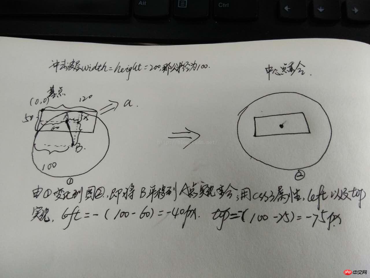
Observe that the wave changes from small to large, and the css3 attribute changes involved include width, height, left, top , opacity, first realize the shock wave layer through pseudo-class, and at the same time, you need to set the center point position before and after the shock wave (a little mathematical knowledge is involved here: draw a picture to calculate the position of two points), and finally set transition-duration: 0 to achieve instantaneous changes, ps learning You can use a:active to simulate the mouse click effect
Simply draw the following picture (very easy):
Implemented code:
  <html>
  <head>
  <meta charset="UTF-8">
  <title>实现冲击波--数学知识很重要</title>
  <style>
  *{
  margin:0;
  padding:0;
  box-sizing:border-box;
  }
  html,body{
  font-family:"微软雅黑";
  }
  .wave{
  position:relative;
  float:left;
  width:50%;
  height:420px;
  }
  .wave a{
  position:absolute;
  top:50%;
  left:50%;
  transform:translate(-50%,-50%);
  display:inline-block;
  width:120px;
  height:50px;
  /*margin-left:-60px;
  margin-top:-25px;*/
  line-height:50px;
  text-align:center;
  border-radius:5px;
  color:#fff;
  font-size:16px;
  cursor:pointer;
  /*overflow:hidden;*/

  }
  #wave1{
  background-color:#00BFFF;
  }
  #wave2{
  background-color:#009955;
  }
  #wave1 a{
  background-color:burlywood;
  }
  #wave2 a{/*宽度不确定长度*/
  width:50%;
  height:50px;
  background-color:cadetblue;
  }
  .wave a:after{
  /*画图
 ,假设left:0;top:0然后画出两个中心点的水平和垂直距离*/
  content: "";
  display: block;
  position: absolute;
  left: -40px;
  top: -75px;
  width: 200px;
  height: 200px;
  background: rgba(255,255,255,0.8);
  border-radius: 50%;
  opacity:0;
  transition: all 1s;
  }
  .wave a:active:after{
  /*位于中间即是a的中点*/
  width: 0;
  height: 0;
  left:60px;
  top: 25px;
  opacity: 1;
  transition-duration: 0s;
  }

  #wave2 a:after{
  left:50%;
  top:50%;
  transform:translate(-50%,-50%);
  }
  #wave2 a:active:after{
  left:50%;
  top:50%;
  transform:translate(-50%,-50%);
  }
  </style>
  </head>
  <body>
  <!--实现冲击波按钮确定长度-->
  <p class="wave" id="wave1">
  <a>点我</a>
  </p>
  <!--实现冲击波按钮不确定长度时-->
  <p class="wave" id="wave2">
  <a>点我哈哈</a>
  </p>
  </body>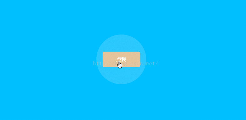
</html>Achieved effect:
Related recommendations:
css3 draws a circle Sharing examples of circular loading and turning animation
javascript, html5, css3 custom pop-up windows
Detailed discussion of the animation sequence of css3 animation special effects
The above is the detailed content of css3 to achieve shock wave effect. For more information, please follow other related articles on the PHP Chinese website!

Hot AI Tools

Undresser.AI Undress
AI-powered app for creating realistic nude photos

AI Clothes Remover
Online AI tool for removing clothes from photos.

Undress AI Tool
Undress images for free

Clothoff.io
AI clothes remover

AI Hentai Generator
Generate AI Hentai for free.

Hot Article
Hot Tools

Notepad++7.3.1
Easy-to-use and free code editor

SublimeText3 Chinese version
Chinese version, very easy to use

Zend Studio 13.0.1
Powerful PHP integrated development environment

Dreamweaver CS6
Visual web development tools

SublimeText3 Mac version
God-level code editing software (SublimeText3)
Hot Topics
 1377
1377
 52
52

 How to insert pictures on bootstrap
Apr 07, 2025 pm 03:30 PM
How to insert pictures on bootstrap
Apr 07, 2025 pm 03:30 PM
There are several ways to insert images in Bootstrap: insert images directly, using the HTML img tag. With the Bootstrap image component, you can provide responsive images and more styles. Set the image size, use the img-fluid class to make the image adaptable. Set the border, using the img-bordered class. Set the rounded corners and use the img-rounded class. Set the shadow, use the shadow class. Resize and position the image, using CSS style. Using the background image, use the background-image CSS property.
 How to set up the framework for bootstrap
Apr 07, 2025 pm 03:27 PM
How to set up the framework for bootstrap
Apr 07, 2025 pm 03:27 PM
To set up the Bootstrap framework, you need to follow these steps: 1. Reference the Bootstrap file via CDN; 2. Download and host the file on your own server; 3. Include the Bootstrap file in HTML; 4. Compile Sass/Less as needed; 5. Import a custom file (optional). Once setup is complete, you can use Bootstrap's grid systems, components, and styles to create responsive websites and applications.
 How to use bootstrap button
Apr 07, 2025 pm 03:09 PM
How to use bootstrap button
Apr 07, 2025 pm 03:09 PM
How to use the Bootstrap button? Introduce Bootstrap CSS to create button elements and add Bootstrap button class to add button text
 How to write split lines on bootstrap
Apr 07, 2025 pm 03:12 PM
How to write split lines on bootstrap
Apr 07, 2025 pm 03:12 PM
There are two ways to create a Bootstrap split line: using the tag, which creates a horizontal split line. Use the CSS border property to create custom style split lines.
 How to resize bootstrap
Apr 07, 2025 pm 03:18 PM
How to resize bootstrap
Apr 07, 2025 pm 03:18 PM
To adjust the size of elements in Bootstrap, you can use the dimension class, which includes: adjusting width: .col-, .w-, .mw-adjust height: .h-, .min-h-, .max-h-
 How to view the date of bootstrap
Apr 07, 2025 pm 03:03 PM
How to view the date of bootstrap
Apr 07, 2025 pm 03:03 PM
Answer: You can use the date picker component of Bootstrap to view dates in the page. Steps: Introduce the Bootstrap framework. Create a date selector input box in HTML. Bootstrap will automatically add styles to the selector. Use JavaScript to get the selected date.
 The Roles of HTML, CSS, and JavaScript: Core Responsibilities
Apr 08, 2025 pm 07:05 PM
The Roles of HTML, CSS, and JavaScript: Core Responsibilities
Apr 08, 2025 pm 07:05 PM
HTML defines the web structure, CSS is responsible for style and layout, and JavaScript gives dynamic interaction. The three perform their duties in web development and jointly build a colorful website.
 How to use bootstrap in vue
Apr 07, 2025 pm 11:33 PM
How to use bootstrap in vue
Apr 07, 2025 pm 11:33 PM
Using Bootstrap in Vue.js is divided into five steps: Install Bootstrap. Import Bootstrap in main.js. Use the Bootstrap component directly in the template. Optional: Custom style. Optional: Use plug-ins.
