
 Web Front-end
JS Tutorial
Detailed explanation of navigation bar implementation examples in Bootstrap
Web Front-end
JS Tutorial
Detailed explanation of navigation bar implementation examples in Bootstrap
Detailed explanation of navigation bar implementation examples in Bootstrap

This article mainly shares with you detailed examples of Bootstrap implementation of navigation. When building a website, different pages have many elements that are the same, such as navigation bars, sidebars, etc. We can use template inheritance to avoid repeated writing. html code. Now we plan to implement a navigation bar at the top of the web page and inherit this navigation bar in all pages. To create the navigation bar, we directly use the following navigation bar style provided by Bootstrap.
Related recommendations: "Bootstrap Tutorial"
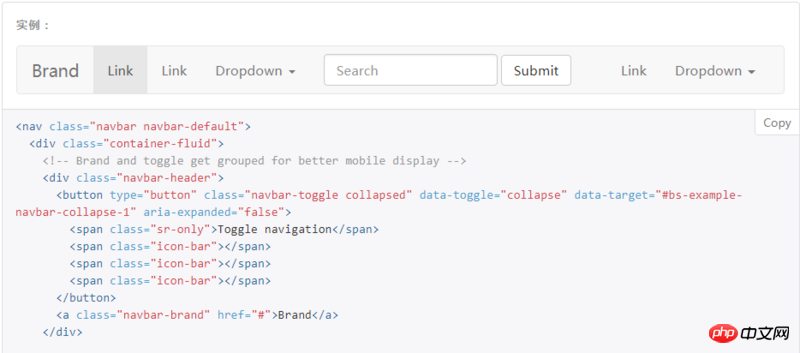
But I am using Bootstrap Before setting the navigation bar style, you need to reference the css and js files required by Bootstrap as well as jQuery. We are ## in html Insert the following code into #header to complete the reference:
1 2 3 |
|
css and js files on the Internet through links instead of downloading them Come down and quote from local. After that, we copy all the html code in the above picture to the body of html, and the browser will display the same navigation bar as in the picture. Let’s make some simple modifications and optimizations. Finally, our navigation bar will look like this:
base.css file to adjust the image size, control position, background color, etc. This part is basic html/css knowledge, so I won’t go into details. All subsequent web pages will use this navigation bar. We will name the html containing the navigation bar base.html, and add the following code below the navigation bar code in its body :
1 2 |
|
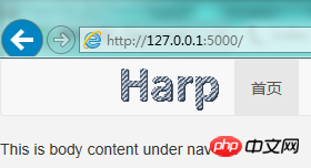
home.html and enter the following content:
1 2 3 4 |
|
home.html and visit, we can see this The result:
 ##So it is not difficult for us to understand that in
, {% extends 'base .html' %} represents the code block inherited from base.html, home.html in the block and endblock intervals It will be automatically replaced with the block area of base.html also named body_part. You can use multiple block, for example, you can also use it in <title>, so that different pages can have different titles. Finalbase.html
The code is as follows: <div class="code" style="position:relative; padding:0px; margin:0px;"><pre class="brush:php;toolbar:false"><!DOCTYPE html>
<html lang="en">
<head>
<meta charset="UTF-8">
<link rel="stylesheet" href="https://cdn.bootcss.com/bootstrap/3.3.7/css/bootstrap.min.css" integrity="sha384-BVYiiSIFeK1dGmJRAkycuHAHRg32OmUcww7on3RYdg4Va+PmSTsz/K68vbdEjh4u" crossorigin="anonymous">
<script src="https://cdn.bootcss.com/jquery/3.2.1/jquery.min.js"></script>
<script src="https://cdn.bootcss.com/bootstrap/3.3.7/js/bootstrap.min.js" integrity="sha384-Tc5IQib027qvyjSMfHjOMaLkfuWVxZxUPnCJA7l2mCWNIpG9mGCD8wGNIcPD7Txa" crossorigin="anonymous"></script>
<link rel="stylesheet" href="{{ url_for(&#39;static&#39;,filename=&#39;css/base.css&#39;) }}"/>
<link rel="shortcut icon" href="{{ url_for(&#39;static&#39;, filename=&#39;images/favicon.ico&#39;) }}">
<title>{% block page_name %}{% endblock %}-HarpQA</title>
</head>
<body>
<nav class="navbar navbar-default">
<p class="container">
<!-- Brand and toggle get grouped for better mobile display -->
<p class="navbar-header">
<button type="button" class="navbar-toggle collapsed" data-toggle="collapse" data-target="#bs-example-navbar-collapse-1" aria-expanded="false">
<span class="sr-only">Toggle navigation</span>
<span class="icon-bar"></span>
<span class="icon-bar"></span>
<span class="icon-bar"></span>
</button>
<a class="navbar-brand">
<img class="logo" src="{{ url_for(&#39;static&#39;,filename=&#39;images/logo.png&#39;) }}">
</a>
</p>
<!-- Collect the nav links, forms, and other content for toggling -->
<p class="collapse navbar-collapse" id="bs-example-navbar-collapse-1">
<ul class="nav navbar-nav">
<li class="active"><a href="#">首页 <span class="sr-only">(current)</span></a></li>
<li><a href="#">发布问答</a></li>
</ul>
<form class="navbar-form navbar-left">
<p class="form-group">
<input type="text" class="form-control" placeholder="Key Words">
</p>
<button type="submit" class="btn btn-default">搜索</button>
</form>
<ul class="nav navbar-nav navbar-right">
<li><a href="#">登录</a></li>
<li><a href="#">注册</a></li>
<li class="dropdown">
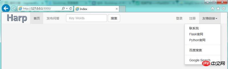
<a href="#" class="dropdown-toggle" data-toggle="dropdown" role="button" aria-haspopup="true" aria-expanded="false">友情链接<span class="caret"></span></a>
<ul class="dropdown-menu">
<li><a href="mailto:liutao25@baidu.com">联系我</a></li>
<li><a href="http://flask.pocoo.org" target="_blank">Flask官网</a></li>
<li><a href="https://www.python.org/">Python官网</a></li>
<li role="separator" class="pider"></li>
<li><a href="https://www.baidu.com" target="_blank">百度搜索</a></li>
<li role="separator" class="pider"></li>
<li><a href="https://www.google.com.hk" target="_blank">Google Search</a></li>
</ul>
</li>
</ul>
</p><!-- /.navbar-collapse -->
</p><!-- /.container-fluid -->
</nav>
{% block body_part %}
{% endblock %}
</body>
</html></pre><div class="contentsignin">Copy after login</div></div>Please note the references to
and logo images, we also use url_for function, the first parameter is static, which represents the static folder under the project folder, and the second parameter is staticThe folder is the relative path of the benchmark static file. We put js files/css files/image files, etc. under this folder, so this usage will be used frequently in the future. When we bookmark a web page, the web page has a small icon. We can also use this line of html code in header to achieve this: <div class="code" style="position:relative; padding:0px; margin:0px;"><pre class="brush:php;toolbar:false"><link rel="shortcut icon" href="{{ url_for(&#39;static&#39;, filename=&#39;images/favicon.ico&#39;) }}"></pre><div class="contentsignin">Copy after login</div></div>Put
The file can be placed in the static/images folder. We used the Flask icon, and the effect is as follows:
 ##base.css
1 2 3 4 5 6 7 8 9 10 11 12 |
|
Related recommendations:
How to implement the fixed positioning effect of jQuery navigation bar
htmlNavigation bar production graphic code sharing
How does JavaScript achieve the effect of highlighting the current menu of the navigation bar after selecting it?
The above is the detailed content of Detailed explanation of navigation bar implementation examples in Bootstrap. For more information, please follow other related articles on the PHP Chinese website!

Hot AI Tools

Undresser.AI Undress
AI-powered app for creating realistic nude photos

AI Clothes Remover
Online AI tool for removing clothes from photos.

Undress AI Tool
Undress images for free

Clothoff.io
AI clothes remover

Video Face Swap
Swap faces in any video effortlessly with our completely free AI face swap tool!
Hot Article
Hot Tools

Notepad++7.3.1
Easy-to-use and free code editor

SublimeText3 Chinese version
Chinese version, very easy to use

Zend Studio 13.0.1
Powerful PHP integrated development environment

Dreamweaver CS6
Visual web development tools

SublimeText3 Mac version
God-level code editing software (SublimeText3)
Hot Topics


 How to get the bootstrap search bar
Apr 07, 2025 pm 03:33 PM
How to get the bootstrap search bar
Apr 07, 2025 pm 03:33 PM
How to use Bootstrap to get the value of the search bar: Determines the ID or name of the search bar. Use JavaScript to get DOM elements. Gets the value of the element. Perform the required actions.
 How to use bootstrap in vue
Apr 07, 2025 pm 11:33 PM
How to use bootstrap in vue
Apr 07, 2025 pm 11:33 PM
Using Bootstrap in Vue.js is divided into five steps: Install Bootstrap. Import Bootstrap in main.js. Use the Bootstrap component directly in the template. Optional: Custom style. Optional: Use plug-ins.
 How to do vertical centering of bootstrap
Apr 07, 2025 pm 03:21 PM
How to do vertical centering of bootstrap
Apr 07, 2025 pm 03:21 PM
Use Bootstrap to implement vertical centering: flexbox method: Use the d-flex, justify-content-center, and align-items-center classes to place elements in the flexbox container. align-items-center class method: For browsers that do not support flexbox, use the align-items-center class, provided that the parent element has a defined height.
 How to write split lines on bootstrap
Apr 07, 2025 pm 03:12 PM
How to write split lines on bootstrap
Apr 07, 2025 pm 03:12 PM
There are two ways to create a Bootstrap split line: using the tag, which creates a horizontal split line. Use the CSS border property to create custom style split lines.
 How to set up the framework for bootstrap
Apr 07, 2025 pm 03:27 PM
How to set up the framework for bootstrap
Apr 07, 2025 pm 03:27 PM
To set up the Bootstrap framework, you need to follow these steps: 1. Reference the Bootstrap file via CDN; 2. Download and host the file on your own server; 3. Include the Bootstrap file in HTML; 4. Compile Sass/Less as needed; 5. Import a custom file (optional). Once setup is complete, you can use Bootstrap's grid systems, components, and styles to create responsive websites and applications.
 How to insert pictures on bootstrap
Apr 07, 2025 pm 03:30 PM
How to insert pictures on bootstrap
Apr 07, 2025 pm 03:30 PM
There are several ways to insert images in Bootstrap: insert images directly, using the HTML img tag. With the Bootstrap image component, you can provide responsive images and more styles. Set the image size, use the img-fluid class to make the image adaptable. Set the border, using the img-bordered class. Set the rounded corners and use the img-rounded class. Set the shadow, use the shadow class. Resize and position the image, using CSS style. Using the background image, use the background-image CSS property.
 How to use bootstrap button
Apr 07, 2025 pm 03:09 PM
How to use bootstrap button
Apr 07, 2025 pm 03:09 PM
How to use the Bootstrap button? Introduce Bootstrap CSS to create button elements and add Bootstrap button class to add button text
 How to resize bootstrap
Apr 07, 2025 pm 03:18 PM
How to resize bootstrap
Apr 07, 2025 pm 03:18 PM
To adjust the size of elements in Bootstrap, you can use the dimension class, which includes: adjusting width: .col-, .w-, .mw-adjust height: .h-, .min-h-, .max-h-
