Angular implements two-way folding list component
This article mainly introduces the sample code for implementing the bidirectional folding list component in Angular. It is divided into two groups, the left and right groups. It has certain reference value. Interested friends can refer to it. I hope it can help everyone.
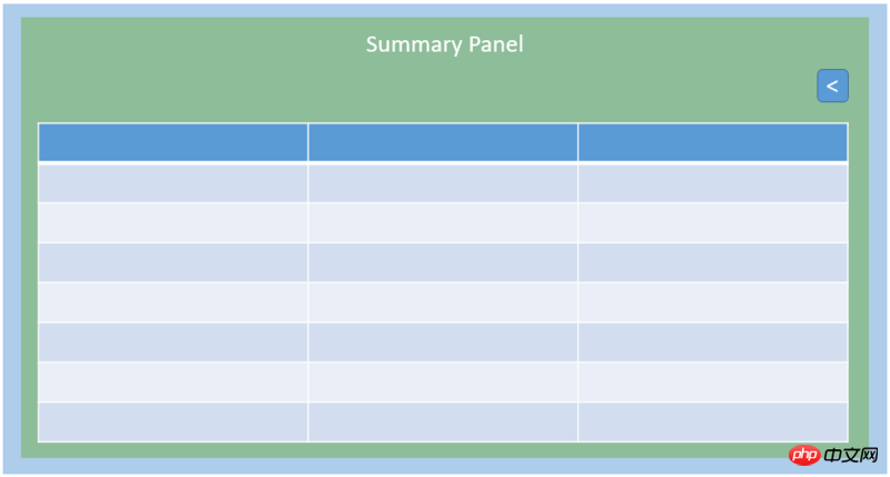
Recently I am making a two-way folding component, as shown in the figure below. The page is divided into two groups. The left page is the Summary Panel, which is mainly a set of lists. The right page is the Detail Panel, which displays a certain item in the left list. The specific information of the item is recorded as "Middle State".


export enum CollapseExpandState {
  Middle = 1,
  Left,
  Right
}##
<p id="container">
  <p id="summary"></p>
  <p id="buttons">
    <p id="left" *ngIf="_collapseExpandState === CollapseExpandState.Middle || CollapseExpandState.Right" (click)="_onHandleLeft($event)">《</p>
    <p id="right"> *ngIf="_collapseExpandState === CollapseExpandState.Middle || CollapseExpandState.Left" (click)="_onHandleLeft($event)">》</p>
  </p>
  <p id="detail"></p>
</p>Here in angular Enumerations are used in the template and we encounter some troubles. If we define the enumeration as above and use the enumeration in the Angular Component template, we will get the following error message:
TypeError: Cannot read property 'Middle' of undefined
That is to say, the defined enumeration type CollapseExpandState cannot be recognized in the Angular2 template. This is because the execution environment of the Angular Component template you wrote is The component class you defined, but there is no reference to the CollapseExpandState enumeration in the class, so Angular thinks that CollapseExpandState is undefined when generating a template for your component. Knowing the reason, the solution is easy. You only need to add a reference to this enumeration in the component class:
@component(...)
export class ContainerWidget {
  public CollpaseExpandState: any = CollapseExpandState;
}We control it through the enumeration state Whether two buttons are displayed in the appropriate page state or not, but even for the same button, the styles used in different page states will be different. The most important thing about the style here is actually the position. Let's first consider how to control the button style, and then consider how to correctly position the button in different page states.
For controlling button styles, we need to control three styles: "left button", "right button" and "buttons". There are three options that can be thought of:
The general usage of ng-class is as follows:
<some-element [ngClass]="{'first': true, 'second': true, 'third': false}">...</some-element>Therefore, it needs to be controlled by boolean. Each style requires a boolean to control. Left and right each have two styles. Buttons have three styles. In this way, 5 booleans are needed to control, which is omitted. Seems troublesome. II. Use ElementRef.nativeElement.className
Use template variables on buttons, left and right respectively, and then define them in class:
@ViewChild("buttons") buttons: ElementRef;
@ViewChild("left") left: ElementRef;
@ViewChild("right") right: ElementRef;In the processing function, assign a value to the class to change the style:
this.left.nativeElement.className = "XXXXX";
In this case, we need to change the style from the element's From a perspective, only 3 element variables are needed to change the className on the element. But there is a hidden danger in doing this. Notice that we use ngIf to control whether left and right exist in different states, because each event processing requires assigning values to the styles of the three elements, but if ngIf in a certain page state If it is false and the element does not exist, then a "Null Pointer" error will be reported. Therefore, if the referenced element is controlled by ngIf and you are not sure whether it must exist, you should use this method to assign styles to the element with caution. III. Use class="{{}}"
为了II中的尴尬,我们采用在HTML元素上对class进行直接赋值的方式,但是需要借用插值表达式{{}}。我们在css中用class的形式定义好样式,并且在compoennt class中定义三个字符串变量记录className,然后在事件处理函数中把相应的className赋予变量即可。这样我们就不用担心元素是否存在而导致的空指针了。
考虑完如何控制样式,下面我们进入CSS样式的讨论,这里其实主要考虑的就是位置。
我们采用flex布局,从左到右依次排列Summary Panel, buttons和Detail Panel。我们希望Buttons向左移,但是空出的位置被Detail Panel来填充。首先来看一下不设样式的效果图:
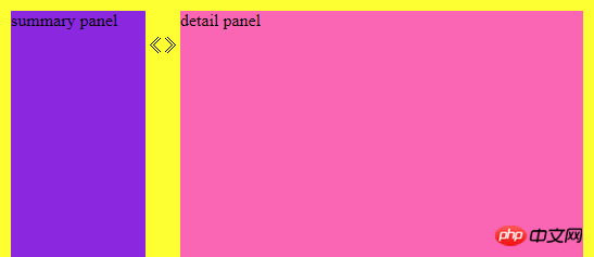
显然buttons是占据了文档流的位置的,如果这时候我们用relative定位buttpms,并且设置left的值为-74px(注意到left为负数就会把元素往左推):
.buttons{
  display: flex;
  position: relative;
  margin-top: 23px;
  left: -74px;
}效果图为:

发现如果用left的话,buttons原来的文档流位置依然存在,只是buttons相对于原来的位置移动了一定的位移。
如果我们用margin-left来设置呢:
.buttons{
  display: flex;
  position: relative;
  margin-top: 23px;
  margin-left: -74px;
}效果图为:

它和left不同之处在于,left会留住原来的文档流位置,但是用margin-left原来的文档流位置会消失,而由后面的元素补充过来,而我们想要的效果,正好是用margin-left来实现的。
所以用CSS定位的时候,要明白left和margin-left的区别,从而选择正确的方式来定位。
总结一下,从这个案例中我们学习到了:
双向折叠可以用“3种页面状态去控制2个按钮”来实现
enum在Angular Component的template中用到时,需要在compnent class中添加它的引用
控制元素样式有很多方法,要选择合适的方法
CSS定位中left和margin-left虽然都能把元素推向左边,但是left保留原来文档流位置,margin-left不保留原来文档流位置。
相关推荐:
The above is the detailed content of Angular implements two-way folding list component. For more information, please follow other related articles on the PHP Chinese website!

Hot AI Tools

Undresser.AI Undress
AI-powered app for creating realistic nude photos

AI Clothes Remover
Online AI tool for removing clothes from photos.

Undress AI Tool
Undress images for free

Clothoff.io
AI clothes remover

AI Hentai Generator
Generate AI Hentai for free.

Hot Article

Hot Tools

Notepad++7.3.1
Easy-to-use and free code editor

SublimeText3 Chinese version
Chinese version, very easy to use

Zend Studio 13.0.1
Powerful PHP integrated development environment

Dreamweaver CS6
Visual web development tools

SublimeText3 Mac version
God-level code editing software (SublimeText3)

Hot Topics
 1378
1378
 52
52
 How to remove square brackets from a list using Python
Sep 05, 2023 pm 07:05 PM
Python is a very useful software that can be used for many different purposes depending on the need. Python can be used in web development, data science, machine learning, and many other fields that require automation. It has many different features that help us perform these tasks. Python lists are one of the very useful features of Python. As the name suggests, a list contains all the data you wish to store. It is basically a set of different types of information. Different Ways to Remove Square Brackets Many times, users come across a situation where list items are displayed within square brackets. In this article, we'll detail how to remove these brackets to get a better view of your listing. One of the easiest ways to remove parentheses in strings and replacement functions is in
 How to count the number of elements in a list using Python's count() function
Nov 18, 2023 pm 02:53 PM
How to use Python's count() function to calculate the number of an element in a list requires specific code examples. As a powerful and easy-to-learn programming language, Python provides many built-in functions to handle different data structures. One of them is the count() function, which can be used to count the number of elements in a list. In this article, we will explain how to use the count() function in detail and provide specific code examples. The count() function is a built-in function of Python, used to calculate a certain
 How to install Angular on Ubuntu 24.04
Mar 23, 2024 pm 12:20 PM
Angular.js is a freely accessible JavaScript platform for creating dynamic applications. It allows you to express various aspects of your application quickly and clearly by extending the syntax of HTML as a template language. Angular.js provides a range of tools to help you write, update and test your code. Additionally, it provides many features such as routing and form management. This guide will discuss how to install Angular on Ubuntu24. First, you need to install Node.js. Node.js is a JavaScript running environment based on the ChromeV8 engine that allows you to run JavaScript code on the server side. To be in Ub
 Samsung's 10,000-yuan foldable phone W25 revealed: 5-megapixel under-screen front camera and thinner body
Aug 23, 2024 pm 12:43 PM
According to news on August 23, Samsung is about to launch a new folding mobile phone W25, which is expected to be unveiled at the end of September. It will make corresponding improvements in the under-screen front camera and body thickness. According to reports, Samsung W25, codenamed Q6A, will be equipped with a 5-megapixel under-screen camera, which is an improvement over the 4-megapixel camera of the Galaxy Z Fold series. In addition, the W25’s external-screen front camera and ultra-wide-angle camera are expected to be 10 million and 12 million pixels respectively. In terms of design, the W25 is about 10 mm thick in the folded state, which is about 2 mm thinner than the standard Galaxy Z Fold 6. In terms of screen, the W25 has an external screen of 6.5 inches and an internal screen of 8 inches, while the Galaxy Z Fold6 has an external screen of 6.3 inches and an internal screen of 8 inches.
 Google Pixel 9 Pro Fold phone case exposed: 6.4-inch outer screen, 8.02-inch inner screen
Jun 25, 2024 pm 02:35 PM
According to news on June 25, the source ytechb published a blog post yesterday (June 24), sharing a rendering of the Google Pixel 9 Pro Fold mobile phone case, once again showing the design of the back of this folding screen. According to previous news, Google will release the Pixel 9 series of mobile phones in October this year. In addition to the three phones in the Pixel 9 series, Pixel Fold will also be included in the Pixel 9 series and will be officially named Pixel 9 Pro Fold. The phone case exposed this time comes from accessory manufacturer Torro. The company's UK and US online stores have listed the product phone case and disclosed the design and display size of the phone. The page shows a large number of Pixel 9 Pro Fold phone case renderings
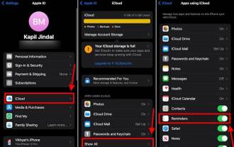 How to Make a Shopping List in the iOS 17 Reminders App on iPhone
Sep 21, 2023 pm 06:41 PM
How to Make a GroceryList on iPhone in iOS17 Creating a GroceryList in the Reminders app is very simple. You just add a list and populate it with your items. The app automatically sorts your items into categories, and you can even work with your partner or flat partner to make a list of what you need to buy from the store. Here are the full steps to do this: Step 1: Turn on iCloud Reminders As strange as it sounds, Apple says you need to enable reminders from iCloud to create a GroceryList on iOS17. Here are the steps for it: Go to the Settings app on your iPhone and tap [your name]. Next, select i
 Samsung Galaxy Z Flip 6 model first revealed: narrower bezels, creases still present
Jun 22, 2024 am 03:28 AM
According to news on June 21, foreign media recently released model photos of Samsung Galaxy Z Flip 6 on the Internet. According to the picture, it can be understood that the borders of Samsung Galaxy Z Flip 6 will be further narrowed, which means that the width of the phone may be reduced in the folded state, and it will also provide a more comfortable grip and portability. Moreover, compared with the previous generation ZFlip5, the model of Galaxy ZFlip6 is more square and the camera module on the back is more prominent. It is expected to use a new camera sensor. However, from the front, the creases of the phone are still relatively obvious, but considering that the leaked model is a model phone, there may be some differences with the real phone, so it is for reference only. In terms of performance configuration, Galaxy
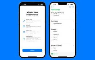 How to create a grocery list: Use the Reminders app for iPhone
Dec 01, 2023 pm 03:37 PM
In iOS 17, Apple added a handy little list feature to the Reminders app to help you when you're out shopping for groceries. Read on to learn how to use it and shorten your trip to the store. When you create a list using the new "Grocery" list type (named "Shopping" outside the US), you can enter a variety of food and groceries and have them automatically organized by category. This organization makes it easier to find what you need at the grocery store or while out shopping. Category types available in alerts include Produce, Bread & Cereals, Frozen Foods, Snacks & Candy, Meat, Dairy, Eggs & Cheese, Baked Goods, Baked Goods, Household Products, Personal Care & Wellness, and Wine, Beer & Spirits . The following is created in iOS17


