
 Web Front-end
JS Tutorial
When the content of the bootstrap table is too long, use ellipsis to indicate detailed explanation
Web Front-end
JS Tutorial
When the content of the bootstrap table is too long, use ellipsis to indicate detailed explanation
When the content of the bootstrap table is too long, use ellipsis to indicate detailed explanation

This article mainly introduces the solution to use ellipses to indicate when the content of the bootstrap table is too long. Friends in need can refer to it. I hope it can help everyone.
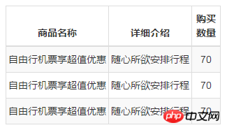
First of all, when the td content in bootstrap exceeds the fixed width I gave, the code replaced by the ellipsis is as follows:
[Related video recommendations: Bootstrap tutorial】
<table class="table table-bordered">
<thead>
<tr>
<th class="center" style='width:38%;'>商品名称</th>
<th class="center" style='width:36%;'>详细介绍</th>
<th class="center" style='width:22%;'>购买数量</th>
</tr>
</thead>
<tbody id="tbody">
<tr>
<td>自由行机票享超值优惠</td>
<td>随心所欲安排行程</td>
<td>70</td>
</tr>
<tr>
<td>自由行机票享超值优惠</td>
<td>随心所欲安排行程</td>
<td>70</td>
</tr>
<tr>
<td>自由行机票享超值优惠</td>
<td>随心所欲安排行程</td>
<td>70</td>
</tr>
</tbody>
</table>
.table tbody tr td{
overflow: hidden;
text-overflow:ellipsis;
white-space: nowrap;
}The display effect of the mobile simulator is like this. It's not very comfortable. It doesn't display according to the width I gave it. It's all squeezed out by the content.
Solution:
<table class="table table-bordered" style='table-layout:fixed;'>
That is, add style
table{
 table-layout:fixed;
}The effect appears:
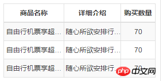
table-layout is used to display algorithm rules for table cells, rows, and columns. Value Description
automatic Default. Column width is set by cell content.
fixed Column width is set by table width and column width.
inherit specifies that the value of the table-layout attribute should be inherited from the parent element.
Related recommendations:
CSS limits the number of displayed words and uses ellipses to indicate excess characters
How to hide extra words using ellipses Replace
css multi-line ellipsis compatibility writing method
The above is the detailed content of When the content of the bootstrap table is too long, use ellipsis to indicate detailed explanation. For more information, please follow other related articles on the PHP Chinese website!

Hot AI Tools

Undresser.AI Undress
AI-powered app for creating realistic nude photos

AI Clothes Remover
Online AI tool for removing clothes from photos.

Undress AI Tool
Undress images for free

Clothoff.io
AI clothes remover

Video Face Swap
Swap faces in any video effortlessly with our completely free AI face swap tool!

Hot Article
Hot Tools

Notepad++7.3.1
Easy-to-use and free code editor

SublimeText3 Chinese version
Chinese version, very easy to use

Zend Studio 13.0.1
Powerful PHP integrated development environment

Dreamweaver CS6
Visual web development tools

SublimeText3 Mac version
God-level code editing software (SublimeText3)
Hot Topics
 1386
1386
 52
52

 How to get the bootstrap search bar
Apr 07, 2025 pm 03:33 PM
How to get the bootstrap search bar
Apr 07, 2025 pm 03:33 PM
How to use Bootstrap to get the value of the search bar: Determines the ID or name of the search bar. Use JavaScript to get DOM elements. Gets the value of the element. Perform the required actions.
 How to use bootstrap in vue
Apr 07, 2025 pm 11:33 PM
How to use bootstrap in vue
Apr 07, 2025 pm 11:33 PM
Using Bootstrap in Vue.js is divided into five steps: Install Bootstrap. Import Bootstrap in main.js. Use the Bootstrap component directly in the template. Optional: Custom style. Optional: Use plug-ins.
 How to write split lines on bootstrap
Apr 07, 2025 pm 03:12 PM
How to write split lines on bootstrap
Apr 07, 2025 pm 03:12 PM
There are two ways to create a Bootstrap split line: using the tag, which creates a horizontal split line. Use the CSS border property to create custom style split lines.
 How to do vertical centering of bootstrap
Apr 07, 2025 pm 03:21 PM
How to do vertical centering of bootstrap
Apr 07, 2025 pm 03:21 PM
Use Bootstrap to implement vertical centering: flexbox method: Use the d-flex, justify-content-center, and align-items-center classes to place elements in the flexbox container. align-items-center class method: For browsers that do not support flexbox, use the align-items-center class, provided that the parent element has a defined height.
 How to set up the framework for bootstrap
Apr 07, 2025 pm 03:27 PM
How to set up the framework for bootstrap
Apr 07, 2025 pm 03:27 PM
To set up the Bootstrap framework, you need to follow these steps: 1. Reference the Bootstrap file via CDN; 2. Download and host the file on your own server; 3. Include the Bootstrap file in HTML; 4. Compile Sass/Less as needed; 5. Import a custom file (optional). Once setup is complete, you can use Bootstrap's grid systems, components, and styles to create responsive websites and applications.
 How to resize bootstrap
Apr 07, 2025 pm 03:18 PM
How to resize bootstrap
Apr 07, 2025 pm 03:18 PM
To adjust the size of elements in Bootstrap, you can use the dimension class, which includes: adjusting width: .col-, .w-, .mw-adjust height: .h-, .min-h-, .max-h-
 How to insert pictures on bootstrap
Apr 07, 2025 pm 03:30 PM
How to insert pictures on bootstrap
Apr 07, 2025 pm 03:30 PM
There are several ways to insert images in Bootstrap: insert images directly, using the HTML img tag. With the Bootstrap image component, you can provide responsive images and more styles. Set the image size, use the img-fluid class to make the image adaptable. Set the border, using the img-bordered class. Set the rounded corners and use the img-rounded class. Set the shadow, use the shadow class. Resize and position the image, using CSS style. Using the background image, use the background-image CSS property.
 How to use bootstrap button
Apr 07, 2025 pm 03:09 PM
How to use bootstrap button
Apr 07, 2025 pm 03:09 PM
How to use the Bootstrap button? Introduce Bootstrap CSS to create button elements and add Bootstrap button class to add button text
