
 Web Front-end
CSS Tutorial
Html/CSS front-end implementation of text border shadow effect example sharing
Web Front-end
CSS Tutorial
Html/CSS front-end implementation of text border shadow effect example sharing
Html/CSS front-end implementation of text border shadow effect example sharing

The use of shadow effects has become more and more widespread in development, so today we will talk about using the same technique to achieve border shadows. Below, the editor of Script House brings you the Html/CSS front-end to realize the text border shadow effect. Friends who need it can refer to it. I hope it can help everyone.
1. Border shadow
box-shadow Border shadow
Parameters: Parameter 1 x-shadow: Set the object’s shadow horizontal offset value, the unit can be px, em Or percentage, etc., negative values are allowed. Parameter 2 y-shadow: Set the vertical offset value of the object's shadow. The unit can be px, em or percentage, etc. Negative values are allowed. Parameter 3 blur: used to set the border shadow radius size. Parameter 4 spread: Expand radius, set the size of the shadow; this parameter is optional, and the default value is 0. Parameter 5 color: Set the color of the shadow. Parameter 6 inset: This parameter is not set by default. The default is outer shadow, inset means inner shadow.
box-shadow:x-shadow y-shadow blur spread color inset;
2. Example
Effect 1
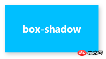
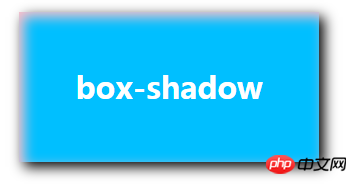
<p class="box">box-shadow</p>
.box{
    width:300px;
    height:150px;
    background: deepskyblue;
    font:30px/150px 'Microsoft YaHei';
    color: #fff;
    font-weight: bold;
    text-align: center;
    margin:100px auto;
    /*边框阴影*/
    /*效果1*/
    box-shadow: inset 5px 5px 20px #ccc;
    /*效果2*/
    box-shadow: inset 5px 5px 20px pink,5px 5px 20px #000;
}Use the box-shadow property of CSS3 to create a border shadow Effect method
css3 rounded border, border shadow_html/css_WEB-ITnose
css to achieve border shadow effect_html/css_WEB- ITnose
The above is the detailed content of Html/CSS front-end implementation of text border shadow effect example sharing. For more information, please follow other related articles on the PHP Chinese website!

Hot AI Tools

Undresser.AI Undress
AI-powered app for creating realistic nude photos

AI Clothes Remover
Online AI tool for removing clothes from photos.

Undress AI Tool
Undress images for free

Clothoff.io
AI clothes remover

AI Hentai Generator
Generate AI Hentai for free.

Hot Article
Hot Tools

Notepad++7.3.1
Easy-to-use and free code editor

SublimeText3 Chinese version
Chinese version, very easy to use

Zend Studio 13.0.1
Powerful PHP integrated development environment

Dreamweaver CS6
Visual web development tools

SublimeText3 Mac version
God-level code editing software (SublimeText3)
Hot Topics


 How to implement a custom theme by overriding the SCSS variable of Element?
Apr 05, 2025 pm 01:45 PM
How to implement a custom theme by overriding the SCSS variable of Element?
Apr 05, 2025 pm 01:45 PM
How to implement a custom theme by overriding the SCSS variable of Element? Using Element...
 How to use the locally installed 'Jingnan Mai Round Body' on a web page and solve the display problem?
Apr 05, 2025 pm 02:06 PM
How to use the locally installed 'Jingnan Mai Round Body' on a web page and solve the display problem?
Apr 05, 2025 pm 02:06 PM
How to use locally installed font files on web pages In web development, users may want to use specific fonts installed on their computers to enhance the network...
 How to use CSS to achieve a gradient effect of the background color transition from left to right and gradually becoming lighter from top to bottom?
Apr 05, 2025 pm 12:57 PM
How to use CSS to achieve a gradient effect of the background color transition from left to right and gradually becoming lighter from top to bottom?
Apr 05, 2025 pm 12:57 PM
CSS gradient color effect implementation: Gradient background color from top to bottom In web design, how to transition from left to right in the search box and the background color under the carousel image...
 How to customize resize symbols through CSS to match background color?
Apr 05, 2025 pm 02:09 PM
How to customize resize symbols through CSS to match background color?
Apr 05, 2025 pm 02:09 PM
How to customize resize symbols with CSS to match background color? In web design, the details of the user experience can often significantly improve the overall effect. For example...
 How to solve the problem of page jitter caused by dynamically setting elements to fixed in JavaScript?
Apr 05, 2025 am 11:39 AM
How to solve the problem of page jitter caused by dynamically setting elements to fixed in JavaScript?
Apr 05, 2025 am 11:39 AM
How to solve the problem of page jitter caused by dynamically setting elements to fixed by JS. When dynamically setting elements to fixed by JavaScript, you sometimes encounter page jitter...
 Under a fixed width layout, what is the relationship between the font size and the letter width?
Apr 05, 2025 pm 12:51 PM
Under a fixed width layout, what is the relationship between the font size and the letter width?
Apr 05, 2025 pm 12:51 PM
Under fixed width layout, the subtle relationship between font size and letter width When designing web pages, we often encounter the need to line up in fixed width containers...
 How to achieve perfect alignment of text bottoms of different font sizes and fonts with CSS?
Apr 05, 2025 pm 01:48 PM
How to achieve perfect alignment of text bottoms of different font sizes and fonts with CSS?
Apr 05, 2025 pm 01:48 PM
The problem of alignment at the bottom of CSS text: The vertical arrangement of different font sizes and fonts in CSS style design, you often encounter the need to align different font sizes and...
 How to implement a front-end progress bar with ring effect and mouse prompt information?
Apr 05, 2025 pm 01:54 PM
How to implement a front-end progress bar with ring effect and mouse prompt information?
Apr 05, 2025 pm 01:54 PM
Discussion on the implementation method of front-end progress bar In front-end development, implementing a progress bar seems simple, but to meet the precise requirements of the design draft, you may encounter a...
