

Detailed explanation of usage examples of CSS table-layout attribute

This article mainly shares with you the usage of the table-layout attribute. The tableLayout attribute is used to display the algorithm rules of table cells, rows, and columns. This article introduces the usage of CSS table-layout attribute to everyone through example code. Friends who need it can refer to it. I hope it can help everyone.
Foreword:
Today I will talk to you in detail about the usage of the table-layout attribute.
 /*eg:设置表格布局算法*/
 table{
     table-layout:fixed;
}***Keywords in this article: table-layout attribute value, definition and usage, fixed table layout, automatic table layout.
1Definition and Usage
The tableLayout attribute is used to display the algorithm rules of table cells, rows, and columns.
①This attribute specifies the layout algorithm used to complete table layout.
②The fixed layout algorithm is faster, but not very flexible.
③The automatic layout algorithm is slower, but more reflective of traditional HTML tables.
2 Fixed table layout
① Compared with automatic table layout, the browser is allowed to layout the table faster;
② Its horizontal layout only depends on the table width , column width, table border width, cell spacing, regardless of the content of the cell;
③ By using a fixed table layout, the user agent can display the table after receiving the first row.
3 Automatically determine the table layout
①The width of the column is set by the widest content without folding in the column cell;
②Due to its needs This algorithm sometimes takes a long time to access all the contents of the table before determining the final layout.
4table-layout attribute value
①automatic: (default value) column width is set by cell content;
②fixed: column width is set by table width and column width ;
③inherit: Specifies that the value of the table-layout attribute should be inherited from the parent element.
Note: All browsers support the table-layout attribute.
Any version of Internet Explorer (including IE8) does not support the attribute value "inherit"! ! !
5 Theory is not as good as practice, and the code can be run
No matter how much you talk, it’s better to understand it faster by looking at the code~ Let’s take a look at this chestnut together↓↓↓
(for the sake of It is convenient for everyone to see the code, I wrote the CSS and HTML code together)
<!DOCTYPE html>
<html>
    <head>
        <meta charset="UTF-8">
        <title>table-layout属性测试</title>
        <style type="text/css">
            table.tb1 {
                table-layout: automatic;
            }
            table.tb2 {
                table-layout: fixed;
            }
        </style>
    </head>
    <body>
        <table class="tb1" border="1" width="100%">
            <tr>
                <td width="20%">aaaaaaaaaaaaaaaaaaaaaaaaaaaaa</td>
                <td width="40%">bbbbbbbbbbbbb</td>
                <td width="40%">ccc</td>
            </tr>
        </table>
        <br />
        <table class="tb2" border="1" width="100%">
            <tr>
                <td width="20%">aaaaaaaaaaaaaaaaaaaaaaaaaaaaa</td>
                <td width="40%">bbbbbbbbbbbbb</td>
                <td width="40%">ccc</td>
            </tr>
        </table>
    </body>
</html>After running, you will see the following picture:
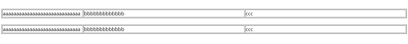
Here I want to explain that maybe your browser is wide enough, maybe your cell content is not enough, and you may not be able to see the effect of the two. In this case, you need to reduce the width of the browser or increase the content of the cell. , you will see the different effects of the two attribute values~~~
Related recommendations:
The cell width is uncontrolled after using table-layout:fixed in CSS Problem Solving
CSS: Detailed explanation of table-layout table layout
CSS: Detailed explanation of the role and use of table-layout attributes
The above is the detailed content of Detailed explanation of usage examples of CSS table-layout attribute. For more information, please follow other related articles on the PHP Chinese website!

Hot AI Tools

Undresser.AI Undress
AI-powered app for creating realistic nude photos

AI Clothes Remover
Online AI tool for removing clothes from photos.

Undress AI Tool
Undress images for free

Clothoff.io
AI clothes remover

AI Hentai Generator
Generate AI Hentai for free.

Hot Article
Hot Tools

Notepad++7.3.1
Easy-to-use and free code editor

SublimeText3 Chinese version
Chinese version, very easy to use

Zend Studio 13.0.1
Powerful PHP integrated development environment

Dreamweaver CS6
Visual web development tools

SublimeText3 Mac version
God-level code editing software (SublimeText3)
Hot Topics
 1371
1371
 52
52

 How to use bootstrap button
Apr 07, 2025 pm 03:09 PM
How to use bootstrap button
Apr 07, 2025 pm 03:09 PM
How to use the Bootstrap button? Introduce Bootstrap CSS to create button elements and add Bootstrap button class to add button text
 How to resize bootstrap
Apr 07, 2025 pm 03:18 PM
How to resize bootstrap
Apr 07, 2025 pm 03:18 PM
To adjust the size of elements in Bootstrap, you can use the dimension class, which includes: adjusting width: .col-, .w-, .mw-adjust height: .h-, .min-h-, .max-h-
 How to insert pictures on bootstrap
Apr 07, 2025 pm 03:30 PM
How to insert pictures on bootstrap
Apr 07, 2025 pm 03:30 PM
There are several ways to insert images in Bootstrap: insert images directly, using the HTML img tag. With the Bootstrap image component, you can provide responsive images and more styles. Set the image size, use the img-fluid class to make the image adaptable. Set the border, using the img-bordered class. Set the rounded corners and use the img-rounded class. Set the shadow, use the shadow class. Resize and position the image, using CSS style. Using the background image, use the background-image CSS property.
 How to upload files on bootstrap
Apr 07, 2025 pm 01:09 PM
How to upload files on bootstrap
Apr 07, 2025 pm 01:09 PM
The file upload function can be implemented through Bootstrap. The steps are as follows: introduce Bootstrap CSS and JavaScript files; create file input fields; create file upload buttons; handle file uploads (using FormData to collect data and then send to the server); custom style (optional).
 How to remove the default style in Bootstrap list?
Apr 07, 2025 am 10:18 AM
How to remove the default style in Bootstrap list?
Apr 07, 2025 am 10:18 AM
The default style of the Bootstrap list can be removed with CSS override. Use more specific CSS rules and selectors, follow the "proximity principle" and "weight principle", overriding the Bootstrap default style. To avoid style conflicts, more targeted selectors can be used. If the override is unsuccessful, adjust the weight of the custom CSS. At the same time, pay attention to performance optimization, avoid overuse of !important, and write concise and efficient CSS code.
 How to change the size of a Bootstrap list?
Apr 07, 2025 am 10:45 AM
How to change the size of a Bootstrap list?
Apr 07, 2025 am 10:45 AM
The size of a Bootstrap list depends on the size of the container that contains the list, not the list itself. Using Bootstrap's grid system or Flexbox can control the size of the container, thereby indirectly resizing the list items.
 How to verify bootstrap date
Apr 07, 2025 pm 03:06 PM
How to verify bootstrap date
Apr 07, 2025 pm 03:06 PM
To verify dates in Bootstrap, follow these steps: Introduce the required scripts and styles; initialize the date selector component; set the data-bv-date attribute to enable verification; configure verification rules (such as date formats, error messages, etc.); integrate the Bootstrap verification framework and automatically verify date input when form is submitted.
 How to layout bootstrap
Apr 07, 2025 pm 02:24 PM
How to layout bootstrap
Apr 07, 2025 pm 02:24 PM
To use Bootstrap to layout a website, you need to use a grid system to divide the page into containers, rows, and columns. First add the container, then add the rows in it, add the columns within the row, and finally add the content in the column. Bootstrap's responsive layout function automatically adjusts the layout according to breakpoints (xs, sm, md, lg, xl). Different layouts under different screen sizes can be achieved by using responsive classes.
