

Sharing examples of making 0.5px thin lines in css3

This article mainly introduces the relevant information about the sample code of using css3 to make a 0.5px thin line. The editor thinks it is quite good, so I will share it with you now and give it as a reference. Let’s follow the editor and take a look.
CSS3 in Webapp implements 0.5px thin lines
It feels like I haven’t written a blog for a long time. My life has been relatively stable recently and I am living a fulfilling life. , so I have to start writing something again. One is to make some records, and I am afraid that one day I will forget it. If I look back at the blog, I will pick it up again. Memory, that's it.
I have seen e-commerce mobile websites such as Taobao, JD.com, Yixun, Yihaodian, etc. The common features of these large e-commerce sites are exquisite workmanship and good user experience. Among them, in terms of layout , a 0.5px line looks much more refined than a 1px line.
Method 1: Use gradients to do
html code:
##
<p></p>
.bd-t{
position:relative;
}
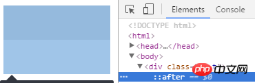
.bd-t::after {
content: " ";
position: absolute;
left: 0;
top: 0;
width: 100%;
height: 1px;
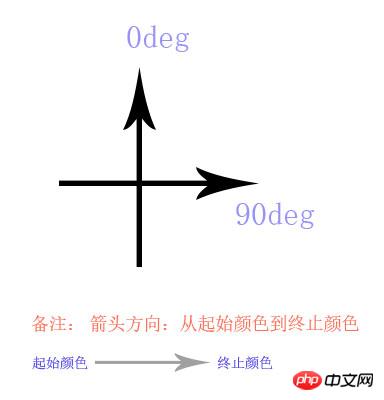
background-image: linear-gradient(0deg, transparent 50%, #e0e0e0 50%);
}-webkit-linear-gradient -ms-linear-gradient -o-linear-gradient
0deg, transparent 50%, #e0e0e0 50% and use the latest version of chrome to test.
border-top: 0.5px solid #e0e0e0;, use after as a hook, width 100%, height 1px, The background gradient, half transparent and half colored, is ok. In the same way, the thin lines on the bottom, left and right are all the same. Of course, if you need to use it in combination, nesting between boxes is also possible, or you have your own ideas (of course there are many ways to do it!)...
Method 2: Use zoom
html code: <p></p><p></p>
##
.bd-t{
position:relative;
}
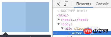
.bd-t:after{
content: " ";
position: absolute;
left: 0;
top: 0;
width: 100%;
height: 1px;
background-color: #e0e0e0;
/* 如果不用 background-color, 使用 border-top:1px solid #e0e0e0; */
-webkit-transform: scaleY(.5);
transform:scaleY(.5);
}Description
This is an approach to achieve a 0.5px border on the box. This approach is not recommended because after testing, some mobile browsers do not display very well. The principle of this implementation is: in the Y-axis direction, compress half. As noted above.
If you feel that the effect is not very good, here is a fallback or workaround, whatsoever: It is the method commented out above: you can try usingborder-top:1px solid #e0e0e0;
instead of background- This is how JD.com does color (if it has not been revised): http://m.jd.com/
html code:
<p></p><p class='bd-all'></p>
css code: <p></p>
  .bd-all{
      position:relative;
  }

 .bd-all:after{
      content: "  ";
      position: absolute;
      left: 0;
      top: 0;
      z-index:-1;
      width: 200%;
      height:200%;
      border:1px solid #e0e0e0;
      -webkit-transform-origin: 0 0;
      transform-origin: 0 0;
      -webkit-transform: scale(.5, .5);
      transform: scale(.5, .5);
}Description :
This is how to achieve 0.5px around a box. If you add the border-radius rounded corner effect, you will find that some mobile phones will have rounded corners, but the impact is not great. If there are two boxes, the upper box has no border effect, and the lower box has a border effect. The two boxes are the same width and the top and bottom are together. You will find that sometimes they are not aligned on the mobile phone... they are staggered by 0.5px. , the reason is already very clear... and the
z-index can be adjusted according to different needs. If possible, it is okay not to use it.
Jingdong did this before, but it is no longer used. For the specific method, please see the demo structure below:
<p></p>├─demo/ ························ demo 目录
└─┬─ test.html ··············· test.html 文件
└─── pic.png ·················· png 图片文件There are the following key codes in test.html:
html Structure:
<p class="bd-t"></p>
css structure: <p></p>
.bd-t{
   position: relative;
}
.bd-t::after {
content: " ";
position: absolute;
left: 0;
top: 0;
width: 100%;
border-top: 1px solid transparent;
/* 下面用 stretch 和 round 都可以 */
border-image: url('pic.png') 2 1 1 1 stretch;
-webkit-border-image: url('pic.png') 2 1 1 1 stretch;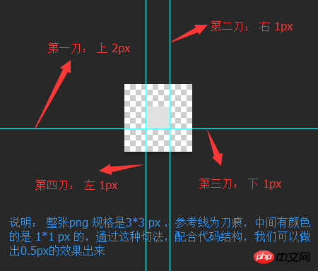
}And the nine-square grid cutting method of pic.png is as shown below: <p></p>
 There are many specific usages of border-image on the Internet:
This one on w3c is not very specific: http://www.jb51.net/w3school/cssref/pr_border- image.htm
在 MDN 上 有明确的介绍,并且有很多配图,包括兼容性等等:https://developer.mozilla.org/en-US/docs/Web/CSS/border-image
但是不推荐这种写法,毕竟图片质量比较大,能用代码解决的,不用图片。在这里border-width 是 1px , 但是 背景是有2px的距离,所以在1px的border-top上,显示出有颜色的高度就是0.5px, 同理,底边,左边和右边的0.5px,也都很容易实现。 这个就是css3的魅力体现(这个现在兼容性也不是很好,在一些较低端的安卓浏览器和一些版本的safari 支持的也不是很好)。
方式四 (推荐): weui的实现方式 :
这是一款微信团队开发的UI 组件 详情见: weui , 它的使用方式是这样的:
.weui-cell:before{
   content: " ";
   position: absolute;
   left: 0;
   top: 0;
   right: 0;
   height: 1px;
   border-top: 1px solid #D9D9D9;
   color: #D9D9D9;
   -webkit-transform-origin: 0 0;
   transform-origin: 0 0;
   -webkit-transform: scaleY(0.5);
   transform: scaleY(0.5);
}方式五: 使用同周边相似的浅色,利用视觉效果,让用户产生错觉
这个就考验设计师的功力了 :)
其他说明:不是很推荐使用渐变来做 , 在移动设备上可以看到,但在一些浏览器上看不到,不便于调试。
相关推荐:
The above is the detailed content of Sharing examples of making 0.5px thin lines in css3. For more information, please follow other related articles on the PHP Chinese website!

Hot AI Tools

Undresser.AI Undress
AI-powered app for creating realistic nude photos

AI Clothes Remover
Online AI tool for removing clothes from photos.

Undress AI Tool
Undress images for free

Clothoff.io
AI clothes remover

AI Hentai Generator
Generate AI Hentai for free.

Hot Article
Hot Tools

Notepad++7.3.1
Easy-to-use and free code editor

SublimeText3 Chinese version
Chinese version, very easy to use

Zend Studio 13.0.1
Powerful PHP integrated development environment

Dreamweaver CS6
Visual web development tools

SublimeText3 Mac version
God-level code editing software (SublimeText3)
Hot Topics
 1378
1378
 52
52

 How to achieve wave effect with pure CSS3? (code example)
Jun 28, 2022 pm 01:39 PM
How to achieve wave effect with pure CSS3? (code example)
Jun 28, 2022 pm 01:39 PM
How to achieve wave effect with pure CSS3? This article will introduce to you how to use SVG and CSS animation to create wave effects. I hope it will be helpful to you!
 Use CSS skillfully to realize various strange-shaped buttons (with code)
Jul 19, 2022 am 11:28 AM
Use CSS skillfully to realize various strange-shaped buttons (with code)
Jul 19, 2022 am 11:28 AM
This article will show you how to use CSS to easily realize various weird-shaped buttons that appear frequently. I hope it will be helpful to you!
 How to hide elements in css without taking up space
Jun 01, 2022 pm 07:15 PM
How to hide elements in css without taking up space
Jun 01, 2022 pm 07:15 PM
Two methods: 1. Using the display attribute, just add the "display:none;" style to the element. 2. Use the position and top attributes to set the absolute positioning of the element to hide the element. Just add the "position:absolute;top:-9999px;" style to the element.
 How to implement lace borders in css3
Sep 16, 2022 pm 07:11 PM
How to implement lace borders in css3
Sep 16, 2022 pm 07:11 PM
In CSS, you can use the border-image attribute to achieve a lace border. The border-image attribute can use images to create borders, that is, add a background image to the border. You only need to specify the background image as a lace style; the syntax "border-image: url (image path) offsets the image border width inward. Whether outset is repeated;".
 It turns out that text carousel and image carousel can also be realized using pure CSS!
Jun 10, 2022 pm 01:00 PM
It turns out that text carousel and image carousel can also be realized using pure CSS!
Jun 10, 2022 pm 01:00 PM
How to create text carousel and image carousel? The first thing everyone thinks of is whether to use js. In fact, text carousel and image carousel can also be realized using pure CSS. Let’s take a look at the implementation method. I hope it will be helpful to everyone!
 How to enlarge the image by clicking the mouse in css3
Apr 25, 2022 pm 04:52 PM
How to enlarge the image by clicking the mouse in css3
Apr 25, 2022 pm 04:52 PM
Implementation method: 1. Use the ":active" selector to select the state of the mouse click on the picture; 2. Use the transform attribute and scale() function to achieve the picture magnification effect, the syntax "img:active {transform: scale(x-axis magnification, y Axis magnification);}".
 How to set animation rotation speed in css3
Apr 28, 2022 pm 04:32 PM
How to set animation rotation speed in css3
Apr 28, 2022 pm 04:32 PM
In CSS3, you can use the "animation-timing-function" attribute to set the animation rotation speed. This attribute is used to specify how the animation will complete a cycle and set the speed curve of the animation. The syntax is "element {animation-timing-function: speed attribute value;}".
 Does css3 animation effect have deformation?
Apr 28, 2022 pm 02:20 PM
Does css3 animation effect have deformation?
Apr 28, 2022 pm 02:20 PM
The animation effect in css3 has deformation; you can use "animation: animation attribute @keyframes ..{..{transform: transformation attribute}}" to achieve deformation animation effect. The animation attribute is used to set the animation style, and the transform attribute is used to set the deformation style. .
