Detailed explanation of implementing a cool menu plug-in in Vue
This article mainly introduces you to implement a cool menu plug-in based on Vue. This tutorial requires you to have certain basic knowledge of css and vue. This article introduces you step by step in very detail. Friends who need it can refer to it. I hope Can help everyone.
Written in front
I recently saw a very cool menu plug-in, and I have always wanted to tinker with it into vue form. Who told me that I am a die-hard fan of vue, if this Not even love :pensive:. :laughing: Let’s have a little fun and explore black magic together. Readers watching this tutorial need to have certain knowledge of vue and css3.
Structure of this article
1. Effect demonstration
2. Introduction to usage
3. Explanation of key steps
Text
1. Effect demonstration
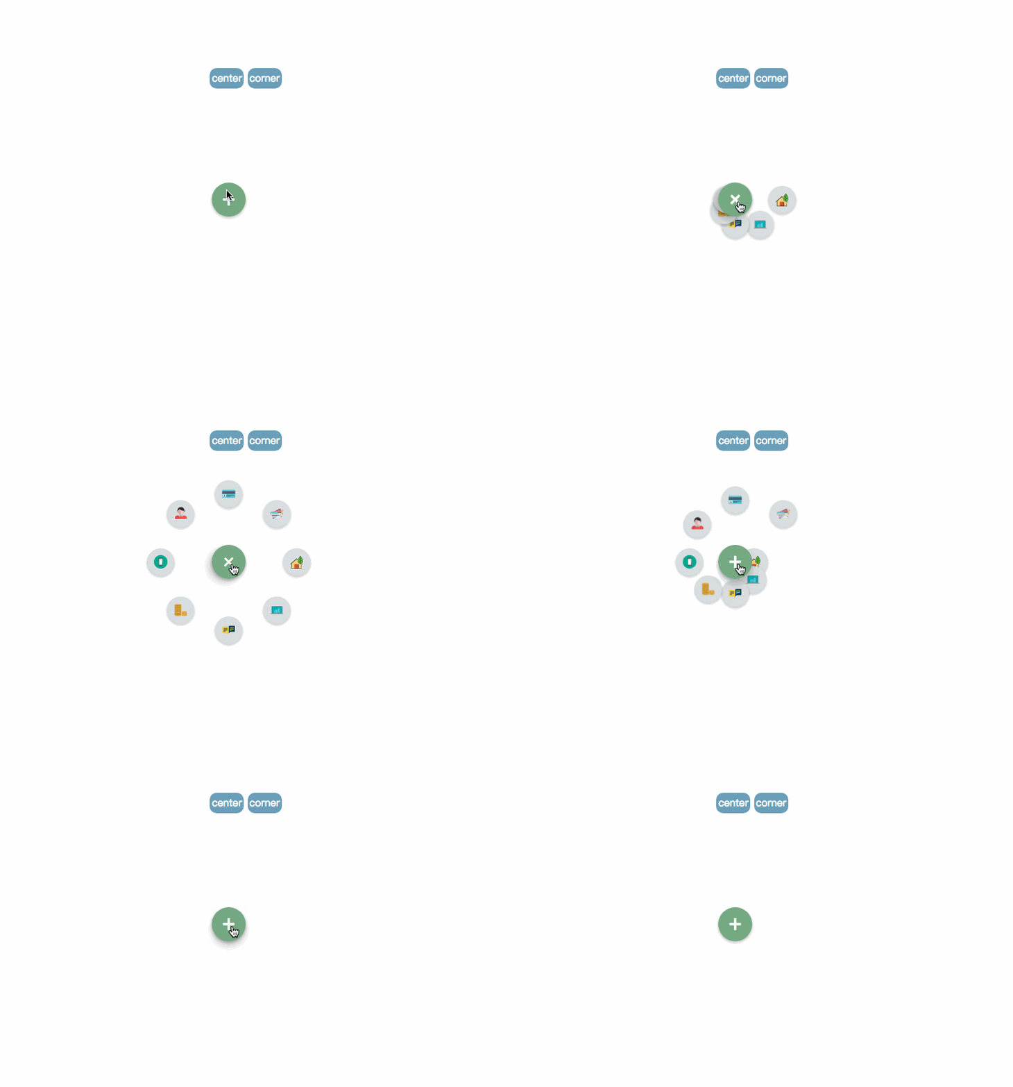
pic_1

pic2
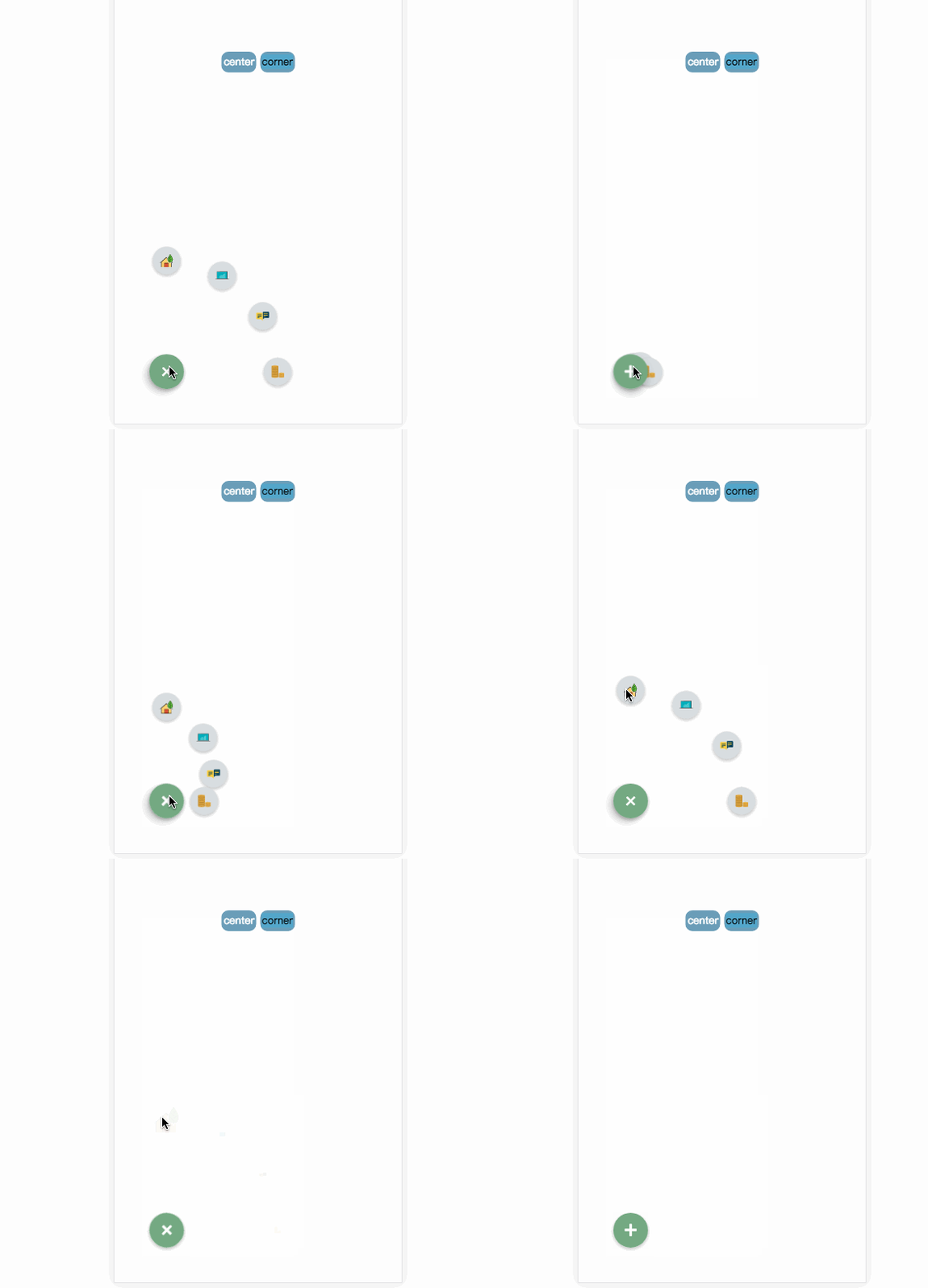
pic_3
Online demonstration live demo
2. Introduction to use
Project address: github .com/MingSeng-W/vue-bloom-menu, clone the project to the local
a. First introduce the menu component in the single file component, and import menuConfig.stylus.
# in the common folder stylus. ##b. Configure the corresponding parameters Optional parameters * radius: default is 100px, the distance between the item and the menu button. * startAngle: defaut is 0, the angle at which the item starts is recorded as 0 with the 3 o'clock direction of the clock, and then the clockwise direction is the increasing direction. * endAngle: default is 315, the angle of the last item. * itemNum: default is 8* animationDuration: default is 0.5s, the execution time of each item animation * itemAnimationDelay: default is 0.04s, each item Interval delay time between animation triggersRequired parameters* iconImgArrImport the icon you need, and then generate iconImgArr (computed attribute binding) and pass it as props For the menu componentThe position of the menuCurrently there are two positions, center and corner, which are specified in the menu class. center’s class: .menu-center-wrappercorner’s class: .menu-left-corner-wrapper. Of course, it’s OK to specify the location yourself. A simple example 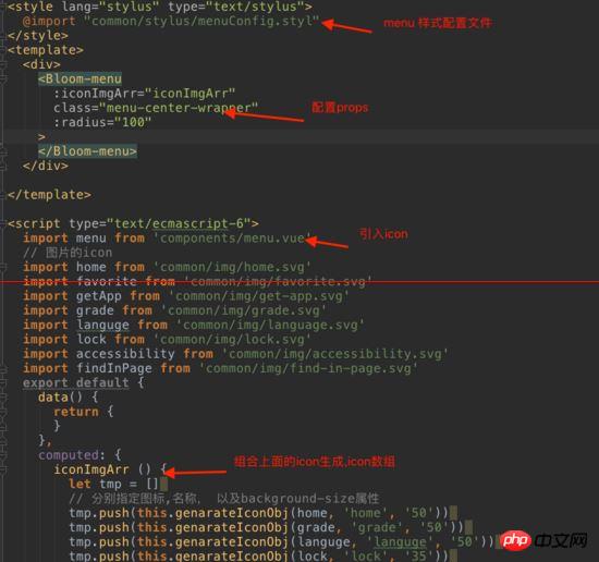


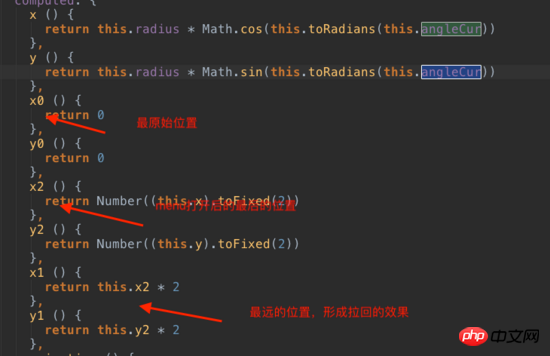
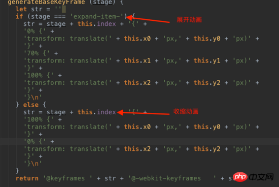
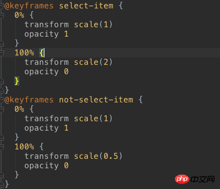


code

When you open the menu again, check whether the showItem bound to the item is false, and if so, set it to true. When clicking, you need to get the index of the clicked item, and get the global currentIndex, which is the index of the clicked item. The clicked one uses the zoom-in animation, otherwise the zoom-out animation is used.

pic_6

Related recommendations:
html: menu tag Detailed explanation of defining menu list
Recommended 10 articles about Menu
Detailed explanation of examples bootstrap uses dropdown-menu to implement context menu
The above is the detailed content of Detailed explanation of implementing a cool menu plug-in in Vue. For more information, please follow other related articles on the PHP Chinese website!

Hot AI Tools

Undresser.AI Undress
AI-powered app for creating realistic nude photos

AI Clothes Remover
Online AI tool for removing clothes from photos.

Undress AI Tool
Undress images for free

Clothoff.io
AI clothes remover

Video Face Swap
Swap faces in any video effortlessly with our completely free AI face swap tool!

Hot Article

Hot Tools

Notepad++7.3.1
Easy-to-use and free code editor

SublimeText3 Chinese version
Chinese version, very easy to use

Zend Studio 13.0.1
Powerful PHP integrated development environment

Dreamweaver CS6
Visual web development tools

SublimeText3 Mac version
God-level code editing software (SublimeText3)

Hot Topics
 1387
1387
 52
52
 PyCharm Beginner's Guide: Comprehensive understanding of plug-in installation!
Feb 25, 2024 pm 11:57 PM
PyCharm is a powerful and popular Python integrated development environment (IDE) that provides a wealth of functions and tools so that developers can write code more efficiently. The plug-in mechanism of PyCharm is a powerful tool for extending its functions. By installing different plug-ins, various functions and customized features can be added to PyCharm. Therefore, it is crucial for newbies to PyCharm to understand and be proficient in installing plug-ins. This article will give you a detailed introduction to the complete installation of PyCharm plug-in.
![Error loading plugin in Illustrator [Fixed]](https://img.php.cn/upload/article/000/465/014/170831522770626.jpg?x-oss-process=image/resize,m_fill,h_207,w_330) Error loading plugin in Illustrator [Fixed]
Feb 19, 2024 pm 12:00 PM
Error loading plugin in Illustrator [Fixed]
Feb 19, 2024 pm 12:00 PM
When launching Adobe Illustrator, does a message about an error loading the plug-in pop up? Some Illustrator users have encountered this error when opening the application. The message is followed by a list of problematic plugins. This error message indicates that there is a problem with the installed plug-in, but it may also be caused by other reasons such as a damaged Visual C++ DLL file or a damaged preference file. If you encounter this error, we will guide you in this article to fix the problem, so continue reading below. Error loading plug-in in Illustrator If you receive an "Error loading plug-in" error message when trying to launch Adobe Illustrator, you can use the following: As an administrator
 What is the Chrome plug-in extension installation directory?
Mar 08, 2024 am 08:55 AM
What is the Chrome plug-in extension installation directory? Under normal circumstances, the default installation directory of Chrome plug-in extensions is as follows: 1. The default installation directory location of chrome plug-ins in windowsxp: C:\DocumentsandSettings\username\LocalSettings\ApplicationData\Google\Chrome\UserData\Default\Extensions2. chrome in windows7 The default installation directory location of the plug-in: C:\Users\username\AppData\Local\Google\Chrome\User
 Detailed explanation of obtaining administrator rights in Win11
Mar 08, 2024 pm 03:06 PM
Windows operating system is one of the most popular operating systems in the world, and its new version Win11 has attracted much attention. In the Win11 system, obtaining administrator rights is an important operation. Administrator rights allow users to perform more operations and settings on the system. This article will introduce in detail how to obtain administrator permissions in Win11 system and how to effectively manage permissions. In the Win11 system, administrator rights are divided into two types: local administrator and domain administrator. A local administrator has full administrative rights to the local computer
 Share three solutions to why Edge browser does not support this plug-in
Mar 13, 2024 pm 04:34 PM
When users use the Edge browser, they may add some plug-ins to meet more of their needs. But when adding a plug-in, it shows that this plug-in is not supported. How to solve this problem? Today, the editor will share with you three solutions. Come and try it. Method 1: Try using another browser. Method 2: The Flash Player on the browser may be out of date or missing, causing the plug-in to be unsupported. You can download the latest version from the official website. Method 3: Press the "Ctrl+Shift+Delete" keys at the same time. Click "Clear Data" and reopen the browser.
 Detailed explanation of division operation in Oracle SQL
Mar 10, 2024 am 09:51 AM
Detailed explanation of division operation in OracleSQL In OracleSQL, division operation is a common and important mathematical operation, used to calculate the result of dividing two numbers. Division is often used in database queries, so understanding the division operation and its usage in OracleSQL is one of the essential skills for database developers. This article will discuss the relevant knowledge of division operations in OracleSQL in detail and provide specific code examples for readers' reference. 1. Division operation in OracleSQL
 Does PyCharm Community Edition support enough plugins?
Feb 20, 2024 pm 04:42 PM
Does PyCharm Community Edition support enough plugins? Need specific code examples As the Python language becomes more and more widely used in the field of software development, PyCharm, as a professional Python integrated development environment (IDE), is favored by developers. PyCharm is divided into two versions: professional version and community version. The community version is provided for free, but its plug-in support is limited compared to the professional version. So the question is, does PyCharm Community Edition support enough plug-ins? This article will use specific code examples to
 Detailed explanation of the role and usage of PHP modulo operator
Mar 19, 2024 pm 04:33 PM
The modulo operator (%) in PHP is used to obtain the remainder of the division of two numbers. In this article, we will discuss the role and usage of the modulo operator in detail, and provide specific code examples to help readers better understand. 1. The role of the modulo operator In mathematics, when we divide an integer by another integer, we get a quotient and a remainder. For example, when we divide 10 by 3, the quotient is 3 and the remainder is 1. The modulo operator is used to obtain this remainder. 2. Usage of the modulo operator In PHP, use the % symbol to represent the modulus


