
 Web Front-end
JS Tutorial
Detailed explanation of how to use bootstrap time control daterangepicker
Web Front-end
JS Tutorial
Detailed explanation of how to use bootstrap time control daterangepicker
Detailed explanation of how to use bootstrap time control daterangepicker

This article mainly introduces how to use the bootstrap time control daterangepicker and various small bug fixes. It has certain reference value. Interested friends can refer to it. I hope it can help everyone.
Dual calendar time period selection plug-in - daterangepicker is a time control later in the bootstrap framework. It can set multiple time period options or customize the time period. The user can choose the starting time and The end time and the maximum span of the time period can be set in the program.
1. Reference
daterangepicker relies on monent.js and jquery. Therefore, monent.js, jquery, and bootstrap must be introduced before daterangepicker is introduced during use.
<script type="text/javascript" src="jquery.js"></script>
<script type="text/javascript" src="moment.js"></script>
<script type="text/javascript" src="daterangepicker.js"></script>
<link rel="stylesheet" type="text/css" href="bootstrap.css" />
<link rel="stylesheet" type="text/css" href="daterangepicker-bs3.css" />
Or when using modular programming, such as seaj.js, add
define("gallery/daterangepicker/1.3.7/daterangepicker",[" in front of the entire code compression jquery","moment","./daterangepicker-bs3.css"],
function(a){a("jquery");window.moment=a("moment"),a("./daterangepicker -bs3.css"),
(You can add the source code of daterangepicker.js in the middle) (I encountered it in the project at the moment, and I made it by myself. It can be used; it is not clear yet and needs to be improved. )
Add
define("gallery/daterangepicker/1.3.7/daterangepicker-bs3.css",[],function(){
 seajs.importStyle(".daterangepicker{position:absolute;color:inherit;.........}"
 )})
})at the end 2. Use
During use, you need to pay attention to the parameter configuration of datetimepicker (this can be checked on the official website to), what I want to explain here is that you can download the source code from the official website, configure the parameters according to its demo to understand its various uses
in the check box above Through selection, you can configure different parameters. Here is a brief explanation of the parameters you use in the project, and how to use them.
Due to the entire system of the project, there are double dates or single dates, or sometimes minutes and seconds. There are no hours, minutes and seconds. So the combination of pairs is divided into four situations:
So I use the following:
/**
* 日历
* @param obj eles 日期输入框
* @param boolean dobubble 是否为双日期(true)
* @param boolean secondNot 有无时分秒(有则true)
* @return none
*/
function calenders(eles,dobubble,secondNot){
var singleNot,formatDate;
if(dobubble ==true){
singleNot = false;
}else{
singleNot = true;
}
if(secondNot ==true){
formatDate = "YYYY-MM-DD HH:mm:ss";
}else{
formatDate = "YYYY-MM-DD";
}
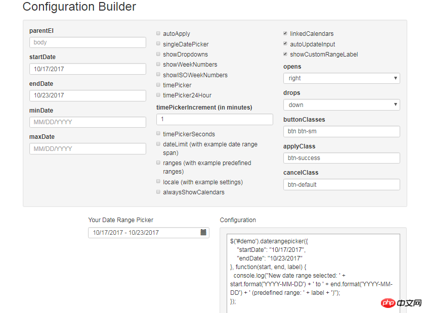
$(eles).daterangepicker({
"singleDatePicker": singleNot,//是否为单日期
"timePicker": secondNot,//时间显示与否
"timePicker24Hour": secondNot,//是否按24小时式来显示
"timePickerSeconds": secondNot,//是否带秒
"showDropdowns":true,//是否显示年月下拉选项,可以快速定位到哪一年哪一月
"timePickerIncrement" :1,
"linkedCalendars": false,//是否开始和结束连动,建议设为false,不然日期一直跳来跳去,首次使用者会觉得用户体检极度不佳
"autoApply":true,//是否自动应用,不带时分秒的都可以实现在选择完日期后自动关闭,带时分秒时不会自动关闭
"autoUpdateInput":false, //是否自动应用初始当前日期
"locale": {
"direction": "ltr",
"format": formatDate,
"separator": "~",
"applyLabel": "Apply",
"cancelLabel": "Cancel",
"fromLabel": "From",
"toLabel": "To",
"customRangeLabel": "Custom",
"daysOfWeek": [
"Su",
"Mo",
"Tu",
"We",
"Th",
"Fr",
"Sa"
],
"monthNames": [
"一月",
"二月",
"三月",
"四月",
"五月",
"六月",
"七月",
"八月",
"九月",
"十月",
"十一月",
"十二月"
],
"firstDay": 1
}
}, function(start,end, label) {
if(secondNot ==true&&dobubble ==true){
$(eles).val($.trim(start.format('YYYY-MM-DD HH:mm:ss')+'~'+end.format('YYYY-MM-DD HH:mm:ss')));
}else if(secondNot ==false&&dobubble ==true){
$(eles).val($.trim(start.format('YYYY-MM-DD')+'~'+ end.format('YYYY-MM-DD')));
}else if(secondNot ==false&&dobubble ==false){
$(eles).val(start.format('YYYY-MM-DD'));
}else if(secondNot ==true&&dobubble ==false){
$(eles).val(start.format('YYYY-MM-DD HH:mm:ss'));
}
});
//清空
$(document).off('click','.clearBtns').on('click','.clearBtns',function(){
$(eles).val('');
})
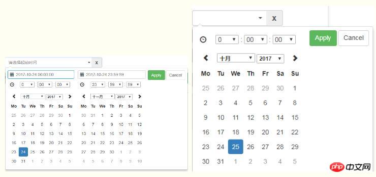
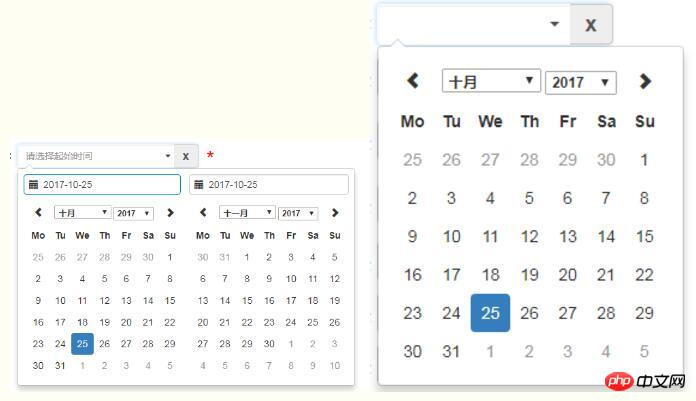
}Because daterangepicker does not have its own clearing function, and in project requirements, sometimes the date box is required. is empty, so I added a cross button behind the input box. As shown below, the code to achieve clearing can be used as a reference (there are various ways to implement this)
<p class="input-group">
 <input type="text" name="extractionDate11" id="extractionDate11" class="form-control dateStart" placeholder="请选择起始时间" readonly size="30">
 <p class="input-group-addon clearBtns">x</p>
 </p>
 <span class="caret"></span>
And for references in various situations: 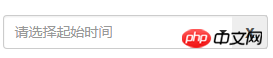
3. Problem Solving
1. Click on the drop-down date box and click on the blank space. The date box is closed, and the value transfer problemBecause the function of daterangepicker is: after clicking on the drop-down date box, click elsewhere on the page, the date box is closed, and the previously selected date value is automatically saved to On the date box, and our habit is, such an operation is equivalent to canceling, so make a modification in the source code:
outsideClick: function(e) {
 var target = $(e.target);
 // if the page is clicked anywhere except within the daterangerpicker/button
 // itself then call this.hide()
 if (
 // ie modal dialog fix
 e.type == "focusin" ||
 target.closest(this.element).length ||
 target.closest(this.container).length ||
 target.closest('.calendar-table').length
 ) return;
 // this.hide();
 if (this.isShowing){
 $(document).off('.daterangepicker');
 $(window).off('.daterangepicker');
 this.container.hide();
 this.element.trigger('hide.daterangepicker', this);
 this.isShowing = false;
 }
 this.element.trigger('outsideClick.daterangepicker', this);
},/*this.oldStartDate = this.startDate.clone(); this.oldEndDate = this.endDate.clone(); this.previousRightTime = this.endDate.clone();*/ this.oldStartDate = this.startDate; this.oldEndDate = this.endDate; this.previousRightTime = this.endDate;
1)在1210行左右的clickRange方法中:添加可以如下对照以下代码:
clickRange: function(e) {
 var label = e.target.getAttribute('data-range-key');
 this.chosenLabel = label;
 if (label == this.locale.customRangeLabel) {
 this.showCalendars();
 // } else {
 }else if (!this.endDate && date.isBefore(this.startDate)) {
 this.autoUpdateInput=true;
  //special case: clicking the same date for start/end,
  //but the time of the end date is before the start date
  this.setEndDate(this.startDate.clone());
 } else { // picking end
 this.autoUpdateInput=true;


 var dates = this.ranges[label];
 this.startDate = dates[0];
 this.endDate = dates[1];

 if (!this.timePicker) {
  this.startDate.startOf('day');
  this.endDate.endOf('day');
 }

 if (!this.alwaysShowCalendars)
  this.hideCalendars();
 this.clickApply();
 }
},2)、在1340行左右,两处添加 this.autoUpdateInput=true; 请对照以下:
} else if (!this.endDate && date.isBefore(this.startDate)) {
this.autoUpdateInput=true;
//special case: clicking the same date for start/end,
//but the time of the end date is before the start date
this.setEndDate(this.startDate.clone());
} else { // picking end
this.autoUpdateInput=true;
if (this.timePicker) {
var hour = parseInt(this.container.find('.right .hourselect').val(), 10);
if (!this.timePicker24Hour) {
var ampm = this.container.find('.right .ampmselect').val();
if (ampm === 'PM' && hour < 12)
hour += 12;
if (ampm === 'AM' && hour === 12)
hour = 0;
}3)、在1400行左右,给clickApply方法中添加 this.autoUpdateInput=true;
clickApply: function(e) {
 this.autoUpdateInput=true;
 this.hide();
 this.element.trigger('apply.daterangepicker', this);
 },
相关推荐:
The above is the detailed content of Detailed explanation of how to use bootstrap time control daterangepicker. For more information, please follow other related articles on the PHP Chinese website!

Hot AI Tools

Undresser.AI Undress
AI-powered app for creating realistic nude photos

AI Clothes Remover
Online AI tool for removing clothes from photos.

Undress AI Tool
Undress images for free

Clothoff.io
AI clothes remover

AI Hentai Generator
Generate AI Hentai for free.

Hot Article
Hot Tools

Notepad++7.3.1
Easy-to-use and free code editor

SublimeText3 Chinese version
Chinese version, very easy to use

Zend Studio 13.0.1
Powerful PHP integrated development environment

Dreamweaver CS6
Visual web development tools

SublimeText3 Mac version
God-level code editing software (SublimeText3)
Hot Topics
 1378
1378
 52
52

 How to get the bootstrap search bar
Apr 07, 2025 pm 03:33 PM
How to get the bootstrap search bar
Apr 07, 2025 pm 03:33 PM
How to use Bootstrap to get the value of the search bar: Determines the ID or name of the search bar. Use JavaScript to get DOM elements. Gets the value of the element. Perform the required actions.
 How to do vertical centering of bootstrap
Apr 07, 2025 pm 03:21 PM
How to do vertical centering of bootstrap
Apr 07, 2025 pm 03:21 PM
Use Bootstrap to implement vertical centering: flexbox method: Use the d-flex, justify-content-center, and align-items-center classes to place elements in the flexbox container. align-items-center class method: For browsers that do not support flexbox, use the align-items-center class, provided that the parent element has a defined height.
 How to write split lines on bootstrap
Apr 07, 2025 pm 03:12 PM
How to write split lines on bootstrap
Apr 07, 2025 pm 03:12 PM
There are two ways to create a Bootstrap split line: using the tag, which creates a horizontal split line. Use the CSS border property to create custom style split lines.
 How to insert pictures on bootstrap
Apr 07, 2025 pm 03:30 PM
How to insert pictures on bootstrap
Apr 07, 2025 pm 03:30 PM
There are several ways to insert images in Bootstrap: insert images directly, using the HTML img tag. With the Bootstrap image component, you can provide responsive images and more styles. Set the image size, use the img-fluid class to make the image adaptable. Set the border, using the img-bordered class. Set the rounded corners and use the img-rounded class. Set the shadow, use the shadow class. Resize and position the image, using CSS style. Using the background image, use the background-image CSS property.
 How to use bootstrap in vue
Apr 07, 2025 pm 11:33 PM
How to use bootstrap in vue
Apr 07, 2025 pm 11:33 PM
Using Bootstrap in Vue.js is divided into five steps: Install Bootstrap. Import Bootstrap in main.js. Use the Bootstrap component directly in the template. Optional: Custom style. Optional: Use plug-ins.
 How to resize bootstrap
Apr 07, 2025 pm 03:18 PM
How to resize bootstrap
Apr 07, 2025 pm 03:18 PM
To adjust the size of elements in Bootstrap, you can use the dimension class, which includes: adjusting width: .col-, .w-, .mw-adjust height: .h-, .min-h-, .max-h-
 How to set up the framework for bootstrap
Apr 07, 2025 pm 03:27 PM
How to set up the framework for bootstrap
Apr 07, 2025 pm 03:27 PM
To set up the Bootstrap framework, you need to follow these steps: 1. Reference the Bootstrap file via CDN; 2. Download and host the file on your own server; 3. Include the Bootstrap file in HTML; 4. Compile Sass/Less as needed; 5. Import a custom file (optional). Once setup is complete, you can use Bootstrap's grid systems, components, and styles to create responsive websites and applications.
 How to use bootstrap button
Apr 07, 2025 pm 03:09 PM
How to use bootstrap button
Apr 07, 2025 pm 03:09 PM
How to use the Bootstrap button? Introduce Bootstrap CSS to create button elements and add Bootstrap button class to add button text
