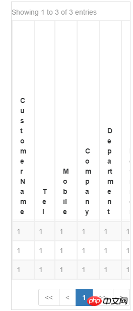
This time I will show you how to handle the automatic line wrapping of the table header in the responsive framework. In the responsive framework, what are the things to pay attention to when handling the automatic line wrapping of the table header?The following are Let’s take a look at practical cases.
Recently I am usingbootstrap to develop a website. When processing a table, I found that the style is normal when viewed on the PC. When viewed on a mobile phone, because the screen is small, TableIt was compressed so much that the header and data were deformed as shown below

attribute, add This problem can be solved by going to

How should the HTML table be laid out?
How to change the text of the click button into the input box, click The effect of saving it into text
What is the difference between class and id when marking HTML elements
The above is the detailed content of In a responsive framework, how to deal with automatic line wrapping of table headers. For more information, please follow other related articles on the PHP Chinese website!


