

CSS uses :before :after to write small triangle examples to share

This article mainly introduces the detailed information on how to use :before :after to write small triangles in CSS. The editor thinks it is quite good, so I will share it with you now and give it as a reference. Let’s follow the editor to take a look, I hope it can help everyone.
The triangles written before are always in the same color and have no border style. As follows:

The CSS code is as follows:
.tri-up{width: 0;height:0;border-left:20px solid transparent;border-right: 20px solid transparent;border-bottom: 20px solid red;  }
.tri-left{width: 0;height:0;border-top:20px solid transparent;border-bottom: 20px solid transparent;border-left: 20px solid red;}
.tri-right{width: 0;height:0;border-top:20px solid transparent;border-bottom: 20px solid transparent;border-right: 20px solid red;}
.tri-down{width: 0;height:0;border-left:20px solid transparent;border-right: 20px solid transparent;border-top: 20px solid red; }To write the following small triangle, you need to use pseudo Class:before :after
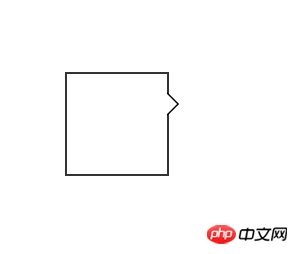
CSS code:
#demo {
            margin: 100px;;
            width: 100px;
            height: 100px;
            background-color: #fff;
            position: relative;
            border: 2px solid #333;
        } //方框的样式

        #demo:after, #demo:before {
            border: solid transparent;
            content: ' ';
            height: 0;
            left: 100%;    //根据三角形的位置,可以随意更改。
            position: absolute;
            width: 0;
        }

        #demo:after {
            border-width: 10px;
            border-left-color: #fff;
            top: 20px;//根据三角的位置改变
        }//此处是一个白色的三角

        #demo:before {
            border-width: 12px;
            border-left-color: #000;
            top: 18px;
        }此处是一个黑色的三角
//当#demo:after和#demo:before的样式重合以后,由于top值的大小不同,就可以得到中间是白色,但是边框的三角形。如上图。<p id="demo"></p>
If To change to the style of the picture below:
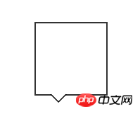
The CSS code is as follows:
#demo {
            margin: 100px;;
            width: 100px;
            height: 100px;
            background-color: #fff;
            position: relative;
            border: 2px solid #333;
        }

        #demo:after, #demo:before {
            border: solid transparent;
            content: ' ';
            height: 0;
            top: 100%;
            position: absolute;
            width: 0;
        }

        #demo:after {
            border-width: 10px;
            border-top-color: #fff;
            left: 20px;
        }

        #demo:before {
            border-width: 12px;
            border-top-color: #000;
            left: 18px;
}Related recommendations:
How to use CSS to achieve the small triangle effect_html/css_WEB-ITnose
Use CSS3 to implement a div box with a small triangle (without pictures)_html/css_WEB-ITnose
The above is the detailed content of CSS uses :before :after to write small triangle examples to share. For more information, please follow other related articles on the PHP Chinese website!

Hot AI Tools

Undresser.AI Undress
AI-powered app for creating realistic nude photos

AI Clothes Remover
Online AI tool for removing clothes from photos.

Undress AI Tool
Undress images for free

Clothoff.io
AI clothes remover

AI Hentai Generator
Generate AI Hentai for free.

Hot Article
Hot Tools

Notepad++7.3.1
Easy-to-use and free code editor

SublimeText3 Chinese version
Chinese version, very easy to use

Zend Studio 13.0.1
Powerful PHP integrated development environment

Dreamweaver CS6
Visual web development tools

SublimeText3 Mac version
God-level code editing software (SublimeText3)
Hot Topics
 1382
1382
 52
52

 Working With GraphQL Caching
Mar 19, 2025 am 09:36 AM
Working With GraphQL Caching
Mar 19, 2025 am 09:36 AM
If you’ve recently started working with GraphQL, or reviewed its pros and cons, you’ve no doubt heard things like “GraphQL doesn’t support caching” or
 Building an Ethereum app using Redwood.js and Fauna
Mar 28, 2025 am 09:18 AM
Building an Ethereum app using Redwood.js and Fauna
Mar 28, 2025 am 09:18 AM
With the recent climb of Bitcoin’s price over 20k $USD, and to it recently breaking 30k, I thought it’s worth taking a deep dive back into creating Ethereum
 Vue 3
Apr 02, 2025 pm 06:32 PM
Vue 3
Apr 02, 2025 pm 06:32 PM
It's out! Congrats to the Vue team for getting it done, I know it was a massive effort and a long time coming. All new docs, as well.
 Creating Your Own Bragdoc With Eleventy
Mar 18, 2025 am 11:23 AM
Creating Your Own Bragdoc With Eleventy
Mar 18, 2025 am 11:23 AM
No matter what stage you’re at as a developer, the tasks we complete—whether big or small—make a huge impact in our personal and professional growth.
 Can you get valid CSS property values from the browser?
Apr 02, 2025 pm 06:17 PM
Can you get valid CSS property values from the browser?
Apr 02, 2025 pm 06:17 PM
I had someone write in with this very legit question. Lea just blogged about how you can get valid CSS properties themselves from the browser. That's like this.
 A bit on ci/cd
Apr 02, 2025 pm 06:21 PM
A bit on ci/cd
Apr 02, 2025 pm 06:21 PM
I'd say "website" fits better than "mobile app" but I like this framing from Max Lynch:
 Comparing Browsers for Responsive Design
Apr 02, 2025 pm 06:25 PM
Comparing Browsers for Responsive Design
Apr 02, 2025 pm 06:25 PM
There are a number of these desktop apps where the goal is showing your site at different dimensions all at the same time. So you can, for example, be writing
 Stacked Cards with Sticky Positioning and a Dash of Sass
Apr 03, 2025 am 10:30 AM
Stacked Cards with Sticky Positioning and a Dash of Sass
Apr 03, 2025 am 10:30 AM
The other day, I spotted this particularly lovely bit from Corey Ginnivan’s website where a collection of cards stack on top of one another as you scroll.
