
 Web Front-end
JS Tutorial
Detailed explanation of bootstrap editable drop-down box jquery.editable-select example
Web Front-end
JS Tutorial
Detailed explanation of bootstrap editable drop-down box jquery.editable-select example
Detailed explanation of bootstrap editable drop-down box jquery.editable-select example

This article mainly introduces the relevant information of jquery.editable-select, the editable drop-down box of bootstrap. Friends who need it can refer to it. I hope it can help everyone.
Then please look at the code directly:
Quote:
<script type="text/javascript" src="${ contextPath }/res/sys/scripts/jquery.editable-select.min.js"></script>
<link href="${ contextPath }/res/sys/scripts/css/jquery.editable-select.min.css" rel="external nofollow" rel="stylesheet">HTML part :
</tr>
<tr>
<th valign="middle" >
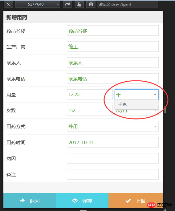
<h4>用量</h4>
</th>
<td valign="middle" style="width:28%">
<input type="text" class="form_input form-control" id='num' name='num' value='${map.get("input_value")}' placeholder=" ">
</td>
<td valign="middle" style="width:27%">
<select id="numUnit" name="numUnit" class="form-control">
</select>
</td>
</tr>JS part:
ajaxDirect(contextPath + "/admin/getDataDictAll/024",{},function(data){
var htm = "";
for ( var int = 0; int < data.length; int++) {
htm += "<option value='"+ data[int].name +"'>"+ data[int].name +"</option>";
}
$('#numUnit').html(htm);
$('#numUnit').editableSelect({
effects: 'slide' //设置可编辑 其它可选参数default、fade
});
$('#numUnit').val(data[0].name); //设置默认值
});The json returned by the url is : [{"dataDictNo":"024001","gbNo":"","name":"Kilograms ","nameInitAbbr":"QK","parentNo":"024"}]
ajaxDirect is ajax with a different twist, which can be ignored
/**
* 返回JSON形式的数据
* @param url 地址
* @param data 参数
* @param func 返回函数
* @param async 是否异步
*/
function ajaxDirect(url,data,func,async){
if(!async){
async = false;
}
$.ajax({
url:url,
type:"post",
dataType:"json",
async:async,
data:data,
success:func
});
}The effect is as shown:
Other option settings:
filter: filtering, that is, when inputting content, the drop-down option will match the entered characters, supports Chinese , true/false, default true.
effects: Animation effect. When the drop-down selection box is triggered, the drop-down box displays the transition effect. There are three values: default, slide, and fade. The default is default.
duration: The transition animation speed displayed in the drop-down option box, including fast, slow, and number (milliseconds), the default is fast.
Event
onCreate: Triggered when input.
onShow: Triggered when pulled down.
onHide: Triggered when the drop-down box is hidden.
onSelect: Triggered when the option in the drop-down box is selected.
Related recommendations:
How to write jquery.editable-select for bootstrap editable drop-down box
Two implementations of editable drop-down box Method_javascript skills
Editable drop-down box implementation code based on jquery_jquery
The above is the detailed content of Detailed explanation of bootstrap editable drop-down box jquery.editable-select example. For more information, please follow other related articles on the PHP Chinese website!

Hot AI Tools

Undresser.AI Undress
AI-powered app for creating realistic nude photos

AI Clothes Remover
Online AI tool for removing clothes from photos.

Undress AI Tool
Undress images for free

Clothoff.io
AI clothes remover

Video Face Swap
Swap faces in any video effortlessly with our completely free AI face swap tool!

Hot Article
Hot Tools

Notepad++7.3.1
Easy-to-use and free code editor

SublimeText3 Chinese version
Chinese version, very easy to use

Zend Studio 13.0.1
Powerful PHP integrated development environment

Dreamweaver CS6
Visual web development tools

SublimeText3 Mac version
God-level code editing software (SublimeText3)
Hot Topics
 1386
1386
 52
52

 How to get the bootstrap search bar
Apr 07, 2025 pm 03:33 PM
How to get the bootstrap search bar
Apr 07, 2025 pm 03:33 PM
How to use Bootstrap to get the value of the search bar: Determines the ID or name of the search bar. Use JavaScript to get DOM elements. Gets the value of the element. Perform the required actions.
 How to use bootstrap in vue
Apr 07, 2025 pm 11:33 PM
How to use bootstrap in vue
Apr 07, 2025 pm 11:33 PM
Using Bootstrap in Vue.js is divided into five steps: Install Bootstrap. Import Bootstrap in main.js. Use the Bootstrap component directly in the template. Optional: Custom style. Optional: Use plug-ins.
 How to do vertical centering of bootstrap
Apr 07, 2025 pm 03:21 PM
How to do vertical centering of bootstrap
Apr 07, 2025 pm 03:21 PM
Use Bootstrap to implement vertical centering: flexbox method: Use the d-flex, justify-content-center, and align-items-center classes to place elements in the flexbox container. align-items-center class method: For browsers that do not support flexbox, use the align-items-center class, provided that the parent element has a defined height.
 How to write split lines on bootstrap
Apr 07, 2025 pm 03:12 PM
How to write split lines on bootstrap
Apr 07, 2025 pm 03:12 PM
There are two ways to create a Bootstrap split line: using the tag, which creates a horizontal split line. Use the CSS border property to create custom style split lines.
 How to insert pictures on bootstrap
Apr 07, 2025 pm 03:30 PM
How to insert pictures on bootstrap
Apr 07, 2025 pm 03:30 PM
There are several ways to insert images in Bootstrap: insert images directly, using the HTML img tag. With the Bootstrap image component, you can provide responsive images and more styles. Set the image size, use the img-fluid class to make the image adaptable. Set the border, using the img-bordered class. Set the rounded corners and use the img-rounded class. Set the shadow, use the shadow class. Resize and position the image, using CSS style. Using the background image, use the background-image CSS property.
 How to resize bootstrap
Apr 07, 2025 pm 03:18 PM
How to resize bootstrap
Apr 07, 2025 pm 03:18 PM
To adjust the size of elements in Bootstrap, you can use the dimension class, which includes: adjusting width: .col-, .w-, .mw-adjust height: .h-, .min-h-, .max-h-
 How to set up the framework for bootstrap
Apr 07, 2025 pm 03:27 PM
How to set up the framework for bootstrap
Apr 07, 2025 pm 03:27 PM
To set up the Bootstrap framework, you need to follow these steps: 1. Reference the Bootstrap file via CDN; 2. Download and host the file on your own server; 3. Include the Bootstrap file in HTML; 4. Compile Sass/Less as needed; 5. Import a custom file (optional). Once setup is complete, you can use Bootstrap's grid systems, components, and styles to create responsive websites and applications.
 How to use bootstrap button
Apr 07, 2025 pm 03:09 PM
How to use bootstrap button
Apr 07, 2025 pm 03:09 PM
How to use the Bootstrap button? Introduce Bootstrap CSS to create button elements and add Bootstrap button class to add button text
