

CSS naming convention saves debugging time answers

This article mainly shares with you the relevant knowledge that CSS naming conventions can save debugging time. Friends who are interested should take a look at it. I hope it can help everyone. Debugging CSS is a time-consuming operation. If you have good naming conventions, you can save a lot of debugging time.

Brief comment: Debug CSS is a time-consuming operation. If you have good naming conventions, you can save a lot of debugging time.
Use hyphens ('-') to separate strings
You may be used to using camel case naming in Javascript:
var redBox = document.getElementById('...')
But it is not recommended in CSS Use this naming method:
.redBox {
  border:1px纯红色;
}Instead, use this:
.red-box {
   border:1px纯红色;
}This is a standard CSS naming convention and has better readability.
In addition, it has the same name as the CSS property.
//正确
.some-class {
   font-weight:10em
}
//错了
.some-class {
   fontWeight:10em
}BEM Naming Conventions
Teams have different ways of writing CSS selectors. Some teams use hyphen delimiters, while others prefer a more structured naming convention called BEM.
Generally speaking, there are three problems to be solved in CSS naming conventions:
The function of the selector can be made clear through the name.
You can see where the selector can be used.
Can see the relationship between classes.
Have you ever seen a class name written like this:
.nav--secondary {
  ...
}
.nav__header {
  ...
}This is the BEM naming rule.
B stands for Block
BEM attempts to divide the entire user interface into reusable independent blocks (Block, note that Block here does not refer to inline-block), a header is a block, Nested elements (logo, input, menu) in the header can also be blocks.
Take the following picture for example:
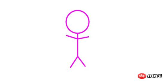
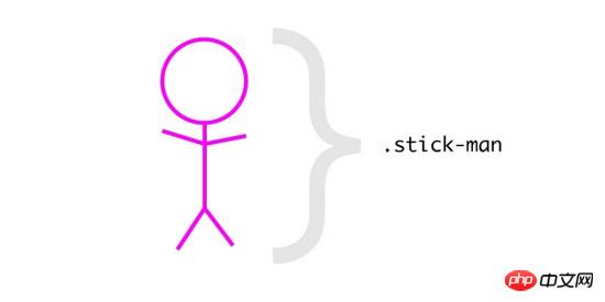
This is a stick figure (we can think of it as a Block). According to the previous statement, this We can set the naming of the component to stick-man.
The style of the primary key should be as follows:
.stick-man {

}
E represents the element
Generally there will be multiple elements in the block, for example Example: The stickman has a head, two arms and feet
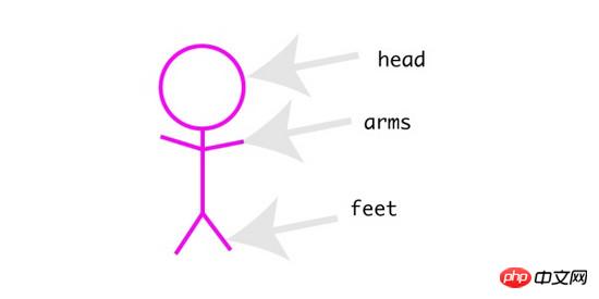
head, feet, and arms are all elements in this component. Use BEM naming rules to connect blocks and elements with double underscores.
.stick-man__head {
}
.stick-man__arms {
}
.stick-man__feet {
}M stands for modifier
M in BEM stands for modification, which can modify the block (Block) or element (Element) (adjustment of appearance or behavior), we can adjust our matches Life creates a blue stickman and a red stickman (actually we might need a blue button and a red button).
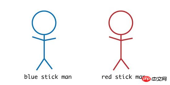
Using BEM’s naming rules we use double connectors to name ('--')
For example:
.stick-man--blue {
}
.stick-man--red {
}Modifier Can also be used on elements, for example we only want to resize the stickman's head. We can name it like this
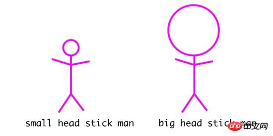
.stick-man__head--small {
}
.stick-man__head--big {
}The above is the naming method of BEM. Although this naming method is a bit verbose, it can be used to clarify the various parts in complex projects. relationship, if it is just a simple project, just use the separator to name it directly.
How should CSS class names used in JavaScript be named
When you see this article, start refactoring your own project.
You changed the original code:
<p class="siteNavigation">
</p>
to:
<p class="site-navigation">
</p>
This looks great, but you forgot that you used it somewhere (JavaScript) This class name:
//the Javasript code
const nav = document.querySelector('.siteNavigation')At this time nav will get null.
In order to prevent this situation, we can use the following naming to remind us.
Use 'js-*' to name
We can use js- to name our class:
<p class="site-navigation js-site-navigation">
</p>
In JavaScript code we use js-site-navigation to get The DOM:
//the Javasript code
const nav = document.querySelector('.js-site-navigation')Now as soon as we see js-site-navigation, we will think of using this class name to obtain the DOM object in a JavaScript code.
Related recommendations:
CSS naming convention and commonly used Chinese and English comparison table for websites
div+css naming reference and CSS naming convention_ html/css_WEB-ITnose
css naming convention_html/css_WEB-ITnose
The above is the detailed content of CSS naming convention saves debugging time answers. For more information, please follow other related articles on the PHP Chinese website!

Hot AI Tools

Undresser.AI Undress
AI-powered app for creating realistic nude photos

AI Clothes Remover
Online AI tool for removing clothes from photos.

Undress AI Tool
Undress images for free

Clothoff.io
AI clothes remover

Video Face Swap
Swap faces in any video effortlessly with our completely free AI face swap tool!

Hot Article
Hot Tools

Notepad++7.3.1
Easy-to-use and free code editor

SublimeText3 Chinese version
Chinese version, very easy to use

Zend Studio 13.0.1
Powerful PHP integrated development environment

Dreamweaver CS6
Visual web development tools

SublimeText3 Mac version
God-level code editing software (SublimeText3)
Hot Topics
 1387
1387
 52
52

 How to use bootstrap in vue
Apr 07, 2025 pm 11:33 PM
How to use bootstrap in vue
Apr 07, 2025 pm 11:33 PM
Using Bootstrap in Vue.js is divided into five steps: Install Bootstrap. Import Bootstrap in main.js. Use the Bootstrap component directly in the template. Optional: Custom style. Optional: Use plug-ins.
 The Roles of HTML, CSS, and JavaScript: Core Responsibilities
Apr 08, 2025 pm 07:05 PM
The Roles of HTML, CSS, and JavaScript: Core Responsibilities
Apr 08, 2025 pm 07:05 PM
HTML defines the web structure, CSS is responsible for style and layout, and JavaScript gives dynamic interaction. The three perform their duties in web development and jointly build a colorful website.
 How to write split lines on bootstrap
Apr 07, 2025 pm 03:12 PM
How to write split lines on bootstrap
Apr 07, 2025 pm 03:12 PM
There are two ways to create a Bootstrap split line: using the tag, which creates a horizontal split line. Use the CSS border property to create custom style split lines.
 Understanding HTML, CSS, and JavaScript: A Beginner's Guide
Apr 12, 2025 am 12:02 AM
Understanding HTML, CSS, and JavaScript: A Beginner's Guide
Apr 12, 2025 am 12:02 AM
WebdevelopmentreliesonHTML,CSS,andJavaScript:1)HTMLstructurescontent,2)CSSstylesit,and3)JavaScriptaddsinteractivity,formingthebasisofmodernwebexperiences.
 How to resize bootstrap
Apr 07, 2025 pm 03:18 PM
How to resize bootstrap
Apr 07, 2025 pm 03:18 PM
To adjust the size of elements in Bootstrap, you can use the dimension class, which includes: adjusting width: .col-, .w-, .mw-adjust height: .h-, .min-h-, .max-h-
 How to use bootstrap button
Apr 07, 2025 pm 03:09 PM
How to use bootstrap button
Apr 07, 2025 pm 03:09 PM
How to use the Bootstrap button? Introduce Bootstrap CSS to create button elements and add Bootstrap button class to add button text
 How to set up the framework for bootstrap
Apr 07, 2025 pm 03:27 PM
How to set up the framework for bootstrap
Apr 07, 2025 pm 03:27 PM
To set up the Bootstrap framework, you need to follow these steps: 1. Reference the Bootstrap file via CDN; 2. Download and host the file on your own server; 3. Include the Bootstrap file in HTML; 4. Compile Sass/Less as needed; 5. Import a custom file (optional). Once setup is complete, you can use Bootstrap's grid systems, components, and styles to create responsive websites and applications.
 How to insert pictures on bootstrap
Apr 07, 2025 pm 03:30 PM
How to insert pictures on bootstrap
Apr 07, 2025 pm 03:30 PM
There are several ways to insert images in Bootstrap: insert images directly, using the HTML img tag. With the Bootstrap image component, you can provide responsive images and more styles. Set the image size, use the img-fluid class to make the image adaptable. Set the border, using the img-bordered class. Set the rounded corners and use the img-rounded class. Set the shadow, use the shadow class. Resize and position the image, using CSS style. Using the background image, use the background-image CSS property.
