

CSS implementation of Sticky Footer tutorial

This article mainly introduces the relevant information about the sample code for implementing Sticky Footer with CSS. The editor thinks it is quite good, so I will share it with you now and give it as a reference. Let’s follow the editor to take a look, I hope it can help everyone.
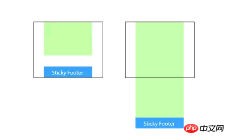
The so-called "Sticky Footer" is not a new front-end concept and technology. It refers to a web page effect: if the page content is not long enough, the footer is fixed at the bottom of the browser window; When the content is long enough, the footer is fixed at the very bottom of the page. But if the content of the web page is not long enough, the bottom footer will remain at the bottom of the browser window.
Implementation
Method
1. Change the content part Set the bottom margin to a negative number
This is a more mainstream usage. Set the minimum height of the content part to 100%, and then use the negative bottom margin value of the content part to achieve that when the height is not satisfied, the page The feet remain at the bottom of the window and will be pushed out when the height is exceeded.
<body>
  <p class="wrapper">
      content
    <p class="push"></p>
  </p>
  <footer class="footer"></footer>
</body>html, body {
  height: 100%;
  margin: 0;
}
.wrapper {
  min-height: 100%;
  /* 等于footer的高度 */
  margin-bottom: -50px;
}
.footer,
.push {
  height: 50px;
}This method requires additional placeholder elements in the container (such as .push)
It should be noted that the margin-bottom value of .wrapper needs to It is consistent with the negative height value of .footer, which is not very friendly.
2. Set the top margin of the footer to a negative number
Since we can use negative margin bottom on the container, can we use negative margin top? sure.
Add a parent element outside the content, and make the bottom padding of the content part equal to the value of the footer height.
<body>
  <p class="content">
    <p class="content-inside">
      content
    </p>
  </p>
  <footer class="footer"></footer>
</body>html, body {
  height: 100%;
  margin: 0;
}
.content {
  min-height: 100%;
}
.content-inside {
  padding: 20px;
  padding-bottom: 50px;
}
.footer {
  height: 50px;
  margin-top: -50px;
}However, this method is the same as the previous one, requiring additional unnecessary html elements.
3. Use flexbox layout
The footer height of the above three methods is fixed. Generally speaking, this is not conducive to web page layout: the content will change. They are both elastic and will break the layout once the content exceeds the fixed height. So use flexbox for the footer, so that its height can become larger, smaller, and more beautiful~ (≧∇≦)
<body>
  <p class="content">
    content
  </p>
  <footer class="footer"></footer>
</body>html {
  height: 100%;
}
body {
  min-height: 100%;
  display: flex;
  flex-direction: column;
}
.content {
  flex: 1;
}You can also add a header above or below Add more elements. You can choose one of the following techniques:
flex: 1 Make the height of the content (such as .content) freely scalable
margin-top : auto
4. absolute
Processing through absolute positioning should be a common solution, as long as the footer is always positioned in the reserved space of the main container.<p class="wrapper">
<p class="content"><!-- 页面主体内容区域 --></p>
<p class="footer"><!-- 需要做到 Sticky Footer 效果的页脚 --></p>
</p>html, body {
height: 100%;
}
.wrapper {
position: relative;
min-height: 100%;
padding-bottom: 50px;
box-sizing: border-box;
}
.footer {
position: absolute;
bottom: 0;
height: 50px;
}5. calc
Calculate (window height - footer height) through the calculation function calc to give the minimum height to the content area. No additional style processing is required, and the amount of code is minimal. ,the easiest.<p class="wrapper">
<p class="content"><!-- 页面主体内容区域 --></p>
<p class="footer"><!-- 需要做到 Sticky Footer 效果的页脚 --></p>
</p>.content {
min-height: calc(100vh - 50px);
}
.footer {
height: 50px;
}6. table
Use the table attribute to make the page appear in the form of a table.<p class="wrapper">
<p class="content"><!-- 页面主体内容区域 --></p>
<p class="footer"><!-- 需要做到 Sticky Footer 效果的页脚 --></p>
</p>html, body {
height: 100%;
}
.wrapper {
display: table;
width: 100%;
min-height: 100%;
}
.content {
display: table-row;
height: 100%;
}
<body>
  <p class="content">
    content
  </p>
  <footer class="footer"></footer>
</body>html {
  height: 100%;
}
body {
  min-height: 100%;
  display: grid;
  grid-template-rows: 1fr auto;
}
.footer {
  grid-row-start: 2;
  grid-row-end: 3;
}Summary
The author has tried all the above implementation solutions in the project. Each implementation method is actually similar, and it also has its own pros and cons. Some of the solutions have restrictive issues and require a fixed footer height; some of them require adding additional elements or hacking methods. Students can choose the most suitable solution based on the specific needs of the page. Of course, technology is constantly being updated, and there may be many different and better solutions. But I believe everyone’s ultimate goal is the same, for a better user experience! Related recommendations:Detailed explanation of Sticky footer layout of CSS classic layout
Sticky Footer Detailed explanation of two routines at the absolute bottom
The above is the detailed content of CSS implementation of Sticky Footer tutorial. For more information, please follow other related articles on the PHP Chinese website!

Hot AI Tools

Undresser.AI Undress
AI-powered app for creating realistic nude photos

AI Clothes Remover
Online AI tool for removing clothes from photos.

Undress AI Tool
Undress images for free

Clothoff.io
AI clothes remover

AI Hentai Generator
Generate AI Hentai for free.

Hot Article
Hot Tools

Notepad++7.3.1
Easy-to-use and free code editor

SublimeText3 Chinese version
Chinese version, very easy to use

Zend Studio 13.0.1
Powerful PHP integrated development environment

Dreamweaver CS6
Visual web development tools

SublimeText3 Mac version
God-level code editing software (SublimeText3)
Hot Topics
 1385
1385
 52
52

 Working With GraphQL Caching
Mar 19, 2025 am 09:36 AM
Working With GraphQL Caching
Mar 19, 2025 am 09:36 AM
If you’ve recently started working with GraphQL, or reviewed its pros and cons, you’ve no doubt heard things like “GraphQL doesn’t support caching” or
 Building an Ethereum app using Redwood.js and Fauna
Mar 28, 2025 am 09:18 AM
Building an Ethereum app using Redwood.js and Fauna
Mar 28, 2025 am 09:18 AM
With the recent climb of Bitcoin’s price over 20k $USD, and to it recently breaking 30k, I thought it’s worth taking a deep dive back into creating Ethereum
 Vue 3
Apr 02, 2025 pm 06:32 PM
Vue 3
Apr 02, 2025 pm 06:32 PM
It's out! Congrats to the Vue team for getting it done, I know it was a massive effort and a long time coming. All new docs, as well.
 Can you get valid CSS property values from the browser?
Apr 02, 2025 pm 06:17 PM
Can you get valid CSS property values from the browser?
Apr 02, 2025 pm 06:17 PM
I had someone write in with this very legit question. Lea just blogged about how you can get valid CSS properties themselves from the browser. That's like this.
 A bit on ci/cd
Apr 02, 2025 pm 06:21 PM
A bit on ci/cd
Apr 02, 2025 pm 06:21 PM
I'd say "website" fits better than "mobile app" but I like this framing from Max Lynch:
 Comparing Browsers for Responsive Design
Apr 02, 2025 pm 06:25 PM
Comparing Browsers for Responsive Design
Apr 02, 2025 pm 06:25 PM
There are a number of these desktop apps where the goal is showing your site at different dimensions all at the same time. So you can, for example, be writing
 Using Markdown and Localization in the WordPress Block Editor
Apr 02, 2025 am 04:27 AM
Using Markdown and Localization in the WordPress Block Editor
Apr 02, 2025 am 04:27 AM
If we need to show documentation to the user directly in the WordPress editor, what is the best way to do it?
 Stacked Cards with Sticky Positioning and a Dash of Sass
Apr 03, 2025 am 10:30 AM
Stacked Cards with Sticky Positioning and a Dash of Sass
Apr 03, 2025 am 10:30 AM
The other day, I spotted this particularly lovely bit from Corey Ginnivan’s website where a collection of cards stack on top of one another as you scroll.
