This article mainly introduces the first experience of mobile development with mui framework. Now I will share it with you and give you a reference. Let’s follow the editor to take a look, I hope it can help everyone.
Preface
The blogger recently came into contact with mobile APP, learned a few tips, and would like to share them with you.
1. Status bar settings
Now when most apps are opened, the status bar is integrated with the APP, which is not only beautiful, but also coordinated with the whole.
The blogger is a moderate obsessive-compulsive disorder patient, and the little black bar at the top really makes me uncomfortable.
First, we create a new mobile APP project on HBuilder
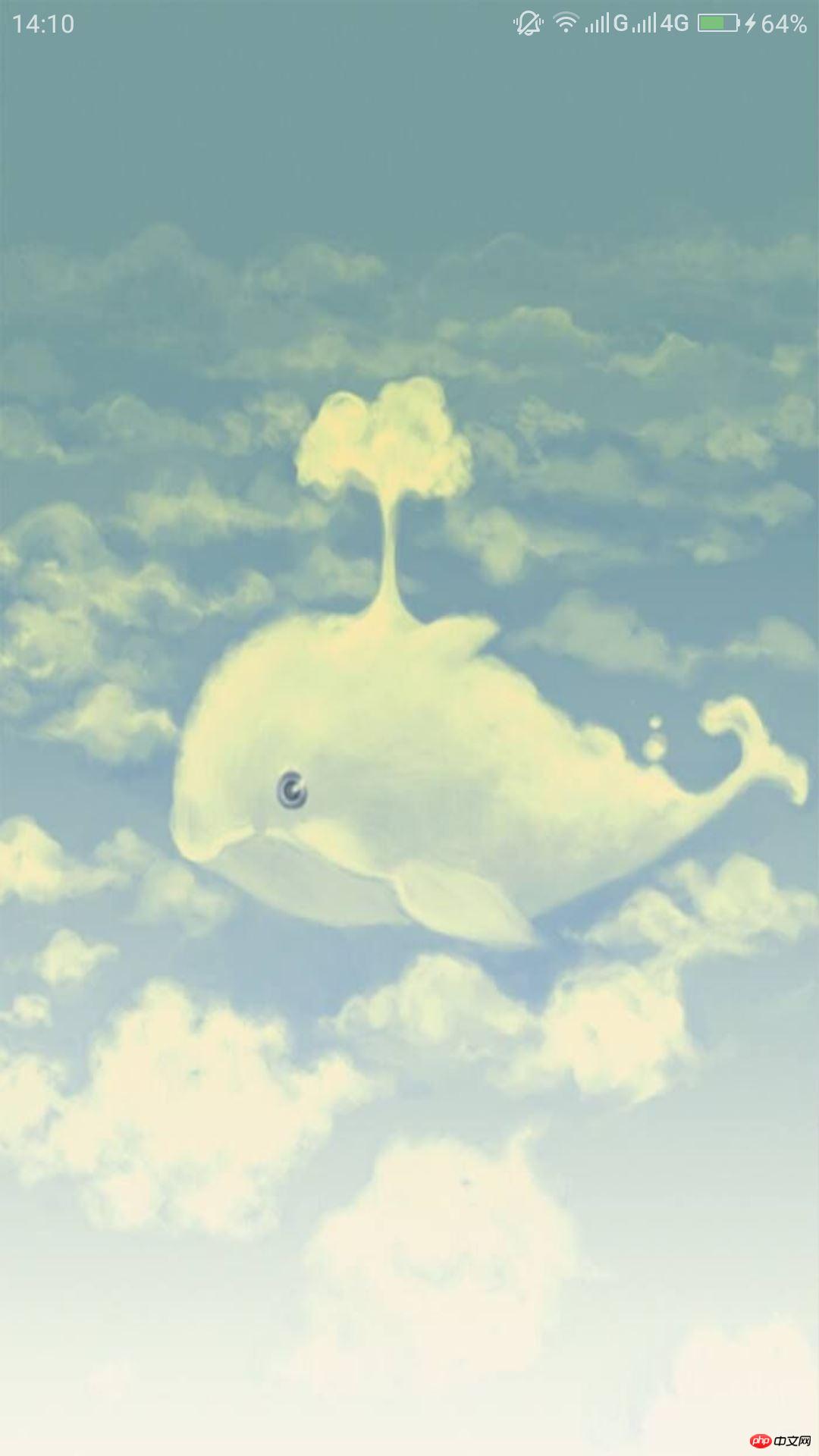
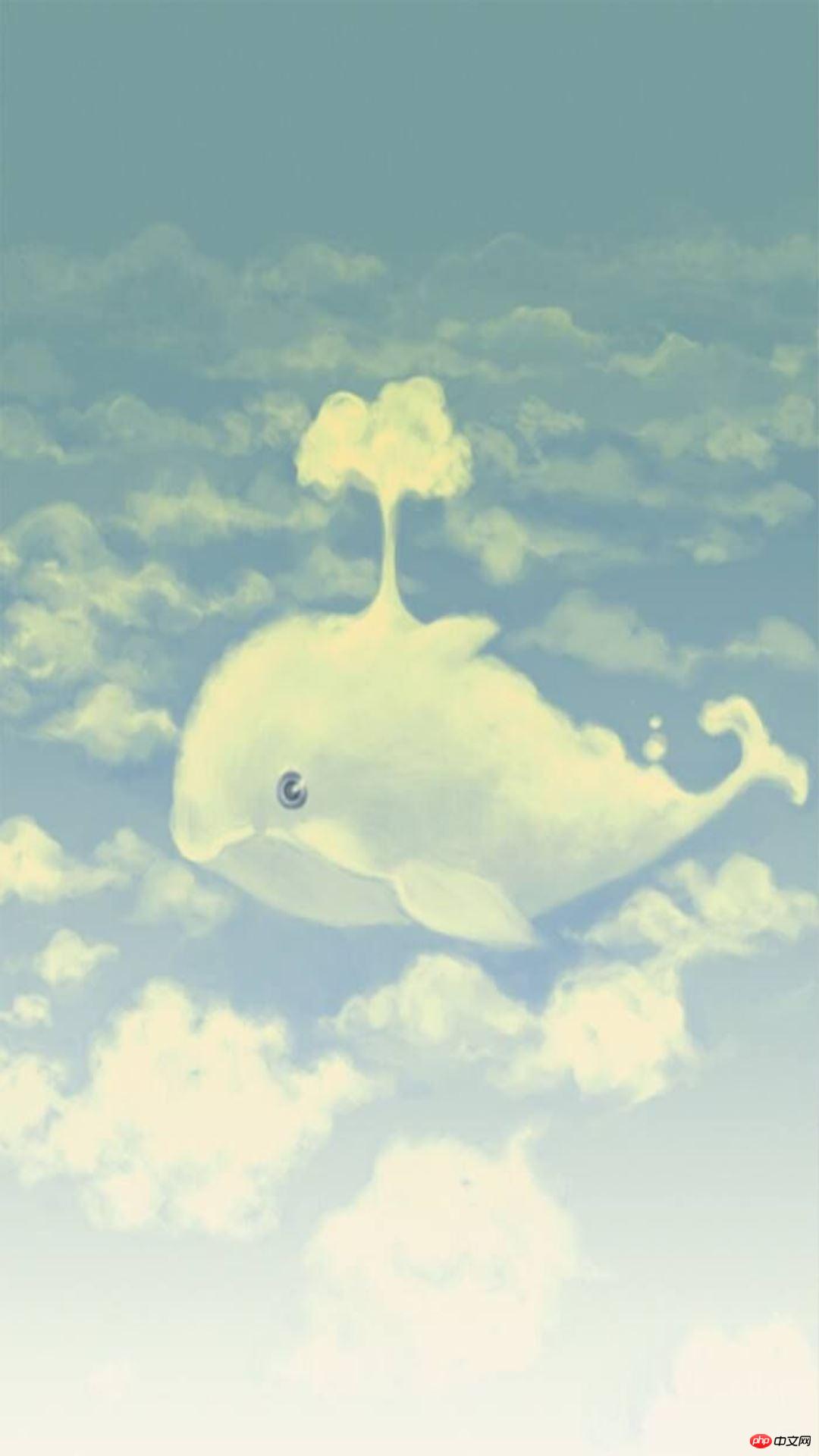
1.1 Immersive status bar (transparent status bar)
Generally, when the entire page is a picture, the status bar will be transparent.
First, detect whether the current environment supports the immersive status bar. Detection statement:
<script type="text/javascript">
  document.addEventListener('plusready', function(){
    //是否支持沉浸式状态栏
    alert(plus.navigator.isImmersedStatusbar());

  });
</script>is not supported by default and false will pop up. If you want the environment to support it, you need to modify the configuration file manifest.json under the project
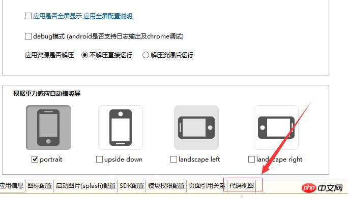
There is a manifest.json file under the project. After opening it, open the code view:

Add
    "statusbar": {
      "immersed": true
},under the code view "plus" as shown in the picture:


<script type="text/javascript">
  document.addEventListener('plusready', function(){
    //参数:true - 全屏;false - 不全屏
    plus.navigator.setFullscreen(true);

  });
</script> ##1.3 Status bar background color
Modifying the background color is generally used in scenarios where the background color at the top of the page is a solid color. Modify it to the same background color as the page to make the page more harmonious.
//设置系统状态栏背景色
plus.navigator.setStatusBarBackground('#6495ED');The Android platform does not support this function. If there is an expert, please give me some advice.
2. Frosted glass effect
Blurring pictures can give people a hazy and beautiful effect. Click on the image blur effect not mentioned before:
css attribute filter:
filter: blur(16px);
The pixels in blur() are the degree of blur.
3. Simply use mui to quickly build a page
The status bar problem that bothered me most has been solved, and the page layout is easier to handle. It can be built quickly using mui templates.
Take XX Music as an example:
2.1 Import file
  <script src="js/mui.min.js"></script>
  <link href="css/mui.min.css" rel="external nofollow" rel="stylesheet"/>
  <link rel="stylesheet" href="css/bofang.css" rel="external nofollow" />
2.2HTML code
The following HTML code is the mui framework part used and the above status bar The relevant part, this mui is about the regional carousel part
The top img is the background image, the p wrapped in the outer layer is very necessary, and the overflow attribute must be used flexibly to achieve perfect effects.
Because the header part of the APP uses positioning, the main part of the page needs to add a padding-top with a height of about 74px
  <p class="mui-slider">
       <p class="mui-slider-group">
         <p class="mui-slider-item">
          第一个轮播区域
         </p>
         <p class="mui-slider-item">
          <p class="singer">
            <span class="ce"></span>
            <span class="mui-text-center">G-DRAGON</span>
            <span class="ce"></span>
          </p>
          <p class="yinxiao">
            <img src="img/player_btn_sq_hlight.png"/>
            <img src="img/player_btn_mv_normal.png"/>
            <img src="img/player_btn_dts_on.png"/>
          </p>

          <p class="datu">
            <img src="img/GD.jpg"/>
          </p>

          <p class="geci">A Boy - G-DRAGON</p>


         </p>
         <p class="mui-slider-item">
          第二个轮播区域
         </p>
       </p>
       <p class="mui-slider-indicator">
        <p class="mui-indicator"></p>
        <p class="mui-indicator mui-active"></p>
        <p class="mui-indicator"></p>
       </p>
    </p>
Main css code:
*{
  padding: 0px;
  margin: 0px;
}
body{
  overflow: hidden;
  height: 100vh;
}
#background{
  overflow: hidden;
  text-align: right;
}
#background #backImg{
  margin-left: -120px;
  height: 99vh;
  filter: blur(16px);
}
.mui-bar-nav{
  top: 30px;
  background-color: rgba(0,0,0,0);
  box-shadow: 0 0px 0px #ccc;
}
.mui-bar-nav .mui-title{
  color: white;
  font-size: 20px;
  font-weight: normal;
  line-height: 50px;
}
#continer{
  width: 100%;
  height: 100vh;
  position: relative;
  top: -100vh;
  z-index: 5;
  padding-top: 80px;
  background-color: rgba(0,0,0,0.7);
  text-align: center;
  color: white;
}The latter is different I didn’t think of center-aligning the large and small pictures for a moment. Here we need to use the cross-axis alignment of elastic layout:
#continer .footer1{
  margin-bottom: 0px;
  display: flex;
  align-items: center;
  justify-content: center;
}Related recommendations:
The above is the detailed content of Mobile development mui framework entry experience case. For more information, please follow other related articles on the PHP Chinese website!


